This photograph was front page above the fold at the New York Times yesterday (Monday):
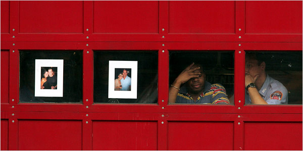
The caption read, “Photographs of Joseph Graffagnino, left, and Robert Beddia at the firehouse for Engine 24 and Ladder 5. They died fighting a fire at the Deutsche Bank tower.” By highlighting the photos taped to the windows this description may distort the overall effect of the visual composition. Likewise, the smaller image here may not do justice to the emotional power of the photograph’s placement in the print edition. It remains a complex and strangely moving photograph nonetheless.
The emotional power of the image begins with the color of the firehouse door. Red is the color of blood, fire, anger, and other intense experiences: psychologists would tell us that it stimulates emotional responsiveness. Red also is the firefighters’ iconic color, but we don’t see the shiny metal surface of a fire truck. The red wood has the grained, organic feel of a barn and its associations of working hard while living close to nature. The large color field is enveloping and yet somehow also soothing, perhaps because of the square panels and solid bolt construction. This is a good red that helps us feel our way into the photograph.
The second major element of the composition is the line of four windows that divide the monochromatic color field. They are tied to the colored door by the touches of red on shirt and badge, but the primary effect is one of contrast. Instead of an exterior surface, we peer into a deep interior. Instead of a surface that catches the light, there is only the all-too-symbolic darkness. The photographs on the windows not only memorialize the dead but accentuate the sense that a window both reveals and buffers. The door becomes a divider between those suffering within and the rest of us peering in from more distant lives.
The photographs themselves are heartbreaking. We see young people full of life and love, and now two of them are only images. The large white frames isolate the vitality of each couple and set these past scenes against the utter darkness behind them. Thus, a second contrast, for the photos of the dead are all the more compelling by being placed in a line with the two living firefighters on the right. Again, darkness lurks behind everyone, but two are obviously alive, real people hurting yet breathing in real time, while the others are now only images on paper that are pathetic, hopeless masks placed on the darkness.
And so we are left with the living. They remain behind a scrim of mourning, but we can see two individuals lost in different though related postures of sadness. They are touchingly close to one another and yet each is lost in thought, dwelling on the tragedy as they work side by side to re-enter life in the outer world. You can’t ask for much more than that, and so they become a model for others’ mourning as well.
It also matters that this is not the first time. The fire was in a building that has been a dangerous wreck since the World Trade Center attack, and the Times story was titled, “Scarred on 9/11, a Firehouse Mourns Again.” The photographs make the same connection visually, as snapshots of the dead were an important part of street-side memorials and Times obituaries after 9/11. Since then, too many Americans have become experienced mourners. This photograph suggests how the rest of us might join them. Patriotic boosterism didn’t save a single life while destroying many American soldiers and Iraqi civilians. Perhaps only by grieving together can we achieve the emotional maturity needed for political wisdom.
In classical rhetoric, one could speak of the “color” of a speech in order to mark its emotional tone. We might do the same today for other works of public art. I would not say that red is a color of mourning, but this photograph as a whole has an emotional tone that is at once nuanced and profound. It is the color of sorrow.
Photograph by Hiroko Masuike for The New York Times.
![]()
Your point about the visual grammar of 9/11 informing the photo is interesting in that it might constrain the vibrancy of public life. This constraint might be seen within the image itself: the repitition of framed faces and the substitution of the snapshot with the mourners. Visuality, in this image, functions as a containment, which is useful in expressing the relationship of the living and the dead, but it also insists upon a visuality that is partial…there is more to the condition of modern life than mourning (but of course it isn’t the photographer’s job to capture such excess). But if photojournalism is a resource for public culture, that excess becomes important. The image as a whole, the idea of the image, is potentially derivative. Borrowing a sensibility of 6 years of mourning, the image might ask us to consider whether the iconicity (and even barring iconicity, the conventions of showing and seeing) of 9/11 isn’t coding the visual experience of our contemporary lives. It seems possible that this is a two way street: the image captures a sensibility informed by past (visual) experiences and reinforces and maintains a visuality of 9/11. But just as the figures in the image are bracketed, one might wonder if the drive for the iconic photograph isn’t bracketing a more robust public vision.