Nov 27, 2012
Feb 04, 2015
Aug 19, 2009
Apr 05, 2015
May 12, 2013
Nov 18, 2009

Sight Gags: Sundown Town

jimcrow-01.jpg

Photo Credit: Michael David Murphy (And with thanks to Stan Banos for calling our attention to the photograph).

Our primary goal with this blog is to talk about the ways in which photojournalism contributes to a vital democratic public culture. Much of the time that means we are focusing on what purport to be more or less serious matters. But as John Stewart and Stephen Colbert often remind us, democracy needs irony, parody, and pure silliness as much as it needs serious contemplation. For our part, we will dedicate our Sunday posts to putting such momens on display in what we call “sight gags,” democracy’s nod to the ironic and/or the carnivalesque. Sometimes we will post pictures we’ve taken, or that have been contributed by others, or that we just happen to stumble across as we navigate our very visual public culture.  Sometimes the images will be pure silliness, but sometimes they will point to ironies, poignant and otherwise.  And we won’t just be limited to photography, as a robust democratic visual culture consists of much more. We typically will not comment beyond offering an identifying label, leaving the images to “speak” for themselves as much as possible. Of course we invite you to comment … and to send us images that you think capture the carnival of contemporary democratic public culture.

 3 Comments

Conference Call: Critical Literacy in Visual Culture

Power to Empowerment: Critical Literacy in Visual Culture

Dates of conference: June 7-8, 2008

Location: Dallas, Texas

Papers are solicited for an international, transdisciplinary conference examining visual literacy as it is shaped by, shapes and integrates private and public identity and subjectivity through social institutions and forces including education, politics, ethics, technology, media, marketing, commerce, the environment and society.

The conference understands visual literacy from the perspective of individuals, communities, groups and organizations to mean the ability to successfully compose and deliver meaningful communication as well as decode and interpret visual messages. It involves perceiving visual images as components of a larger culture matrix, constituting their meaning and significance, discerning relationships between their intended and actual purposes and audiences, and acting with or upon them.

Visual literacy generates and is affected by relationships between the visual, literacy and power, including disenfranchisement. Particular themes or topics for papers may include but are not limited to the economics of visual culture, constructing the visual landscape, visual culture and affiliations and disenfranchisements, brands and users, ethnographies of visual culture, the charge of education to superintend visual literacy, visual literacy and power, visual illiteracy, visual culture and social difference, and visual cultures of everyday life.

Abstracts between 250-500 words are sought for 15-20 minute paper presentations. The deadline to receive abstracts is February 1, 2008. Notification of acceptance will be March 1, 2008.

Please send your abstract electronically as a word-document to Keith Owens, Assistant Professor, Communication Design, University of North Texas College of Visual Arts & Design, kowens@unt.edu.

Assistant Professor
Communication Design

College of Visual Arts & Design
The University of North Texas
PO Box 305100
Denton, Texas 76203

Office 940.369.7243
Mobile 214.649.3647

 3 Comments

Seeing Through Shadows

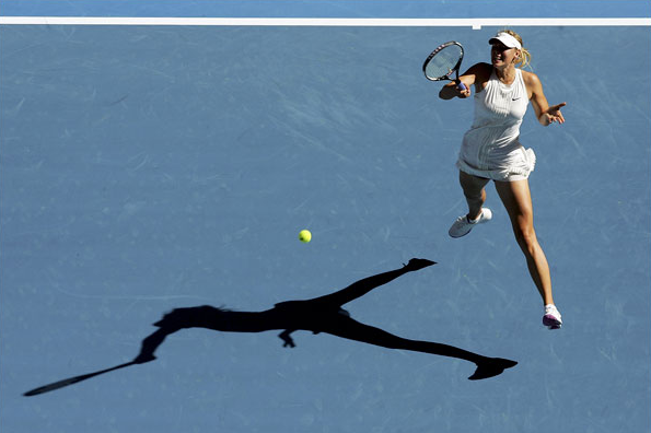
Every so often there will be a soft news photo that features the optical effect of a double image. It might involve a mirror or TV monitor or a photograph, among other options. Shadows are another variant of optical replication, as in this photo from the Australian Open:

tennis-shadow.png

Maria Sharapova is hitting a forehand. It’s not a good photo of her. At the least, most photo editors would have no interest in a long view that has her looking awkward and disconnected from her own shot much less the flow of the game. (Unless, perhaps, she was blundering to a loss, but she won the match handily.) One thinks of antique images from the 1920s, when the game had style but none of the extreme athleticism that we now take for granted.

But it’s not a picture about her, directly. The interest is created entirely by the shadow. The optical doubling of Sharapova lies along the two primary axes of the composition: she defines the vertical plane, while her shadow lies along the horizontal. Sharapova is the familiar presence visually, but the shadow is reinforced by the horizontal white line crossing the field of blue along the top of the photograph. The ball lies like a point in a graph, the intersection of X and Y coordinates. Thus, the figural composition acquires a hue of abstraction. This is not a photograph of a person, but of something else.

What else? The shadow knows. We can look there for the form of a thing and so for what we might miss when distracted by all the details of ordinary perception oriented toward social interaction. Were we looking only at Sharapova swinging her racket, we should see an individual tennis player, someone with a specific face, look, game. When we look at the shadow, however, the distortion created by the angle of the light and twist of her body brings something more elemental to the surface of the court. There we see a body transformed by the act of hitting the ball. The shadow outline of her legs is much like her legs, but as she torques through the shot her torso appears to be compressed into one continuous limb that grows out of her pelvis and arcs into forearm, hand, and racket. Her head has disappeared into upper body which has morphed to maximize the force traveling into the prosthetic extension of the hand. What started out human ends up a hitting machine.

Thus, the optical double reveals a more abstract dimension of the act of hitting a tennis ball, and of the game of tennis as it is played on the world stage. Tennis is promoted by featuring individual players as if they were fashion models or rock stars. To get there, however, the players need a lot more than flair. They can only succeed by subjecting themselves to grueling training that makes them extremely efficient competitors, and little else.

Shadows can reveal the other self. Like the portrait of Dorian Gray, the double might reveal one’s sins, but that might be more melodramatic than is needed much of the time. A shadow also could lend itself to recollection or prophecy or other opportunities for reflection. I’ll close with another image, one also taken because of the shadow in the frame.

soldier-shadow-thin.png

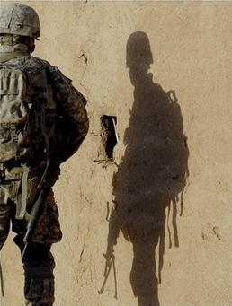
This image of an American soldier in Iraq is a study in opposites. The soldier, who should be the focal subject, is partially outside the frame and has his back to us. His shadow, which should be merely an afterimage, is in the right center of the picture and facing forward. Indeed, the shadow figure seems almost exposed, turned toward us in a way that makes him seem vulnerable, open to injury as the stalwart soldier shielded by his backpack is not. That vulnerability is accentuated by the distortion, which makes him appear slouched, even sunken-chested. And this shadow is not hard dark but rather a soft, yellowish color like the wall behind it. This double is wraith-like, a ghostly presence with streamers and gun drooping down like Marley’s chains, though ethereal. And also, like the photograph above, somehow less than human: in this case, arachnoid–like a spider or scorpion lying in wait in the sun.

Somewhere between Sad Sack and the war dead while looking like a primitive predator, this shadow could be the image of the elemental soldier. That is, the soldier seen without the martial virtues evident in the actual figure on the left. The soldier who, for all his terrible power, will not project power for long, whose presence will evaporate in time even if he is not killed first. The soldier who will have to be replaced by another much like him.

Photographs by Ezra Shaw/Getty Images (1/14/08) and Alexander Nemenov/AFP (9/29/07).


Digg!

 5 Comments

Eyes on the Prize

14campaign600.jpg

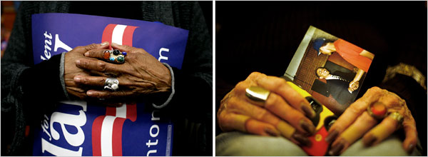
The NYT published this diptych in a story titled “Race and Gender are Issues in Tense Day for Democrats.” The story is a “he-said, she said” tale that is implicitly about who gets to play the race card in the on-going democratic primaries. Apparently Barack Obama should be able to, but doesn’t want to (because presumably he doesn’t have to in order to preserve his base); Hillary Clinton apparently does play it, but in an allegedly backhanded way that allows her to underscore her own marginalized status as a woman (thus, presumably to energize her base). The issue comes down to a debate about the relationship between race and gender, as if, at the end of the day, we should decide our votes somehow on who is more marginalized than the other. The photograph that accompanies the story – and is nowhere remarked upon, and thus might appear to be something of an excess – tells a somewhat different tale.

The key here is in understanding how the stark tension between race and gender is muted by attention to more complex generational differences. To see how, envision one set of hands as white and female, the other as black and male. How would each be inclined to vote? The lines of identification would seem to be pretty obvious, driven by both race and gender in each direction. And indeed, it is this stark and uncomplicated dialectic that the NYT exploited on Sunday when it juxtaposed images of Elizabeth Cady Stanton and Frederick Douglass in a story that featured what Michael Shaw at BAGnewsNotes called the “pink-black divide.” But notice that the demographic put on display in the above diptych is much more complex, as the images feature the much harder case: How do African-American women who share identities with both candidates choose? Will they be guided by their racial identity or their gender?

And the answer we get is a study in ambiguity that takes the false essentialism of identity politics to task—or at least it complicates it in ways that bear consideration. Thus, while both sets of hands are clearly female and African-American, there are nevertheless important and notable differences that mark something of a subtle, but complex and significant generational divide. To begin, take note of the fact that these are neither young nor inexperienced hands. Each pair is clearly weathered by the passage of time and the accumulation of experience, but they wear their experiences differently. The hands on the left bear a feminine style that associates them with the feminist politics of the 1970s, where the cosmetics that we traditionally affiliate with female sexuality were somewhat muted. Notice how the fingernails are carefully trimmed and without polish. They are adorned by rings that mark them as female, to be sure, but they are folded in a somewhat pragmatic, masculine fashion that underscores the attitudes about gender equality that animated many women in the post-civil rights generation of the 1970s. Indeed, they seem to be protecting the poster, a symbol of the political world and the public sphere that was opened to women by the efforts of second wave feminism.

The hands on the right present a somewhat different, older, feminine style, with more rings, and long, painted fingernails. The pose is more traditionally feminine as well, as the hands rest in the woman’s lap, gently holding a snapshot. And unlike the poster, the snapshot signifies the private, domestic sphere – the world of family photo albums – to which women have traditionally been relegated in a patriarchal order. In a world of cultural stereotypes then, these are the hands of a woman who, in all likelihood, comes from an earlier generation than the woman on the left. She is perhaps old enough to have participated in a sit-in in Mississippi or to have marched in Washington, D.C. From this perspective, the snapshot she holds may well be the cipher for an emotional aide de memoire to her youth, as the picture of Obama recalls the eloquence and charisma of John F. Kennedy or Martin Luther King, Jr., young, men whose uplifting appeals to a color blind society no doubt resonate with her candidates’ eloquent promises for a changed world. Indeed, his very candidacy may serve as the evidence that the struggles of the civil rights generation were not for naught. In this register it is little wonder why some might have interpreted Clinton’s recent comments about Dr. King’s role in bringing about the Civil Rights Voting Act as derisive.

If experienced African-American women can be so divided over their support for Obama and Clinton, then it should be clear that there is something more complicated going on in this political campaign than a simple race-gender opposition. Here that complication is a somewhat subtle divide between maturing generations, but in other contexts it is no doubt something else. The diptych underscores the centrality of such impediments to the interpretive process, however, by forcing the viewer to negotiate such complexities and instabilities of meaning as a condition of even the simplest reading of the images. Note in this regard how the poster on the left is designed to be displayed in a horizontal plane, but here it is out of kilter, held on a slanted, vertical plane that is further obscured by the hands. The photograph on the right is even more askew. The effect is to force the viewer to have to strain to figure out what it is that they are seeing, tilting their head to the left to decipher the poster (and to guess at what the missing hidden letters might be) and then squinting to take account of the snapshot. One has no choice but to be an active reader/viewer.

The ultimate point I want to emphasize here is that the diptych calls to our attention a more important and complex tension in the current democratic primaries than the simple, faux battle between race and gender being crafted and preached by those who would prefer to see two historically marginalized groups doing battle with one another rather than working in solidarity. That doesn’t mean that there aren’t differences that have to be negotiated here, or that there isn’t a great deal at stake in the various generational divides (and there is clearly more than one) that seem to vex the democratic party at this historical juncture. But what it should also remind us is that we need to keep our eyes on the prize rather than to be distracted by reporters with time on their hands.

Photo Credits: Todd Heisler/New York Times; Eric Thayer/New York Times

Digg!

 0 Comments

Eventide in Iraq

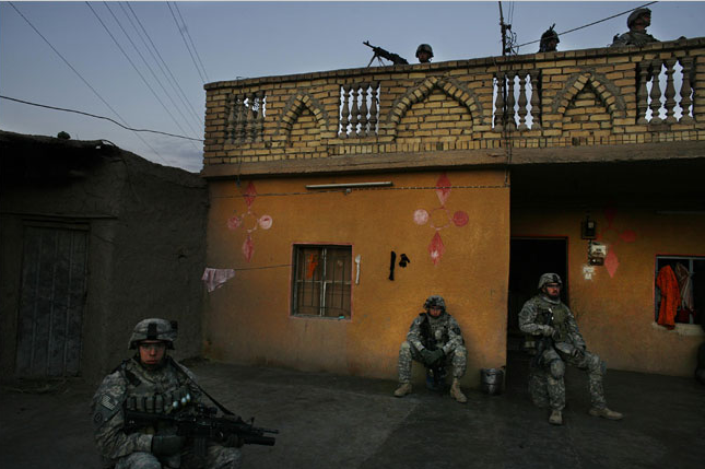
No one is moving, nothing is happening, and the scene is unexceptional, yet I find this photograph strangely poignant.

iraq-evening.png

There is something serene here, yet not with the promise of safety. Although the men are sitting quietly, almost as if posed for portraits, they remain soldiers in full combat gear with weapons drawn. But somehow they are, for a moment, seemingly at peace, just sitting and content with that. They may be waiting for something to do, yet the coming of evening bathes the scene in quietude. They could be at Vespers.

The emotional resonance may be very simple: men sit calmly in the evening, self-contained, not asking for anything as the dark moves in. But other soldiers are hovering above them, and those sitting are in front of a house that belongs to others. So the emotional tone becomes complicated. The scene contains rural domesticity and military force, modern electrical lines and ancient designs in the brickwork, warm colors and deep isolation. The men seem at peace, but they each sit alone within a very small place that exists only for a moment, only until the war starts up again.

The photo accompanied a New York Times report on 9 U.S. deaths from a bomb that went off while the soldiers were searching a house. The photo’s caption said, “American soldiers briefly occupied a house in Diyala Province on Wednesday as American forces hunted for insurgents and bombs.” That’s the same province where the 9 were killed. These troops might be staying “briefly,” but not so little that they haven’t posted guards and a machine gun on the roof. This clearly is dangerous duty: they could be attacked or they could be sitting above a bomb about to be detonated. In that context, just to sit quietly might be a moment of grace.

Photograph by Jehad Nga/New York Times.

Digg!

 0 Comments

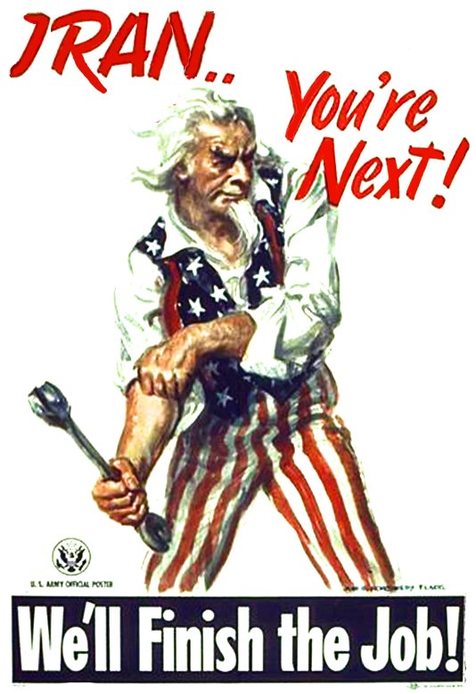
Sight Gag: Who's Next?

iran-next.jpg

And while it isn’t actually a part of the visual culture, the poster recalls this ditty from Tom Leher originally sung in the 1960s but apparently somewhat timeless.

Photo Credit: Global Security.Com

Our primary goal with this blog is to talk about the ways in which photojournalism contributes to a vital democratic public culture. Much of the time that means we are focusing on what purport to be more or less serious matters. But as John Stewart and Stephen Colbert often remind us, democracy needs irony, parody, and pure silliness as much as it needs serious contemplation. For our part, we will dedicate our Sunday posts to putting some of that silliness on display in what we call “sight gags,” democracy’s nod to the carnivalesque. Sometimes we will post pictures we’ve taken, or that have been contributed by others, or that we just happen to stumble across as we navigate our very visual public culture. And we won’t just be limited to photography, as a robust democratic visual culture consists of much more. We typically will not comment beyond offering an identifying label, leaving the images to “speak” for themselves as much as possible. Of course we invite you to comment … and to send us images that you think capture the carnival of contemporary democratic public culture.

 1 Comment

Post-Cold War Trash Talk

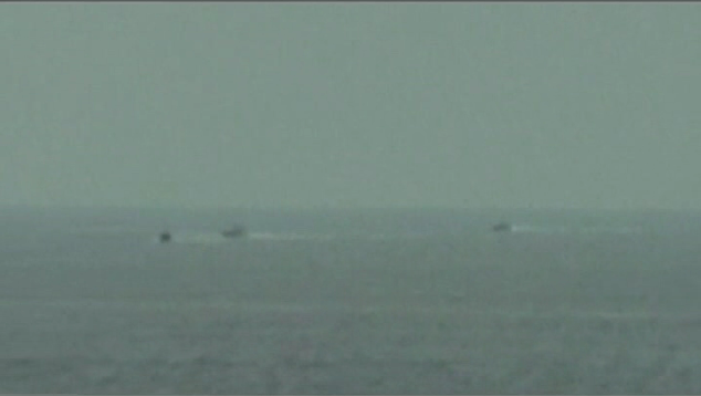
iranboat1.png

This could be a group of good ole boys out for an afternoon on the lake, drinking beer and “buzzing” those who come from out of town for the summer with their big yachts, fancy cars and lake front condos. But as it turns out it is one of five similar open-air speed boats commanded by the Iranian Revolutionary Guard in the Strait of Hormuz, taking what President Bush characterized as “provocative” action against the U.S.S. Hopper. The Hopper is an 8,000 ton guided-missile destroyer equipped with M240 machine guns that fire 10 armor-piercing projectiles per minute, and on this particular day it was accompanied by two other guided-missile ships, including the U.S.S. Port Royal, a 9,000 ton cruiser that is capable of firing Tomahawk Missiles. If you ask me it wouldn’t be much of a fight, even if, as the Pentagon reports, the speed boats can carry machine guns. But, of course, if you are the Captain of a U.S. vessel in the Persian Gulf you probably can’t be too careful. And so the question is, how did this event become an “incident”? And what do the pictures that have been used to report the incident tell us about it?

The photograph, released by the U.S. Navy and featured by nearly all of the national news outlets tells us almost nothing. It could be a snapshot taken anywhere in the world, and so its value as visual evidence is virtually nil. Hence, the U.S. Navy also released a four minute, 20- second videotape taken from the deck of the Hopper which purports to contextualize the image above and thus corroborate the claim of provocative action. That videotape, however, is shot at long distance and shows very little. And what it does show is jumpy, grainy, and tonally muted:

gulf-1.png

gulf-2.png

Indeed, much of the imagery in the videotape recalls the photographs we were shown of the three North Vietnamese motor torpedo boats attacking the U.S.S. Maddox in the Gulf of Tonkin in 1964 and used as positive visual evidence to grant President Johnson the authority to deploy military forces in Vietnam. We now know that if there was a provocation in the Gulf of Tonkin that it was almost assuredly made by the Maddox, and so we have to be not only somewhat skeptical about the truth value of such photographs, but also about the ways in which they are used as visual arguments.

The Bush administration’s usage of the photographs from the Gulf of Hormuz to suggest that Iran is being provocative relies upon two optics or visual logics, one drawing upon a Cold War consciousness and the other drawing upon the logic of the “suicide bomber.” The Cold War optic recalls the ability of the modern, technologically sophisticated, military to observe the world from afar as a means of identifying and assessing threats to national security. Think here of Adlai Stevenson challenging Ambassador Zorin of the USSR with satellite photographs of missile silos in Cuba in 1962. Or more recently, of course, we have Colin Powell using similar photographic evidence to prove the existence of WMDs in Iraq. One case turned out to be true, the other false, but what is important is the underlying assumption of the positive truth content of such visual evidence which presumes to show what otherwise could not be seen. Of course, this is nonsense. Nevertheless, recent videotape from the Gulf of Hormuz operates in precisely this optic. Shot at great distance, we never actually see individuals, let alone incontrovertibly threatening behavior, but that actually works in the favor of the underlying optic of the Cold War logic, for in a sense it is what cannot ordinarily be seen that is the threat, and so the speed boats function as a cipher for a presumably hidden, greater menace.

In this instance, the threat that can’t be seen is animated by the more contemporary optic of the “suicide bomber.” Suicide bombers operate in the light of day, not the cloak of darkness (as was the myth of the Cold War spy). They can be anyone, and indeed, their very visibility makes them effectively invisible (hidden in plain sight), and thus all the more a threat. Add to this the discursive connection between “suicide bombers” and “Middle Eastern Islamic fanatics” and the picture of the speed boats takes on a somewhat different resonance. All the more so in the wake of the terrorist attack on the U.S.S. Cole perpetrated by Al-Qaeda, a self-professed terrorist organization, in 2000. And to accentuate the point the U.S. Navy added an audio recording to its version of the videotape that has someone threatening to bomb the Hopper. We are now told that the Navy doesn’t know where that voice came from and, indeed, cannot confirm that it came from the speedboats. And more recent videotape released by the Iranian government suggests that it is unlikely that it came from the speedboats. But, again, the point is that the photographs are framed within the optic of the suicide bomber that encourages the viewer to see the ordinary and everyday as threats.

The final question then, has to be, did the speedboats perpetrate a threatening and provocative action that would warrant treating this as an international incident – for that is clearly what the Bush administration seems to be trying to make out of it? The Iranian videotape seems to suggest that the speedboats were doing no more than seeking to ascertain the identity of the U.S. ships and to determine their intention. One might imagine the U.S. Navy or Coast Guard doing something similar in the waters between Cuba and Miami. The U.S. Navy reports that the ships had been questioned earlier in the day by the Iranians and that the U.S. ships were clearly marked, thus suggesting that the action had to be provocative in a warlike sense. An alternate possibility is that the Revolutionary Guard was simply trying to harass the U.S. armada occupying its home waters, itself no small threat to Iran. As a spokesman for Iran’s Foreign Ministry noted, “[This] is something normal that takes place now and then for each party.” And what is that normal behavior? Could it be, that what we were witnessing is something like the political version of trash talk? An international version of the masculine bravado designed to distract and annoy one’s opponent in a contest while beating one’s own chest? If that is what we mean by “provocative,” so be it, but it is hardly warlike behavior that might warrant military retaliation. And to be sure, the fact remains that no shots were fired and no one was hurt.

The bigger point here, of course, is to remember the sense in which making this a persuasive and compelling international incident seems to rely upon the visual evidence. But once we identify the underlying optics that animate an interpretation of these photographs and videos as provocative action, it is only too easy to see their particular enactments for the fallacies that they are.

Photo Credits: U.S. Navy/Defense Department


Digg!

 3 Comments

The Photographic Cosmos

The English word “cosmos” is defined by Websters/Random House as “the world or universe regarded as an orderly, harmonious system.” The word derives directly from the Greek kosmos, which could mean the world or universe, and also an ornament and the mode or fashion of a thing. The connection between the, well, macrocosmic dimensions of the universe and correspondingly microcosmic scale of an ornament–think of an minutely detailed earring–came in the Greek mind from a shared sense of order. That connection is lost in English usage, where “cosmic” and “universal” go in one direction and “ornamental” and “fashionable” in quite another. At times, however, it is still there to be seen. Let’s start with this image:

helix-cocktail-pic.png

This is a photograph of a carefully prepared martini. The image first appeared in a Chicago Tribune Magazine photo-essay on “cool cocktails” and ended up as one of many images in an end-of-the-year review. This is a better fate than what awaits most photographs of food or drink, and for good reason. This image is a stunning example of modernist design at its best. It also is optically interesting, not least because of how the light in the glass, whether of the cocktail or camera or both, makes an X pattern in the conic section, and of how the colors in the drink are repeated as a spectrum on the perimeter. These designs suggest another structure underlying the aesthetic design of the cocktail, the natural ordering of the physical universe. Against such cosmic extension, the drink is but an ornament yet something differing from the universe only in scale, not in aesthetic significance.

Whatever their worth, I was brought to these thoughts not by the photograph itself but because it inadvertently made me think of another:

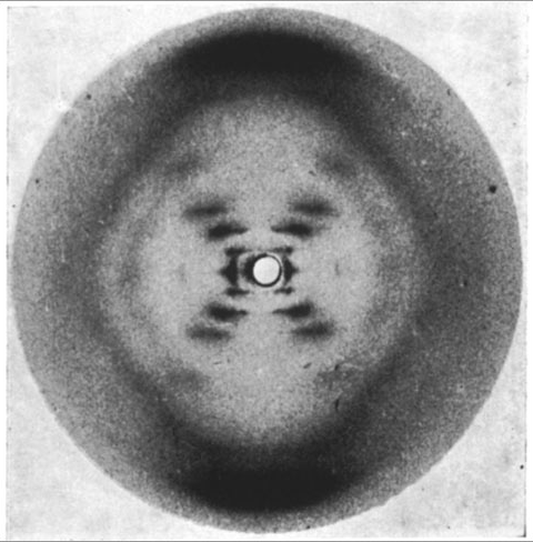
photo-51.png

This is the now famous Photo 51 taken by Rosalind Franklin in Kings College London in 1952. You are looking at an X-ray diffraction image of DNA. And not just any image X-ray diffraction image of DNA, but the one that provided the key missing piece of information for Watson and Crick’s discovery of the structure of the DNA molecule. (Two of the three named above received the Nobel Prize for this discovery; want to guess which one was left out?) It’s a stretch to see the structure of life in a photograph of a martini; indeed, a physicist might point out that a more parsimonious explanation is available. But I love the aesthetic correspondence. Each can be ornament and each cosmos to the other. One can see structure within design, or design within structure. (And this without any religious implications, by the way.)

Universe or ornament, fashion or nature. You don’t have to be Greek to see that they can be the same. It does help to be open to allegory, however, and to chiasmus and, perhaps, to quote Wallace Stevens, to the Motive for Metaphor and “the vital, arrogant, fatal, dominant X.”

Photographs by Bill Hogan/Chicago Tribune (February 2, 2007); Rosalind Franklin, Kings College London (1952).


Digg!

 2 Comments

Seeing We the People in New Hampshire

There will be a lot of photos in the papers today following the New Hampshire Primary. These will include professional photojournalism as well as the Polling Place Photo Project and other examples of vernacular photography. I’m going to add one from the recent past:

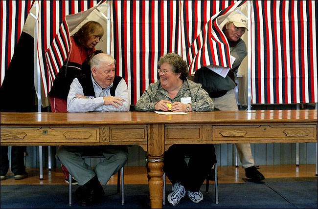
poll-dancers.jpg

This is from the 2004 New Hampshire primary. I haven’t seen it reproduced anywhere.

I love this photograph, which could be labeled Poll Dancers. There is a lot going on, including the expressions of the poll workers, the color and texture of the setting–look at that beautiful table–and the formal relationships in the visual composition of the scene. The basic design is what was called a chiasmus in classical rhetoric. The formal pattern for chiasmus in a verbal text is ABBA: “Let us never negotiate out of fear, but let us never fear to negotiate.” In a visual image, the equivalent figure would be a crossing pattern that carries a change in meaning or joins opposing concepts. In this photograph, this pattern is cued by the legs of the two poll workers: each are crossed, front foot toward the other. This unconsciousness entrainment is mimed by their arms and turned heads, and by the spontaneous entrainment of the two voters stepping out of the booths. The symmetrical alternation by gender links the two pairings, who together form a large X if you draw lines from head to toe, male to male and female to female. Each of the two couples has nearly identical expressions on their faces, and the seriousness of the citizens who are voters is complemented by the good vibe of the citizens who are tending the polling place.

The smiles cue emotional response to the rest of the scene, even though it is obvious that those smiling could not be reacting to those behind them. Likewise, it doesn’t matter that the viewer will never know the joke being shared by the two volunteers. Their smiles, along with the informal clothing of all four figures and the fact that all are acting as if no one is watching, make the scene a celebration of the beautiful egalitarianism of democratic elections. This more complex sentiment is shaped by the red, white, and blue cloth draping the voting booths. Wrapped in the national colors, the voters’ accidental choreography symbolizes that elections can aggregate private decisions by strangers to produce social harmony. The woman on the left and the man on the right are different individuals, but they unconsciously move in unison on election day.

Note also that the photograph has no news value. We know that thousands voted, that many voting stations and voters look very much like these, and so forth. Instead, the photograph crafts an emotionally rich performance of democratic life. The vernacular life of small town democracy temporarily is given national significance and emotional resonance; likewise, the social form of citizenship, which often is disembodied, standardized, and abstract, becomes more embodied, familiar, and particular. Aesthetic judgments have to be specific, particular judgments, just like voting, and so there is yet another continuity offered: the act of voting, which only a few were able to do yesterday, is extended to all who are able to view the photograph. One act of citizenship becomes multiplied many times by public spectatorship.

The cynic could point out the virtual citizenship is a long way from political power, and for that voting and viewing often are about equally useless. My attachment to the photograph is not nostalgic, as I see it as a still present reality, but it certainly is sentimental and idealistic. Just like voting.

Photograph from the New York Times.


Digg!

 1 Comment

The Political Season

Robert and I have not written very much about the current political season. Part of the reason is that our good friend over at the BAGnewsNotes, Michael Shaw, has been tireless in covering the campaign and we encourage our readers to check in there. But there is another reason as well, for while there was a time when the political campaign for president truly constituted a quadrennial season, something that political junkies like ourselves would look forward to, the current campaign seems to have transcended any sense of being seasonal; indeed, it has become altogether ordinary and everyday –- if not downright monotonous. I find myself checking in on the various candidates and their doings as a matter of mindless habit, much like the way I check in on the baseball box scores in mid-June (or the way in which some friends of mine watch the afternoon soap operas). And if I miss them for a day or two, or even a week, I can usually be confident that little of real or longstanding consequence will have changed.

The length and mundanity of the campaign seems to have taken its toll on photojournalists as well. If I see one more picture of the various candidates shaking hands with citizens, or speaking from the stump in a town square or in a quaint little café, or against flag draped backgrounds, or surrounded by spouses or celebrities with cheesy smiles … I think I might die from excessive exposure to visual cliché.* I realize that this seems like it is all that there is to capture visually in these contexts, that photojournalists are working on deadlines and the tried and true genres and conventions are easy to supply, and further that it is the media’s job to “report” what is actually happening (even if that turns out to be … well, nothing), but all of that may well be part of the problem. The campaigns have become so quotidian that it seems like there is nothing “new,” nothing really to see. Of course, one of the things that Robert and I have been suggesting all along is that it is precisely at such moments that we need to look all the more closely.

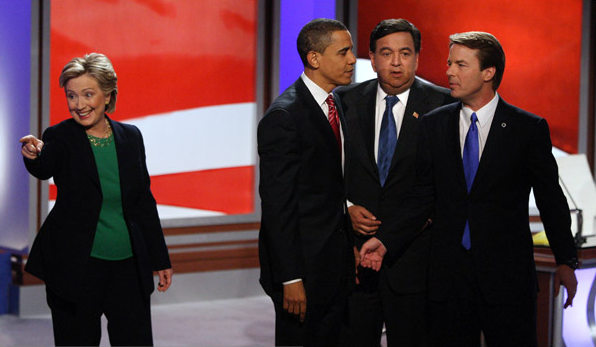
Consider this photograph from this week’s Sunday NYT:
campaign-1.png

At first blush, it could be a photograph of a singing group, say, Hillary and the Three Pips (sorry, I couldn’t resist). But in fact it anchors a story about how Senators Obama and Edwards joined forces to “go after” Senator Clinton in a televised debate in Manchester, NH. The attack turned out to be pretty mild stuff, with Obama and Edwards accusing Senator Clinton of being an advocate of the status quo after she had suggested that Obama had unfairly characterized Edwards’s positions on several issues. And one can only imagine what Governor Richardson (the third “Pip”) might have been thinking when he noted that he had been in “hostage negotiations” that were “more civil.” In any case, apart from the separation of Clinton and the three men, it seems to be a rather generic and ordinary campaign picture. In fact, we have seen it before. Look at this photograph that Robert posted on in August:

labor-meeting-gestures.jpg

The first thing to notice, of course, is how little has really changed. The staging and background are effectively identical to one another, with each enveloping the candidates in a red, white, and blue color scheme. Clinton is clearly separated from her three rivals in each image, and more, she stands in almost the exact same spot and strikes the exact same pose, presumably making contact with someone in the audience. She may even be wearing the same suit. The male actors have changed, but more in name than anything else as they all represent the Democratic party and the Washington establishment.

But of course the differences are pronounced. In August the separation of the four people seemed to be a function of random movement, and the sense in which Senator Clinton was disconnected from her rivals was minimal at most. In the more recent picture the separation seems forced, or rather calculated – the relationship between Clinton and the others is one of disconnection and not just separation. Note in this regard that while Clinton still looks out to the audience, seeking (or at least seeking to appear) to make contact with one or another of the spectators, the other three are talking to one another, a closed group seemingly oblivious to the fact that they are on stage or in front of an audience, while nevertheless appearing to conspire about what to do with this woman. One can almost hear them figuring out who will play what roll in the drama that is about to unfold (or if this is an after moment, assessing what actually took place). While in the earlier image Clinton seems to be channeling the energy of the audience, in the later image she seems “defiant,” rather as the title of the article suggests, standing strong and independent in opposition to the men bonding together to attack her.

And so, perhaps the photojournalist here has captured not just another in the continuing and everyday moments of the campaign, but what the editors have recognized as an image that goes beyond what words can say easily or prove (or what it might be injudicious for a journalist to report), i.e., a male conspiracy against the candidacy of the New York senator. The story does not seem to have achieved very much traction, however, and one has to wonder why.

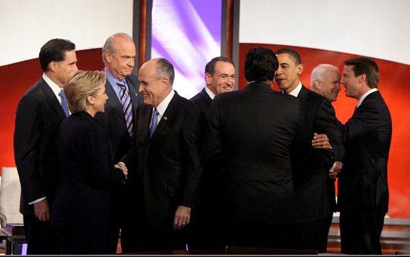
One reason might be that the whole issue of opposition between the candidates seems so much like political melodrama put on simply to accommodate the daily news cycle. So, for example, take note of this photograph that also appeared in the NYT on Sunday.
campaign-2.png

Here we have something close to the full slate of candidates for president kibitzing with one another in between the Democrat and Republican debates. No less staged than other pictures from the event – a picture of the performance of civility really – nevertheless it makes one wonder how the participants could be engaged in the incivility of hostage-like negotiations at one moment, and hand shaking and back slapping at another. Sure, Hillary is separated from the three Pips here, but it is hard to imagine that she has any more regard for those with whom she is socializing. The point, of course, is not to make light of public displays of civility, but to wonder what to make of them when they lack narrative fidelity with the stories being reported or seem to be altogether feigned, merely staged for the camera.

Then again, maybe it’s just another day in the never ending political season …

*UPDATE: Since writing this post I came across Alan Chin’s black and white photographs of the New Hampshire campaign. His work stands out as a stark exception to many of the claims made here. I will try to post on it in the near future, but in the meantime check it out at BAGnewsNotes.

Photo Credits: Doug Mills/NYT, Peter Wynn Thompson/NYT

Digg!

 3 Comments