Jan 12, 2015
Sep 08, 2010
Mar 09, 2011
Sep 24, 2007
May 29, 2008
Sep 25, 2013

"It's the least the American People can do …"

Purphle Heart 1

Earlier this week former Secretary of Defense Colin Powell visited Walter Reed Hospital and presented Purple Hearts to two soldiers wounded in Iraq. The formal occasion for the ceremony was inauspicious: the third reissue of a U.S. postage stamp honoring the Purple Heart on the 75th Anniversary of its having been initiated by the War Department (even though the order establishing it was signed in February 1932, not August). In presenting the awards, Powell, himself a Purple Heart recipient, noted, “It’s the least the American people can do to recognize those of our soldiers, sailors, airmen, Marines and Coast Guardsmen who have been willing to step forward to serve the nation …” As I read these words I was reminded of an episode of the TV show M*A*S*H in which Hawkeye Pierce responded to a similar comment with the retort “… and never let it be said that we didn’t do the very least that we could do.”

Even a minor occasion for a photo-op requires photographs and this event was no exception (after all, August is a slow news month). The AP posted 8 photographs. Two featured Powell by himself, one featured Powell and the Postmaster General unveiling the new stamp, and there were five photographs that featured the Purple Heart and the presentation ceremony. Of these later five, all by the same photographer, three are particularly interesting.

The first photograph of the set, shown above, is the one that seems to be most frequently reproduced in newspapers and on websites. It is a thoroughly conventional representation of an awards ceremony. We’ve seen it before in pictures from the county fair, or the local Rotary Club, and so on. Here the former Secretary is pinning the medal on Army PFC Marcus LaBadie while his mother proudly (if somewhat uncomfortably ) looks on. The image is shot from a slight, low angle, and from off to the side. The effect is to distance the viewer from the scene as spectator, and thus to allay emotional identification; the more important point is that there is no evidence of injury. There has to have been one, of course, otherwise there would be no award, but the clear message here is that once hurt, LaBadie is now whole again.

Contrast this with an image that, as far as I can tell, has not been reproduced anywhere but at the AP website. This photograph seems to be a somewhat sardonic comment on Powell’s claim that the American people are in fact doing the least that they can do:

Purple Heart 2

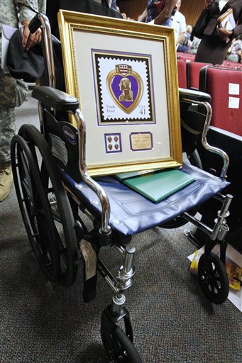
Here we have Pvt. LaBadie’s wheel chair with a framed reproduction of the postage stamp commemorating the Purple Heart resting where he should be. Following the conventions of realist photography, it is shot straight on and in fairly close range, encouraging the viewer’s direct involvement, and thus increasing the likelihood of emotional identification with the scene. The wheel chair is a harsh reminder that LaBadie is not as well as he looks in the previous photo as, apparently, he still needs help getting around; but of course all of that has to be inferred as the hurt body itself has vanished. The framed commemorative stamp physically takes his place – and our attention – and is thus a reminder that the occasion has more to do with a political spectacle than the honoring of a particular soldier’s sacrifice. Or perhaps it is a signal that contrived photo ops such as this actually damage the award itself, putting it in need of rehabilitation and care. In any case, the placement of the picture frame is a clear indication that the presentation of such awards, however honorable and deserved, is a poor substitute for giving soldiers what they need in order to heal and become whole. It is an image of “the least the American people can do” with the clear implication that much more is needed.

In the third photograph the body returns.

Purple Heart 3

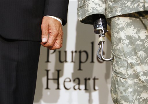
On the left is Powell’s healthy hand, the prosthesis on the right belongs to Army Sgt. Robert Evans. Again, it is not a photograph that has been reproduced all that much, though it did appear in the Bloomington Herald-Times (8/8/07, C8) in conjunction with a story on the number of U.S. troops killed in Iraq in the first week of August. Like the photograph of the wheelchair, it is shot straight on, though here the cropping is tight and in a manner that forces the viewer’s attention to focus on what she or he might prefer otherwise to ignore. If you “really” pay attention, the image suggests, here is what you get: Aging men (notice the wrinkles on the hand) in suits dictating what men in uniform do. And the result is palpable. The Purple Heart can help in the process of healing, perhaps, but it must sit in the shadows and in the background; it should never – because it can never – replace what was lost.

This last image is, in some measure, a poignant synthesis of the first two pictures. It moves beyond the somewhat antiseptic vision of the first, but it lacks (or rather softens) the biting cynicism of the second. It is a powerful and searing emblem of the real costs of war and who pays the price; but it is also a reminder that even as we need to do more than the “least [we] can do,” sometimes doing even as much as we can may never be enough.

Photo Credit: Charles Dharapak/AP


Digg!

 3 Comments

Dancing with Wolves at Camp David

Yesterday’s papers reported on the talks between Bush and Afghanistan President Hamid Karzai, which were concluding with the requisite photo-ops. These diplomatic events are artfully choreographed dances: the American president has to suggest that the two countries are equal partners rather than an imperial state and its client regime; the visiting pol has to suggest some degree of independence for the folks back home while otherwise blessing the dependent relationship. Thus, Bush could say that Karzai “knows best about what’s taking place in his country, and of course, I’m willing to listen.” That’s our Bush, not only The Decider but also one heck of a listener. And Karzai (on CNN) had referred to Iran as a “helper” while not making a fuss about his country’s lack of sovereignty, say, in deciding whether US troops are allowed within its borders. The New York Times coverage included a front page above-the-fold shot of the two striding along as if equals hitting their stride together, and then this photo with a story that made it sound like they were having a thoughtful debate.

07prexy600.jpg

Two things strike me right away. One is Karzai’s gesture, which neatly reflects his ambivalent stance politically. Holding his hands in that manner can provide sophisticated inflection of a point in deliberative discussion, and it can also can be a sign of obeisance or supplication. The second thing I can’t help but notice is the grass–how green and lush it is. Everyone there is taking it for granted, but it’s so rich–and so far away from Afghanistan:

afghanistan-senlis-council.JPG

Photographs by Doug Mills/The New York Times, and the Senlis Council/Global Policy Forum


Digg!

 0 Comments

Mourning in America, II

Arlington West, Santa Monica

Last week I commented that the war in Iraq is being fought in the shadow of dueling memories of WW II and Vietnam by a very different generation of individuals/citizen-soldiers, and I suggested that one consequence might be the need for unique modes of public memoria. I don’t know how I missed it until now, but such an effort has been underway on the west coast in Santa Monica, Santa Barbara, Oceanside, and other locations. Created anew every Sunday by Veterans for Peace, “Arlington West” is a “temporary cemetery” of 3,000 crosses placed in perfect rows, eighteen inches apart, on a beach facing a flag draped coffin. Mourners write the names of the deceased on slips of paper and place them on individual crosses, giving them a personal identity. A poster that lists all of the American military personnel who have died in Iraq since the beginning of the war is also on display.

The comparison to Arlington National Cemetery is obvious, but it is the differences between the two that are pronounced. Arlington National Cemetery is a permanent installation administered by the Department of the Army and governed by a strict code of regulations, including restrictions on demonstrations of protest or dissent. One needs a pass to enter the grounds. Arlington West (which began in Santa Barbara in November 2003) is a temporary installation that is recreated each and every week by private citizens—veterans and volunteers alike. The sustained dedication and effort to produce the installation week after week is almost beyond imagination. There are no formal regulations governing its operation, and when opposition to the project emerges, as it has from time to time, it is engaged in a democratic spirit. No one needs a pass to enter. And there is one more significant difference: unlike its east coast namesake, it rests on sand, not lush, green grass, an emblem, no doubt, of the distant battlefield on which the death and carnage being marked took place. Perhaps, within these discrepancies, we espy the invention of a unique and radically democratic mode of remembrance; egalitarian and pragmatic, it simultaneously invokes a pious reverence for the sacrifices of fallen comrades and a cynical contempt for the undemocratic ways in which the war that took their lives continues to be waged and prosecuted, both abroad and at home.

Photo Credit: Santa Monica Chapter of Veterans For Peace


Digg!

 2 Comments

Arms and the Man

Recently I suggested that photojournalism includes an iconography of body parts that are used to communicate emotions, attitudes, relationships, and the other elements of political experience. Coverage of the celebration of the 54th anniversary of the Cuban revolution is a case in point, and also a brief lesson in the politics of photo selection. Let’s start with this photograph of Raul Castro speaking at the ceremony:

raul-no-hand-01.jpg

Raul is not exactly shown to advantage here. By contrast with the concrete bas relief of Fidel in front of the podium, he is a diminutive figure set into the background of the scene. Fidel is cut to heroic dimension, bold, direct, and resolute. Raul is like a Lil’ Bush, outmatched even by the lecturn blocking him off from Fidel, the audience in Camaguey, and the viewer. Most important, Fidel is pointing in a classic elocutionary pose as the leader pointing the way into the future. Although looking along the same line of sight, Raul’s arm is stuck next to his side as if he were a stiff, bureaucratic functionary. The implication is clear: Raoul is not the bold, active leader of a revolution. And since that leader is already set in stone while no longer on the political stage, he’s no longer a factor either. Whatever the past glories of the Cuban revolution, it seems apparent that the future will be dull, inert, doomed to decline.

But that’s not the only photo available. Some papers showed this one:

raul-hand.jpg

Here Raul still has to follow behind Fidel, but now the comparison is altered on both sides. Fidel now is not just pointing but doing so to give elocutionary inflection to his speech before a bank of microphones. Raul also is speaking before a row of mikes and he is pointing; instead of a lifeless speech shown up by an image of bold action, we have two speakers making an emphatic point in much the same way. Perhaps its much the same point; in any case, the photo becomes a story of continuity. Raul may be no Fidel, but he obviously knows the role and is playing it with gusto while leading the state in the same direction.

And, fittingly for Cuba, between decline and progress there also is a third alternative.

raul-hand-che.jpg

Now we have a more complicated scenario. Both Castros are set back while Che enters the tableau. This ghost of the revolution is set at an oblique angle to both Fidel and Raul. He also is set in a shadow that neatly follows the line of Fidel’s arm. That arm is no longer the dominant signal but rather the transition between past and present. This image has more ambivalent implications. The left-right-up succession goes from dead to nearly dead to living but perhaps geriatric leader. That would suggest decline. But there also is a deeper continuity from martyred idealist to bold founder to ordinary official. Raul may be less than his older brother, but he is grounded in their achievements and remains heir to the spirit of the revolution.

Three photographs, three stories. Regardless of what the photographer is thinking when the picture is taken, by the time the photo is published, photojournalism is an art not only of description but also of prediction and political judgment.

Photographs by Associated Press.


Digg!

 3 Comments

CSI Expert Determines Famous Times Square Kisser

Time/Life reports that it is their most valued commodity, a photograph that is requested and reprinted more than any other from the archive and – we might add – has been celebrated almost as much as Joe Rosenthal’s “Raising Old Glory on Iwo Jima.” It is, of course, Alfred Eisenstadt’s “Times Square Kiss.” Part of the allure of the photograph is that the kissers are anonymous: They could be everywoman/everyman. Robert and I have written about this photograph in several places, including the namesake for this blog, talking about the power that the image has for civic renewal, but it never ceases to amaze us how entranced the culture is with “who” the “real” kissers are and the incredible lengths to which we go to make the determination. In the 1980s Life magazine sponsored a national search for the sailor and nurse. According to Life the search was “inconclusive,” but that hasn’t stopped everyone from the Dean of the School of Art at Yale to the Naval War College in Rhode Island and a high tech electronics imaging firm in Cambridge, MA from getting into the fray.

Now, Lois Gibson, Houston Police Department forensic artist and Guinness Book of World Records “Most Successful Forensic Artist” reports that the kisser is actually 80 year old Glen McDuffie:

McDuffie the Kisser

Gibson’s method was to have McDuffie don his uniform and pose for new pictures, using “a pillow instead of a nurse.” After measuring his “ears, facial bones, hairline, wrist, knuckles and hand” she compared them with the original photograph. Her conclusion, “I could tell just in general that, yes, it’s him … But I wanted to be able to tell other people, so I replicated the pose.” According to the news report, “Life magazine isn’t convinced.” Neither are we. But we are convinced that the photograph remains a cultural treasure, precisely because people like McDuffie—and no doubt the many who will show up at the August 14, 2007 “kiss-in“—can can see themselves as part of this national imaginary.

Photo Credit: Pat Sullivan/AP

Update: The New York Times has posted a story on the photo at their City Room, and a discussion is developing there.


Digg!

 3 Comments

Giving Elocution a Hand

A long century ago some of the self-help gurus of the day were teachers of elocution, the art of gestural inflection in public speaking. Today it is easy to ridicule their elaborate systems for training speakers to communicate emotions through minutely choreographed patterns of hand movements. Note, for example, this diagram from Albert Bacon’s Manual of Gesture:

bacon-genture-diagram.jpg

Bacon’s system would describe the gesture in this pose as “right hand supine descending oblique.” It is one of 88 basic gestures, each of which had a preparation, execution, and return, and all of which could be used in combination with a large number of foot positions and facial expressions, and with varying degrees of energy, and sometimes including additional gestures of the hands such as a clenched fist. The thousands of possible combinations were supposed to communicate many different emotions or attitudes; the book helpfully includes a list of common sentiments and their accompanying gestures (e.g., “Abandonment, utter”: both hands descending lateral). Foucault would have been beside himself.

So, who would do that today? Well, nobody and everybody. Whether schooled or not, we talk with our hands. And some are even schooled, though not at an institution you’d care to attend. Here, for example, is a snapshot of a competitor for the Boylston Prize for Elocution at Harvard:

harvard-elocution.jpg

There even are elocutionary moments outside the ivory tower, but, again, not in reputable settings:

01military-600.jpg

John and I have started to collect images of hands being used for communicative effect, and there are a lot of them. More to the point, we believe that, although elocution is rightly no longer an important part of public speech, the elocutionary function of using gestures to communicate has been transferred from one public art to another, that is, from oratory to photojournalism. There are several dimensions to gestural photography, including recording elocutionary acts such as the images above, to relaying stock gestures characterizing the political class, to creating its own iconography of photographically dismembered hands and feet. We’ll be showing examples of each of these variations in later posts. Criticisms and other suggestions are welcome. We always can use a helping hand.

Photographs by Jose L.A. Camacho for the Harvard Crimson, August 9, 2004, and Brendan Smialowski for The New York Times, August 1, 2007.


Digg!

 1 Comment

Back Lot Iwo Jima

Yesterday’s New York Times reports that “Iwo Jima Sculpture, Model for Marine War Memorial, Is Losing Its Home on Floating Museum.” The story is about a statue created as one of the models for the Marine Memorial at Arlington Cemetery. Since 1995 it has been part of the Sea, Air, and Space Museum on the aircraft carrier Intrepid. Museum officials have decided that the statue has no place in a renovation now underway. Other items have been shipped out to other museums, but there are no takers for the statue.

Is the Iwo Jima icon being consigned to the back lot of US public culture, or, worse, the scrap heap of history? Could happen, of course. Photographic icons are not immortal and many have strong generational resonance. Ken Burns has remarked that his forthcoming documentary on The War reflects his sense of urgency about recording soon-to-be-lost oral testimony. Perhaps he also sensed that his primary audience was slipping away as well.

The photo accompanying the story reflects some of these tensions.

iwojima600.jpg

The flagraising dominates the middle of the frame but also is set back as if receding into blue (heavenly) sky beyond and then into the vanishing point of the picture. The lighting, faux bronze hues of the men, and bright flag give the sculpture a heroic cast, but it also looks colorized in comparison with the rest of the picture and, more important, with the iconic photograph that was the inspiration for the statue. The effect seems contrived, as if to evoke reverence that already has faded, or to appeal to a younger audience that already has too many flashier distractions.

This sense of futility is reflected in the other figures in the picture. On the far right, we see a young man; if he isn’t old enough to be drafted, he soon will be. He is the natural successor to those memorialized by the statue, whose civic republican aesthetic carries with it the anxiety that the sacrifices of one generation will be squandered by those who follow. This is the visitor who should be gazing reverently up at the model of civic virtue. Instead, he isn’t looking at the statue, and he seems to be either fixated on the kilted bagpiper in front of him or hurrying by as if intent on getting to something more pressing such as the cafeteria. The piper, who is hard to pick out of the background figures, seems to be another contrivance, and his Scottish costume suggests that the whole tableau is one of pastiche. Other figures continuing leftward around the statue also are looking away. The only person looking at the flag raising is the woman in the wheelchair that dominates the left foreground. Indeed, she is the counterpoint to the statue: both sit in metal, and her umbrella points directly to the base of the flagpole. Thus, the one connection being made in the picture is between able-bodied men in the past and a disabled woman in the present. This does not bode well for the statue.

The full implication might be that times have changed and different people are dealing with different issues. We need national solidarity and heroic effort not on the battlefield but in health care reform. We need museums, too, of course, and we may still have good use of the Iwo Jima icon. What we don’t need, however, is to keep one of several poorly crafted statues in the public eye. Today, as in 1944, the public art that counts is photojournalism.


Photograph by Librado Romero/The New York Times.


Digg!

 0 Comments

Fort Rule of Law

I recently participated in a conference on the prospects and challenges of democracy in the modern world. One of the primary issues for discussion concerned the appropriate and effective constitutional mechanisms for advancing the goals of democratization in emergent democracies, and in particular, the role that the rule of law might play in such a process. One of the questions posed in this context was, “what does the rule of law look like”? The question is not as odd as it might at first seem, for the “rule of law” is not just a thing to be envisioned, but a legal concept, a frame through which we envision–literally see–the political and juridical world. And, of course, as we see the world, so are we inclined to engage it and to act in it.

The NYT recently featured this picture of the “Rule of Law Complex,” which it characterized as “an unusual measure to help implant the rule of law” in “a city plagued by suicide bombers and renegade militia.”

NYT Fort Rule of Law

While constitutional democracies depend upon the rule of law, not all governments that employ a rule of law are constitutional democracies. And the problem with a democratic rule of law, as with democracy more generally, is that it relies fundamentally upon a modicum of popular or public trust in its ministrations. Where such trust is lacking, the rule of law can only survive by virtue of sheer force or other “unusual measures.” As this photograph indicates, Baghdad’s “Rule of Law Complex” rests precariously between contemporary Iraqi society–the troubled world of Sunni and Shiite fears and suspicions of one another–and the occupation by imperial force. Here, the rule of law is isolated from the larger society, with Central Baghdad just barely visible on the distant horizon. Contained and fortified by 10 foot high fences sporting razor wire, the encampment appears rather more like a prison compound than a government “complex,” with armed guards securing its boundaries. The irony, of course, is that prisons are designed to keep its detainees under surveillance as part of the process of protecting those on the outside from those on the inside. Here, that function is reversed, as the rule of law is quarantined (and protected) from the outside world—more a fort, perhaps, than a prison.

The real question posed by the photograph is who is doing the watching? And what are they seeing—what exactly does the rule of law look like? What does it envision? For the rule of law to gain the traction necessary to a functioning constitutional democracy in Iraq, one might imagine that the most important viewers here would be Iraqi citizens, though what exactly they might need to see in order to coach their trust in an imperial and imposed legal system is not easy to know from our ethnocentric, Judeo-Christian, judicial world view. But this photograph seems to tell a different story, with a different purpose in mind. The viewer is decidedly western, not Iraqi, and the goal has less to do with creating identification with the rule of law than with reinforcing western attitudes concerning the uncivilized and threatening conditions of a world “plagued by suicide bombers and renegade militias.” Note, for example, that the camera is positioned along a west-to-east axis, with Central Baghdad sitting to the west of the complex (a point emphasized by the NYT reporter). The viewer is thus literally situated to see from a western perspective. But more, the viewer is framed figuratively by a modernist aesthetic that incorporates many of the conventions that anthropologist James C. Scott affiliates with “seeing like a state.” The image is shot from a high angle and at some distance from the event, thus encouraging the perspective of a neutral spectator who can neither be harmed by nor affect the action unfolding below. Such distancing separates the viewer from the scene both physically and emotionally, substituting a topographical perspective that encourages the rational and strategic calculation of actions and events, rather than an emotional identification with either. The appeal to a strict, instrumental rationality is further invoked by the functionalist and stark geometrical design of the complex, underscored by the trajectory and perspective of the fence as it draws our line of sight to the distant and barely visible Baghdad.

The photograph thus locates the “rule of law” within a western perspective for modern eyes. One might even imagine the nineteenth-century American frontier with military forts used to protect “settlers” from the threat of indigenous forces in the “march of the flag” ever westward. The flag now marches in a different direction, but the conclusion seems obvious: Their present is our past! We can only wonder how far the analogy will extend.

Photo Credit: Benjamin Lowy/New York Times


Digg!

 2 Comments