Aug 20, 2012
Dec 14, 2011
Oct 23, 2009
Jan 27, 2010
Apr 13, 2009
Jan 11, 2013

And The Wall Came Tumbling Down


2024985585

Twenty five years ago it was all concrete and mortar and barbed wire dividing east from west. Guards with their dogs stood their posts and friend and families were separated from one another. And then, as if in a blink of an eye, the wall came down, leading some to maintain that history itself had come to an end. Of course, such pronouncements proved to be little more than precipitous as wars quickly transformed from being cold to hot once again. But, at least in Germany, perhaps the most stable and prosperous economy in the world right now, the Berlin Wall is but a distant memory.

Photographic slide shows at numerous news outlets (e.g., here, here, and here) have featured the anniversary of this momentous event, comingling black & white images of the wall as a blockade separating a nation along military and ideological lines with black & white and color images of the frenzied destruction of the wall in 1989 and colored images of the current Germany where the least vestiges of what was once remain, mostly random slabs of concrete that once were covered with graffiti and now convey all manner of artistic murals. The transition from black & white to color, from then to now, is telling. But more so is the need to recover what once was if only to remember what had to be overcome. And, of course, public art plays an important part in such recovery.

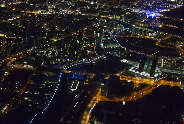
Public art takes many forms, of course, such a statuary and murals, as well as more transitory forms such as Lichtgrenze 2014, a temporary “light border” of 8,000 illuminated balloons that follows the path of the original Berlin Wall. But most of us, of course, will never be able to experience Lichtgrenze 2014, except of course through the photographic frame. The photograph above is not just a medium for conveying the art project however, but it is its own version of public art. After all, even those who can walk among the lights traversing the path of the wall cannot see it from the god’s eye view that the camera provides, reminding us of the capricious and haphazard trail that the wall followed. Note for example how difficult it is to identify the path of the light border among all the other lights. If you didn’t know what you were looking for you probably would assume that the bluish lights snaking through the city were little more than an ordinary thoroughfare with nothing distinguishing the lighted city on either side of the divide. And so the photograph invites a somewhat unique perspective on the ways in which walls often follow a somewhat arbitrary logic, and how, once they (inevitably) come down, it is easy to forget they were ever there in the first place.

The fall of the Berlin Wall was a world historical event, to be sure, so much so that slabs of the wall have been cast to the four winds. One can find them as scattered relics  throughout the world in London, Brussels, Haifa, Kingston, Sofia, Moscow, Guatemala City, Porte de Versailles, Taipei, Tokyo, Seoul, Canberra, Cape Town, Buenos Aires, and any number of locations in the United States, including a city block that includes ten segments of the Wall in Los Angeles. And the message, it would seem, is clear enough: However much energy we put into building it and maintaining it, however much we think it can keep things in or keep things out, however much we think it will last forever … in the end it will fall, shards of it preserved as a reminder of the folly that produced it in the first place.

And so, finally there is this photograph of a segment of the wall that sits in Simi Valley, California. Simi Valley is northwest of Los Angeles and the home of the Ronald Reagan Pres-

Screenshot 2014-11-09 21.51.25

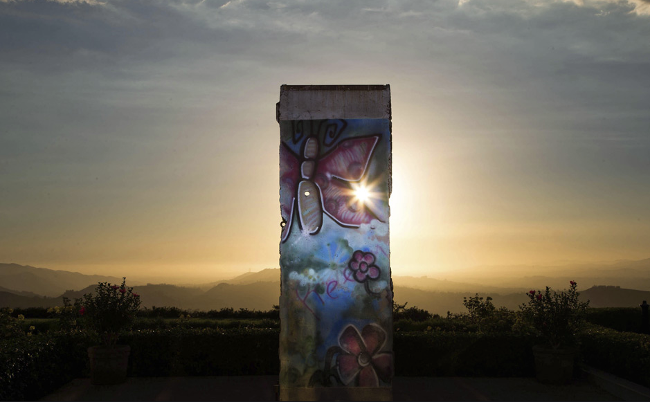
idential Library where everyone is reminded that it was President Reagan who implored Mr. Gorbachev to “tear down that wall.”  Simi Valley is also not all that far from where the wall designed to “secure” the border between the United States and Mexico begins its journey from the Pacific Ocean eastward. And so the photograph takes on something of an allegorical quality: mysteriously (ominously?) out of place in what appears to be a scene from the American western frontier, it is hard to know if the sun is setting on a past in which the wall came down, or if it rising on a new epoch of the inevitably failed project of building walls for political purposes.

Photo Credit: Rainer Jensen/EPA; Lucy Nicholson/Reuters


 0 Comments

Judging the Photography Awards: How Much Art Is Too Much?

The Sony World Photography Awards shortlist has been announced, and some of those entries are being showcased in slide shows.  Doing so will build interest in the final decisions, but it also reflects interest already present.  That interest extends not only to the photos but also into discussions about how they should be judged.  Increasingly, the judging itself has come under scrutiny; as one example, one of the most viewed posts at this blog is on The Rhetoric of Prize-Winning Photographs.

To summarize the broader debate, winning photos have been declared to be too conventional, too safe, too much like previous winners, and too arty, while the contests have been faulted for elitism, cronyism, and selling out.  All this is simply more evidence that photography has arrived–that its status as a public art is being taken seriously.  Welcome to public debate, and by the way, what have you done for us lately?

Since the criticisms come from all sides, consistency is hardly a virtue, but what might seem to be contradictions need not be.  Can something be both explicitly artistic and safe?  Well, actually, yes.  Are you likely to sell out if already comfortably elitist or networked?  Well, yes, and by then it may even be second nature.  But are the criticisms always right?  No.  And even when on target, should they be the last word on what criteria should be used to judge photography?  Again, no.  Not, that is, if we really are going to consider photography to be an important public art.

So let me take up briefly the concern that photography awards can favor artistry over other values such as documentary witness, hard-boiled realism, formal simplicity, or critical provocation.  Of course, these are extremely important values, but we know that.  The question is whether photographs should win awards for doing something else; something like this.

Wildebeest airborne

This is a scene from the annual wildebeest migration in Kenya.  And it is a scene, a tableau, because this photograph looks very much like a painting.  More to the point, it has a lot in common with the landscape painting of the Hudson River School of Thomas Cole, Asher Durand, and others who drew on Romantic aesthetics to capture the grandeur of nature.  Using strong contrasts of light and shadow and movement and mass amidst a moody atmospheric haze, the composition suggests the enormous energies flowing through the land, water, herd, and sky, yet leaves their source or purpose illegible, as something that is too large to ever by captured by art alone.  This combination of awe and futility is epitomized by the beast leaping from the high bank, soaring improbably but magnificently through the air.  Perhaps he (or she) will stick the landing–I can’t help thinking of its similarity to an Olympic athlete–but the important fact is that the beast has to answer to crash’s law, the rough ground and uncertain fate of any animal having to survive in a harsh environment.  Ultimately scenes such as that are not about the individual, save for the spectator, who is to marvel the powerful forces shaping the earth.

The romanticism goes further still, as the photograph can be seen as elegiac.  The sublime offered the Hudson School a sense of consolation, for they were meditating on how nature was being lost to civilization: both displaced (destroyed) and forgotten.  The same may apply here: as the space and water left to the wildebeest becomes more limited, their migration routes disrupted, their numbers reduced further by poaching and other predations.  This beautiful photograph can hint at the dark finality of all of that, but its beauty also could be taken as a form of consolation, and with that an act of abandonment.

So why not just paint it?  The cynical answer is that painting would take more skill than photography.  If that’s your answer, go back to the studio and paint.  For those who recognize that we are not in a zero-sum competition among the arts, the question still points in the right direction.  Does the photograph offer anything that a painting would lack?  And does the explicit artistry of this photograph–specifically, its painterly quality–add or detract from the distinctively photographic contribution?

Frankfurt School theorist Siegfried Kracauer defined photography as being shaped by two generative principles: “there is on the one side a tendency toward realism culminating in records of nature, and on the other a formative tendency aiming at artistic creations.”  As he also noted, this tension generated aesthetic problems for the medium.  He could have added that it explains the subsequent division in the road between documentary photography and fine art photography, as each developed one media capability or the other while trying to avoid problems that could, if not mastered, lead to either paralysis or mediocrity.  But as Kracrauer correctly observed, the specificity of photography comes from the primacy of the realistic principle.  Although “a minimum requirement,” it is almost absolute: photographs are expected to show something that was in front of the lens prior to the creation of the image.  The more they deviate from this requirement, the more they become merely inventive, which is why fine art photography is inherently compromised: unlike the other arts, experimental optimization leads it away from its own medium.

Almost all photographs are not fine art photography, however, including those that are submitted to photo contests.  The habitus of photography is capacious, and almost every photograph taken has some value beyond solely aesthetic value, and almost every photograph submitted for an award professes to show us something, not just about the art, but about the world.   So it is that, outside of a fine arts context, the reality principle rightly holds pride of place, which in turn makes artistry suspect.  Awards do bring the tension to the fore, however.  If given only for documentary fidelity, the judges would soon have to be basing their decisions on the topics rather than the images themselves, or on purely formal criteria which, as Susan Sontag pointed out forty years ago, has become a “bankrupt” vocabulary for photography.  So what is to be done?

Kracauer recognized that the imaginative and realist principles don’t have to conflict: indeed, the formative tendency “may help substantiate and fulfill” the realist tendency.  In a nutshell, the judges for photography awards should be looking for exactly that conjunction.  Artistry can be quiet or explicit, but it should bring the viewer to see, understand, and work out a relationship with a reality that might be overlooked otherwise.  And, to get back to the question above, the photograph, because it is a photograph and not a painting, should be about a reality that exists regardless of human imagination, something having its own place and value in the universe beyond our limited ability to understand what that is.

Perhaps by imitating a painting, the photograph above can remind us that photography itself is not a mirror of nature, but rather one useful but still limited way of seeing.  And by hinting at the limits of representation, the image may also call up more emotional or intuitive responses to the world.  As Kracauer noted, the best photographic seeing “is of a kind which is closer to empathy than to disengaged spontaneity.”  That is the difference between depicting a sudden leap into the air, and bringing you closer to the beast.  Look at the photograph again and ask yourself, which is it?

Photograph by Bonnie Cheung/2014 Sony World Photography Awards.  Quotations from Siegfried Kracauer, Theory of Film: The Redemption of Physical Reality (New York: Oxford UP, 1960), p. 12 ff., and Susan Sontag, On Photography (New York: Picador, 1977), p. 136.  For the record, I’m not saying Cheung’s photo should win an award (or not win, either), only that it provides a fine example for public discussion of an important question about photographic excellence.

Cross-posted at BagNewsNotes.

 1 Comment

The Rhetoric of Prize-Winning Photographs

Guest Correspondent: Jens Kjeldsen

Is it a fake? Is it photoshopped? Is it real? Paul Hansen’s winner of the 2012 World Press Photo competition is just the latest example of more than 100 years of continuous discussions about the manipulation of photographs.

Netherlands World Press Photo Contest

However, instead of asking only if prize winning images are manipulated (and of course in some way they all are), we should also ask why are they changed to become the way they are?  Or, to put it differently: what kinds of photographs win awards?

When we look closer at the changing styles of the winning photographs since the beginning of the World Press Photo competition in 1955, we see that Hansen’s picture is part of a cinematic form of expression that has emerged in the last 6-7 years.

The image portrays family members from Gaza carrying the bodies of a two small children to their burial after being killed in an Israeli air strike. It is no coincidence that it has been called a movie poster. However, the photo is more like a still; a story frozen in time, but condensed with motion and movement, inviting us into a narrative of what has happened before, and what might happen next.

This new trend is different from other dominant styles among the WPP winners. Some of the winning pictures hold what we can call news moments (similar to Henri Cartier Bresson’s decisive moments). Most of the news moments are from the 1960s. A prime example is Eddie Adams’ 1968 picture of the execution of a suspected Viet Cong member, showing the exact moment of the bullet’s penetration of the brain. The impact of the picture lies primarily in capturing a certain news event in a fraction a second.

The closer we get to this century, the fewer pictures we see of such news moments.

Instead we see more feature-like photographs capturing – not a moment, but a general situation or condition. Take this winner from 2004 portraying a woman mourning a relative after the Asian tsunami of December 2003.

Image 2, WPP 2004, A. Datta

The photo is constructed around a juxtaposition between the dead body, represented by only an arm in the left of the frame, and the bereaved, represented by a woman lying face down on the sand in the right part of the frame.

This kind of explicitly artistic visual rhetoric prevailed from 2000-2004. The 2001 winner portrays how the body of a one-year-old boy who died of dehydration is being prepared for burial at Jalozai refugee camp in Pakistan.

Image 3, WPP 2001, E. Refner

It is a very rare example of a picture being taken in a full bird’s eye perspective, directly from above.

The picture is dominated by the white color of the draping sheets, covering the body of the little boy, so we only see the left side of his face. He seems at peace, and the picture exudes calmness, giving it an almost ethereal dimension. Combined with the angle of the arms draping the sheets, the picture is more an aesthetic moment than it is a news moment.

Hansen’s picture is neither a news moment nor an aesthetic moment – not to say, of course, that it does not have style. All images do. Instead the aesthetic tendency exhibited in this picture is a more of a kind of movie realism, a sort of photographic cinema verité. We see a similar tendency in the winners from 2007, 2008, and 2009.

Image 4_Winners of WPP 2007, 2008, 2009, 2012

The 2007-winner shows a US soldier sinking onto an embankment in a bunker in Afghanistan. The 2008 winner depicts a policeman entering a home in Cleveland, USA, in order to check whether the owners have vacated the premises. In 2009 we see women shouting their dissent from a Tehran rooftop following Iran’s disputed presidential election.

These images are not colorful, there are no close ups, no clear, simple or stylized compositions, and no conspicuous juxtapositions or an obvious use of some part to represent a whole. They give the impression of the fictional realism we sometimes encounter at the cinema.

While the beginning of the decade presented photographs that have their main rhetorical appeal in their compositional and aesthetic organization, these photographs appeal more through story-making.

The first kind invites the viewer inside the frame, encouraging exploration of the elements in the visual moment, captivating us through visual design. The second kind invites the viewer outside the frame, encouraging participation in the construction of a narrative, engaging us in speculations of what has happened and what will happen.

This kind of neo-realistic press photography seems to be more open to interpretation than the more obvious symbolic photos.

The strange thing, though, is that the more the pictures draw us into a story of mostly our own creation, they seem to draw us away from the events they are depicting. They are all fabulous images, but even when provided with the backstories I remain a spectator immersed in the story, in awe of the artwork, waiting for the movie to premiere.


World Press Photo award-winning photographs by Paul Hansen, Arko Datta, Erik Refner, and (clockwise from the upper left) Tim Hetherington, Paul Hansen, Pietro Masturzo, and Anthony Suau.

Jens Kjeldsen is professor of rhetoric and visual communication at the Department of Information Science and Media Studies, University of Bergen (Norway), and Professor of rhetoric at Södertörn University (Stockholm, Sweden). He currently is visiting Fulbright professor at the Department of Communication Studies, Northwestern University.

 8 Comments