Jul 06, 2011
May 08, 2008
Jun 01, 2009
Aug 05, 2013
Mar 15, 2011
Feb 04, 2015

Sight Gag: Irony or Synchrony?

ironysynchrony.png

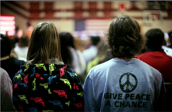
Photo Credit: Damon Winter/New York Times, On the Trail, January 19, 2008

Our primary goal with this blog is to talk about the ways in which photojournalism contributes to a vital democratic public culture. Much of the time that means we are focusing on what purport to be more or less serious matters. But as John Stewart and Stephen Colbert often remind us, democracy needs irony, parody, and pure silliness as much as it needs serious contemplation. For our part, we will dedicate our Sunday posts to putting such momens on display in what we call “sight gags,” democracy’s nod to the ironic and/or the carnivalesque. Sometimes we will post pictures we’ve taken, or that have been contributed by others, or that we just happen to stumble across as we navigate our very visual public culture. Sometimes the images will be pure silliness, but sometimes they will point to ironies, poignant and otherwise. And we won’t just be limited to photography, as a robust democratic visual culture consists of much more. We typically will not comment beyond offering an identifying label, leaving the images to “speak” for themselves as much as possible. Of course we invite you to comment … and to send us images that you think capture the carnival of contemporary democratic public culture.

 1 Comment

Photographer's Showcase: Campaign 2008 – On The Road

Today we are introducing a new feature that we call the “Photographer’s Showcase.” From time to time we will post the work of photographers whom we believe exemplify or extend photojournalism as it is an important public art. We will feature their work without commentary, although we do of course encourage you, our readers, to comment and link on behalf of our common interests.

There are many fine photographers and the authors of this blog know only a very few of them. We spend our days in the university, not the newsroom, and have little opportunity to meet with working photographers, attend exhibitions, or otherwise make connections that could lead to work being posted here. If you know of photographers whose work should be featured, please contact us. Self-nominations are welcome, as photographers today have enough problems without having to be modest as well.

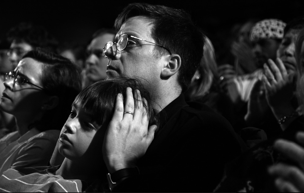
We inaugurate the Photographer’s Showcase with the work of Patrick Andrade. Patrick is a freelance photographer affiliated with the Atlas Press. His work has appeared in the NYT, Newsweek, and Paris Match as well as many other places. He is currently following the campaign for the presidency. The work posted here is a series of black and white photographs that feature the people of Campaign 2008 – On The Road. Click on the photograph below to see the full slide show.

andradenhpeople08.png


 3 Comments

Kissing War and Tasting Victory

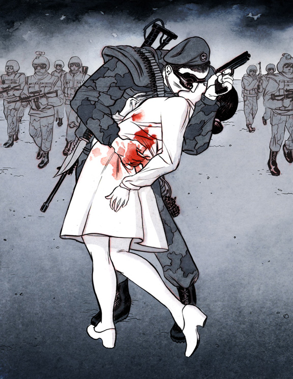
Alfred Eisenstaedt’s “Times Square Kiss” is among the most famous photographs ever taken.With the exception of Joe Rosenthal’s “Raising Old Glory on Mt. Suribachi,” it is possibly the most reproduced, imitated, and performed photograph of any in the pantheon of U.S. photojournalism or documentary photography. It is, as Time/Life might say, the center piece in the American family photo album, a representation, as one caption of the image has it, of “The Way We Were.” It should come as no surprise then, when critics draw upon it to call attention to the hypocrisies and tragic ironies of U.S. policies and cultural practices. The most recent case in point is this digital illustration by Koren Shadmi that appears in “Artists Against War,” a collaboration between The Nation and The Society of Illustrators to showcase the work of 60 prominent graphic artists whose work “challenges the self-destructive ignorance, indifference, incompetence and corruption that is the result of the U.S. Middle East foreign policy.”

shadmi-kiss.jpg

The illustration is easily recognizable as an imitation of Eisenstaedt famous photograph, but of course the differences are both pronounced and resonant. The original is a bright and fairly high contrast image produced in the grey scales of black and white film and according to the strict conventions of realist photography; there are shadows, but they are barely recognizable, and in general the visual tableau invokes the symbolic brightness of a new day, just as the occasion of V-J Day invited the promise of the return to a golden past. Following the visual conventions of the graphic novel, the illustration above is drawn in muted tones and tinctures, only slightly more colorful than the black and white photograph. The kissers here are cast at the edge of a dark shadow (emanating from the space of the viewer, and pointing, no doubt, to the future), the background of the drawing enveloped in either billowing smoke or black clouds, and in any case the overarching tonality of the image is dark and ominous rather than bright and joyful, menacing rather than hopeful.

It is the thorough absence of joy and hope that determines the affect of the illustrated kiss. The photograph represents a joyful moment, its kiss a passionate and public performance of the release of nearly four years of repressed desires. Thanatos gives way to eros, marked not only by the kiss itself, with the promise of greater release yet to come, but by the way in which civilian spectators witness the event with approving smiles. This is the world we want to live in, and there is a sense in which the bodies of the kissers channel the emotional energy—the hopes and desires—of the people that surround them as the vectors of the image vaguely recall the “V” for victory, men on his side, women on hers.

By contrast, the illustrated kiss is neither joyful nor passionate, but rather decidedly foreboding. The awkward and somewhat restrained left hand of the sailor in the photograph now holds a gun poised for use (although the enemy remains unseen and thus anonymous), while his right hand is covered in red blood that blemishes the purity of the nurse’s white uniform and forces us to acknowledge that eros and thanatos are inextricably entwined. The kiss is made to seem all the more impersonal—if not also somewhat transgressive—by the fact that the kisser is wearing night goggles as well as a wide array of weapons and military accoutrements. And note too that the pair are no longer surrounded by ordinary citizens—an indulgent and approving public—but by an anonymous and armed military force. It is not clear that the surrounding soldiers even notice the kissers, and even if they do, they certainly offer no signs of approval. Overshadowed by the events of war, both the presence and voice of the public has been erased—a telling cipher, perhaps, for our current political condition. If victory has been achieved here, it clearly seems to be short lived.

The Eisenstaedt photograph is often captioned as a “return to normalcy,” and on one popular poster for sale, it is titled “Kissing the War Goodbye.” From this perspective the normal world is a rejection of the dark and dreary culture of war, and with it the eternal return to a bright and joyful place where the sexual obsessions of private life can operate in tandem with the decorum necessary to the discipline of public life without the hint of tension or irony. By contrast, Shadmi’s illustration is titled “Tasting Victory,” and thus frames the image as the embrace of war, rather than its rejection. From this perspective, the normal world seems to be a culture where one eroticizes the taste of military success and in which wars are cultivated and eventually normalized in a never ending cycle of violence.

It is easy, of course, to prefer one image over the other at any given moment in history, entranced either by the romance of the photograph or the critical skepticism of the illustration. But what we need to acknowledge is the fundamental sense in which the two images are inextricably connected. Treated apart from one another, each underwrites a more or less simplistic political fantasy of civic life that invariably falls short of the complex social and political needs of the late modern world; treated together the two renditions remind us that each representation is a limited construction of the world and that a healthy polity needs both romance and skepticism—and more—in order to enable and sustain a robust public culture.

Illustration Credit: Koren Shadmi

Digg!

 5 Comments

Joy and Grief in Kenya

World news coverage of late has been filled with images of violence in the streets. Typically these are photographs of demonstrators battling with police or rival mobs. Sometimes there are scenes of looting or beating–often of the police laying into someone–or of spectators such as children or shopkeepers looking anxiously at the still unfolding madness around them. For all that, the many images look much the same, as if there were one endless demonstration playing out continually across the world, one long-running political spectacle in the theater of the Arab/African/Asian/Latin American street.

That may be why this image is at once familiar and yet scandalous:

dancing-by-flames.png

Instead of the usual backdrop of the demonstration along an otherwise busy city street, here we see real wreakage amidst what otherwise was already a slum. And instead of the stock characters of earnest citizens and bullying cops, or outraged citizens and cautious cops, or mob frenzy and state terror, or any other political scenario, here we see a man exulting in the sheer ecstasy of destruction. An obscene truth is being revealed: what is violence and burning and horror to some is for others an experience of raw freedom as it can be perversely but powerfully known only through violent revenge and ruin. The sound track should be the Ode to Joy.

We’re not supposed to see that truth, and many others appear once that Pandora’s box is opened. Violence persists not only because so many are denied so much by so few, but also because it remains the best shot some have at feeling powerful. Freedom comes from democracy and prosperity, but the experience of freedom can be had by destroying those that have what others lack. I could go on, but you get the point. And that’s why it also is important to look at the next photo:

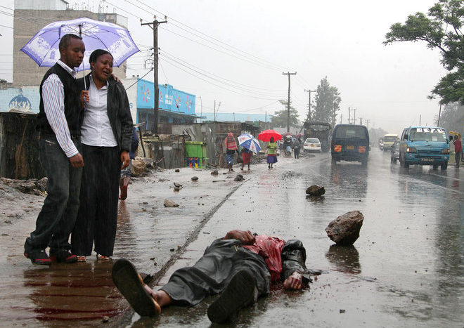
grief-kenya.png

The Washington Post caption says, “A woman finds the body of her brother lying by the roadside in Nairobi’s Mathare suburb.” This also is a terrible picture. We see not violence but its aftermath of death. And, as if it matters, useless, sad, lonely, ignoble death. But that doesn’t matter. A person–a brother, son, friend, and more–has been destroyed. The terrible absence of the head could be an optical illusion, but one fears the worst. The boulder, which could have killed him and seems to be his severed head, lays there as if the reality of the body alone weren’t enough to communicate the harsh brutality and finality of his murder.

This also is a photo about softness, however. Other than the hard-edged boulder, the scene features draped clothing, a woman’s torso, her companion’s kindness, the lavender umbrella, and, of course, the elegiac rain. Nature has obliged to express the appropriate tone for a scene of mourning. And she is mourning, and by standing there without touching her brother she already is giving herself over to the utter helplessness that death lays on the living. Yet by being there and bearing witness to her brother and her loss, she stands for the return of human decency.

The joy in the first photo comes from hate. Hate is something harder, deeper, less changeable, and far more dangerous than other emotions. It also has no place in politics. Hate is in fact one border of the political: You can struggle to live with others, even to dominate them, or you can hate and kill them. Likewise, hate is felt toward groups, while anger is felt toward individuals (see Aristotle’s Rhetoric, 1382a). By seeing the senseless loss created by an individual laying dead on the street, the second photo returns us to a world of persons who deserve justice or protection but not violence.

Grief may be a deeply political emotion. Even though no one can reach the depths of pain felt by the individual stricken with grief, it calls forth empathy and can move us all to cross the borders of our estrangement from one another. It was grief, not killing or victory or glory that finally brought Achilles out of his rage against the Trojans to a moment of decency. Perhaps the recognition of grief can remind us that violence is not just another means for political expression. It is how we end up dancing in Hell.

Photographs by Simon Maina/Agence France-Presse-Getty Images and Boniface Mwangi/Bloomberg News.


Digg!

 5 Comments

Fred Thompson, Trouper

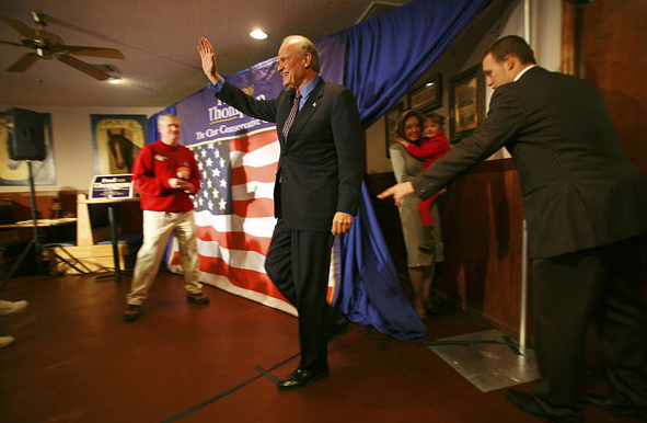
The papers of late have been full of pictures of the front runners in the presidential nominating races surrounded by throngs of near delirious supporters eager to touch the hem of the political celebrity who has come to their otherwise inconsequential state. (OK, I’ll retract that last remark in respect to South Carolina, which has started a war.) These photos are full of the energy of massed bodies, close encounters, and the charismatic touch. They are representative of important features of our political process, for better or worse, but they don’t tell the whole story. To get closer to that, we have to look elsewhere, like here:

thompsontrail.png

You are looking at a photo from last week of Fred Thompson stepping onto a stage in Prosperity, South Carolina. The long view allows us to see the candidate as part of a scene, rather someone around whom everything else is compressed. The view also isolates each part of the scene: candidate, bunting, handler, local supporter, and wife-and-kid are each identifiable as if pieces of a grade school diorama. What is most revealing, however, is that we see both stage and backstage in a single view. What would have been The Candidate framed by the Red White and Blue becomes instead a tacky stage set–hey, don’t trip on that cord! And instead of those gathered in his name, we see instead wife-and-kid waiting in the wings, or waiting to make their entrance, but either way now bit players that make Thompson no more than the lead in the school play.

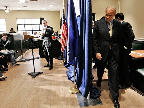
I suspect that this image is presented to remind us that Thompson’s campaign remains a non-starter. One reason I think so is because the shot above called to mind another taken last year:

thompsonbackstage.png

Now we’re in Anderson, South Carolina. Not much has changed. Again, the key element of composition is that we are shown both stage and backstage. And as before, the difference between front and back is only a flimsy curtain and our customary inattention to political stagecraft. This photo may be a bit more grim in that we see Thompson just before he puts on his theatrical mask. And we see a bit more of the area behind the curtain–enough to really know that backstage is a cold, harsh, functional place of calculation and paying the bill.

Again, the message is that this guy is not going to win. He’s playing on far too small a stage in too small a place to what barely counts as an audience. (Pop Quiz: how old will Thompson by the time that kid on the left votes?) That’s not exactly news, however. I think the real value of these images is that they show us what every candidate experiences and endures. The big winners only get there by playing before small houses like these in the community theater of American politics. And when some of them make it, the stage gets larger, but there is always a stage.

Photographs by Jim Wilson/New York Times and Mary Ann Chastain/Associated Press.


Digg!

 4 Comments

Sight Gags: Sundown Town

jimcrow-01.jpg

Photo Credit: Michael David Murphy (And with thanks to Stan Banos for calling our attention to the photograph).

Our primary goal with this blog is to talk about the ways in which photojournalism contributes to a vital democratic public culture. Much of the time that means we are focusing on what purport to be more or less serious matters. But as John Stewart and Stephen Colbert often remind us, democracy needs irony, parody, and pure silliness as much as it needs serious contemplation. For our part, we will dedicate our Sunday posts to putting such momens on display in what we call “sight gags,” democracy’s nod to the ironic and/or the carnivalesque. Sometimes we will post pictures we’ve taken, or that have been contributed by others, or that we just happen to stumble across as we navigate our very visual public culture.  Sometimes the images will be pure silliness, but sometimes they will point to ironies, poignant and otherwise.  And we won’t just be limited to photography, as a robust democratic visual culture consists of much more. We typically will not comment beyond offering an identifying label, leaving the images to “speak” for themselves as much as possible. Of course we invite you to comment … and to send us images that you think capture the carnival of contemporary democratic public culture.

 3 Comments

Conference Call: Critical Literacy in Visual Culture

Power to Empowerment: Critical Literacy in Visual Culture

Dates of conference: June 7-8, 2008

Location: Dallas, Texas

Papers are solicited for an international, transdisciplinary conference examining visual literacy as it is shaped by, shapes and integrates private and public identity and subjectivity through social institutions and forces including education, politics, ethics, technology, media, marketing, commerce, the environment and society.

The conference understands visual literacy from the perspective of individuals, communities, groups and organizations to mean the ability to successfully compose and deliver meaningful communication as well as decode and interpret visual messages. It involves perceiving visual images as components of a larger culture matrix, constituting their meaning and significance, discerning relationships between their intended and actual purposes and audiences, and acting with or upon them.

Visual literacy generates and is affected by relationships between the visual, literacy and power, including disenfranchisement. Particular themes or topics for papers may include but are not limited to the economics of visual culture, constructing the visual landscape, visual culture and affiliations and disenfranchisements, brands and users, ethnographies of visual culture, the charge of education to superintend visual literacy, visual literacy and power, visual illiteracy, visual culture and social difference, and visual cultures of everyday life.

Abstracts between 250-500 words are sought for 15-20 minute paper presentations. The deadline to receive abstracts is February 1, 2008. Notification of acceptance will be March 1, 2008.

Please send your abstract electronically as a word-document to Keith Owens, Assistant Professor, Communication Design, University of North Texas College of Visual Arts & Design, kowens@unt.edu.

Assistant Professor
Communication Design

College of Visual Arts & Design
The University of North Texas
PO Box 305100
Denton, Texas 76203

Office 940.369.7243
Mobile 214.649.3647

 3 Comments

Seeing Through Shadows

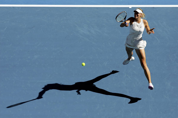
Every so often there will be a soft news photo that features the optical effect of a double image. It might involve a mirror or TV monitor or a photograph, among other options. Shadows are another variant of optical replication, as in this photo from the Australian Open:
tennis-shadow.png

Maria Sharapova is hitting a forehand. It’s not a good photo of her. At the least, most photo editors would have no interest in a long view that has her looking awkward and disconnected from her own shot much less the flow of the game. (Unless, perhaps, she was blundering to a loss, but she won the match handily.) One thinks of antique images from the 1920s, when the game had style but none of the extreme athleticism that we now take for granted.

But it’s not a picture about her, directly. The interest is created entirely by the shadow. The optical doubling of Sharapova lies along the two primary axes of the composition: she defines the vertical plane, while her shadow lies along the horizontal. Sharapova is the familiar presence visually, but the shadow is reinforced by the horizontal white line crossing the field of blue along the top of the photograph. The ball lies like a point in a graph, the intersection of X and Y coordinates. Thus, the figural composition acquires a hue of abstraction. This is not a photograph of a person, but of something else.

What else? The shadow knows. We can look there for the form of a thing and so for what we might miss when distracted by all the details of ordinary perception oriented toward social interaction. Were we looking only at Sharapova swinging her racket, we should see an individual tennis player, someone with a specific face, look, game. When we look at the shadow, however, the distortion created by the angle of the light and twist of her body brings something more elemental to the surface of the court. There we see a body transformed by the act of hitting the ball. The shadow outline of her legs is much like her legs, but as she torques through the shot her torso appears to be compressed into one continuous limb that grows out of her pelvis and arcs into forearm, hand, and racket. Her head has disappeared into upper body which has morphed to maximize the force traveling into the prosthetic extension of the hand. What started out human ends up a hitting machine.

Thus, the optical double reveals a more abstract dimension of the act of hitting a tennis ball, and of the game of tennis as it is played on the world stage. Tennis is promoted by featuring individual players as if they were fashion models or rock stars. To get there, however, the players need a lot more than flair. They can only succeed by subjecting themselves to grueling training that makes them extremely efficient competitors, and little else.

Shadows can reveal the other self. Like the portrait of Dorian Gray, the double might reveal one’s sins, but that might be more melodramatic than is needed much of the time. A shadow also could lend itself to recollection or prophecy or other opportunities for reflection. I’ll close with another image, one also taken because of the shadow in the frame.
soldier-shadow-thin.png

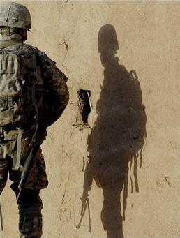
This image of an American soldier in Iraq is a study in opposites. The soldier, who should be the focal subject, is partially outside the frame and has his back to us. His shadow, which should be merely an afterimage, is in the right center of the picture and facing forward. Indeed, the shadow figure seems almost exposed, turned toward us in a way that makes him seem vulnerable, open to injury as the stalwart soldier shielded by his backpack is not. That vulnerability is accentuated by the distortion, which makes him appear slouched, even sunken-chested. And this shadow is not hard dark but rather a soft, yellowish color like the wall behind it. This double is wraith-like, a ghostly presence with streamers and gun drooping down like Marley’s chains, though ethereal. And also, like the photograph above, somehow less than human: in this case, arachnoid–like a spider or scorpion lying in wait in the sun.

Somewhere between Sad Sack and the war dead while looking like a primitive predator, this shadow could be the image of the elemental soldier. That is, the soldier seen without the martial virtues evident in the actual figure on the left. The soldier who, for all his terrible power, will not project power for long, whose presence will evaporate in time even if he is not killed first. The soldier who will have to be replaced by another much like him.

Photographs by Ezra Shaw/Getty Images (1/14/08) and Alexander Nemenov/AFP (9/29/07).


Digg!

 5 Comments

Eyes on the Prize

14campaign600.jpg

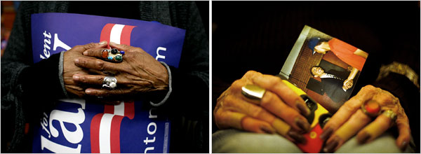
The NYT published this diptych in a story titled “Race and Gender are Issues in Tense Day for Democrats.” The story is a “he-said, she said” tale that is implicitly about who gets to play the race card in the on-going democratic primaries. Apparently Barack Obama should be able to, but doesn’t want to (because presumably he doesn’t have to in order to preserve his base); Hillary Clinton apparently does play it, but in an allegedly backhanded way that allows her to underscore her own marginalized status as a woman (thus, presumably to energize her base). The issue comes down to a debate about the relationship between race and gender, as if, at the end of the day, we should decide our votes somehow on who is more marginalized than the other. The photograph that accompanies the story – and is nowhere remarked upon, and thus might appear to be something of an excess – tells a somewhat different tale.

The key here is in understanding how the stark tension between race and gender is muted by attention to more complex generational differences. To see how, envision one set of hands as white and female, the other as black and male. How would each be inclined to vote? The lines of identification would seem to be pretty obvious, driven by both race and gender in each direction. And indeed, it is this stark and uncomplicated dialectic that the NYT exploited on Sunday when it juxtaposed images of Elizabeth Cady Stanton and Frederick Douglass in a story that featured what Michael Shaw at BAGnewsNotes called the “pink-black divide.” But notice that the demographic put on display in the above diptych is much more complex, as the images feature the much harder case: How do African-American women who share identities with both candidates choose? Will they be guided by their racial identity or their gender?

And the answer we get is a study in ambiguity that takes the false essentialism of identity politics to task—or at least it complicates it in ways that bear consideration. Thus, while both sets of hands are clearly female and African-American, there are nevertheless important and notable differences that mark something of a subtle, but complex and significant generational divide. To begin, take note of the fact that these are neither young nor inexperienced hands. Each pair is clearly weathered by the passage of time and the accumulation of experience, but they wear their experiences differently. The hands on the left bear a feminine style that associates them with the feminist politics of the 1970s, where the cosmetics that we traditionally affiliate with female sexuality were somewhat muted. Notice how the fingernails are carefully trimmed and without polish. They are adorned by rings that mark them as female, to be sure, but they are folded in a somewhat pragmatic, masculine fashion that underscores the attitudes about gender equality that animated many women in the post-civil rights generation of the 1970s. Indeed, they seem to be protecting the poster, a symbol of the political world and the public sphere that was opened to women by the efforts of second wave feminism.

The hands on the right present a somewhat different, older, feminine style, with more rings, and long, painted fingernails. The pose is more traditionally feminine as well, as the hands rest in the woman’s lap, gently holding a snapshot. And unlike the poster, the snapshot signifies the private, domestic sphere – the world of family photo albums – to which women have traditionally been relegated in a patriarchal order. In a world of cultural stereotypes then, these are the hands of a woman who, in all likelihood, comes from an earlier generation than the woman on the left. She is perhaps old enough to have participated in a sit-in in Mississippi or to have marched in Washington, D.C. From this perspective, the snapshot she holds may well be the cipher for an emotional aide de memoire to her youth, as the picture of Obama recalls the eloquence and charisma of John F. Kennedy or Martin Luther King, Jr., young, men whose uplifting appeals to a color blind society no doubt resonate with her candidates’ eloquent promises for a changed world. Indeed, his very candidacy may serve as the evidence that the struggles of the civil rights generation were not for naught. In this register it is little wonder why some might have interpreted Clinton’s recent comments about Dr. King’s role in bringing about the Civil Rights Voting Act as derisive.

If experienced African-American women can be so divided over their support for Obama and Clinton, then it should be clear that there is something more complicated going on in this political campaign than a simple race-gender opposition. Here that complication is a somewhat subtle divide between maturing generations, but in other contexts it is no doubt something else. The diptych underscores the centrality of such impediments to the interpretive process, however, by forcing the viewer to negotiate such complexities and instabilities of meaning as a condition of even the simplest reading of the images. Note in this regard how the poster on the left is designed to be displayed in a horizontal plane, but here it is out of kilter, held on a slanted, vertical plane that is further obscured by the hands. The photograph on the right is even more askew. The effect is to force the viewer to have to strain to figure out what it is that they are seeing, tilting their head to the left to decipher the poster (and to guess at what the missing hidden letters might be) and then squinting to take account of the snapshot. One has no choice but to be an active reader/viewer.

The ultimate point I want to emphasize here is that the diptych calls to our attention a more important and complex tension in the current democratic primaries than the simple, faux battle between race and gender being crafted and preached by those who would prefer to see two historically marginalized groups doing battle with one another rather than working in solidarity. That doesn’t mean that there aren’t differences that have to be negotiated here, or that there isn’t a great deal at stake in the various generational divides (and there is clearly more than one) that seem to vex the democratic party at this historical juncture. But what it should also remind us is that we need to keep our eyes on the prize rather than to be distracted by reporters with time on their hands.

Photo Credits: Todd Heisler/New York Times; Eric Thayer/New York Times

Digg!

 0 Comments