Mar 28, 2010
Jul 04, 2008
Nov 04, 2009
Mar 09, 2014
May 15, 2009
Jan 11, 2012

Politics and Fashion in Modern Dress

Fashion Week has been running for about a month around the world, and so the slide shows have been full of carefully staged displays of both elegance and excess. Usually excess, of course, but sometimes a bit of both.

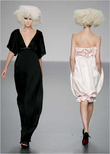
This shot is a small masterpiece of visual design. The twin models signify difference articulated perfectly within a pervasive uniformity. They are two: front and back, pants and dress, black and white, hands loose and pocketed, legs and shoulders covered or bare. And they are one: identical in height, weight, posture, skin, hair, walk, training, occupation, attitude, and place. Were it a movie, we would assume the same actress had been doubled via special effects. Were it a science fiction movie, we would assume they were cloned from the same egg.

What it is, of course, is the aesthetic vision of modernism. If you aren’t sure, look at the spare, minimalist, rectilinear plane surfaces that make up the rest of the scene. The robotic women stand against the decor in the grammatical relationship of figure to ground, a process of reciprocal definition here honed to perfection by the additional technique of the mirror image. Even the decor is two-toned in the same manner as the models: grayed white wall and whitened gray floor could each be the reflection of the other.

One would expect the fashion houses to imagine the world as a hall of mirrors. The mirroring of one another may be more than an artistic conceit, however. Perhaps it is used to manage modern culture’s paradoxical development of individual identity within processes of production and distribution that produce comprehensive uniformity. Stated otherwise, mirroring may become useful precisely as modernity makes different people more and more uniform.

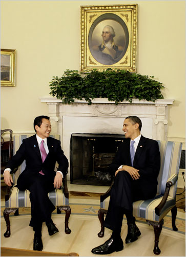
From that perspective, modernity itself seems to be on display in this otherwise conventional photograph:

The stock photo presents Japanese Prime Minister Taro Aso with President Barack Obama in the Oval Office. Look at how they mirror one another, much like two models waiting to be called to the runway. Two stylish men in identical chairs each look toward the other. They wear nearly identical suits, shirts, shoes, socks, smiles, and lapel pins. The are distinguished by differences in size and how they hold their hands and feet, and by their equally stylish ties: one a shiny pink and the other a subdued blue. They could be a nice gay couple.

They also are two official heads of state. One is the leader of a nation that recently experienced a decade of stagflation, and the other the leader of a nation trying to ward off that same fate. Their near-perfect mirroring of each other’s position in the modern world is highlighted by one other, slightly ironic use of the same technique. George Washington’s portrait sits above them, mirroring the two leaders below. Although supposed to bestow legitimacy on those below, his colonial era dress and incarnation within the pre-modern art of painting signal more difference than commonality, just as there is only one of him. He remains the distinctive work of art commanding an aura, while they seem more the issue of a process of mechanical reproduction.

But that aura seems faded and distant when set against the mutual admiration of the two models in the foreground. And so the two photographs mirror one another. In modernism, fashion is placed in one realm and politics in another, each ideally uncontaminated by the other. But that mirror image is another example of accenting small differences within the deeper uniformity of modern culture.

Photographs by Arturo Rodriquez/Associated Press and Doug Mills/New York Times.
 0 Comments

Automotive Wreckage and Crash's Law

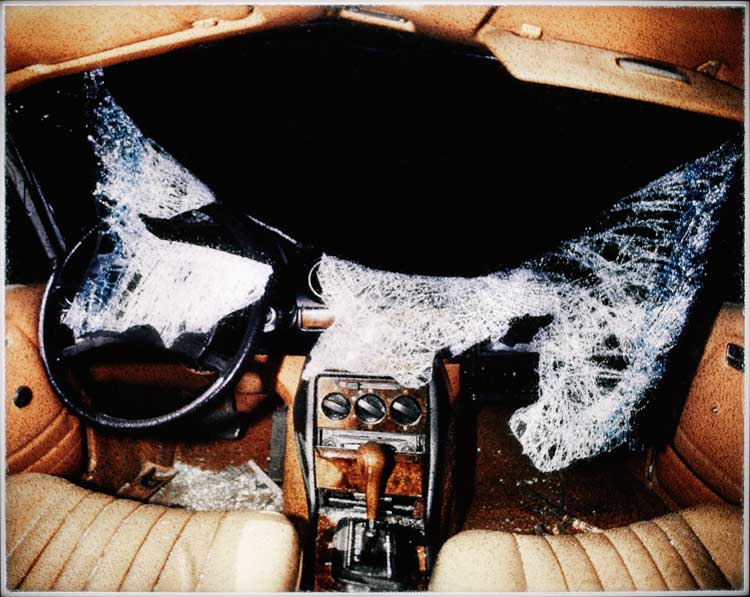
Close your eyes, think Big Three auto companies, and open them again:

Just about perfect, isn’t it? An out-of-date vehicle with crappy decor designed to distract you from substandard engineering has been wrecked by a head-on collision. And what do we see now that the barrier between the car and the outside world has caved in? Utter darkness.

Even if you stagger away from the wreck, head-on collisions are particularly awful because you know you should have seen it coming. Although the crash explodes in an instant, it was developing well before: when people weren’t paying attention, when merely adequate brakes were installed, or barely adequate regulations enacted. The long aftermath of an accident is the other side of a long winding of the spring beforehand. Emily Dickinson said it best:

Ruin is formal — Devil’s work
Consecutive and slow —
Fail in an instant, no man did
Slipping — is Crash’s law.

The Big Three didn’t collide with market reality overnight. They had been warned and warned, but they looked the other way, as did a lot of other people. The result is broken glass, broken dreams, and a dark future.

The photograph is by Nicolai Howalt, from his series Car Crash Studies. I found the series at Amy Stein’s blog on photography. The poem is an excerpt from “Crumbling is not an instant’s Act.”

Cross posted at BAGnewsNotes.

 1 Comment

Sunset in Oil Town

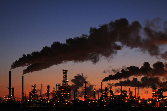
Today I came across a photograph that could be a picture-perfect illustration of how aesthetic judgment depends on context. I also discovered a photograph that could be a picture-perfect illustration of how political judgment depends on context. Fortunately, the two photos are identical:

This photo of an oil refinery in Edmonton, Alberta could be placed on a Petro-Canada promotional brochure. Surely for many of those in the business, and for a majority of those in North America in the last half of the twentieth century, this could be an image of progress. The sun is setting but that doesn’t matter as hundreds of lights wink on at the refinery that is a vital node in the great industrial system that has all but eliminated darkness in the modern world. The plant (note the word) seems to be a substitute for nature itself: electric light replaces sunlight, the steam from the towers plumes like beautiful clouds across the night sky, and all this because subterranean power is being drawn out of the deep earth.

The stacks, towers, and other structures are the work of civilization, of course. The industrial complex seems to be a city rather than one factory for powering distant networks. This seamless fusion of the natural and technological sublime is one source of the photograph’s appeal. We are brought to a limit condition–the setting of the sun, the outer edge of civilization–and yet can gaze safely on the power emanating from the other side. Awesome power that is contained by the machinery of civilization, from refinery to camera.

But that is only half of the story. The same image will have looked quite different to those who saw high-volume pollution instead of billowing vapor, and consumption of a non-renewable resource instead of production, and a massed concentration of corporate power instead of economies of scale creating mass prosperity. Likewise, the design and tonal values of the image can reveal not beauty and power fused together but instead an allegory of the decline of the industrial society. Now the sun is setting on both the landscape and the refinery. The orange glow along the horizon reveals what was always true: that this was an infernal place that could only end in self-destruction. The lights now look like torches that cannot hold off the impending night when the oil runs out, never to be replaced for hundreds of millions of years. Instead of replacing nature, this place is returning to nature as sure as night follows day.

I’m writing this at night, the computer screen aglow in a house illuminated and heated by power plants that draw on resources thousands of miles away, day and night, year in and year out, continuously, reliably, without my doing anything other than writing a check once a month. That has to be acknowledged. The oil does no good to anyone if never used, but it would be one of history’s great crimes to exhaust the supply before a sustainable alternative was available. Likewise, it seems foolish to deny that the image can be a symbol of progress, but the wiser choice might be to see it as an allegory of decline.

Photograph by Dan Reidhuber/Reuters.

 0 Comments

Photography and the Visual Recession

I’d like to consider why this is a good photograph:

We start by noting how it is a bad photograph: a dull, static, poorly lit shot of a dull, featureless, commercial building in an unknown location on a cloudy winter day. The building itself is of no obvious significance, and the image does nothing to elicit and direct our attention. Even when a caption is supplied–this is the plant of the Manchester Tool Company in New Franklin, Ohio that has been shuttered for ten months–nothing remains of visual interest.

In fact, the photo actually diffuses the viewer’s gaze. Your eye might be caught by the bright colors on the large sign, but it then is pulled along the left-to-right diagonal to the next sign that is smaller and less legible, and then instead of converging on a point it spreads out along the shadowed wall of the building, and from there it wanders right and left trying to draw things together into a coherent whole except that the building continues beyond the frame in each direction. Worse yet, the flag lifts the gaze up on the left but then leaves it hanging there, looking above everything else in the picture to the empty sky, and what is the purpose of having a flag waving over an empty building?

Even if you were one of the perhaps two readers worldwide who might be interested in buying a plant in Ohio at this time, this photo wouldn’t grab you. And it certainly is not one likely to be seen on someone’s desk or in a family album or even in the newspaper. So, what is it doing?

At some point last year a friend got in my face and said that I needed to be posting about the economic downturn. I gave a grumpy reply to the effect that doing so was easier said than done: a fragmentary medium such as photography wasn’t suited to depicting structural problems, and the news media limited themselves to a few stock images such as executives before Congress and workers at factory gates. But I knew he was right, and since then John and I have put up a number of posts on the economy. What I’ve noticed, however, is that the best photos have been uniformly bland images. Examples have included customers leaving a restaurant, an empty auto showroom, furniture dumped along a sidewalk, and others as well. They provide visual parables, but they do not feature the art of photography.

By contrast, the visual archive contains many images of both economic power and economic catastrophe. Think of the World Trade Center or famous images of the Great Depression such as Dorothea Lange’s White Angel Breadline. Even government response to the Depression was captured in monumental imagery, as in the photograph of Fort Peck Dam on the first cover of Life Magazine. But it seems that the economic mudslide we have experienced so far requires a different iconography.

What I like most about the photograph above is how the building seems to be withdrawing from view, receding into its minimal state of dull banality. Of course, it wouldn’t look much different in good times. Commercial real estate like this is not built for looks. But the “For Sale” sign wouldn’t be there, and the windows might be open and the walk shoveled, and, most important, the photograph wouldn’t have been taken at all. The image seems dull, cold, and aimless, but that is exactly what it is documenting: how the plant closing leaves nothing but an empty building, forlorn signs, and workers who are left out in the cold without work or opportunity when they need it.

Recession may include not only cutting back on luxuries but also cutting back on the optical extravagance of towering skyscrapers and dramatic action shots. The photojournalist’s task now includes documenting dispersion, retraction, erosion, and sad quietude. In doing so, it may bring us to dwell on the dull surfaces of ordinary life. Those surfaces were easily overlooked when driving down the road in an SUV using cheap gas to get to the mall. Now, however, they may be all that remain.

Photograph by David Ahntholz for The New York Times. See also the Times article, Months After Plant Closed, Many Still Struggling.

 6 Comments

Obama's Eloquence: Mistaking the Artist for the Art

I’m not sure anyone expected that the celebration of Barack Obama would have continued this long, yet it is still in full swing. For once, right-wing pundits may have a point when they lash back, but they also have a well-deserved credibility problem. The question remains, however: What might be lost in the shadows when all the lights are on Obama?

Let me offer one of the many answers that could be provided: By celebrating Obama too much, we can conclude that only he can do what he does well. When he is the only figure in the picture and the only hero in the story, it becomes too easy to see him as the sole embodiment of virtues that could be developed more broadly.

This conflation of the political leader and his skills is most evident in the responses to Obama’s eloquence. Perhaps because the contrast with his predecessor could not be greater, it quickly became commonplace to declare that Obama’s speeches, answers, and other remarks were astonishingly skilled. Make no mistake about it: he’s a very, very good speaker–and one whose speeches, like everything else he does, show all the marks of political genius. But you don’t have to be a genius to speak effectively.

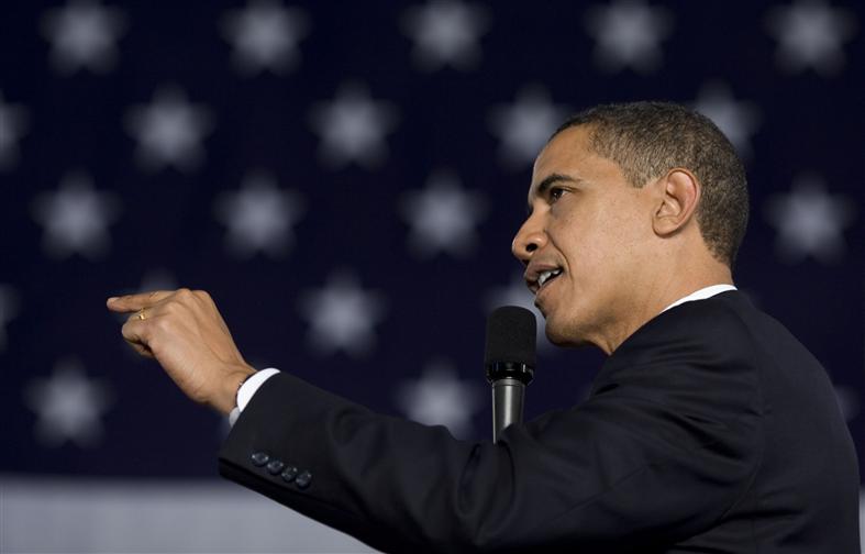
The photograph above features Obama’s sure command of the platform, but it also reveals commonly available means of persuasion. Obama is speaking at a town hall meeting in Elkhart, Indiana. The white dots on the blue background could be lights but actually are the stars on a large American flag. Framed by the flag and the closely cropped photograph, Obama appears to be the epitome of the political leader as public speaker. His words can’t be shown in the photograph, of course, but look at what is on display: the focused line of sight toward the audience, the comfortable ability to speak across the microphone rather than be disturbed by it, the thoughtful tilt of the head as he strives to connect with the questioner, the forceful gesture of arm and hand to emphasize the argumentative point while exuding confidence, the slight smile of public combativeness oriented toward conciliation, and all seemingly without breaking a sweat.

You can’t deliver a speech much better than that. But asking how he does it is like asking how an NBA player can make a three-pointer. He can do it because he’s done it a million times. And because he studies the game, and works at it, and enjoys it when he does it well. And if everyone can’t play in the NBA, anyone can become a better player if they work at it. The same holds for public speech.

If you look at Obama performing, you can see how to do it well. Look closely and you also will see a lot of small mistakes and other features of ordinary, everyday communication. He’s not perfect, and virtually everything he does is something anyone could do with a bit of practice. How to answer questions masterfully? Well, if asked two questions at once, respond to each in turn directly and succinctly and don’t answer other questions that weren’t asked. How to respond when someone is channeling the opposition’s talking point? Well, identify the source and its characteristic bias, then counter with the corresponding principle on your side. How to do this without dying of nervousness? Well, put yourself where you get to practice before others who take it seriously.

When looking at Obama on the stump, you can see the consummate public speaker without peer, or you can see the art of rhetoric that he practices. That art is something that can be taught to and learned by ordinary people. More to the point, democracy depends on ordinary people taking turns speaking and listening with some commitment to doing both well. To think that only great speakers can speak well is to mistake the artist for the art.

Someone once said that the genius of democracy is that it doesn’t require genius. A good monarchy requires a great monarch, while democracy can do just as well or better if ordinary people put enough effort into public discussion. Obama concluded his press conference Tuesday night by saying that he believed in civility and rational argument. Those are the values of good public speech. He shows how it’s done, but many people could do it. Let’s admire the artist, but work at the art.

White House photograph by Pete Souza, 2/9/09.

 3 Comments

Blindness and Insight in 3D

3D glasses are making a comeback–again. The investment history of that little device must be a trail of broken dreams, but they probably said that about the lint rollers. Before looking ahead, however, let’s not forget our glorious past:

This is one version of the classic Life Magazine photograph of the audience watching the first 3D color motion picture. It’s been a while since people dressed up to go to the movie theater. The date was 1952, and since then this image has become emblematic of all that was odd, dispensable, or dangerous about the 1950s. We see the American middle class lined up in rows, willingly clouding their vision to be transfixed by the mass media on behalf of civic conformity. Serious, silent, formal, and numbingly uniform–what’s not to like?

It’s easy now to look at the 1952 photo and imagine the audience is auditioning for “Invasion of the Body Snatchers.” And unfair, of course. They will have been a diverse mix of individuals having a good time going to the movies, much as people do today. And the glasses disturb in part because they remind us that the cinematic experience is always an illusion created by equipment. That said, the image does provide a window into the culture of the time, and thus a basis for comparison with more recent attempts to use 3D technologies. So, let’s take a look at this year’s model:

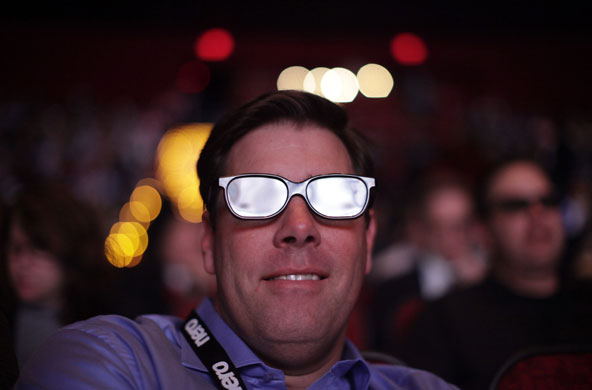
Cool, huh? This happy camper is watching a college football game in 3D in Las Vegas. Obviously the glasses have gotten a fashion upgrade. The photo suggests other changes as well. Now we see not the mass audience of 1950s popular culture, but instead a single individual relatively isolated from those in the soft focus background. Now the photographer zeros in on the individual’s experience, and his happiness clearly is his own and not related to those around him. He is illuminated, as if the spectacle is being produced just for him. Or at least for those like him–the niche audience able to afford the trip to Vegas and whatever else went into this show.

This inversion from the mass audience to the isolated spectator can be read as a shift from a culture of collective solidarity to one focused on individual autonomy. Conformity is not a problem, and as for the rest, well, let the market take care of that. As with better eyewear and improved projection, this is supposed to be progress: whereas the eyepieces in the first photo are dark, his lenses are shining with enlightenment.

And it may be progress. The audience in 1952 was watching “Bwana Devil,” which is all one need say about that. At the same time, one can’t help but think that this is a case of the same thing coming around again. What people need from their media today is not more “life-like” film and video projection but an upgrade in content.

And perhaps now more than ever, we don’t need glasses that make it easier to not see those around us.

Photographs by J. R. Eyerman/LIFE and Jae C Hong/AP.

 0 Comments

Conference: Women in Photojournalism

WOMEN IN PHOTOJOURNALISM

The National Press Photographers Association will hold the annual Women in Photojournalism Conference in Las Vegas, Nevada on June 10, 2009. The conference theme is Celebrating Our Past, Looking Forward Toward the Future. On the occasion of its twentieth meeting, the conference will feature the history of women in photojournalism and include a juried exhibition, workshops, and critiques. Additional information is available here.

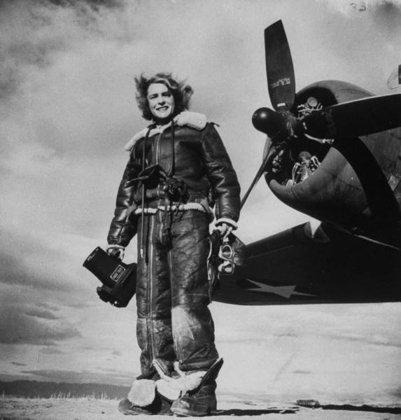
Photograph of Margaret Bourke-White by Margaret Bourke-White, Life Magazine, 1943.

(Those readers who still hold their noses when confronted with Margaret Bourke-White’s photography (much less her self-promotion) would do well to read John Stomber’s essay, “A Genealogy of Orthodox Photography,” in Beautiful Suffering: Photography and the Traffic in Pain, ed. Mark Reinhardt, Holly Edwards, and Erina Dubanne. If nothing else, the smear job done by James Agee and Walker Evans was an exercise in hypocrisy on a grand scale, and there is reason to look at any image anew rather than through the lens they crafted.)

 0 Comments

The Great Unraveling

Descriptions of the current recession often feature terms of constriction: “cutting back,” “downsizing,” “retrenchment,” “shrinkage,” and so forth. Companies are reducing inventories as people are eating in instead of going out, all because bubbles, markets, and sectors have collapsed. With the Dow at a fraction of its former value and the global economy cooling like a dying star, it seems that drawing inward is a universal law of hard times. Until you look at photographs such as this one:

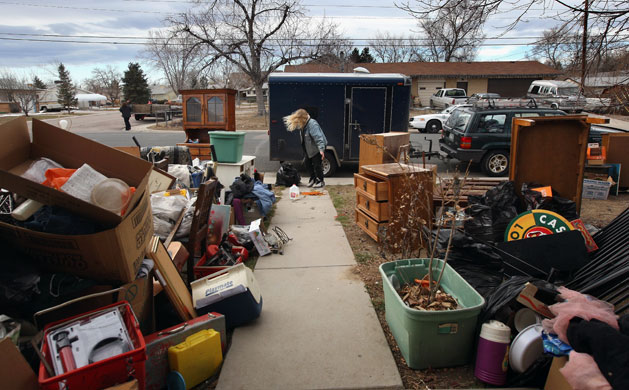
A woman is standing among her possessions after having been evicted from her house. She is seen at the back of the photograph, at the end of the bare concrete sidewalk leading to the street, on the line to the vanishing point. The wind blows her hair across her face, adding insult to injury. She stands as if at a loss. What to do? How can she gather this all up and put it somewhere safe, much less back where it belongs? How can she hold onto anything of value?

The garbage bag in front of her makes the question seem particularly futile: she could put something in it, except that it’s already full and likely to tear anyway when she tries to carry it, if she can carry it far at all. No wonder that she looks as if she is having an exasperated conversation with the bag. Who else can she talk to?

The rest of her stuff is strewn along the sidewalk and out into the street. It’s in no order save the haphazard mess made by the eviction team (they have jobs). Drawers are pulled open, a table overturned, the cabinet stands empty and precarious at the curb, boxes are piled helter skelter, a plant dies in the winter air. . . It would look much the same if it had been done by vandals, but then she would know whom to blame. In any case, she isn’t likely to see the people who helped her get into this mess.

This is a scene of personal desolation. It also is a sign of collective danger. The economic implosion does not lead only to the frugality and togetherness celebrated in nostalgic memories of bygone days. Economic disasters also release terrible centrifugal forces: winds of dispersion that tear lives apart and scatter people across places that will never be called home. Paul Krugman put it well when he spoke of The Great Unraveling. To see what that can mean, you don’t have to look too far.

Photograph by John Moore/Getty Images.

Update: Thanks to the cross post at BAGnewsNotes, you can read an extended caption to the photograph and additional comments by readers there.

 1 Comment

Photographing the Facial Mask

The slide shows are full of masks these days. January is the beginning of both the Chinese new year and Carnival time around the globe, not to mention various religious holidays, civic anniversaries, and assorted other excuses for parades, fireworks, dancing, and mummers galore. Factor in a sag in the news cycle and you get more than the usual number of colorful images. I’ve picked out two that seemed more artful than the standard fare.

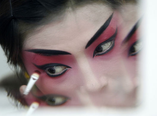
The caption identifies the artist as Chen Ting, a Beijing opera performer from the Jiangsu Art Group. You can see a more direct view of the made up face at The Big Picture, but this photo adds a reflective dimension better suited to highlighting the theatrical artistry on display. The double image mirrors the fact that the makeup doubles the face. Similarly, the explicit artifice in the photograph suggests that the makeup is not merely enhancing nature but rather creating a mask. The point, after all, is to depict something larger than a single person. We can see the difference between actor and character only because the camera has taken us backstage. Once the makeup is applied and brush and mirror have been put away, artifice and nature will have become fused into a third thing, the facial mask of the living character in the play.

The backstage shot reminds us that there is machinery behind enchantment. It may be as simple as a brush, some paint, and a mirror, but the mythical creation is a product of methodical craft. We are easily enchanted nonetheless, and so it is that many of the other photographs of the season feature spectacular sets, shows, and performances. Perhaps that’s why I found this next photograph absolutely endearing.

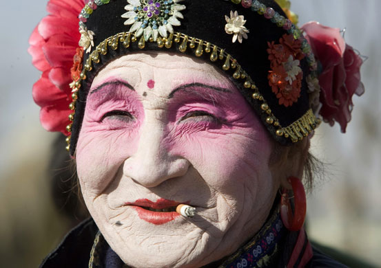
The caption reads, “A performer smokes a cigarette during a show to celebrate the Chinese lunar new year.” No news there. I wonder, though, if she is on stage; I doubt it, and so this would be another backstage shot. There is another similarity, as she, too, has reddish makeup under black eyebrows. But that’s it. This performer is old rather than young, adorned in folk costume instead of artiste simplicity, grinning while taking a break rather than tightly focused, and she’s got a lot of miles on her.

And one more thing: she’s beautiful. She’s beautiful because of that wonderful smile, and her enjoyment of the cigarette, sun, and whatever else has caught her fancy, and because, despite her age and those lines and creases that can’t be hidden by any makeup, she’s still getting up on the boards and living her life in the theater.

And so we see another way that art and life merge. Instead of conforming her face to the mask, her mask has changed with her face. We see neither actor nor character but instead a real person. Someone whose facial mask has become the familiar expression of who they are. This is the better art: it doesn’t enchant, and settles instead for showing us a real face, one much like all the others that we could see but ignore.

Photographs by Darrin Zammit Lupi/Reuters, Christina Hu/Reuters.

 0 Comments

Jackboot Ballet

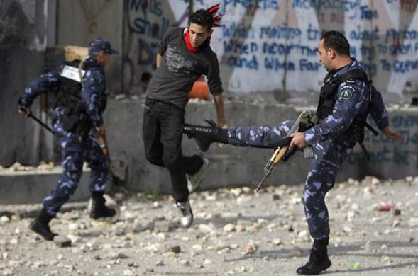
Photography is faulted for creating what it reveals: the aesthetic dimension of social reality. This image is so good it almost looks rehearsed:

The caption at The Guardian tells us that a member of the Palestinian security forces is kicking a protester in Bethlehem, West Bank. That’s the language of professional journalism, and you can see how it misses exactly what is distinctive about the photograph. There can be both athleticism and artistry in violence, and here both art and agility are on display.

The casting is perfect: a beefy adult male pivots on one boot while swinging the other with the full force of experience; the young man leaping nimbly to avoid the kick is lean, graceful, and yet vulnerable. The costumes have been made to character: top-of-the-line clothing and accessories for the well-heeled professional, and basic black jeans and jersey topped off with a dash of red for the young artiste. Behind them the more awkward, uniformed stooge with club in hand reprises the attacker, while the graffiti smeared on the wall backs up the artiste. Against this background of force without style and resistance without clarity, the two actors in the center play out the drama of youth and authority with consummate elegance.

About ten months ago I did a post entitled The Olympics of the Street. Subsequently the Beijing Olympics got more attention, even at this blog, and then the American presidential campaign dominated everything else. Now the news is slowly settling back into some of its old rhythms. If you read my older post, you’ll see that there is no news whatsoever in the photograph above. I try to avoid repeating myself even though the news is repetitive, but today’s image was too good to pass up. More important, however, is the realization that this scene is part of a long running show—one that has gone on much too long.

Photograph by Eliana Aponte/Reuters.

 2 Comments