Mar 27, 2008
Oct 20, 2014
Sep 09, 2011
Dec 23, 2007
Jul 11, 2011
Nov 19, 2008

Seeing Atoms

We are pleased to welcome Ivan Amato as a guest correspondent. Ivan is the author of the wonderful book, Super Vision: A New View of Nature.

A century ago, some of the best scientific minds were still debating whether atoms actually existed. Although atoms had long been a fabulously useful concept for making sense of chemical and material phenomena, no one had actually seen them. Their existence always was inferred, not confirmed by way of direct observations. Even so, well before World War I, almost all scientists believed that atoms were real.

Since then, microscopists and instrument designers have been inventing ever more clever ways to visualize the material world on ever finer scales. For years now, scientists have been using tools with names like scanning tunneling microscopes (STM) and high resolution transmission electron microscopy (HRTEM) to image the regimented geometry of crystalline samples’ constituent atoms. It has been way easier to image individual atoms of the heavier elements of the periodic table, such as tungsten and gold, compared to the atoms of lighter elements. Hardest of all has been imaging the lightest and smallest atoms of all, among them hydrogen and carbon atoms. These are the atoms most associated with life and with the biological chemistry that underlies life, which is why atomic-scale imaging has largely been the province of physicists and materials scientists who make products such as industrial catalysts and semiconductors.

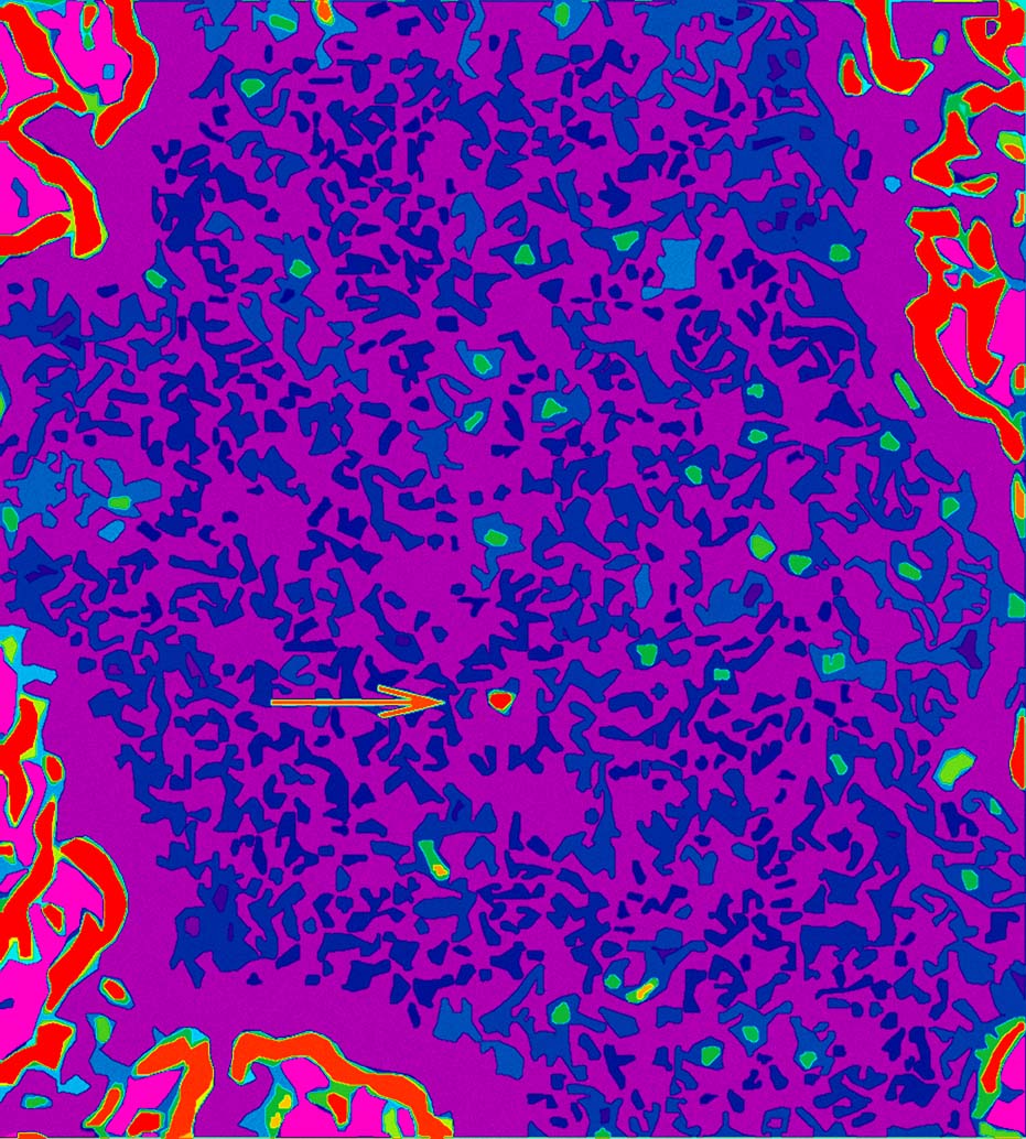
A team of researchers at the University of California at Berkeley, led by physicist Alex A. Zettl, has found a way to use a standard-issue transmission electron microscope (TEM) to visually discern individual atoms of hydrogen and carbon. A small number of these atoms that were lingering in the TEM’s sealed and evacuated sample chamber had drifted onto an atomically thin sheet of graphene–a molecular grid of carbon atoms in the geometry of chicken wire-that the researchers had placed inside the chamber. In the image shown, to which the researchers have liberally applied image processing tools to produce the colors, the hydrogen atoms appear as green dots amidst a speckling of blue, which essentially is background noise due to the graphene. A lone red dot, with an arrow for extra emphasis, marks the location of a single carbon atom.

In a more raw form, the data from the TEM appears as squiggly traces that indicate how much a beam of electrons impinging on the sample scatters as the beam hits different locations of the sample’s microscape. A computer then transforms this scatter intensity data into a two-dimensional, black-and-white pictorial image that corresponds to the sample’s atomic landscape. Then, with additional image processing requiring the applications of aesthetic judgments, that is, choosing colors, the original data finally becomes the abstract “painting” seen here, a painting that harbors what appears to be scientists’ first glimpses of individual hydrogen atoms by way of TEM.

Unlike directly seeing a flower in your garden or the web page you are viewing by way of your own eyes and brain, “seeing” atoms requires mediation–a TEM, a computer, and image processing tools-to render what is otherwise invisible visible. Yet, eyes and brains also mediate our seeing. They constitute evolution-honed instrumentation that senses photons from objects and processes these signals in a way that we experience as seeing. Directly seeing with eyes, then, might be thought of a singly-mediated seeing, whereas using tools like TEMs might be thought of as doubly-mediated seeing.

Credit for image: Courtesy Zettl Research Group, Lawrence Berkeley National Laboratory and University of California at Berkeley. The Zettl group just published, in Nature (vol. 454, pp. 319-322), their first paper on the technique. The image above is not in the paper but is available at their web site.
 2 Comments

Summer and the Moral Equivalent of War

It’s summertime and the news is breezy. No paper can seem to muster the energy to do more than go through the motions, and who can blame them? The political class is laying low–for good reason–while most of us are either on vacation or looking forward to going there. We all know that not much is going to improve in the short term and a lot could get worse, so why not take a break?

Or better yet, take in a blockbuster cinematic epic of heroic scale, like this:

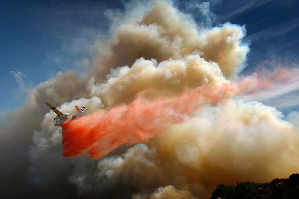
You didn’t know that a World War II movie was playing in the multiplex, did you? And you were right: good wars are out of fashion at the moment, so I substituted this image of an air tanker dropping fire retardant over one of the 1000 wildfires burning in California earlier this month.

This cinema-quality image could be from a WWII movie. A vulnerable prop plane carries its payload right into the maw of the battle. Great clouds of destruction loom all around but the crew are undaunted; they’ve got a job to do, a war to win. The red chemical streaming from the plane could be streaked with fire or blood, and perhaps they will have to make it home on a wing and a prayer. The plane looks fragile yet dauntless, as if already on its way to becoming a scale model of itself, ready to fly again and again in a child’s imagination.

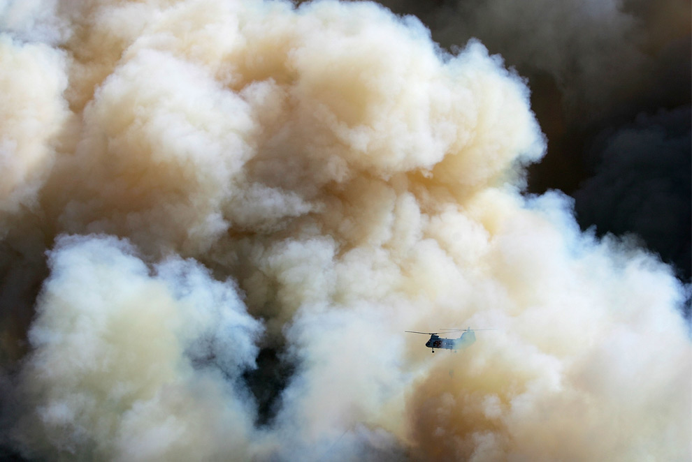
If such simple scripts are too distant now, the California firefighters still have a role to play:

This image could be from the Vietnam War. The helicopter became the symbol of that tragedy, and once again we see a chopper lowering itself into an inferno. The aircraft is farther away than in the image above, smaller, more likely to disappear in the smoke and crash unseen rather than bank toward the sun or go down in a ball of flame. A craft designed for mobility seems almost mired in time, and instead of heroic action on behalf of a great national effort, this is a picture of being dwarfed by historical forces. But bad war or worse, the crew will do their best to complete their mission.

What I wish for America this July is not that we would get serious and turn our attention back to a world in flames. What I would rather see is a lot more images like this one–that is, images of the government turning its powers for organization and action to attack real problems like fire, floods, depletion of natural resources, bad health care, poor schools, poverty, crime, and more. We spend a billion dollars every three days in Iraq, which would fund a lot of work at home. Firefighters, cops, social workers, construction workers, and many more people take risks for others every day, and they could be doing a lot more good if there were a real national commitment to building a good society, which can only be a society that is good for all.

Jimmy Carter is still excoriated on the right for referring to the moral equivalent of war in a speech on energy policy. In the speech he is quoting a union leader–I can explain that term later to some of our younger readers. The union leader was well read, as he was alluding to William James’ essay by that title. You don’t have to like Carter or buy all of James’ arguments to recognize that we could have all of the good side of war without killing, maiming, or otherwise ruining lives. Call it the aesthetic equivalent of war: let’s get a good story and enjoy the show, one where we don’t have to look away.

Photographs by David McNew/Getty Images.  A slide show of these and other images of firefighting is at The Big Picture.

 1 Comment

Why "Surge" is a Euphemism

Here is one reason why we need to look past the language being used to bury the war in Iraq:

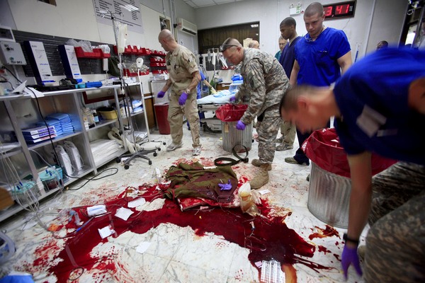
You are looking at the blood of a “gravely wounded soldier at the Ibn Sina Hospital” in the Green Zone. Awful, just awful, isn’t it? And look at the guys on clean-up duty. They are not freaked. Not happy about it, either, but it seems clear that they’ve done this before.

The stuff strewn across the bloody smear is evidence of the frantic pace of the emergency care. The room otherwise remains well equipped. The medical staff will have been superb. We can be confident that that soldier was given every chance he could be given. But they can’t turn back the clock, take him back to the other side of the blast, back to that last minute when he will have been whole. Nor can they stop the next one from arriving. And look at the size of those trash cans.

This photo was taken about a year ago during the surge that now is being defined as a success. By finally following the military advice that it had rejected for years, the administration increase in troop numbers and operations may have helped restore a degree of stability. Many goals remain unmet and reductions in violence often are due to other factors such as ethnic migration, but you can’t argue with success.

OK, but let us never call it an unqualified success, and never forget the cost. Also keep in mind that the word “surge” itself is part of the problem. A surge seems so clean and impersonal. We have power surges and storm surges. I have a surge protector on my computer. Surges come and go, and they seem to be bloodless. But they are not bloodless. Soldiers and civilians were gravely wounded and killed during the surge, just as they were before the surge and as they still are suffering and dying every day.

The good news is that on Friday the Bush administration committed to a “general time horizon” for withdrawal. They also were quick to say that this is not a timetable. Nor is it a fundamental change but rather an “evolution” in policy. (One might ask whether the administration now believes that evolution occurs generally or only within the White House.) Even as the policy changes for the better, the administration is still spinning the language to deny its arrogance and its terrible, terrible mistakes. As before, the entire tragedy is clothed in unreality.

Say what they will, they have blood on their hands.

Photograph by Maya Alleruzzo from the slide show “Scenes from the Surge” at her website.

 1 Comment

Picturing Darfur

This week we are pleased to welcome photographer Aric Mayer as our first guest correspondent at the New and Improved NCN.

“When we see them, we run. Some of us succeed in getting away, and some are caught and taken to be raped–gang-raped. Maybe around 20 men rape one woman. […] These things are normal for us here in Darfur. These things happen all the time. I have seen rapes too. It does not matter who sees them raping the women–they don’t care. They rape girls in front of their mothers and fathers.”

This is the statement of an unnamed victim quoted by prosecutor Luis Moreno-Ocampo this week in a hearing before the International Criminal Court. The prosecutor called for an arrest warrant to be issued for Omar Al Bashir, the president of Sudan, for 10 counts of genocide, crimes against humanity, and war crimes. Al Bashir’s weapons of genocide in Darfur are listed as rape, hunger, and fear.

The testimony achieves in one concise paragraph what photographs can rarely accomplish. First, the woman describes what she has seen in person, then what she and her community are suffering, and finally she attaches those horrifying images to the systematic raping of women in Darfur as a weapon for destroying the people and the fabric of their communities. It is the third part, the connection of individual experiences and individual crimes to the systematic destruction of society, that photographs do not do well on their own.

Despite the efforts of some of the world’s great photojournalists, the crimes of genocide in Darfur remain largely unseen in the West. The remote location, the political hurdles, and the extreme physical danger make Darfur nearly impossible to visit, much less to depict in photographs. But we can learn from another recent genocide in Rwanda.

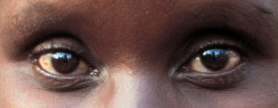
The aftermath of the Rwandan genocide was visually graphic. Piles of hacked and/or burnt corpses covered the countryside for months afterwards. Buildings that had been burned down with hundreds of people inside of them stood untouched as the bones bleached in the sun. Even then, photographer Alfredo Jaar recognized that his best efforts to convey such horror were failing to communicate the breadth of the killing. In the end, he showed one photograph, “The Eyes of Gutete Emerita.” This image is an intense and intimate encounter with another human being, the eyes being the windows to the soul.

Gutete Emerita is, in this eternally frozen moment, looking at the remains of the church in which her husband and two sons were hacked to death with machetes by a Hutu death squad right in front of her. Now weeks later she has returned to the scene of their deaths and stands among bodies rotting in the African sun. Suddenly we, the viewers, are confronted not with a visual spectacle of the dead, but with the trauma, pain, and frailties of the living. Gutete’s eyes speak across time and space as a witness to violence and death on a scale that defies visual depiction. Jaar’s photograph brings us to contemplate the human soul in the face of such cruelty and pain. And Gutete’s eyes stand in as a witness of all crimes of genocide.

Currently in Darfur the genocide is being carried out in a very different manner from Rwanda. Rather than a spasm of violence, the genocide is perpetrated by attrition. Rape, hunger, and fear are slowly and steadily killing an entire population of people. That the rapes are frequently performed in public adds to the terrorizing effects of the crimes. In the West, rape tends to be a hidden form of violence, kept out of the public gaze, while in Darfur it is being used in a highly visible systematic way to destroy women, their families, and their communities. Dislocation and the constant threat of violence make it impossible for the Fur, Masalit, and Zaghawa groups to support themselves in an already difficult environment. Hunger and starvation are inevitable.

The request for an arrest warrant for Al Bashir is an important step towards generating a clearly articulated picture of how the Sudanese government has sustained and perpetrated genocide while the world knows that it is happening. The scarcity of visual evidence of these crimes in the western media should be no excuse for our lack of understanding of the problem. It may perhaps even help the cause. As in Alfredo Jaar’s images from Rwanda, we can bypass the spectacle and get straight to the systematic structures that keep the genocide occurring. Prosecutor Moreno-Ocampo’s document presented to the ICC creates a clear picture of how the genocide has been implemented and sustained. You can read a synopsis and download the full text here.

 2 Comments

Sleepwalking Out of Iraq

There has been something strange about the recent coverage of the war in Iraq. Privately I’ve been complaining that the war has all but disappeared from the papers, or that the photos are soft news shots, or that everything has becoming numbingly repetitive. There is some truth to all of that, but not enough. It finally hit me today after a friend suggested that I was giving up too easily. So I looked again and there it was: the US, across the board, is already disengaging and moving on, but as if in a dream, as if none of this is really happening.

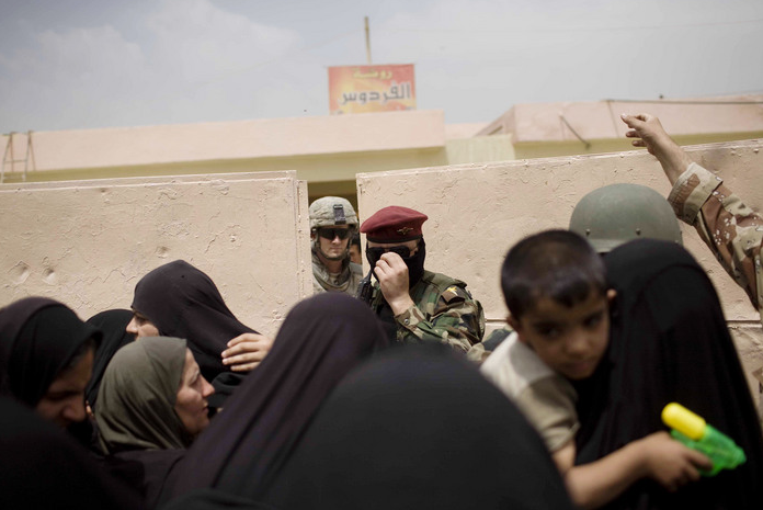
To see what I mean, you might look at this photograph:

Iraqi civilians are queued up for food and medical aid in Sadr City. We see, front to back the civilians, an Iraqi soldier, and then an American soldier. The details tell a familiar story not without irony: As the Iraqi military steps up the US can drop back into a supporting role, although the US troops are occupying a school that had to be abandoned, the Iraqi soldier is masked because of sectarian violence, and kids are already armed, albeit with water pistols. But these are distractions from the real truth of the photograph. The American is already well in the background, behind a barrier, peering out as though from a door that he is about to close. He is looking on a scene of his own making, but one that now clearly is separate from where and who he is. The interaction is all on the other side of the barrier. Soon he will step back. After all, he is in the vanishing point of the picture.

Any one photograph can be but a fragment and not representative of a larger pattern. So let’s look at two more. This one is yet another shot of US soldiers searching a family’s home in Iraq. You might contrast it with others which were images of close encounters that could be terrifying and confusing for all concerned (here’s one we’ve posted on before). This picture, by contrast, could be a study in alienation:

The scene has an eerie feel to it as if it were a still from some European film where dream and reality get mixed together. He is preoccupied in the background, she is waiting in the foreground, and they are separated by the long viewing angle as well as a concrete partition, as if they were in separate zones of feeling. She is tense, alert, even colorful; although frightened and wary, this still is her home. He is distant, relaxed, even laconic–just going through the motions. He stands by a door. On close inspection it appears to be a closet, but it does double duty as a portal to the some symbolic other place. He will look around, go through his check list, and then go out the door. Why not? He already is far away from those around him in Iraq.

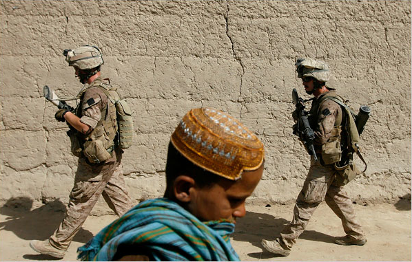
And besides, he might be redeployed to go on patrol in Afghanistan:

This is supposed to be our new and improved war against terror, but old habits are hard to break. The photograph captures the near-complete separation between the US military and those living under the occupation. The troops are walking in one direction, set on their mission, while the Afghani civilian walks in the other. Once again, the troops are a muted presence in the background while more colorful domestic life goes on as best it can. Purely military rather than political, cultural, or economic engagement means that the US is there but not there. The unreal quality of American empire makes it easy to send the troops abroad, and easy to let it all melt away without really admitting mistakes and counting the cost.

The war in Afghanistan initially was justified and may still be necessary. The war in Iraq was neither. That war began in a condition of collective–though not total–delusion. Perhaps it is too much to expect it to end any other way. One would like to think the US could face up to the tragedy and learn from its mistakes. As these photographs suggest, however, it could be that we haven’t learned a thing and that we will leave Iraq in a haze of denial, perfectly capable of making the same mistakes again.

Photographs by Andrea Bruce/Washington Post, Damir Sagoli/Reuters, and Rafiq Magbool/Associated Press. This post also is going up at BAGnewsNotes today. As always, we’re very pleased to be associated with Michael Shaw’s terrific blog on politics and photojournalism.

 3 Comments

Public Faces Large and Small

Public life involves seeing the faces of strangers. Often they are but a blur, yet they can create a unique emotional experience. Ezra Pound captured that experience in his famous poem, “In a Station of the Metro”:

The apparition of these faces in the crowd/Petals on a wet, black bough.

The faces are of individuals yet unknown save as part of an unconscious pattern; ghostlike in their sense of social presence and yet vividly present in aesthetic space; beautiful yet ephemeral. Pound was able to create this masterpiece of emotional discernment and poetic compression by imitating Japanese haiku. One wonders what he would have thought of this face:

Actually, there are two faces, neither one quite what Pound depicted. The large image is a work of art by Kaho Nakmura on display at the Tokyo Express exhibition in London. The woman in the foreground, a dark smudge on a bright background, is someone walking through the gallery. Though seeming opposites–large/small, bright/dark, art/life–the two women are tied together by the photographic composition and the color red. The reversal of foreground and background makes each a commentary on the other. Thus, the red of her coat is exposed by the bloody glob on that tongue. In actual display, what should be inside the body is imitated on the surface, while what would seem to be on the surface–our expressiveness–is in fact hidden behind a mask, say, the flat expression and dark glasses of the onlooker.

So it is that the artwork is transgressive. This young woman is so out there, and so in your face. She exposes her inner self, which includes being pierced with a tongue stud. Eyes, mouth, face are open and illuminated for public view. She is not receptive, however, but aggressive, larger than life, projected into our world. A signboard, not a flower petal. She exists not as a moment of beauty, but rather as a beacon of desire that always will remain unnamed and unsatisfied because created entirely through the circulation of images.

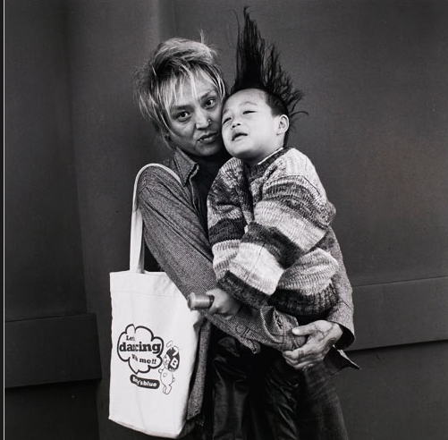
At this point it would be easy to fall into a blanket dismissal of public imagery as having become too commercial, empty, loud, and otherwise degrading. That’s not my point, and Pound’s vision has not gone out of date either. To take a step in his direction, let’s look at another image from Japan, this one probably taken on the street:

This beautiful work by Hiroh KiKai is not of Pound’s apparitions, but there is something haunting about it. The young, hip father is so gentle, and so worn. He is holds the boy so lovingly, but the child’s weight is a load on the man’s slight frame. Look at this face, hands, every part of him suggests that he is steadily sacrificing his youth for this child. Youthful affectations remain, but I suspect the only dancing in his life right now is the sign on the bag. Not to worry. The beautiful realism evident in his face is matched by the sense of sheer, imaginative flight in the boy. He could be in a dream, on a magic carpet ride, flying high above the world and yet completely secure in his father’s arms. Dream and reality are face to face, cheek to cheek, in this remarkable image.

There is no need to choose between the painting and either of these photographs. Like Pound, each of the artists is showing us how we can see, value, and think about the faces that we see when walking down the street, through the terminal, in the mall, or at the summer festival. Art and life are there to be seen, face to face, in the gallery of public culture.

Photographs by Ben Stansall/AFP-Getty Images and Hiroh Kikai, from the New York Times slide show on Japanese Photography at the ICP. The show at the International Center of Photography is entitled Heavy Light.

 1 Comment

Shades of Gray

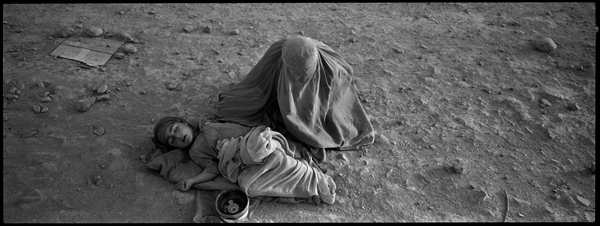
Digital technologies have changed both color and “black and white” photography, not least by leveling the hierarchy between the two modes. Color now can be both the norm for popular photography and a rich resource for photographic depiction; likewise, black and white has been demoted from being the artistic standard but can mark a subject for thoughtful reflection. So it is that the New York Times has been featuring ordinary life in Afghanistan by showing it without color.

This image is the titular photo from the latest in a series of photo essays. The lack of color defines the scene comprehensively. That absence is the dominant feature of these images, rather than the sharp definition and subtle contrasts that once were the raison d’etre of black and white photography. This is not black and white so much as it is gray, and with that, “dark, dismal, gloomy,” and “dull dreary or monotonous,” or “indeterminate and intermediate in character,” as my dictionary defines the term. It is easy to conclude that life in Afghanistan, a desert country ruined by decades of war, oppression, and more war, has become unrelentingly bleak.

This is not the place to suggest that there are pockets of bright colored happiness even in Afghanistan. Indeed, color is no defense against the misery of a poor woman reduced to begging for her child. One might ask, however, if we are brought closer to the truth by the obvious manipulation of the gray image shown above. Frankly, I don’t think the scene needs that kind of help. (See, for example, the photograph here.) That said, I have to admit that this image has a metaphoric resonance that might be missed if we could see what color was there. The term “shades of gray” comes strongly to mind: as if the child were about to become a “shade,” that is, a ghost. As if the mother were already reduced to the status of a shadow, a wraith-like being that exists only for the task of keeping the child alive, or accompanying him to the underworld. The scene could be from an upper circle of hell.

And that’s the problem. As we look down into their bleak underworld, they are close enough to be seen but still in another world forever without color and life. There seems to be no chance that we could reach down and pull them back among the living. And so, we, like the “neutral hue” of the image itself, are left in a space without values, with little basis for doing anything other than looking and reflecting on human misery.

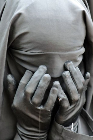
The suggestion of a spirit world is evident in another photograph taken in gray recently. This image portrays a religious student praying in Islamabad:

I first thought that this photo was a color shot of gray clothing, and it may be, but it has the look of digital gray–that is, of the image after the color has been removed. Here the gray again is being used to frame the object for reflection. We are to dwell on how she is completely covered. Head, face, even her hands–this is not the typical burqa; indeed, the student may be male for all I know. What strikes me is how the hands are touching the hooded eyes. She cannot see and yet is creating some inner circuit of the senses. The gray tone now suggests a similar coordination of her apparel and so of the entire ritual act: she is completely shrouded from the outside world in order to turn toward her spiritual center. Again, the gray shroud makes her somewhat otherworldly, a spiritual medium rather than someone who might communicate with us. And again, she seems closed off from this world by the photograph itself.

Photojournalism need not be a trigger for immediate action. It is enough sometimes to take us out of our familiar sense of of the world. Gray imagery is one way to do that, not least when we are likely to see distant war zones through the rose colored glasses of commercial media and consumerism. More important, the absence of color in the photograph can not only set the tone for thinking about a subject but also reveal our own deficiencies. If there is a lack of either compassion or charity in response to the first photograph, or a lack of empathy in response to the second, the problem may not lie in the image. It may be because those capacities are not there as they should be in the viewer. There may be more gray in the world than we realize.

Photographs by Tyler Hicks/New York Times and Farooq Naeem/AFP-Getty Images.

 1 Comment

Stopping Time at the Olympic Diving Trials

The Boston Globe now provides an online photography page that features stunning images in full page display. I’ve wanted to call attention to The Big Picture since it was brought to my attention recently, and the images below are a fitting example of the work that can be found there.

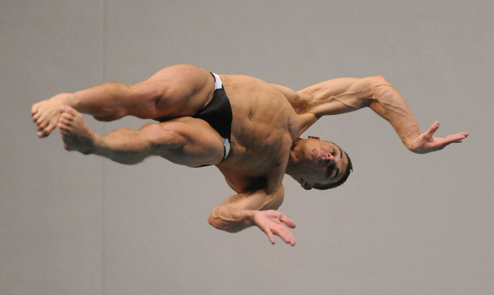
Tony Dumais is spinning through the air between the three meter board and the water at the US Olympic diving trials. You’ll see more at the slide show at The Big Picture, but hang with me for just a minute. This is an amazing shot, not least because you are seeing something you would never see were you watching the actual dive. The dive will have been a whirling swoosh of motion that was over in the blink of an eye. Yeats once asked, “O body swayed to music, O brightening glance,/How can we know the dancer from the dance?” Well, this is how: stop time and take a look.

There is much to see in this instant of stopped time. The incredible muscle definition, his concentration, the contortion that exposes the body while bending it to a demanding task, the sheer energies of the torqued body drawn through gravity’s funnel toward the surface below, the taut suspense of whether he will pull everything together in time. And the photograph asserts itself amidst all this, displaying a human body with the exquisite anatomical detail of Renaissance art. The body is displayed as if a specimen, and yet not only that, for it is both commanded and exposed as part of a society’s relentless attempt to optimize human power. The perfect dive, the perfect shot.

All that is evident in this image, and something more.

Again, the definition is incredible. Allison Brennan could have been sculpted out of living flesh. But another facet is revealed here, as this image reminds us that diving is a controlled fall. Allison seems to have it under control, waiting only for gravity to finish the job. For some reason, however, the photo gives me the sense that she could be falling for miles. She seems to be holding her breath, and that may evoke something dream-like, as though she were under water rather than in the air, or in a science fiction film, falling through one dimension after another in some alternate universe. Her body’s sense of suspended animation reinforces the formal dimension of the photograph itself, a suspension of time, and so of space.

Thus the dive unfolds: from concentrating the body while throwing oneself out into the air, to folding into a controlled fall toward the earth, to entering the water:

This is Terry Horner at the moment of completion. Again, a powerfully defined body, the controlled fall, and now the water. The beautiful water, which reminds us that this has been about being in another medium all along. Not just on the ground, where we only breathe the air and drink the water, but in the air, just as he will within the next instant be immersed in the water. Just as these photographs have allowed us to be suspended within another medium, not just looking at things but caught up in vision, seeing what otherwise would be a blur.

Only a very few people will ever dive at this level. Their experience is not ours, nor should we miss it. The last picture provides a caution in that regard. The buff body is so forceful within the frame, and yet it also is headless. I can’t help but admire his build, and yet he appears monstrous. The beautiful water might as well be a trap. The diving competition has brought these athletes to the heights of athletic achievement, and yet there always remains the fall. Much is given, and yet something is always taken. The Olympics, like the dives, isn’t even here yet but soon will be over. The trick is to see, and savor, the brief moment of time.

Photographs by Harry How/Getty Images. Note that The Big Picture at the Boston Globe online should not be confused with the excellent economics blog, The Big Picture.

 2 Comments

Post-Doctoral Fellowships in Photography Studies

This from Andrea Noble at the University of Durham (UK):

I’m writing to see if you happen to know of any candidates eligible to apply for a Newton Fellowship that would enable them to come to the UK to work on a photography-related project at the Durham Centre for Advanced Photography Studies (DCAPS). This seems like an exciting opportunity for 2-years postdoctoral research experience in the UK. Newton Fellowships provide grant of £24,000 per annum to cover subsistence and £8,000 to cover research expenses, plus a one-off relocation allowance. Additionally, as part of the scheme, all Newton Fellows who remain in research will be granted a 10-year follow-up funding package worth £6,000 per annum. I’m forwarding further details of the scheme (below) and would be very grateful if you could bring it to the attention of (ex) graduate students (up to 6 years postdoc) working in a photography-related field who might be interested.
Full details can be found at:
http://www.newtonfellowships.org/

I’d be happy to field any questions, so please don’t hesitate to get in touch.

Professor Andrea Noble
School of Modern Languages and Cultures
Durham University
Elvet Riverside
Durham
DH1 3JT
00 44 (0)191 334 3428
www.dur.ac.uk/dcaps

 3 Comments

It's not the Message, It's the Medium

How often have you seen a t-shirt of tattoo featuring Japanese or Chinese ideograms? No doubt they were beautiful. They also may have not exactly said what they were supposed to mean. A line here or there, a seemingly incidental mark might make a big difference in the original language. LIke this, for example:

There are hundreds like this at Engrish.com. As the site explains, in Japan English lettering often is used just as we use ideograms here–entirely for decoration. “Most of the Engrish found on Engrish.com is not an attempt to communicate – English is used as a design element in Japanese products and advertising to give them a modern look and feel (or just to “look cool”). There is often no attempt to try to get it right, nor do the vast majority of the Japanese population (= consumers) ever attempt to read the English design element in question.” OK, that we can understand.

But is it correct to say that Engrish is “not an attempt to communicate”? Obviously, if communication is defined as the intentional transfer of information and ideas from one person to another, the answer is no. But what is design doing if not communicating? Even the attempt to look cool is a message, and the “modern look,” like any style, involves an act of identification–I am such a person, or adopting such a role, or orienting myself toward such people, etc. We dress to identify ourselves with particular cultures and subcultures, and we then can be identified by others accordingly. Even the social references often are not exactly spot-on accurate: look at how many university sweatshirts are worn by people who never attended the school. Society works in part by articulating social types such as college student, middle class family, and hip consumer, and some of the time we are the signboards for keeping those types in circulation.

Way back in the twentieth century someone stated that “you cannot not communicate.” He should have added that this fact of life can be the source of a lot of business, and even a laugh or two.

So, have a nice day:

PS: Thanks to those who contacted us via the blog or email regarding the future of NCN. John and I will continue to post, though not at the 6 days per week pace that we have maintained for the last year, and we will be bringing in a few guest authors as well. One of the strengths of this blog is that we have discerning readers who value the public arts and engaged discussion that characterize a strong democratic society. You may not know of each other, but you are there.

 2 Comments