Nov 21, 2007
Oct 14, 2013
Feb 05, 2010
Sep 20, 2013
Aug 11, 2010
Feb 14, 2008

The State of the State of Nature

From the redwood forest to the gulf stream waters and from sea to shining sea, images of natural splendor have loomed large in American national identity. The appear everywhere from car ads to movie vistas to those framed Ansel Adams’ photographs that you see in doctors’ offices. Images of the national landscape also appear periodically as photographs in the daily paper. This one caught my eye yesterday while clicking through the photos of the week at the Chicago Tribune:

idaho-landscape.jpg

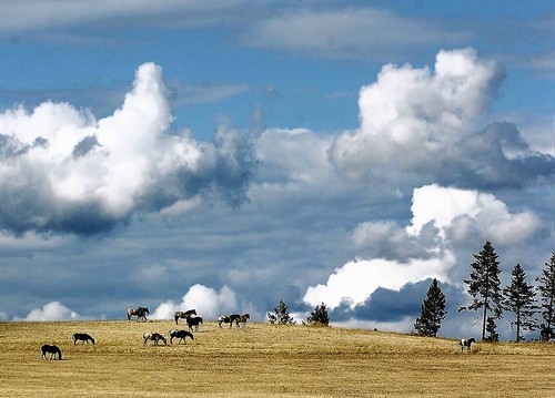
Why did I stop and look? Because it is beautiful. The strong blues and turbulent contrasts of the sky flow smoothly over the golden field of grass. The herd of horses moves nonchalantly across the field despite the powerful forces gathering above them. Like the trees on the right, together yet each standing independently, they need not fear an afternoon storm. The photograph was taken “near Troy, Idaho”; that “near” is a linguistic marker of the Western sense of open space. The scene is a reminder of the sublime promise of the American West, where all can live both free and in harmony with nature.

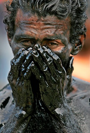
That’s the promise. Other photographs document the underside of the dream. Richard Avedon created a brilliant series of images to challenge the myth of the empty landscape. His images of miners, migrant workers, and others provide stunning evidence that the West is also a place where people live lives of hard labor. These images reveal domination, exploitation, and the wastage of human life on behalf of the production of wealth, but they also reveal something not found in the natural landscape: dignity.

avedon_100604_big.jpg

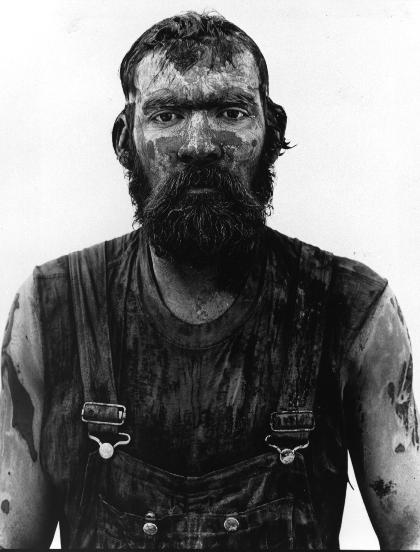
This is a picture of Red Owens, an oil field worker. This, too, is the American West. Free but not free, close to nature but used up by the physical work of extracting natural resources from the earth.

The first picture appeared during a week when the papers were reporting deaths from a mining accident in Utah, and a swath of destruction unleashed by thunderstorms across the Midwest. The mountains bring more than scenic views, and nature is no respecter of persons, or cities, or nations. We cannot serenely move across the landscape to better pastures.

The task of rebuilding community has to include far more than a change in perspective. In fact, I think we need both photos. And they can do more than provide sunny distraction or a grim reminder. It’s a stretch, but the first photo brought to mind a phrase from Winston Churchill’s “finest hour” speech: “If we can stand up to him (Hitler), all Europe may be free and the life of the world may move forward into broad, sunlit uplands.” If a photograph of beautiful uplands can be an image of freedom, then perhaps we are more likely to aspire to that. Likewise, the second photo can evoke the remainder of Churchill’s statement: “But if we fail, then the whole world, including the United States, including all that we have known and cared for, will sink into the abyss of a new dark age made more sinister, and perhaps more protracted, by the lights of perverted science.” We need not bash science, but the truth is that the control of nature, like nature itself, can be used for good or ill. A free people cannot live in a state of nature, but freedom may depend on how they understand their relationship to nature and to each other.

Photographs by Steve Hanks, Lewiston Tribune, August 22, 2007, and Richard Avedon, 1980/1985. See In the American West.

Winston Churchill, “Their Finest Hour,” speech to the House of Commons, June 18, 1940.

Thanks to Michael J. Shapiro for bringing the Avedon photographs to my attention in his fine essay, “The Political Rhetoric of Photography,” chapter four of The Politics of Representation.


Digg!

 4 Comments

Why Can't the War in Iraq Be a Disaster?

The news of the past week has included disaster coverage of the earthquake in Peru. A level 8 quake, it was a bad, killing at least 500 people and rendering thousands homeless. This photo is typical of the coverage:

peru-quake-bbc.jpg

We see survivors contending with shattered housing. Whether to undertake extensive repairs or rebuild from scratch obviously is a real question. Equally evident is the relative calm. People are dealing the the aftermath, but the quake is over. A cinder block will fall here and there and the area will remain somewhat dangerous during the clean-up, but people can get to work and help one another like the two guys in the picture, as everything is settling into place.

The news coverage already reflects (models) this thoroughly pragmatic state of affairs. We hear of governments, international aid organizations, churches, and other volunteers swinging into action. Public discussion begins about the effectiveness (or lack thereof) of early warning systems, architectural designs, first responders, and other matters of public safety and infrastructure administration. The press also provides stories and images of solidarity: people praying together, impromptu vigils, neighbors assisting neighbors. These are good stories, even if we all know the drill. The stories have consequences: many readers will open their pockets, local governments will review disaster response plans, social networks will expand, and for a while lesser quake victims will receive news coverage and the benefits thereof that they would otherwise have missed.

One can still find much to fault, of course, but the whole business is at bottom a testament to the public value of news coverage and the organizational effectiveness that it nurtures. It also is an example of the power of framing. Look at this photograph:

baghdad-boming-feb-4-07.jpg

This, too, could be a photo of the aftermath of an earthquake. Instead, it’s a Baghdad marketplace following a bombing. This one killed 170 and injured over 300, according to the first count. The week of the Peruvian earthquake saw blasts that killed 500+ Yazidis in two villages year the Syrian border. Since the invasion of March 19, 2003, at least 300 Iraqis have been killed by warfare every week, week after week, for a total thus far of at least 70,000. Think of it: an earthquake a week, every week for four years.

I can’t help but wonder what might change were enough people to label the situation in Iraq a disaster. Of course, it is a war–in fact, several wars all mixed up together. But here the war frame can only lead to more war. And for all the expressions of sympathy for those being destroyed, the response to Iraq at all levels has virtually none of the pragmatism and cooperation characterizing disaster relief. This difference in attitude is reflected in the two photographs above: in one, the viewer is at street level, close to the scene, postitioned as if to lend a hand; in the other, we are looking down as if “seeing like a state,” emotionally distanced from a mass of people being channeled through the “collateral damage” of history. One frame pulls us into the picture, and the other provides the secure perspective of geopolitical observation.

One can’t wish away the problems in Iraq by changing a label any more than one can fix it by waving a magic wand. And yet it is looking unlikely that the US will extricate itself any time soon, while our military presence there will continue to be a major cause of the carnage. This is in fact a disaster in more ways than one, and perhaps it is time to say so and, more important, to act as if it were so.

Photographs by AFP/BBC and Khalid Mohammed/Associated Press.


Digg!

 3 Comments

Hiding in Plain Sight

Northwestern graduate student Brett Ommen recently completed the oral defense of his Ph.D. thesis on the role of graphic design in public culture. Brett’s argument is too detailed for me to summarize it here, but he highlights something everyone ought to consider from time to time. Brett claims that an important function of graphic design comes not from the message content but rather from how it covers the surfaces of public space. Thus, even when not attending to the myriad of signs that surround us, we are unconsciously responding to the “surface message” that our environment is intensively communicative. To illustrate this point, Brett took a page from the work of an artistic project called Delete!, which covered the signage along Vienna’s Neubaugasse for two weeks:

delete-vienna.jpg

Brett did the same virtually, here with an image that replaces the signage in Chicago’s Ogilvie Center with whiteout.

ogilve-copy.jpg

The Center is a late-modern environment that doesn’t encourage civic association, and you can see just how barren it is when the graphic content is deleted. You also can observe how much you see-but-don’t-see. I’ll bet that few commuters could fill in many of the blanks. You might look at a familiar street scene of your own and count how many signs you overlook at any given time. We are awash in information and continually accosted with appeals, yet much of that registers, if at all, only as a form of blind sight. That idea might be extended further: how much of the information about who we are collectively is already right in front of us, but unseen? More important, how is that inattentiveness not only characteristic of our relationship with signage, but also with each other? You can’t and really don’t want to see everything, of course, but what are we missing?

Photograph by Hans Punz/Associated Press. An AP article on the Delete! project is here.


Digg!

 2 Comments

The Color of Sorrow

This photograph was front page above the fold at the New York Times yesterday (Monday):

firehouse-memorial.jpg

The caption read, “Photographs of Joseph Graffagnino, left, and Robert Beddia at the firehouse for Engine 24 and Ladder 5. They died fighting a fire at the Deutsche Bank tower.” By highlighting the photos taped to the windows this description may distort the overall effect of the visual composition. Likewise, the smaller image here may not do justice to the emotional power of the photograph’s placement in the print edition. It remains a complex and strangely moving photograph nonetheless.

The emotional power of the image begins with the color of the firehouse door. Red is the color of blood, fire, anger, and other intense experiences: psychologists would tell us that it stimulates emotional responsiveness. Red also is the firefighters’ iconic color, but we don’t see the shiny metal surface of a fire truck. The red wood has the grained, organic feel of a barn and its associations of working hard while living close to nature. The large color field is enveloping and yet somehow also soothing, perhaps because of the square panels and solid bolt construction. This is a good red that helps us feel our way into the photograph.

The second major element of the composition is the line of four windows that divide the monochromatic color field. They are tied to the colored door by the touches of red on shirt and badge, but the primary effect is one of contrast. Instead of an exterior surface, we peer into a deep interior. Instead of a surface that catches the light, there is only the all-too-symbolic darkness. The photographs on the windows not only memorialize the dead but accentuate the sense that a window both reveals and buffers. The door becomes a divider between those suffering within and the rest of us peering in from more distant lives.

The photographs themselves are heartbreaking. We see young people full of life and love, and now two of them are only images. The large white frames isolate the vitality of each couple and set these past scenes against the utter darkness behind them. Thus, a second contrast, for the photos of the dead are all the more compelling by being placed in a line with the two living firefighters on the right. Again, darkness lurks behind everyone, but two are obviously alive, real people hurting yet breathing in real time, while the others are now only images on paper that are pathetic, hopeless masks placed on the darkness.

And so we are left with the living. They remain behind a scrim of mourning, but we can see two individuals lost in different though related postures of sadness. They are touchingly close to one another and yet each is lost in thought, dwelling on the tragedy as they work side by side to re-enter life in the outer world. You can’t ask for much more than that, and so they become a model for others’ mourning as well.

It also matters that this is not the first time. The fire was in a building that has been a dangerous wreck since the World Trade Center attack, and the Times story was titled, “Scarred on 9/11, a Firehouse Mourns Again.” The photographs make the same connection visually, as snapshots of the dead were an important part of street-side memorials and Times obituaries after 9/11. Since then, too many Americans have become experienced mourners. This photograph suggests how the rest of us might join them. Patriotic boosterism didn’t save a single life while destroying many American soldiers and Iraqi civilians. Perhaps only by grieving together can we achieve the emotional maturity needed for political wisdom.

In classical rhetoric, one could speak of the “color” of a speech in order to mark its emotional tone. We might do the same today for other works of public art. I would not say that red is a color of mourning, but this photograph as a whole has an emotional tone that is at once nuanced and profound. It is the color of sorrow.

Photograph by Hiroko Masuike for The New York Times.


Digg!

 1 Comment

The Photographic Renaissance

Not long ago it was easy to think of photojournalism as a dying art. Its successful remediation on the web now suggests a very different if less predetermined story. In fact, you could argue that we are experiencing something like a renaissance of the art. One sign would be that we are surrounded by many dazzling images that we take for granted. Another comparison would be that photojournalism today at times achieves the powerful aesthetic and ethical values of Renaissance humanism. This may seem a stretch, but I’ve seen two images this week that stopped me in my tracks, and for the same reason. The first is a profile relief by the Florentine sculptor Desidero da Settignano, who is the subject of a retrospective at the National Gallery of Art.

19355243jpg.jpg

Ostensibly a “Young St. John the Baptist,” the figure is a stunning depiction of a young boy as if in the flesh, and of the grace and wonder and vulnerability of childhood, and of human being in all its individuality and curiousity.

The work obviously required incredible artistic skill. We could hardly expect to see anything like it from a camera, where it seems all you have to do is push a button to make an image. For all that, I think the following image is equally accomplished:

31784129.jpg

The caption reported that this was a ritual immersion in recycled oil during the celebrations in Managua, Nicaragua for its patron saint, St. Dominic of Guzman. As before, a religious scene is the pretext for isolation of the individual person. We see in his face, eyes, brow, hands not idiosyncrasy but rather a profound depiction of individual experience captured within visible form. I have seen many Renaissance sculptures that are nearly identical in features and effect. The oil gives the image the feel of sculpted stone or metal, and it seems that the man’s human distinctiveness is emerging out of the block of inert material. I could look at it, and learn from it, for hours.

The first image is considered priceless. The second was stuck among many others in a big slide show of “photos of the week.”

Photograph of “The Young St. John the Baptist” by Desiderio from the Museo Nazionale del Bargello, Polo Museale Fiorentino, Florence. Photograph of Nicaraguan man by Esteban Felix/Associated Press.


Digg!

 0 Comments

Politics as Performance Art

Jay Leno once remarked that “Politics is just show business for ugly people.” He got that right: politics is a performance art. The media are rightly criticized for focusing too much on style during electoral campaigns, but they actually are on to something important. Political campaigning is an art of improvisation on stock repertoires, and the skills honed there can be put to use later in the practice of governing. A photo from the recent A.F.L.-C.I.O forum in Chicago provides a nice example of this political stagecraft:

labor-meeting-gestures.jpg

This image is a study in the relationship between convention and improvisation on the rubber chicken circuit. Pointing to someone in the crowd obviously is a stock gesture on the political stage. You’ve got to do it to appear active, attentive, and connected with the audience. It also communicates past experience with those present, and it even is a bit charismatic, as the leader dispenses the gift of his or her much coveted attention to an individual singled out of the crowd. Thus, the candidate not yet doing it in this photo looks a bit withdrawn, disconnected, or slow on the uptake. Note to Joe Biden: you don’t get elected by not following the script.

Despite their uniform behavior, the candidates also are improvising as they can to distinguish themselves from the others on stage. (Remember, there is no director to keep anyone from stealing the scene.) Christopher Dodd, on the right, looks poised, polished, and wholly scripted. He’s the newcomer to the presidential stage, and it shows. The other two are old troopers and much more interesting, perhaps surprisingly so. Hillary, who is portrayed by the media as highly controlled, looks very different here. She’s having a great time and really letting it show; you can feel the emotional energy that she is channeling. And then there is Kucinich, who supposedly is the loose canon of the bunch. Look closely: sure, he’s pointing towards someone in the room, but he’s looking directly into the camera. That’s what Hillary is supposed to be doing: acting as a hardened professional whose only relationship to real people is to use them as props while playing to the media. That rap may not fit Kucinich, but he clearly is a savvy actor.

So it is that anyone can say that “politicians are all alike.” They have to be to make it on stage. And yet they are not all alike as every performance is slightly different. And while the media feed us stock characterizations, they also show more than they tell. But you have to look to see it.

Photograph by Peter Wynn Thompson for the New York Times.


Digg!

 3 Comments

K at the NYSE

Kafka’s Trial and Fritz Lang’s Metropolis (for images, go here and here) were once touchstones for understanding the deep anxieties of modern social organization. Mention them now and you mark yourself as a boomer (as if it weren’t obvious enough anyway). Both came to mind recently, and particularly Kafka’s depiction of K, the everyman caught in organizational processes that by turns snare, thwart, baffle, awe, and destroy him. Something like this, perhaps:

littlemanmarket.jpg

 You are looking at a trader on the floor of the New York Stock Exchange on August 9th, when shares were plummeting to the worst drop since February. It also looks as if K had wandered into an updated Metropolis (or perhaps Metropolis meets The Matrix). The concrete tower behind him (it loomed higher in the paper print of the photo), the machines surrounding everyone in the room, the anomic space in which each person stands alone: these are the signs of centralized authority, comprehensive organization, and social isolation. The trader stands at the center of the picture, dwarfed by the organization around him and anxious, very anxious. He is looking up as if to a superior officer dreaded for his harshness. He looks stunned into deference, waiting to take an order dictated by the unseen power. It could be his death warrant, but he would dutifully write it down.

Of course, he is a trader intensely focused on a screen of data. He is at work, not in a novel. Nonetheless, the photograph has captured the terror lurking in the shadows of a market society.

Photograph by James Estrin/New York Times.


Digg!

 0 Comments

Why Can't a Minaret Look Like a Spire?

Yesterday the Chicago Tribune posted a report about protests arising in Cologne, Germany regarding plans to build a new mosque in the city. The story is an object lesson in negotiating the visual public sphere. To begin with, an obviously ideological reaction is being couched in aesthetic terms: “The residents complain that the minarets would clash with the towering spires of the city’s celebrated 13th Century cathedral.”

cologne2_web.jpg

Never mind that the two buildings would be over a mile apart and that the Gothic cathedral would be nearly three times the height of the mosque.

The reaction against the mosque moved from far-right crabbing to a full-blown public controversy once it was voiced by Ralph Giordano, “a respected German-Jewish writer” and Holocaust survivor who warned that the mosque represented “‘creeping Islamization’ of Europe.” In a radio interview Giordano observed that the sight of veiled women on the street disturbed him, and he labeled them “‘human penguins.'” You might think that a German-Jewish Holocaust survivor would be wary of stigmatizing fellow citizens by their ethno-religious garb, much less describing them as animals. Apparently the Holocaust was a long time ago. In any case, this is yet another example of how the sight of the veil in public spaces can deeply trouble the Western viewer. And sure enough, the debate about the Mosque includes arguments about, on the one hand, the “openness” of the design, and, on the other hand, how it symbolizes “isolation” and enclaved resistance to assimilation. (The Tribune included an illustration of the design in the morning paper, and it appears beautiful, open, and uplifting; unfortunately I can’t find a good copy on the Web.) Neither of these claims are in any way directly religious, but they feature a fundamental norm of the bourgeois public sphere: transparency, and not as a metaphor for institutional accountability but as an actual condition of interaction in public.

And so we get to the street, that is, to a demonstration earlier in the summer protesting construction of the mosque. This is the photograph accompanying the Tribune story:

4338089.jpg

The photo incidentally provides an outline of the planned mosque, and you can bet that the architect imagined a visual homage to the cathedral. That’s not what the demonstrator’s saw, however. The placard’s illustration deviates considerably from the architect’s drawing precisely by making the mosque appear less open, more enclaved. It also appears more traditional and less modern than the proposed design. The placard visualizes what they see, which is what they fear.

Three other features of the image also caught my attention. Because we see the backs rather than the faces of the demonstrators, they are themselves somewhat veiled, as it were, and so perhaps may appear not entirely legitimate. Second, although the red slash over a politicized image is a stock use of the “prohibited” sign from public iconography, it acquires additional meaning here: what should be an informational sign used in the neutral administration of public space has become a primal ban, the sign of fundamental exclusion from the community.

And so we get to the cross. The coincidence of the two in effect makes all the placards into crosses while turning the cross into a political tool. This is the political transformation that Giordano unleashed. And I can’t help but notice that the cross is tilting; indeed, it is starting to look like a swastika.

Getty/AFP photograph by Henning Kaiser.


Digg!

 2 Comments

Double Duty During the Dog Days

John and I have been posting six days a week since we started at the end of June, and we hope to continue to maintain a pace of 5-6 posts per week. It is August, however, and traffic is slow everywhere–on the street, on the Internet, around the office, you name it. So today I’m just directing those who might be interested to our posts this past week at BAGnewsNotes: yesterday, the 11th, on “The Fighting Romneys,” and August 6 on the photographs accompanying Michael Ignatieff’s mea culpa in last week’s New York Times Magazine.

In the latter posting we caught some heat for being too easy on Ignatieff, which we were. For the record, I’ll reprint my own mea culpa from the comments thread at the BAG:

In the last week, Ignatieff has been beaten with a stick all over the blogosphere. He deserved every bit of it. The essay is as self-serving as they come. So why did John and I say it was “thoughtful”? Three reasons: 1. We wanted to get past most of it to focus on the photos and how they illustrated his bad advice about being emotionally muted. Obviously, that didn’t happen, and for reasons–i.e., emotions–we have to respect. 2. If you read the essay as having nothing to do about Iraq but rather as an essay on the mentality best suited for politics, it’s pretty good of kind. John and I have an interest in that literature on prudence, so it was easy for us to bracket his motives. Too easy, it seems; we got suckered on that one. 3. We haven’t been interested in talking about any of the many mea culpas now being written becasue they all have been pathetic, don’t show real remorse, etc. Because so many of us were right about the war from the beginning, why listen to the other side’s still bizarrely convoluted acounts of the world? The lesson I’ve learned this week at the BAG and elsewhere is that people like Ignatieff do need to be thumped when they don’t come clean. The record does need to be set straight, and not being honest and not recognizing good judgment still are major causes of this war. And that’s why it remains important to think about what we see and how we feel. One problem with the reaction against Ignatieff–Katha Pollitt’s otherwise fine essay at The Nation is a good example–is that we only end up going from worse back to bad. We shouldn’t have a foreign policy conducted by overzealous ideologues, sure, but do we really want a foreign policy conducted by “realists” who also have a bad track record? If we reject Rumsfeld only to resurrect Kissinger, we haven’t learned a damn thing.

 0 Comments

Bare Life in Kabul

This photograph is one I could write about for hours, and yet none of that could do justice to the image itself:

burqa-begging-image.png

I’m not going to write for hours, but where to begin? The photograph combines in a single, compact image so much of the human condition: naked physical need, confinement, dependency, vulnerability, shame, desolation, death. Surely this is the truth of the image.

And perhaps we should stop there. It is a stunning, haunting, damning image. Leave it alone. Think about the carnage and suffering being wrought in the world, about how these two human beings without status or money are caught between two civilizations, one medieval and the other mechanized, and excluded and abandoned by each of them. Think anything you want, just don’t turn away, yet another abandonment.

But it’s not that simple. Read the caption: “A woman begs as she lets her son sleep with his head covered to attract attention in Kabul, Afghanistan.” How the writer knew her motive for covering the child’s head, I don’t know; it could also be covered to help him sleep in the sunlight. And perhaps this caption exemplifies the abyss between image and text, between the mad, raw truth of an image and the linguistic shroud being applied to keep it tame. Perhaps, but the fact is the boy is asleep, not dead. In fact, he looks pretty healthy. And his pants look like they came from the mall and not long ago either. Does she really need to beg, or is this just a gambit to pick up some loose change when the foreigners walk by?

Perhaps there is a double manipulation, one by her and the other by the photographer. We’ve written at this blog about how the burqa (she is wearing the Afghani variant called the Chadri) is a traumatic violation of Western norms of visibility, and of how images of feet and hands (accompanied by virtual decapitation) are techniques for creating emotional meaning and intensity. And that empty desert background is part of a city, not some alien moonscape. Worse yet, the photograph is austerely beautiful and so perhaps aestheticizing suffering. There also may be an orientalist appeal to the male gaze: the mystery of flesh revealed from underneath the restrictions of purdah. And one can go further down that road. The photograph seems to be a powerful witness to suffering and yet also a trap pulling one into a perversely pleasurable spectacle.

That’s where a lot of academic commentary would stop, but let’s look at it again. She is sitting on a piece of cardboard; that seems to undermine the idea that she is being opportunistic. This could well be her sole source of income, at best. Next, and this is the punctum (the term comes from Roland Barthes, Camera Lucida) in my experience of the photo, look at her shoe. What is it doing there? It could be a signal, it could be that she was more comfortable sitting on her bare foot, we don’t know. It looks like an ordinary sandal that could have come from Walmart, and that may bring the manipulation thesis back in, but I see it differently. The shoe is a sign of several things that further complicate the meaning of the photograph. First, this odd, ordinary item of apparel reminds me that her culture is not medieval but, like all culture, hybrid. Second, she is not a symbol but someone who acts, however limited her sphere of action, and acts practically by adjusting, dealing, making do. I’m not sure how, but somehow her mundane practicality challenges any metaphysical exclusion or aesthetic regime. That shoe is a thread connecting to other threads of personal and then social activities that can become a web of associations, obligations, actions. Thus, she is not entirely cast out but rather still within her society, and ours.

Photograph by Farzana Wahidy/Associated Press; caption from the Washington Post Day in Photos, May 8, 2007. For a summary of Giorgio Agamben’s concept of “bare life,” read here. If you want to see another (consistent) level of meaning, read the story in Genesis 21 of Hagar and Ishmael.


Digg!

 2 Comments