Apr 10, 2009
Dec 11, 2011
Apr 29, 2012
Jan 07, 2009
Jun 02, 2013
Feb 15, 2012

A Man, A Tank, and A Cow

olympic-tank.png

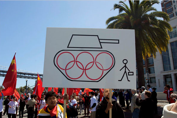
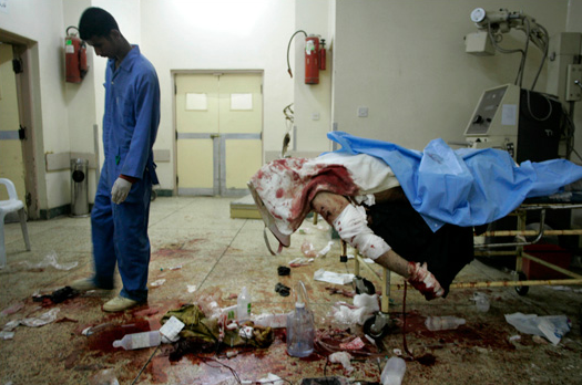
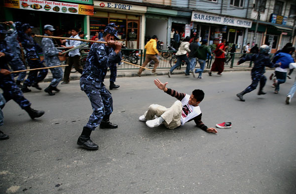
From time to time we comment on creative appropriations of iconic photographs. One image that has been frequently copied, parodied, and otherwise appropriated to various political and commercial ends is the photograph of the lone individual standing before a row of oncoming tanks in Tiananamen Square in 1989. The image has shown up with some frequency recently in protests against the upcoming Beijing Summer Olympics, as in this photograph of a rally in San Francisco that appeared this past week in the NYT. The iconic photograph (which is really three different photographs by three different photojournalists—Jeffrey Widener, Charles Cole, and Stuart Franklin—all shot from similar but nevertheless different vantages) is widely recognized throughout the western world, but interestingly, it has almost no visibility or recognition in China where it has been effectively censored.

We have written about the image somewhat extensively in No Caption Needed (the book) where we argue that the image activates a cultural modernism that displaces democratic forms of political display and opposition (remember that the protests in Tiananmen Square included thousands of students and nearly a million protesters in all who had organized in various groups) and plays to western conceptions of individualism and apolitical social organization. Thus, while the original photograph can function as a progressive celebration of human rights, it also risks limiting the political imagination to narrowly liberal versions of a global society.

We see the possible implications worked out to some extent in an ad for Chick-fil-A that parodied the Tiananmen Square photograph during the 2002 Peach Bowl. To see the ad click on the image below.

tiananman-square-cow.jpg

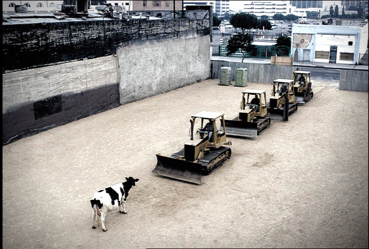
As we note in our discussion of the image in No Caption Needed, the ad’s sophistication speaks volumes about liberal-democratic identity construction. Key features of public dissent are recreated within a comic fame that allows one to enjoy them without actually becoming in any way committed to political action. Instead, identification occurs entirely with regard to a topography of private life: the viewer makes choices about small scale consumer consumption—where to drive through tonight?—that supposedly are choices between social conformity or individual self-expression. Cows cannot speak and consumers are not likely to speak out, but the comic imitation of a silent act of public protest makes consumption appear to be a public act. The democratic mythos of representing the will of the people to challenge authoritarian power becomes a vehicle for motivating completely individuated acts within private life. But the active agent with whom we are invited to identify is a cow with no voice. And there, of course, is the rub, for while the ad is witty, it nevertheless also masks a deep fatalism about individual powerlessness as it asks us to smile along when the brutal suppression of a popular movement is remembered as an argument to shift our allegiance from one fast food franchise to another.

Photo Credits: Reagan Louie/NYT; Chick-fil-A, Inc./The Richards Group. For our detailed discussion of the Tiananmen Square photograph and its many appropriations, see No Caption Needed, 208-41.

 2 Comments

The Global Neighbor: Behind a Glass Darkly

Photographers occasionally shoot images of people reflected in windows, framed by windows, or looking through windows. Such images can be visually distinctive while also prompting more reflexive viewing: one sees both the image and some aspect of seeing. The two images below are examples of this visual thinking, while also reflecting other conventions that mediate global communication.

afghan-window-veil.png

This photograph shows an Afghan schoolgirl. The good news is that she is in school–not a given in Afghanistan. The bad news is that the photographer has put her under the veil. The window screen stands in for the chadiri she is likely to wear as a woman, while the rip in the screen might be a trace of orientalist fantasy, one shaded further by the stain on her hand. The implication is that, despite being in school, she still needs to be liberated. She would welcome that, it seems, as she is looking not through the screen but through the tear. That gash in the screen could stand for poverty or accident, but it makes the screen appear the more inevitable. Although a close-up shot of a vibrant young girl, she remains on the other side of a barrier. That barrier dulls perception in both directions. She seems a lost soul, ghost-like, someone who can see and be seen but not someone we can touch or help, as she really is from another world.

There are others in that world.

china-window.png

This is actually only a temporary confinement, as they are passengers in a Chinese train delayed by heavy snow. But that news is the least of it. Surely this is a vision of the human condition of separation, of the transparent barrier that stands between any human being and another. One grips the rail and looks to the side, warily; he has learned to expect the worst. The younger man still can admit to his yearning to connect. He looks at us, reaches out and puts his hand to the glass, as if we might place ours against his, as if we could touch and not feel only the cold glass.

Each photo tells us that it is not enough to see; we also need to connect. The Biblical allusion in the title of this post is to the beautiful poem in 1 Corinthians 13. Now we see in a “glass” (in the oft-quoted King James translation, referring to a mirror) darkly, but when united with God we shall see face to face. This vision of heaven doubles as a vision of how humanity might live with itself. Indeed, it might be that one step to achieving heaven on earth is to see one another as if face to face. To do that, we have to not settle for merely being able to see through barriers that still dull empathy and divide one from another.

Photographs by Rafig Maqbool and Vincent Yu for the Associated Press.

 0 Comments

Sport on Planet Arrakis

One of the basic ideas of this blog is that photographs can depict more than what was happening in front of the lens. This added value can include highlighting larger patterns and processes and also providing imaginative projections of current tendencies. This is what some artists try to do by writing, and science fiction is particularly keen on exploring possible technological and political consequences of present tendencies. This comparison came to mind when I saw this photograph from Afghanistan.

sandcricket.png


The caption confirms that these are cricket players in a sandstorm. It also adds that they are on a “playground,”but something seems lost in translation. The scene looks more like something out of Dune (the book, not the movie). Recreation on the desert planet Arrakis may not be a lot of fun, but we can marvel at how humans can adapt to anything. At the same time, the imperial influence seems to be alien and superficial rather than any genuine improvement of the place. The storm and much more may pass, but there is something poignant about this image of human beings defined by arbitrary rules and shared isolation on their desert planet.

With this photo sitting on my desktop, I wasn’t entirely surprised when a second appeared a few days later.

morrocorace.png


You are looking at the competitors begin the 150-mile Sand Marathon in Morroco. The race includes a full marathon, and a 50-mile day, and others as well across varying terrain. The race has to be run while carrying all their equipment on their backs and getting only 9 liters of water a day. Again, the old fort, the desert, and the peculiar, imported form of ritual play by hardy adapters could be from Dune. Where one would think survival would be enough, more is achieved, but always by staying close to the severe limits of nature.

My comparison may be fanciful, but I can’t help but think that these photos are displayed for reasons that go beyond being visually distinctive or documenting unusual forms of recreation. They might also be images of a possible future. That would be a future not on some distant planet, but on this one, should it become ruined by some combination of unrestrained emissions, deforestation, warfare, and other forms of ecological destruction.

Photographs by Ahmed Masood/Reuters; Pierre Verdy/AFP-Getty Images.

 0 Comments

The Wall

fence-1.png

I hated that I was required to memorize poems when I was in the 8th grade. But I had one of those truly inspirational teachers by the name of Abraham Elias, and when Mr. Elias said memorize poems … well, I memorized them. I never imagined that it would become an useful exercise. But then I encountered the above picture in an LA Times slide show titled “Building a Better Fence,” and the words came tumbling out, almost as if I couldn’t control them:

“Something there is that doesn’t love a wall,
That sends the frozen-ground-swell under it,
And spills the upper boulders in the sun,
And makes gaps even two can pass abreast.”

The photograph is of a portion of the 15–foot-high wall fence that stretches 40 miles east of San Luis, Arizona and separates the U.S. from the Mexican state of Sonora. In case you can’t tell, that is Sonora on the right side of the wall fence and San Luis, Arizona on the left. When completed the wall fence will start in San Diego and extend in fits and starts some 700 miles along the 2,000 mile U.S./Mexico border. Sometimes walls fences are designed to keep people in, like was the case with the Berlin Wall, but here the wall fence is designed to keep people out, protecting the U.S. from its neighbors to the south. In our post-cold war era this is what we call “homeland security.”

The need for serious immigration reform in the U.S is real, to be sure, but a 700 mile wall fence across a barren dessert valley in the name of national security is … well … insane. Indeed, upon first glance my initial thought was that the photograph above was actually an April Fool’s Day joke, but then I recalled that President Bush had signed an order to start such an enterprise and that the U.S. Congress had actually designated an initial 1.2 billion dollars (of what is expected ultimately to be a 6 billion dollar expenditure) to begin the task. But even still, I had to check to make sure I wasn’t reading The Onion.

The photograph marks the absurdity, if not the futility, of such an effort. The wall fence, which looks as much like a crack in the earth as anything, extends from an unidentified “here” to an infinitely distant and unknowable “there.” Its scope is thus hard to imagine, all the more so as we recall that the wall fence itself will only cover one-third of the border dividing the U.S. and Mexico. The viewer is located on the U.S. side looking across the wall fence line into Mexico, but of course we know this only because the caption tells us so since the two sides of the wall fence are equally barren and desolate, virtually and otherwise indistinguishable from one another. The arbitrary and political nature of the boundary between the two nation-states and of the location and exercise of power to enforce the separation is thus pronounced. And more, the very thought that such a physical boundary can be sustained for any extended period of time seems to be mocked by the natural landscape of the desert which promises to encompass and contain all that would disturb its contours.

It is difficult to see the poet’s “ground-swell” from this perspective, shot on-high and from a distance, nor are the two-abreast “gaps” that render such structures altogether ineffective apparent, but rest assured that they are there or will soon appear. For historically that has been the nature of walls and fences, whether in Berlin or Belfast or Jerusalem or Padua or elsewhere. What they are designed to keep out always finds its way in, and what is being contained always finds a way to leak or leech out. And for all of their failures such structures only fortify and reinforce the obsessive paranoia and fear of the alien that led to their being built in the first place, one more event in a cycle of state driven violence that keeps us from discovering more humane solutions to our problems.

The poet had it right, “Something there is that doesn’t love a wall.”

Photo Credit: Don Bartletti/LA Times; and the poet, of course, was Robert Frost, the poem, “Mending Wall.”

 7 Comments

Lying to Tell the Truth about Hillary Clinton

The story of Hillary Clinton’s compulsive lying about being under sniper fire during a trip to Bosnia is already slipping away, so much so that she now is referring to is as a minor mistake. Well, I guess we should forgive and forget, right? (Wrong.) Before that happens, however, let’s take one last look at Hillary dodging bullets as she sprints across the tarmac:

clintonbosniajpg.jpg

As one astute reader put it at another blog, it depends on what your definition of “sniper fire” is.

Cynics will be gloating over this egregious example of how “all politicians lie.” That sloppy thinking only helps cynics and liars. Not everyone is in Hillary’s league, and she, not her opponent, has asked that people judge her on her judgment and experience. Note that character is not on that list, and the lie about her reception upon landing in Tuzla reflects both bad judgment and a misuse of experience. But, truth be told, her claim may have been not so much a lie in her own sense of things as a fiction–something not true that is told to convey a truth. OK, the snipers weren’t there, and she had to know it since she brought her daughter along, but you’ve just got to know that she is soooo ready to be a “war-time president.”

I don’t think earnest yearning excuses much, but if we grant Hillary any slack, she had better be ready to concede that visual commentary might tell the story slant to get a better sense of the truth. Like this:

iwo-cartoon-hillary.jpg

Editorial cartoonists love to use the Iwo Jima icon. This one may seem a tad unfair because of how the icon is gendered, but, again, it’s Hillary who has said she’s the only one who ought to answer the mythical National Security Phone. What is more telling is that she is facing the viewer. In contrast to the anonymity of the soldiers laboring together selflessly on behalf of the nation, she is jumping in unbidden to serve personal ambition. Of course, she wasn’t claiming to be a soldier, and there are no bullets in the iconic photograph of the flag-raising, but the cartoonist has revealed more than one problem with Clinton’s lie.

Hillary got caught telling a whopper; perhaps she ought to be given a dose of her own medicine. Some people wish it could be her Dukakis moment–that is, the equivalent of the 1988 Democratic candidate’s mistaken photo-op, when a shot of him riding in a tank became a defining moment of the campaign and one reason you don’t hear references to “President Dukakis.” That episode may be why you can see this image online today:

hillary-tank.jpg


Really, really unfair. I’m just broken up about it.

Photograph by the Associated Press. Cartoon by Joe Heller/Green Bay Press-Gazette (March 31, 2008). Photoshopped image by registered@aol.com. For scholarly discussion and examples of the use of the Iwo Jima template in editorial cartooning, see Janis L. Edwards and Carol K. Winkler, “Representative Form and the Visual Ideograph: The Iwo Jima Image in Editorial Cartoons,” Quarterly Journal of Speech 83 (1997(: 269-89, and Hariman and Lucaites, No Caption Needed, at pp. 121-124 (on Iwo Jima) and elsewhere.

 3 Comments

The Face(s) of Death

4000.png

The death toll for Americans in Iraq reached 4,000 on Sunday. “It’s a sober moment, and one that all of us can focus on in terms of the number.… The president feels each and every one of the deaths very strongly and he grieves for their families. He obviously is grieved by the moment but he mourns the loss of every single life.” Or at least that is what one of his surrogates reported as President Bush himself was too busy entertaining the Easter Bunny on the South Lawn of the White House to acknowledge and address the gravity of the moment.

The number of U.S. casualties is really rather hard to get a handle on, and the administration treat it as something of a shell game. When it is pointed out that we have reached something of a milestone with 4,000 deaths there is an effort to deflect the magnitude of the number by mourning “every single life”; when attention is turned to individual deaths the focus shifts to how the overall number of deaths has slowed since the beginning of the “surge” or how, as Vice President Cheney emphasized today, “every casualty, every loss” had joined the military voluntarily (as if that somehow mitigates the tragedy of their loss or soothes the pain of their families and friends).

Of course, visually representing the relationship between individual and collective is always a vexing problem. Since social and political collectives are corporate entities constituted by more than the sum of their parts, it is difficult to put the whole on display in any demonstrably real or objective manner. All we can ever really show is a part that presumably stands in for the whole, such as when large groups of people saluting the flag stand in for “the American people.” The typical strategy for representing the collective is through opinion polls or charts and graphs which aggregate individuals into statistical displays. The problem with this approach, of course, is that it removes all sense of the individual from the equation, literally reducing people(s) to abstract numbers. So it is that we can report that the average American family includes 2.6 children.

The NYT has addressed this problem inventively with a graphic representation that literally “puts a face” on war casualties in a manner that imbricates individual and collective losses in an interactive image that holds each in a kind of suspended animation, both the “one” and the “many” present at the same time with neither yielding their magnitude or significance to the other.

What we have above is a photo/graphic representation of David Stelmate, U.S. Army, age 27, who died on March 22, 2008. His face is made up of 4,000 squares, each one representing one of the other 3,999 U.S. deaths since the beginning of the invasion and occupation five years ago. When you click on any single square the name of one of those others appears; if you double click on it the large image changes to that individual. Below, for example is Jay T. Aubin, age 37, a U.S. Marine who was among the very first to die on March 21, 2003. To get to his image you would double click on the first block in the lower right hand corner of the graphic. To see how it works click on either the image above or below.

auben.png

Looking at these “faces of death” is excruciatingly difficult, all the more so when we condition ourselves to recognize how each demands that we take account–and responsibility–for the combined magnitude of individual and collective loss simultaneously. These are not just 4,000 Americans, but also and simultaneously 4,000 individuals: husbands and wives, mothers and fathers, sons and daughters, sisters and brothers, friends and, yes, even strangers. And as you gaze upon these faces what you need to acknowledge is that even though the “number” of American deaths in Iraq has gone down since the surge, we are still losing American lives at the rate of “one a day” and there does not appear to be an end in sight. 4,000 American deaths–and lord knows how many Iraqis; a “sobering moment” indeed.

Photo Credit: Gabriel Dance, Aron Pilhafer, Andy Lehren, Jeff Damens/New York Times

Note: For a non-interactive variation on the this visual theme that uses the faces of the dead to create a mosaic that underscores both the magnitude of the collective loss and emphasizes cupability, see this representation at the Huffington Post.

 3 Comments

Iraq War Anniversary: Notes from the Charnel House

“Anniversary” hardly seems like the right word, but that’s what is being used to mark five years of war in Iraq. The New York Times is devoting a lot of print and digital coverage to the start of the sixth year of the war. Their interactive time line is particularly depressing, not least because the Times still isn’t admitting to its complicity in the rush to war. For example, the photo selection suggests that Saddam was a casus belli and that the toppling of his statue was a popular uprising rather than a media event staged by the military in concert with our puppet du jour and international pariah Ahmed Chalabi. Even so, the truth gets through. Like this:

iraqi-hosp-dead.png

I can barely stand it. Death–stupid, senseless death–is right there in front of us. And mess–the unholy mess of war and especially of this miserable, unnecessary, pathetic war. The whole scene is an allegory: the room obviously is not equipped for the emergency that has developed; the mutilated body (politic) has been bombed and then abandoned, leaving only horror and waste and indignity.

The photograph accompanies notes from the field by the photographer, Max Becherer. The caption reads, “A hospital worker in Kirkuk cleaned up after doctors tried, and failed, to save Mahmood al-Obaidei, a car-bomb victim, in 2005.” What hospital worker? I hardly noticed the orderly, who could as well be a department store mannequin. If you look closely you can see that he is alive but hardly a model of can-do professionalism. Nor can you blame him, as he too is dispirited, pushing a piece of the carnage with his foot like a kid with a mashed toad, not able to leave and not knowing what to do now that nothing really matters any more.

Becherer reports that minutes before the staff had been working furiously to save the bombing victim, who was responding to a defibrillator, only to have the power go out. Mahmood al-Obaidei, Kirkuk, death due to roadside bomb and power failure. The same could be said of the occupation.

Photograph by Max Becherer/Polaris for the New York Times.

 6 Comments

The Lone Red Shoe

protest-1.png

It is hard to look at the images of the “riots” in Tibet and the Chinese provinces and not be reminded of our own history of human rights repressions, and especially the violence that erupted across the South in the early 1960s. Just as then, those animated by a commitment to non-violent protest and resistance are being accused of causing the disturbance. And just as then, the visual evidence seems to give the lie to the claims by those defending the repressive regime—or at least it did until the Chinese government began to censor internet sites and to expel foreign journalists. And perhaps with good reason …

The Chinese government maintains that the police and military have used “restraint,” refusing to “open fire” on the crowds. That might be true enough (though there are conflicting—albeit unconfirmed—reports of nearly 30 Tibetan Monks being shot by the police in Aba, Sichuan), but the photograph above from Nepal and others like it would seem to give new meaning to the word “restraint,” at least as it is used by governments in the area. The lone individual laying in the middle of the street seems to be helpless, and even if he had previously been “riotous,” here he certainly isn’t much of a threat to anyone or anything, least of all a squad of riot troops who could easily detain and arrest him if that was their goal. And yet the soldier about to beat him with a baton has his legs spread and weight back to bring the full force of his weapon to bear upon the face and head of his target, a victim who can only feebly attempt to ward off the blow.

What makes the photograph all the more difficult to look at—and yet also somehow hard to look away from—is the red shoe left sitting in the middle of the street. We can only assume that whoever lost the shoe literally ran out of it in a frantic effort to escape the oncoming mayhem. But more than that, it is only a flimsy canvas shoe, a stylized covering for the foot that offers the merest of protection. Notice how it sits in stark contrast to the heavy leather boots worn by the approaching troops. And thus, the photographer has revealed the sense in which the supposed physical threat posed by the protestors is no threat at all. What we have here, then, is an image not of restraint but of brutality. The difference between the shoe and the boot marks the fundamental inhumanity that all too easily results when established regimes set out to suppress ethnic and sectarian differences. We’ve seen the inhumanity before, and not just in foreign lands.

But there is more, for the image of the lone shoe also invites comparison with another photograph taken during the Burmese government’s brutal suppression of protests challenging its violation of human rights. That crackdown occurred in Myanmar this past September:

yangon-myanmar.png

The obvious difference is that here we have hundreds of shoes and sandals, not just one, and so the magnitude of the situation is somewhat more pronounced. But now, the street, virtually empty with the exception of a single individual lurking in the margin, is being guarded by troops as if democracy will arise spontaneously from the shoes and sandals left lying around. And it might, for that is the mythic promise of the democratic movements that the Chinese and Burmese governments fear. My fear is that it will take more than simple faith for sandals and flimsy shoes, however numerous, to challenge jackboots in any effective way. This is not to say that it cannot happen, but it will surely take more than lone individuals to forge the battle, whether lurking in the shadows or standing up against tanks in a public thoroughfare.

Photo Credits: Euan Deenholm/Bloomberg News; Mandalay Gazette-AFP/Ghetty Images

 6 Comments

The Political Mask

Everybody knows that politicians are two-faced. They say one thing and mean another, or promise something to one audience and promise the opposite to someone else. They smile and smile and smile and we know that nobody can feel that happy. We know that they are supposed to put up a good front but have to be someone else inside, and so we don’t trust them. And then we go and vote according to how we like them or how we judge their “character.”

So it is that the politician’s face deserves some attention. And gets it. The photograph below is one of several that have featured the candidates up close and personal. Too close, perhaps:

obama-in-lens.png

You are looking at Barack Obama through a television camera viewfinder. Surely this is one example of the lengths to which photojournalists will go to create a distinctive image that might be picked out of the thousands sent to photo editors each day. This is distinctive and more. Some might say it’s a hatchet job–cutting Obama’s head away to make him look grotesque. Could be, but it also captures some of the elements of the presidential campaign as it is almost completely embedded in and defined by the media.

We could caption the photo “Moon Man.” The visual allusion is at once to the man in the moon and to an astronaut (think of the film 2001: A Space Odyssey). In either case he is far away, distant, almost alien. He also appears to be behind heavy glass, as if on the other side of an air lock. In fact he looks trapped in there, encased in the media apparatus of the campaign, ready for launch but also in danger of running out of oxygen.

The more you look, the worse it gets. The dark framing on the bushy brows, direct gaze, and exposed teeth might appear menacing to some, but look closer. I see someone assuming the look not of a predator, but of someone’s prey. The cross-hairs are just about dead center while he seems immobilized, caught in the hunter’s scope, stunned by the glare of a sudden flash, almost imploring us to help him. All we can do is stare and in staring note the moles, the pores, the creased skin–all evidence that here, in this twice mediated, highly distorted image, here we are actually seeing a real face.

But not the only one:

hilary-face.png

Again, it may have been taken for its novelty value, but it succeeds as a work of art. I won’t say this is Everywoman, but she is one very tired woman. She also is someone whose long experience with fatigue is matched by deep reserves of strength. Most of the American public have not a clue about how grueling the presidential campaign is, but you get a glimpse of it here.

I’m not backing Hillary in the campaign for the nomination, but I’m touched by this photograph. Perhaps it’s the contrast with the conventional shots of candidates smiling (much less the manic, bug-eyed shots the press likes to serve up about Hillary). Likewise, the closed eyes offer her to the viewer, as opposed to the demand placed by eye contact and the campaign generally. That’s only part of it, however. As with Obama’s image above, the dark framing isolates the face and all it stands for. But where Obama looks trapped, she has been exposed. We see her make-up and a tracery of wrinkles in spite of that. This, too, is an image of vulnerability. And look closer: it could be a death mask.

It certainly is a mask–and this is the photographer’s achievement. We are shown the candidate in an unguarded moment, one in which she is doing nothing to please anyone, and, sure enough, she is wearing a mask: the make-up, the disciplined concentration, the facial mask itself. And it is for precisely that reason that we can be sure we are seeing a real person.

Photographs by Damon Winter/New York Times; Carolyn Kaster/Associated Press.

 4 Comments