Dec 19, 2012
Jan 21, 2008
Dec 23, 2016
Oct 11, 2009
Feb 05, 2008
Aug 03, 2007

The News from Photos

It is difficult/to get the news from poems/yet men die miserably every day/for lack/of what is found there.

These words by William Carlos Williams stand as a critique of the news media and a challenge to the reading public. Even if the mainstream media cannot change, the question remains of what one should be reading and how one should read. Williams suggests that we are either reading the wrong things or reading the right things obtusely. Certainly the wars go on and men die for not knowing what they should know.

That said, I have never trusted the distinction between poems and news, political deception and artistic truth. You can find both artistry and bad behavior on both sides, and no democratic society can live on poetry alone. One place where art and news intersect is photojournalism. Applied there, Williams question acquires more precise reference: Are we getting the news–the real news–from the photograph? To do that, it would seem, we have to learn to recognize its poetry. And the difficult task would still remain: to see what can be found there that is not available in the photo’s reportage.

This is the ideal to which this blog strives, however fitfully. It should be applicable to any photograph. Today, I’m taking one that has been sitting on the desktop for two months. I’m not sure what I was waiting for, but one answer is that I was waiting for what has happened: amnesia. The photograph was featured item in a New Yorker report on the demonstrations against the brutal dictatorship in Burma.

murdered-monk.jpg

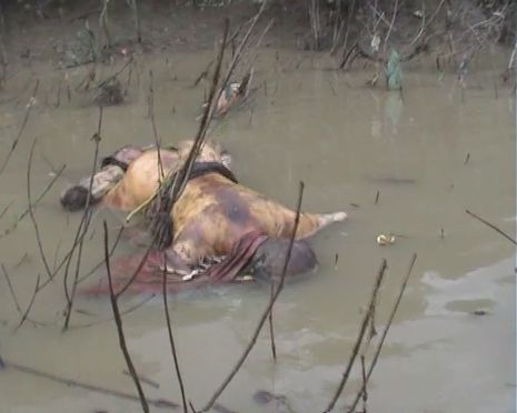
Certainly there is ordinary news here. Monks really were killed, whatever the government might say to the contrary. But what lies deeper than that? The New Yorker commentary provides one answer: the image “shows totalitarianism in its most physical form: the elimination not just of an individual’s life but of his value.” This observation followed a vague comparison to other atrocity photos. I think there is another, more patently artistic comparison that reveals a second truth.

The force of the photograph comes in part from comparison with standard images of Buddhist serenity. All the elements are there: the still pond, isolated reeds, monk in repose, all composed in simple aesthetic harmony reflecting alignment with the cosmic order. Surely this monk is undisturbed by desire, surely he is in harmony with his natural surroundings. Although his stillness is foreign to us, there is no doubt that he is close to God.

But, of course, the photo depicts not that image but rather its terrible perversion. The pond is still but filthy; the monk is serene because dead; his union with the cosmic order has begun via the body swelling with putrefaction. In place of the harmonious life, he has died miserably.

Cynics could say that he died because he did not understand the poems he had been reading. Would Buddha have taken to the streets? Well, Buddha did take to the streets, in Burma, and now the question is what we are to learn from that. I think the news of this photograph is that Burma has been turned into an ugly, brutalized semblance of what it was. The totalitarian society is one in which everything is the same and yet brutally perverted, violated and then recomposed as if the same as before. The news goes further. This process of violent, destructive, brutalization is going on across the globe. Not everywhere, but in too many places. As with totalitarianism in the 20th century, it happens when modern technologies are placed in the service of a primitive will to power, and when the rest of the world stands by and watches or forgets.

And so there really is no news here after all. And that may have been Williams’ point.

The photograph is a video still taken by a reporter for Democratic Voice of Burma; the epigram is from Williams’ “Asphodel, That Greeny Flower.”


Digg!

 3 Comments

The Familiy of Man in a Digital World

family-1.png

Writing in Newsweek recently (12/1/07), Peter Plangens reprises an argument that seems to emerge every now and then about the death of this or that medium or art form as it is confronted by newer and different technologies that somehow undermine its “aura.” Walter Benjamin probably made the most famous, recent version of the argument in “The Work of Art in an Age of Mechanical Reproduction,” but let’s not forget that it has a lineage that goes back at least to Plato’s critique of the technology of “writing” and its impact on the importance of the spoken word.

Plangen’s concern is photography, and his claim is that the “explosion” of digital technologies has created a medium that has “lost its soul.” Photography’s “soul,” apparently, is its connection to the “real,” for, as he puts it, “no matter how much darkroom fiddling someone added to a photograph, the picture was, at its core, a record of something real that occurred in front of the camera.” That was the original allure of photography, of course, but it was more a hope (or a faith) than an objective reality. And it didn’t take take avant garde photographers like Cindy Sherman to show us otherwise. Indeed, from the beginning the history of photography is replete with a wide range of examples that make the point, not least the work of prominent and important documentary photographers like Alexander Gardner during the Civil War (with his sharpshooter photograph) or Arthur Rothstein during the Great Depression (with his skull photograph). And these are not lone instances.

That said, while the advance of digital technologies has altered the way in which we think about and use photographs—and very clearly has reinforced a postmodern cynicism about realist representation that seems to worry Plantgen—it has also arguably invigorated photography as a cultural practice, enabling something of a rebirth out of the ashes of modernism. That rebirth includes not only a much wider democratization of the use of photography—witness the millions of digital cameras in everyday usage, many contained in cell phones that are carried about as a matter of course like one’s wallet or purse—but also in its capacity (in the words of Patrick Maynard) to “enhance and filter human power” in a broader spectrum of visual possibilities.As an example, consider the photograph above that was recently published in the on-line version of the Washington Post. It is a stand alone photograph of 55 year old Angel Lopez, the patriarch in a family of five who were unable to find refuge in a Bronx city shelter and were forced to spend the night on the streets.

It is a compelling and affective photograph, all the more so given that there is no story that accompanies it other than the caption which identifies Angel and his family members as “A Family in the Streets.” Shot in a middle space between the camera and a long street that invokes the conventions of classical perspective, distance is privileged as an aesthetic, bringing us closer to the homeless than we might imagine that we need – and perhaps would prefer – to be. Angel is in the very center of the image, his eyes making contact with the camera in a manner that demands recognition and a response. But what could his demand be? Clean and neatly dressed, he doesn’t seem to be the stereotypical homeless person or skid-row bum, and in any case the crutches make it clear that he has a hard time helping himself and thus stands in need of our care. In its own way the photograph is vaguely reminiscent of Dorothea Lange’s “Migrant Mother” with its projection of social responsibility for others. But, of course, it is hard to know.

Now click on the picture. A quick time movie should open in a new screen. Give it a moment to load. What we have here is a 360º panorama of the scene. Now we see not just Angel, but all of the members of his family. We are now pulled into the scene more directly as we see (and hear) Angel and his family briefly reflect upon their plight. While they all appear to be looking at the camera in their turn, they also seem to be interacting with one another as well, thus suturing the viewer into the scene in a manner that dictates a more complex social register. This last is underscored by the interactivity of the medium itself as the viewer can zoom in and out of the scene by manipulating the “+” and “-“ buttons on the screen.And with each click, of course, the social and political dynamic changes, pulling us in or pushing us out. But even as we zoom out and distance ourselves from the scene we are forced to take account of the full panorama.

No more “real“ than the earlier photograph, the panorama nonetheless invites and invokes a different affect, a different social and political interaction with the image; and I would argue it is at least potentially a more progressive kind of interaction because it doesn’t allow for a simple passive turning of the page. The image is still controlled in some measure by the camera and the photographer – the frame remains as a constraint on what we can see and know – but as a technology the photograph now filters the relationships between Angel and his family, the street, and the absent state in a somewhat fuller and more engaging fashion. Whether this increases or decreases our sense of compassion or willingness to work to make sure that such situations don’t persist is hard to say, but it would be interesting to consider how such usage would have altered the affect of 1930s FSA photography or Edward Steichen’s 1950s Family of Man exhibit (not to mention, say, the scene of a bombing). But however we evaluate the particular affect of this panorama, the larger point here is that the “soul” of the photograph is not contained by the particular technology of mediation per se, but is rather a function of how such images are received and used (or abused).

As long as we actively make and use photographs – engaging them and talking about them, drawing from them as markers of our sociality, as well as questioning and challenging their politics and affect – they are not likely to lose their soul as a simple function of the particular technologies through which they are enacted, be it framed in terms of the the “magic“ of the nineteenth-century daguerreotype or what Plangens blithely refers to as the “fairy tale” fantasy of Photoshop.

Photo Credit: Travis Fox, Washington Post; and with credit to Patrick Maynard, The Engine of Visualization: Thinking Through Photography (Cornell UP, 1997).

Update: For another critique of Plangens at American Photo go here.

Digg!

 6 Comments

The 21st Century Carcass

In 1906 Upton Sinclair published The Jungle, a muckraking novel that alerted the American public to the horrors of the meatpacking industry of the time. Millions of workers and all American consumers have lived longer and better lives as a result. Conditions have improved drastically since then, but safety remains a continuing problem in industrialized meat processing. The slaughterhouse is still a dangerous place to work, and meat periodically becomes contaminated. The latest threat is from a toxic strain of e coli. This despite surprisingly clean plants, acid baths, steam vacuums, and sophisticated testing. Needless to say, when it comes to survival, the bacteria have the edge. To give you a view of the steps being taken, the Times published this photo:

meat.png

It’s not often that photographs from the business page merit comment, much less awards. This one is typical. The focus is split between the objects in the foreground and the person in the background. Neither is the point of the picture, which is to show an industrial process. The diffusion is emotional as well. The photo communicates above all a sense of routine, ordinary, another-day-another-dollar activity; nothing to write a novel about. The conveyor belt moves things along, the worker directs a spray of water here or there, all against an unexceptionable background of white wall and grey pipes. You might be interested in how your meat is handled, but not to worry.

This ideological framing of viewer response is what is most typical about this business page photograph. What most interests me is the photograph’s distinctiveness, which is the brute presence of the carcasses. These amputated trunks are no longer animals, yet they are not yet slabs, much less cuts of meat. They are huge, visceral, bulging with muscle, bones, organs, everything that was alive but now is raw weight.

There is something scandalous about this image. One sees a packing plant and the anonymity of death; an industrial process, and the humiliation of being reduced completely to a condition of utility. Above all, there is again the massive reality of the carcasses. They are once living things now reduced to things, and yet they still resist somehow. Against the inevitable processing by both factory and camera, they remain massively, unintelligibly real. This is a scandal in the 21st century: against all attempts to transform everything into a virtual world of effortless consumption and digitized representation, some things refuse to surrender their reality.

Of course, those carcasses no longer exist, but the e coli do. The photograph of the carcasses can be a simple reminder that production is hidden during consumption; that is true of every form of production, including writing. Or it can be a scandal–literally, something that snares, in this case, that snares our attention. The hulking things in the photograph should snare our attention, they should offend the sensibility being constructed by the photograph, they should give offense to the idea that everything in our industrialized food production is doing fine as long as it is running smoothly.

Photograph by Kent Sievers/New York Times.

Digg!

 2 Comments

If Can't See Guilt, Can We See Character?

Discussion of a recent post raised an important question about visual thinking. In commenting on a murder suspect’s strategic manipulation of press coverage, I concluded that he still looked guilty.

Of course, I wouldn’t convict on that, and an astute reader noted that “the appearance of ‘innocence’ can only be another act,” and so it seems that there is no point whatsoever to looking for either guilt or innocence in how a person appears in public. And that’s before considering the role of racial, ethnic, and other forms of social bias in perception.

The focus of the earlier post was on the use of appearances rather than their accuracy. But what about their accuracy? I think most people would agree that you shouldn’t judge guilt or innocence on the basis of how a person looks. When that happens–and it does happen–the results include both false convictions and a free pass for con artists. But if that is true, why do we think we can see character?

And we do think we can see character. Scientists report that infants already are paying close attention to facial cues. People are constantly and often accurately discerning that others are in this or that mood. As we get to know people, we sometimes can read much deeper elements of personality on the basis of a glance. Photographs are used the same way, not least to communicate emotions. John and I have been reading social experience, attitudes, and ideas off of photographs for five months now and we rarely are called on this point. As long as the photographs are dealing with known individuals such as Bush, representative figures such as the latest casualty in Iraq, stock social types such as students, or common experiences such as shopping, there is little to be worried about. Whether right or wrong about the individual in the frame, the image provides a basis for conversation about those things that define collective life. And the court of public opinion is not a court of law.

All of this is a long introduction to another photograph:

musharraf.png

You are looking at Pakistan’s President General Pervez Musharraf reviewing an honor guard with his hand-picked successor, Gen. Ashfaq Kayani. There was this little problem of being a “President General”; fortunately, that term still embarrasses Musharraf’s patron, the US. So Musharraf has turned over direct control of the military, the better to maintain US support for his dictatorship. The transition involved a series of rituals, including a tearful speech. The tears may have been heartfelt; again, that is not the important question.

I’ll cut to the chase: I think we can see character here, and these guys are thugs. If that is too harsh, how about “hardened autocrats.” Of course, they will look otherwise in family photos, just as they will have behaved otherwise when playing with their kids. They may not be thugs all the time: just when in power or maneuvering to stay in power. So what? Any dictator can have a good side. The question is what side will be in charge when power is at stake. I think we can see the answer in this photograph. Musharraf may be a dedicated warrior against Islamic fanaticism, but he is no more a democrat than is Gen. Kayani.

And now for the quiz. What do you see in this photo: the appearance of innocence, or the character of an autocrat?

mush-on-stewart.jpg

Perhaps the question should be, if we can see character, why can’t we see guilt? One answer is that guilt is an assessment of past conduct involving a violation of a law, and these things are not to be seen in the present. There also is the complication of distinguishing between legal and psychological guilt, not least because some people need not hide guilt because they don’t feel it, while others can feel guilty for crimes they never committed. But perhaps there is another answer: the guilt is there to be seen, were we but able to see it. I would never convict on such evidence, but I can’t help but think that there is more to be seen than we realize, and that seeing it might get us closer to justice.

Photographs by Anjum Naveed/Associated Press; Digg screen grab of the You Tube video of Musharaff’s interview on The Daily Show with Jon Stewart.


Digg!

 2 Comments

Dueling Cameras in the Peterson Case

The wife of a police sergeant disappears, and stays disappeared. Turns out that she is–or was–his fourth wife, and the third wife had expired in suspicious circumstances, and the cop may have been using police department computers to get information on his (fourth) wife’s friends, and the story gets curiouser and before you know it, he resigns from the force while becoming both a police suspect and the hot story in the Chicago media.

And they say the suburbs are dull.

Even if this guy beats the rap, it’s clear there is much not to like, but that’s his business. My interest in how he has provided a lesson about the visual public sphere. Peterson clearly has adapted quickly and dramatically to the media mob camped outside his house. Here’s where he started:

dad-american-burqa.jpg

The caption read: “Bolingbrook Police Sgt. Drew Peterson — whose wife, Stacy, has been missing since Sunday — steps outside his home for a few seconds as police investigators search his home Thursday. Asked about whether he was nervous, Peterson told the Tribune, ‘Why should I be nervous? I did nothing wrong.'”

Now it can get chilly in Chicago in November, but you don’t have to cover your face. I thought of doing a separate post on this photo and calling it “American Burqa.” By bundling up against the media gaze, Peterson is challenging our norms of public visibility. Some of us resist the demand to be seen, as when we wear sun glasses inside or ball caps pulled low, but that is always within the range of legitimate withdrawal into a zone of privacy. As Peterson shows, all you have to do is cover the face itself and your display of autonomy is no longer acceptable. No wonder the guy looks guilty as hell. The picture says, “withholding information, hiding something, and a law onto himself.”

It is easy to conclude that this strategy of hiding in the light is not so smart. But don’t conclude that Peterson is not cagey. The jacket and jeans combo, NYPD ball cap, and flag bandanna scream “selected for symbolic value.” He may not be nervous, but he is trying to put some visual spin on a bad situation.

Turns out that he’s also coachable. I’m speculating here, but I’ll bet he got a lawyer and some help on the presentation of self in public. Because this is what we saw more recently:

peterson-cameras.jpg

Whoa! Is that the suspect or his lawyer? Comfortably striding along in middle class attire, he turns his video camera on the press. Instead of denying the norm of public visibility, he ramps it up, creating a hypervisual scene of cameras recording cameras recording cameras. Instead of passively hiding in full view of an unseen camera, he aggressively records the press, thereby bringing them into the picture. Instead of looking isolated and guilty, he declares that he has nothing to hide while the press is unfairly ganging up on him.

He’s catching on, isn’t he? This is what conservative politicians and media flacks have been doing for years: shifting the focus from their actions to the media coverage, which then is denounced as excessive and unfair. You can’t paint Peterson completely with that brush, however, as his brash act has another, more distinguished lineage. This includes Garry Winogrand, a photographer who focused his camera on the technologies of media coverage (see his 1977 book, Public Relations), and, behind him, Walter Benjamin’s argument that photographic artifice depends on hiding the equipment. By exposing the cameras trained on him, Peterson has not only adopted a sophisticated strategy for deflecting the gaze, but also activated a more reflexive awareness of the role of photojournalism in shaping the story.

Even so, I think he still looks guilty as hell. It’s probably the smile. . . .

Chicago Tribune photographs by Antonio Perez (November 1, 2007) and Terrence Antonio James (November28, 2007). Thanks to Elisabeth Ross for reminding me of Winogrand’s work, which was included in her presentation on “Private Eyes and Public Lives” at the recent Northwestern University conference on Visual Democracy.


Digg!

 6 Comments

Mug Shots, Portraiture, and the Verdict of History

You might as well know that recently it’s been getting harder by the day to post at this blog. As far as I can tell, the press is rolling over to accommodate the neocon line that the surge has worked. According to that argument, any bad news now demonstrates that the liberal media refuse to change their script. Since violence is down, there must be a turn for the better, and so the president was right, and the press had better put up or shut up. Perhaps it’s a coincidence, but now we are getting little beyond but photo-op images of officials at press conferences, leaders walking together, soccer games in Iraq, and the like. And this is before we get to the soft news fare for the holidays. . . .That’s why it is heartening to see this image from the Art & Design section:

runsfeld-mug-shot.jpg

This is one of a series of prints by Nora Ligorano and Marshall Reese entitled “Line Up.” Each diptych presents a Bush administration official as if being booked for lying about Iraq; you can hear the vocal recording of the lie while you look at the print. They are on display as part of an exhibition of contemporary prints at the New York Public Library. According the the New York Times, “Line Up” has “prompted protests from some library patrons, attracted coverage by The Daily News, Fox News and USA Today, and has stirred the blogosphere.” It’s not often and probably a bad sign that the action is on the third floor of a library, but I’ll take it.

Of course, the Times doesn’t say that Bush administration lied, only that one can hear each “statement of questionable veracity.” And maybe it really doesn’t matter: the disaster is so comprehensive, the carnage so devastating, the loss of American lives and wealth ($3.5 trillion, according to the latest estimate) so permanent, it’s not worth arguing over this or that fragment of administrative speech. Better perhaps to look at the artwork and see what it has to tell us.

The joke comes from putting a high official in a mug shot. The humor actually runs rather deep: it can suggest that the offense could go beyond false statements; or that these officials are no better the the leader they deposed, Saddam Hussein, who also suffered the indignity of a mug shot; or that in a better world the Arlington police would arrest war criminals the same way they arrest common criminals.

But I think the joke is only the vehicle for a more interesting point, which is made by the fact that the photographs are of portrait quality. Sans the ID sign, the work could double as a heavily framed painting to be hung on the walls of the halls of power. When framed that way it becomes a character study. Forget the lie, but look at the habitual squint of a calculating man, and the assertive posture of a verbal warrior. The man on the left readily adopts a defensive position as he assesses, tests, counters, and feints while planning his rhetorical offensive. The man on the right is on the assault, a model of both composure and intensity as he rains words down relentlessly on those before him. Think of how easily these same portraits–these same characteristics–could be celebrated had the disaster been anything less than one of historical proportions.

Just as the neocon pundits are cowing the press, they will try to do the same with the history of the war. Willful blindness will become decisiveness, rigidity will be the courage of one’s convictions, immorality will be accepting the burden of leadership. (To understand the cause and consequences of this attitude, see Thucydides’ History 3.82-84.) They will spin the pictures the same way they spin the words. But thanks to two printmakers and the New York Public Library, it now will be a bit easier to see what was wrong.

Photograph by Jim Kempner/Fine Art.

Update: Michael Shaw of BAGnewsNotes posted today on another work from the “Line Up” series, one featuring a somewhat clownish Cheney. I couldn’t quite put my finger on what was odd about that piece, but Michael nails it.

To buy postcards of some of the images, go here. From the ad at Pure Products USA, it seems evident that Michael and I each saw one of the two faces of the exhibit. It involves parodic portraiture, and some images (e.g., of Cheney) emphasize the parody and others (e.g., Rumsfeld) the portrait. You can see the very powerful video installation here. A t-shirt is available here.

Digg!

 3 Comments

Public Health and the Cancer Ward

She doesn’t really have cancer. Nor does she die. The emphysema patient in this photograph is now walking without oxygen, enjoying her renewed appetite, and “‘very, very happy.” Thus, the title of this post, like the photograph itself, tells a lie.

or-patient.png

Or does it? Let’s first identify what’s misleading about the photograph. We see an OR/intensive care patient looking as if she has been left to die. Head and hand reveal her pale skin that is otherwise shrouded in layers of white, as if already prepared for burial or fading into some gauzy realm of the spirit. The turn of the head and lifeless droop of the hand suggest that she has no energy left. All but one of the staff in the room has turned their backs to her, and he is intently focused on something else. It’s as if she isn’t there or is already inanimate. Hooked to machines at each end of her body, their currents seem to flow through her uninterrupted on to the monitor hanging overhead that shows only a test pattern. The metal table could be used in a morgue. She is placed in the vanishing point of the picture.

Louis P. Masur deftly summarized a standard criticism of photography in a recent review: “‘The devious lie of a snapshot’ is a marvelous phrase. It is not the photographer who is devious, but the snapshot itself, which isolates and freezes action, disconnecting it from context and sequence.” (Masur is quoting photographer Thomas Hoepker.) This cautionary note would seem to apply directly to the photograph above: what looks like a death scene is in fact a woman beginning her recovery from disease to life.

I think there is more to be said, however. The image accompanies two stories, one about an operation used to treat emphysema sufferers by removing sections of their damaged lungs, and another, much longer front page story about how a past smoking boom among woman is now a major killer. As deaths from chronic obstructive pulmonary disease are rising like smoke in an updraft, and medical costs scaling upward along with them, considerable attention is being focused on the various techniques being mobilized to manage the disease. One strong theme of the story is that we must avoid blaming the victims. OK, but why was nothing said about blaming the tobacco companies, who are not mentioned in the article? We are to not blame individual patients, but we also are supposed to focus entirely on individuals. The disease is an “epidemic” but apparently not a public health problem having a common cause.

So there is something right about the photograph, in that it reproduces the newspaper’s framework for the story, which in turn is not merely a compositional strategy but one that reflects key features of how American health care is organized. When disease appears, the medical patient is the center of our attention, and she will live or die according to how well the society mobilizes high-tech, capital-intensive medical treatments for each individual.

The photograph can lie, but it also reveals.  This photo depicts three forms of inattention built in to our health care system: First, the photo depicts how medical staffers in the room are completely indifferent to her because she already has received their expert care; they know that there is little to worry about as they debrief, clean up, and make the transition to the next case. Second, because they are on the job, we don’t have to pay attention unless we’re likely to end up on the OR table. Epidemic? Not to worry. Third, by focusing on the effects and not the causes of the epidemic, the image models an artificial blindness regarding the causes of a serious public health problem: we are to not see the tobacco companies that work relentlessly to addict people to their carcinogenic drug.

I think the truth of the photo goes beyond its inadvertent performance of a form of blindness. Some of the bad news is seeping out of the frame. Look again at the scene, particularly at the swirl of wires and the rat’s nest of electronic gear. We are looking at a real place of work, but also a society that is held together by a snarl of gerry-rigged connections always on the verge of being jostled, bumped, or broken. It works because there is a lot of expensive equipment combined with serious, no-frills professionalism, but it also is a messy assemblage without any means for doing anything other than responding to disasters seemly not of its own making.

The room is functional but closed off from thinking about public health. The work done there is miraculous but very costly. The operations interrupt suffering but do nothing to prevent it. When her care is structured by the American health care system, the patient is in good hands, but she may be in a cancer ward after all. The question is not whether there is hope for her, but whether there is hope that the system can be changed. In the photograph, the patient is completely without the ability to do anything, and so is the public audience. She will live, but we may be dying.

Photograph by Damon Winter/New York Times. Masur’s review: “How the Truth Gets Framed by the Camera,” Chronicle of Higher Education, November 23, 2007, B6-B8. (Full disclosure: No Caption Needed is discussed elsewhere in the review.)


Digg!

 2 Comments

War, Terror, and a Chain of Photos

Recently the Chicago Tribune ran a special report on one of the lesser known consequences of war: an increase in mental illness among civilians. The story is set in Somalia and includes a slide show of scenes from the only mental health clinic in Mogadishu. Some of the patients will be dangerous to themselves or others, and so the problem arises of how to restrain them. In the West, this is done with drugs, locked wards, and other disciplinary technologies. In Somalia, the means are simple, though effective:

boy-chained-to-tree.png

This young man is chained to a tree. Viewers in the US shouldn’t get too judgmental, as here he could be “free” but homeless, sleeping in the ground, and less likely to be fed regularly. Better resources are needed in Somalia and in the US. My question is, what can photojournalists do to motivate public action on behalf of the mentally ill wherever they are? The press can be damned either way: one always will be faulted if not documenting a social problem, while visual documentation is subject to charges of creating an atrocity aesthetic and compassion fatigue. How, then, should we assess this image?

We can begin by asking how it seems unique, and then how it might nonetheless iterate prior images and assumptions. The photograph is distinctive because of how it places the young man prostrate, legs splayed and body core exposed, and because the girl huddled behind him suggests an unending series of damaged souls, and because the viewer towers above the scene. Indeed, the angle joins the viewer with the trunk of the tree: strong but immobile, anchoring a system of benign restraint but not responsible for the fetters. This is not a position of action.

One reason the photo above caught my eye is that I’d seen it before.

jolie-with-title.jpg

This is the signature shot from the March 19, 2007 edition of Newsweek. (The image was brought to my attention last spring by Beth Iams, who wrote a fine paper on the magazine’s photo essay for my graduate seminar on visual rhetoric.) The story, “Star Power,” chronicled Angelina Jolie’s attempt to focus attention on the suffering in Darfur. Jolie states that “‘If I can draw you in because I am familiar, that’s great because I know that at the end you’re not looking at me, you’re looking at them.'”

Of course, the image is all about Angelina, and there are very few correspondences with the first photograph. I think the few that are there are important, however. The boy is restrained for the same reason in each, and perhaps the tether is becoming a visual convention. (There are other examples of this tether and other forms of shackling by the two photographers.) If so, we might consider how it not only depicts limited means but also implies more fundamental deficiencies. As long as the tether remains identified exclusively with mental illness, poverty, and Africa, it ties understanding to a host of assumptions about premodern medicine and social organization. Never mind that the restraints shown above are age-appropriate and keep the patient within the daily round of community life. Such considerations fall outside the modern disciplinary matrix.

Thee might be a second set of implications. We see not only restraint but also a black body, male, barelegged, tethered to a pole. I can’t help but wonder whether these images allude to lynching photos: whether hanging barelegged from a tree, as in the famous photograph from Marion, Indiana, or chained to one in order to be blow-torched, as in Without Sanctuary. Whatever the source, the association is horrific, and completely mistaken. It could be there, however, in the hope that the public would be motivated to act if they intuitively sensed that they were witnessing a similar descent into brutality.

If there is a chain of visual allusions binding African victims of war to American victims of terror, it surely is unconscious. One should ask whether it might also be influential, and to what end. Are the photos merely imitative of those before them, or are they artistic attempts to mark yet another breakdown in humane social order? Are we becoming complicit in normalizing violence, or is some potential for public action being suggested? Are they hypocritical reconstructions of a tragedy on familiar terms, which certainly is part of the Angelina Jolie story, or do they reflect some peculiar progress regarding public understanding of the suffering of others?

You tell me.

Photographs by Kuni Takahashi/Chicago Tribune and Per-Anders Pettersson/Getty Images. Newsweek gave a documentary tone to the second image by reproducing it in black and white; you can see it in color here. Note also the recently published Beautiful Suffering: Photography and the Traffic in Pain. Thanks again to Beth Iams, who can be contacted at elizabethiams@yahoo.com.


Digg!

 3 Comments

Ship Sinks, Fools Saved, For Now

On an admittedly slow news weekend, there was something about this photograph that tugged at me.

sinking-ship.png

The picture was front page above fold for a story entitled “An Icy Rescue As Seas Claim A Cruise Ship.” An iceberg punched a hole below the waterline, those aboard spent a few hours in lifeboats before being rescued, and the ship eventually went to the bottom of the Antarctic Ocean.

The story is sappy from start to finish. The Explorer was “fondly known in the maritime world as ‘the little red ship,'” as in The Little Engine that Could, perhaps. It closes with a staffer playing the role of the Old Salt who says, “‘She doesn’t want to give up, I can tell you. I still believe that perhaps it is not the last time that we see her.'” Well, maybe someone will try to salvage a 40-year-old single-hulled craft at the bottom of the world, but don’t bet on it.

If you don’t like the yarn, you won’t like the facts. Although named Explorer, the ship is a cruise ship, carrying “modern adventure travelers” for $7,000-$16,000 a pop. To put it bluntly, those on the ship don’t explore anything. Instead, they go on a set route to have preprogrammed experiences. No wonder they were in such “good spirits”after the rescue: the disaster was a genuine novelty, and one that proved to be just as safe as the trip to Shackleton’s grave. I have no doubt that the episode will be good for business.

Given the reasons to be cynical about this soft news story, why does the image take me down a different path? Perhaps because it looks like one of the toy boats powered by baking soda that I played with in the tub long ago. Or it could be the color: lying on its side on the cold ice flow, it resembles an animal bleeding to death in some lonely winter field. Or the name might matter after all: not just this explorer, but exploration is over, and the challenge now is not discovering some new region but rather living amidst natural scarcity. The ship is disappearing, and so are the ice flows around it. Although they are far more important, no one in the story romanticizes their loss.

Let me add something more to the allegory. Roland Barthes once remarked somewhere that the attraction of a cruise ship, which everyone knows is an antique technology, was that it created the sense of living in an autarky, that is, a self-contained, self-sufficient place. That sense of being a world onto itself is an illusion, of course, one similar to the notion that “modern adventure travelers” are exploring the unknown.

Both myths die hard. If the photo is poignant, it may be because we can imagine not just a ship but a civilization going under. That is, if modern civilization is to avoid disaster, it needs more than a double hull or other technological backups. Instead, we have to give up the idea that we are a law onto ourselves, that we can provide adequately and sustain indefinitely without regard to the natural limits and complex dynamics of the rest of the planet.

Photograph from Fuerza Aerea de Chile [Chilean Air Force] via European Presssphoto Agency.


Digg!

 4 Comments