Jan 07, 2013
Mar 20, 2008
Oct 14, 2009
Apr 16, 2014
Jun 21, 2009
Feb 04, 2008

Hiding in Plain Sight

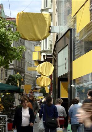
Northwestern graduate student Brett Ommen recently completed the oral defense of his Ph.D. thesis on the role of graphic design in public culture. Brett’s argument is too detailed for me to summarize it here, but he highlights something everyone ought to consider from time to time. Brett claims that an important function of graphic design comes not from the message content but rather from how it covers the surfaces of public space. Thus, even when not attending to the myriad of signs that surround us, we are unconsciously responding to the “surface message” that our environment is intensively communicative. To illustrate this point, Brett took a page from the work of an artistic project called Delete!, which covered the signage along Vienna’s Neubaugasse for two weeks:

delete-vienna.jpg

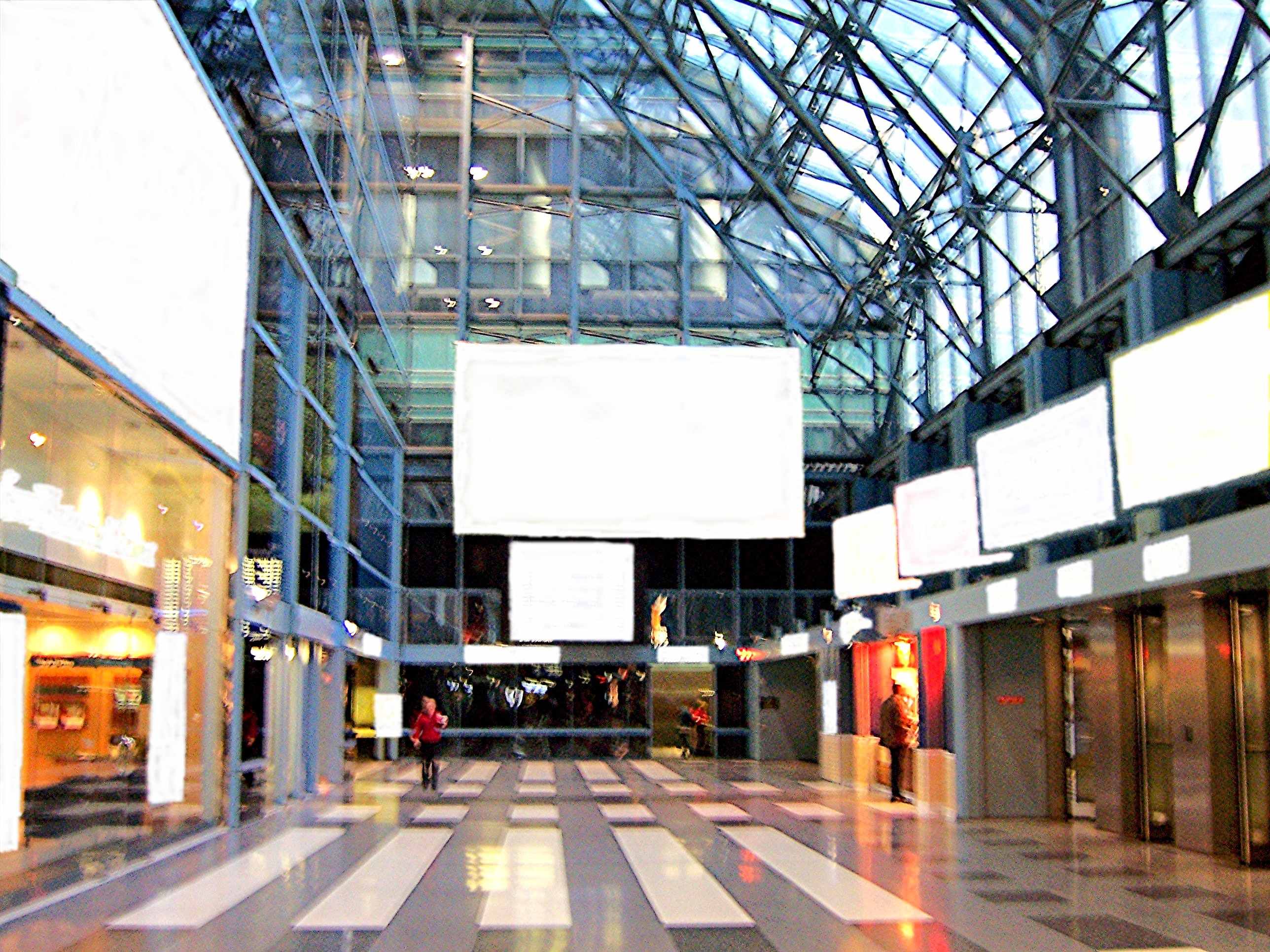
Brett did the same virtually, here with an image that replaces the signage in Chicago’s Ogilvie Center with whiteout.

ogilve-copy.jpg

The Center is a late-modern environment that doesn’t encourage civic association, and you can see just how barren it is when the graphic content is deleted. You also can observe how much you see-but-don’t-see. I’ll bet that few commuters could fill in many of the blanks. You might look at a familiar street scene of your own and count how many signs you overlook at any given time. We are awash in information and continually accosted with appeals, yet much of that registers, if at all, only as a form of blind sight. That idea might be extended further: how much of the information about who we are collectively is already right in front of us, but unseen? More important, how is that inattentiveness not only characteristic of our relationship with signage, but also with each other? You can’t and really don’t want to see everything, of course, but what are we missing?

Photograph by Hans Punz/Associated Press. An AP article on the Delete! project is here.


Digg!

 2 Comments

The Color of Sorrow

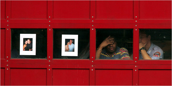
This photograph was front page above the fold at the New York Times yesterday (Monday):

firehouse-memorial.jpg

The caption read, “Photographs of Joseph Graffagnino, left, and Robert Beddia at the firehouse for Engine 24 and Ladder 5. They died fighting a fire at the Deutsche Bank tower.” By highlighting the photos taped to the windows this description may distort the overall effect of the visual composition. Likewise, the smaller image here may not do justice to the emotional power of the photograph’s placement in the print edition. It remains a complex and strangely moving photograph nonetheless.

The emotional power of the image begins with the color of the firehouse door. Red is the color of blood, fire, anger, and other intense experiences: psychologists would tell us that it stimulates emotional responsiveness. Red also is the firefighters’ iconic color, but we don’t see the shiny metal surface of a fire truck. The red wood has the grained, organic feel of a barn and its associations of working hard while living close to nature. The large color field is enveloping and yet somehow also soothing, perhaps because of the square panels and solid bolt construction. This is a good red that helps us feel our way into the photograph.

The second major element of the composition is the line of four windows that divide the monochromatic color field. They are tied to the colored door by the touches of red on shirt and badge, but the primary effect is one of contrast. Instead of an exterior surface, we peer into a deep interior. Instead of a surface that catches the light, there is only the all-too-symbolic darkness. The photographs on the windows not only memorialize the dead but accentuate the sense that a window both reveals and buffers. The door becomes a divider between those suffering within and the rest of us peering in from more distant lives.

The photographs themselves are heartbreaking. We see young people full of life and love, and now two of them are only images. The large white frames isolate the vitality of each couple and set these past scenes against the utter darkness behind them. Thus, a second contrast, for the photos of the dead are all the more compelling by being placed in a line with the two living firefighters on the right. Again, darkness lurks behind everyone, but two are obviously alive, real people hurting yet breathing in real time, while the others are now only images on paper that are pathetic, hopeless masks placed on the darkness.

And so we are left with the living. They remain behind a scrim of mourning, but we can see two individuals lost in different though related postures of sadness. They are touchingly close to one another and yet each is lost in thought, dwelling on the tragedy as they work side by side to re-enter life in the outer world. You can’t ask for much more than that, and so they become a model for others’ mourning as well.

It also matters that this is not the first time. The fire was in a building that has been a dangerous wreck since the World Trade Center attack, and the Times story was titled, “Scarred on 9/11, a Firehouse Mourns Again.” The photographs make the same connection visually, as snapshots of the dead were an important part of street-side memorials and Times obituaries after 9/11. Since then, too many Americans have become experienced mourners. This photograph suggests how the rest of us might join them. Patriotic boosterism didn’t save a single life while destroying many American soldiers and Iraqi civilians. Perhaps only by grieving together can we achieve the emotional maturity needed for political wisdom.

In classical rhetoric, one could speak of the “color” of a speech in order to mark its emotional tone. We might do the same today for other works of public art. I would not say that red is a color of mourning, but this photograph as a whole has an emotional tone that is at once nuanced and profound. It is the color of sorrow.

Photograph by Hiroko Masuike for The New York Times.


Digg!

 1 Comment

The Conquering Hero


Peyton
“I firmly believe that any man’s finest hour, the greatest fulfillment of all that he holds dear, is the moment when he has worked his heart out in a good cause and lies exhausted on the field of battle-VICTORIOUS.” – Vince Lombardi

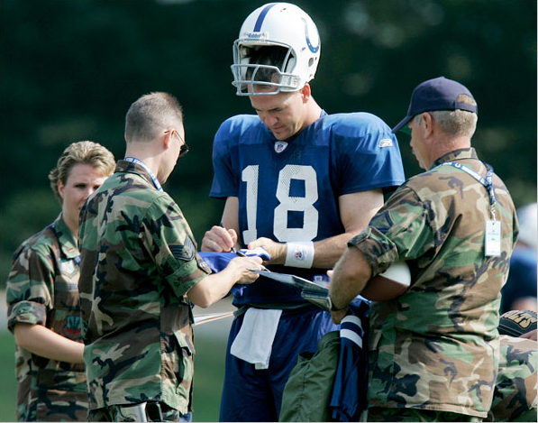
I don’t usually follow football, but I do live in the Indianapolis area and like most Hoosiers I was caught up in all of the hoopla leading to last year’s Super Bowl victory. Even still, I probably would not have given this photograph so much as a second look, let alone a second thought, had it shown up in the Indianapolis Star or one of the smaller suburban newspapers. After all, Peyton Manning is a hometown hero and regularly celebrated by the local media. But where I came across it was in the New York Times “Pictures of the Day” slide show for August 17th, nestled in with photographs of the tragic (the Peruvian earthquake, the Utah mine disaster), the mundane (a long time congressional leader announcing his retirement, political and religious celebrations), and the silly (the Dutch Office Chair Racing Championship).

What makes this photograph notable is how truly ordinary it is: a revered sports figure attending to his doting fans. Even the irony of “real” warriors seeking the attention of a professional “weekend” warrior seems to slip past our notice with a wink and a nod, as just another day at the office. As the caption reads, “Taking a break from preseason workouts, Peyton Manning, quarterback for the Indianapolis Colts, signed autographs for members of the 181st Tactical Fighter Wing visiting training camp in Terre Haute, Indiana.” And therein lies the problem, for these are most definitely not normal times. Like it or not, we are entrenched in a foreign war that over a period of four years has taken the lives of 3,700 U.S. troops and at least 50,000 Iraqis. And yet here we have a “picture of the day” in the “paper of record” that shows absolutely nothing out of the ordinary—for civilians and the military alike. Indeed, in an array of fourteen photographs of “the day,” this is the only one to portray the U.S. military in any fashion whatsoever.

The image of Peyton Manning signing autographs for members of the 181st Tactical Fighter Wing is telling in this regard. The faces of the autograph seekers are turned from the camera or obscured from view, their identities reduced to the anonymity of the uniform they share and the souvenirs that they carry; the only identifiable visage belongs to the successful warrior (“winning, is” after all “the only thing”), girded for battle. Manning towers over his suitors like a Titan. They seem to approach him tentatively, respectfully; they are thus subordinate not only in stature, but in attitude and gesture (as is due the “conquering hero”). Winning the Super Bowl is no small thing, to be sure, and obeisance to sport celebrities is a regular feature of late modern consumerist culture, but when military figures are visualized as supplicants to a civilian athlete during a time of war, our eyebrows should raise just a bit.

But focusing too much on how the photograph normalizes the current situation in Iraq risks looking past a separate, albeit related, concern. For the image also visualizes—and in the process normalizes—conventional beliefs and attitudes about the constitutive identity between the military and contemporary sport culture. The above quotation from Vince Lombardi is posted at a website for Sandhurst, the U.S. Military Academy Prep School. And like the photograph, it is altogether routine, a comparison that not only recalls the romantic mythos of battle and warfare of a bygone era, but is part and parcel of our contemporary vocabulary for talking about sports: a season is a “campaign”; coaches, quarterbacks, and point guards are “generals”; contests are won or lost “in the trenches”; the field of play is a “war zone”; and on and on. And then too there is this: Since July 2005 the U.S. Army and the U.S. Marines have spent a combined total of 12.5 million dollars in sports related television recruitment advertising aimed at the 17-24 demographic, with the vast majority of it going to ESPN.

Hail Caesar.

Photo Credit: Michael Conroy/Associated Press


Digg!

 4 Comments

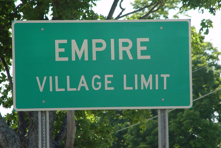
Sight Gag: The Limits of Empire

empirea-reduced.jpg

Our primary goal with this blog is to talk about the ways in which photojournalism contributes to a vital democratic public culture. Much of the time that means we are focusing on what purport to be more or less serious matters. But as John Stewart and Stephen Colbert often remind us, democracy needs irony, parody, and pure silliness as much as it needs serious contemplation. For our part, we will dedicate our Sunday posts to putting some of that silliness on display in what we call “sight gags,” democracy’s nod to the carnivalesque. Sometimes we will post pictures we’ve taken, or that have been contributed by others, or that we just happen to stumble across as we navigate our very visual public culture. And we won’t just be limited to photography, as a robust democratic visual culture consists of much more. We typically will not comment beyond offering an identifying label, leaving the images to “speak” for themselves as much as possible. Of course we invite you to comment … and to send us images that you think capture the carnival of contemporary democratic public culture.

Photo Credit: John Lucaites


Digg!

 4 Comments

Who is that Man in the Picture?

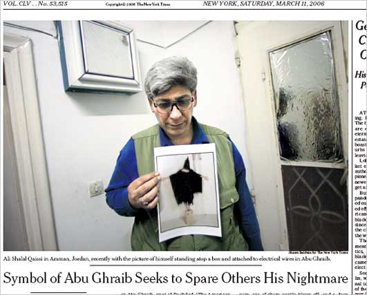
Last week I commented on the latest effort to discover the “true” identity of the kissers in the famous “Times Square Kiss” photograph. Reporting on such efforts is a fairly common narrative that follows along with the circulation of many iconic photographs. After all, most such photographs rely upon a certain degree of anonymity and when we encounter the anonymous our curiosity is piqued. Who is the migrant mother? Or that young girl at Kent State? Or the man standing in front of the tank in Tiananmen Square? And so on. Earlier this week Erroll Morris, an important documentary film maker, reprised the question raised last year (3/11/2006) in the NYT concerning the alleged identity of the man known as”Gilligan” in the iconic Abu Ghraib torture photograph:
15qaissi533.jpg

Morris argues that the controversy demonstrates “how we make false inferences from pictures.” We think that he gets it wrong, or perhaps more to the point, he asks the wrong question and thus diverts attention from the very important range of ways in which photojournalism contributes to a vital and robust democratic public culture. Robert posted our response as a comment at the Times. We’ve reposted that comment below, but we also encourage our readers to attend to the continuing and very spirited and engaged debate on this topic at the NYT.

Posted at the New York Times, August 16, 2007:

Errol Morris’s essay is one example of his claim that “We do not form our beliefs on the basis of what we see; rather, what we see is determined by our beliefs.” His critique of the Abu Ghraib story depends on several axioms of Susan Sontag’s critique of photography. Unfortunately, each one of them is at best half true.

1. Photographs corrupt moral response by substituting the image of the victim for reality: “The no longer anonymous Hooded Man became a national news story – not because he was a victim of torture and abuse at Abu Ghraib but because he was in a famous photograph.”

2. Photographs corrupt our knowledge of reality: “Namely, the central role that photography itself played in the mistaken identification, and the way that photography lends itself to those errors and may even engender them. . . . photographs attract false beliefs – as fly-paper attracts flies.”

The basic problem with both of these ideas is that the critic is attributing to photography what is true of all representation, verbal as well as visual. Think about it: can you depend any more on written accounts of reality? If so, I have a bridge to sell. You don’t have to spend more than ten minutes in a court of law to see that writing is highly suspect. Newspaper reportage is partial at best while details often are mistaken; government reports have an additional set of problems, scholarship is subject to paradigmatic restrictions, and so forth and so on. The most false, dangerous, immoral, and harmful publication in the world is not a photograph, but a book: The Protocols of the Elders of Zion.

And for all that, writing, like photography, is a remarkable tool for learning about, knowing, and navigating through the world. If left only to what we see directly, we would know and care about very few people (and no more accurately, by the way: eyewitness testimony is notoriously bad evidence). That we care about victims because we see images of them—or read about them, say, by reading the Diary of Anne Frank—demonstrates that we can expand our capacity to care through our use of the public media. Nor are we trapped in our representations. In fact, belief and experience work both ways: prior belief shapes perception, yet human beings, like other animals, continually adjust their conception of the world based on what they observe.

That said, I’ve gotta like the attention Morris pays to iconic images such as the photo from Abu Ghraib. (Full disclosure: I’m co-author with John Lucaites of No Caption Needed: Iconic Photographs, Public Culture, and Liberal Democracy, and John and I maintain the blog No Caption Needed.) The debate about identifying the specific individual in the Abu Ghraib icon is one measure of the photo’s status: similar efforts are made with every iconic photo. At least two issues need to be noted here: one is that, although indifference to the specific individual in the photo could be a moral mistake, the moral testimony of the photograph requires only that someone is there, not any one person. Morris makes the right distinction but gets things backwards when he claims, “Now we are talking about reality – not about photographs.” No, we are talking about photographs, specifically, about a photograph’s documentation of torture. As with other iconic photographs, the image’s moral power depends on the anonymity of those in the picture. We empathize because the person could be anyone, not because it is this or that individual. The photograph of the napalmed girl running down the road in Vietnam was moving not because it was a picture of Kim Phuc, but because it was a picture of a girl much like children you have known.

This is why I can’t get excited about the stories of who was in the photographs from Iwo Jima, Vietnam, Kent State, or Abu Ghraib. These narratives usually serve to domesticate the image, to transform its powerful call for public action into a feel-good story about private life. Barthes said the photograph could be mad or tame. Locating the individual in the iconic image, however accurately, only tames the photograph and perhaps the public as well.

Photo credit: Shawn Baldwin/New York Times


Digg!

 0 Comments

The Photographic Renaissance

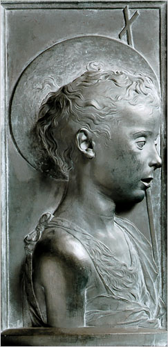
Not long ago it was easy to think of photojournalism as a dying art. Its successful remediation on the web now suggests a very different if less predetermined story. In fact, you could argue that we are experiencing something like a renaissance of the art. One sign would be that we are surrounded by many dazzling images that we take for granted. Another comparison would be that photojournalism today at times achieves the powerful aesthetic and ethical values of Renaissance humanism. This may seem a stretch, but I’ve seen two images this week that stopped me in my tracks, and for the same reason. The first is a profile relief by the Florentine sculptor Desidero da Settignano, who is the subject of a retrospective at the National Gallery of Art.

19355243jpg.jpg

Ostensibly a “Young St. John the Baptist,” the figure is a stunning depiction of a young boy as if in the flesh, and of the grace and wonder and vulnerability of childhood, and of human being in all its individuality and curiousity.

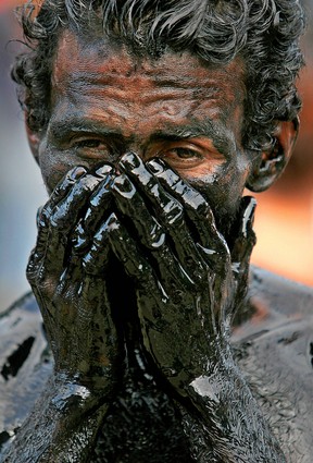
The work obviously required incredible artistic skill. We could hardly expect to see anything like it from a camera, where it seems all you have to do is push a button to make an image. For all that, I think the following image is equally accomplished:

31784129.jpg

The caption reported that this was a ritual immersion in recycled oil during the celebrations in Managua, Nicaragua for its patron saint, St. Dominic of Guzman. As before, a religious scene is the pretext for isolation of the individual person. We see in his face, eyes, brow, hands not idiosyncrasy but rather a profound depiction of individual experience captured within visible form. I have seen many Renaissance sculptures that are nearly identical in features and effect. The oil gives the image the feel of sculpted stone or metal, and it seems that the man’s human distinctiveness is emerging out of the block of inert material. I could look at it, and learn from it, for hours.

The first image is considered priceless. The second was stuck among many others in a big slide show of “photos of the week.”

Photograph of “The Young St. John the Baptist” by Desiderio from the Museo Nazionale del Bargello, Polo Museale Fiorentino, Florence. Photograph of Nicaraguan man by Esteban Felix/Associated Press.


Digg!

 0 Comments

"For Now We See As Through A Glass Darkly"

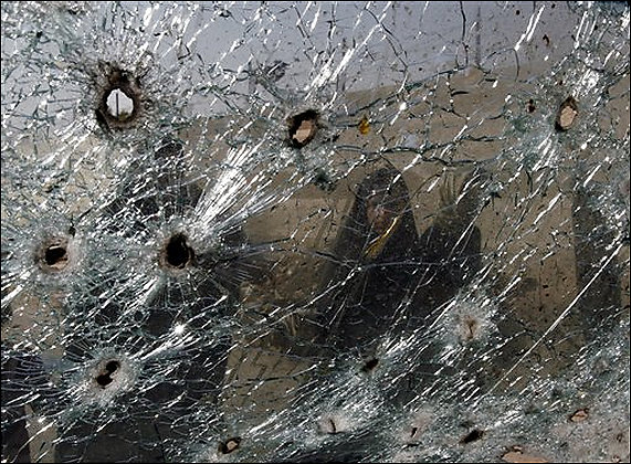
Shattered Glass

The photograph has a haunting quality about it. At first glance it is hard to know what one is looking at. Attention is probably drawn initially to the three holes in the right side of the upper left quadrant that create something of a triangle and the menacing specter of a predatory face – a wolf perhaps – staring back at the viewer. Eventually, one’s eyes drift to the midpoint and notice the dark shadow which upon scrutiny turns out to be the image of a human face, possibly a woman though it is hard to tell; her expression, fractured and obscured by what we finally recognize as bullet-riddled glass, appears simultaneously cautious and curious. The question is, what does she see?

The caption provides the facts: “Iraqi women [yes, two women, at closer examination you can see the second shadow on the left side of the image] look through a bullet-riddled windshield after an overnight raid by U.S. troops in the Shiite enclave of Sadr City in Baghdad, Iraq, Aug. 12, 2007. Police and residents said U.S. and Iraqi troops backed by helicopters raided the east Baghdad neighborhood on early Sunday killing two people and wounding four others. The U.S. military said it was looking into the report.” The story to which the photograph is attached, as if an illustration, is a report that four U.S. soldiers were killed when a sniper shot one and then lured the others into a house rigged with a bomb.

The facts, it turns out, tell us very little. Even after careful study they prove to be no more than tidbits of data that confirm the obvious – women looking at a bullet-riddled window – and leave all else open to conjecture? But what do these women see? A world torn apart no doubt. But by whom? And why? Liberators protecting their world from an indigenous repressive regime? Or an occupying force guided by its own imperial designs? The picture doesn’t say, and the story only confuses the matter, but as the caption notes, the U.S. military is “looking” into it. Of course, what these women actually see or don’t see is only half of the problem – and perhaps the least of it.

The other half of the problem is that we don’t quite know what we see either. The photograph positions the viewer inside the vehicle looking out through the windshield. Windshields are contrivances of the modern world. One does not typically find them in the coaches, buggys, and surreys of an earlier century. They are transparent walls that segregate and insulate those on the inside from the outside world. Indeed, they are, in their fashion, modern veils produced by an advanced technological society, shielding those on the inside from the gaze of outside “others” (as external backlighting often obscures and distorts the vision of those who would peer in), even as they enable a certain scopic sovereignty to those on the inside to see the world around them. In this picture the windshield seems to separate the modern world from a foreign and archaic other. But here, of course, the protective layer afforded by technological superiority has been breached, the scopic regime fractured and distorted by another modern technology. No longer insulated from the elements and protected from the outside world, we see as “through a glass darkly,” a mirror that reflects back at us a vision of our own rapacious impulses.

But not to worry, for the military is looking into it.

Photo Credit: Karim Kadim/AP Photo


Digg!

 1 Comment

Politics as Performance Art

Jay Leno once remarked that “Politics is just show business for ugly people.” He got that right: politics is a performance art. The media are rightly criticized for focusing too much on style during electoral campaigns, but they actually are on to something important. Political campaigning is an art of improvisation on stock repertoires, and the skills honed there can be put to use later in the practice of governing. A photo from the recent A.F.L.-C.I.O forum in Chicago provides a nice example of this political stagecraft:

labor-meeting-gestures.jpg

This image is a study in the relationship between convention and improvisation on the rubber chicken circuit. Pointing to someone in the crowd obviously is a stock gesture on the political stage. You’ve got to do it to appear active, attentive, and connected with the audience. It also communicates past experience with those present, and it even is a bit charismatic, as the leader dispenses the gift of his or her much coveted attention to an individual singled out of the crowd. Thus, the candidate not yet doing it in this photo looks a bit withdrawn, disconnected, or slow on the uptake. Note to Joe Biden: you don’t get elected by not following the script.

Despite their uniform behavior, the candidates also are improvising as they can to distinguish themselves from the others on stage. (Remember, there is no director to keep anyone from stealing the scene.) Christopher Dodd, on the right, looks poised, polished, and wholly scripted. He’s the newcomer to the presidential stage, and it shows. The other two are old troopers and much more interesting, perhaps surprisingly so. Hillary, who is portrayed by the media as highly controlled, looks very different here. She’s having a great time and really letting it show; you can feel the emotional energy that she is channeling. And then there is Kucinich, who supposedly is the loose canon of the bunch. Look closely: sure, he’s pointing towards someone in the room, but he’s looking directly into the camera. That’s what Hillary is supposed to be doing: acting as a hardened professional whose only relationship to real people is to use them as props while playing to the media. That rap may not fit Kucinich, but he clearly is a savvy actor.

So it is that anyone can say that “politicians are all alike.” They have to be to make it on stage. And yet they are not all alike as every performance is slightly different. And while the media feed us stock characterizations, they also show more than they tell. But you have to look to see it.

Photograph by Peter Wynn Thompson for the New York Times.


Digg!

 3 Comments

K at the NYSE

Kafka’s Trial and Fritz Lang’s Metropolis (for images, go here and here) were once touchstones for understanding the deep anxieties of modern social organization. Mention them now and you mark yourself as a boomer (as if it weren’t obvious enough anyway). Both came to mind recently, and particularly Kafka’s depiction of K, the everyman caught in organizational processes that by turns snare, thwart, baffle, awe, and destroy him. Something like this, perhaps:

littlemanmarket.jpg

 You are looking at a trader on the floor of the New York Stock Exchange on August 9th, when shares were plummeting to the worst drop since February. It also looks as if K had wandered into an updated Metropolis (or perhaps Metropolis meets The Matrix). The concrete tower behind him (it loomed higher in the paper print of the photo), the machines surrounding everyone in the room, the anomic space in which each person stands alone: these are the signs of centralized authority, comprehensive organization, and social isolation. The trader stands at the center of the picture, dwarfed by the organization around him and anxious, very anxious. He is looking up as if to a superior officer dreaded for his harshness. He looks stunned into deference, waiting to take an order dictated by the unseen power. It could be his death warrant, but he would dutifully write it down.

Of course, he is a trader intensely focused on a screen of data. He is at work, not in a novel. Nonetheless, the photograph has captured the terror lurking in the shadows of a market society.

Photograph by James Estrin/New York Times.


Digg!

 0 Comments

Why Can't a Minaret Look Like a Spire?

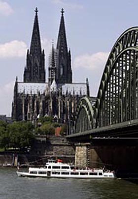
Yesterday the Chicago Tribune posted a report about protests arising in Cologne, Germany regarding plans to build a new mosque in the city. The story is an object lesson in negotiating the visual public sphere. To begin with, an obviously ideological reaction is being couched in aesthetic terms: “The residents complain that the minarets would clash with the towering spires of the city’s celebrated 13th Century cathedral.”

cologne2_web.jpg

Never mind that the two buildings would be over a mile apart and that the Gothic cathedral would be nearly three times the height of the mosque.

The reaction against the mosque moved from far-right crabbing to a full-blown public controversy once it was voiced by Ralph Giordano, “a respected German-Jewish writer” and Holocaust survivor who warned that the mosque represented “‘creeping Islamization’ of Europe.” In a radio interview Giordano observed that the sight of veiled women on the street disturbed him, and he labeled them “‘human penguins.'” You might think that a German-Jewish Holocaust survivor would be wary of stigmatizing fellow citizens by their ethno-religious garb, much less describing them as animals. Apparently the Holocaust was a long time ago. In any case, this is yet another example of how the sight of the veil in public spaces can deeply trouble the Western viewer. And sure enough, the debate about the Mosque includes arguments about, on the one hand, the “openness” of the design, and, on the other hand, how it symbolizes “isolation” and enclaved resistance to assimilation. (The Tribune included an illustration of the design in the morning paper, and it appears beautiful, open, and uplifting; unfortunately I can’t find a good copy on the Web.) Neither of these claims are in any way directly religious, but they feature a fundamental norm of the bourgeois public sphere: transparency, and not as a metaphor for institutional accountability but as an actual condition of interaction in public.

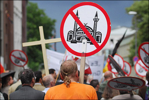
And so we get to the street, that is, to a demonstration earlier in the summer protesting construction of the mosque. This is the photograph accompanying the Tribune story:

4338089.jpg

The photo incidentally provides an outline of the planned mosque, and you can bet that the architect imagined a visual homage to the cathedral. That’s not what the demonstrator’s saw, however. The placard’s illustration deviates considerably from the architect’s drawing precisely by making the mosque appear less open, more enclaved. It also appears more traditional and less modern than the proposed design. The placard visualizes what they see, which is what they fear.

Three other features of the image also caught my attention. Because we see the backs rather than the faces of the demonstrators, they are themselves somewhat veiled, as it were, and so perhaps may appear not entirely legitimate. Second, although the red slash over a politicized image is a stock use of the “prohibited” sign from public iconography, it acquires additional meaning here: what should be an informational sign used in the neutral administration of public space has become a primal ban, the sign of fundamental exclusion from the community.

And so we get to the cross. The coincidence of the two in effect makes all the placards into crosses while turning the cross into a political tool. This is the political transformation that Giordano unleashed. And I can’t help but notice that the cross is tilting; indeed, it is starting to look like a swastika.

Getty/AFP photograph by Henning Kaiser.


Digg!

 2 Comments