Jan 16, 2012
Oct 24, 2007
Mar 28, 2008
Feb 14, 2008
Mar 13, 2009
Oct 21, 2009

Photography’s Renaissance and the Curators at Time’s Lightbox

Photographers are finding it harder and harder to make a living while print journalism is being pulled deeper and deeper into the undertow of history, but photography is experiencing a renaissance.

APTOPIX Mideast Syria

I don’t have the time today to say much at all, but consider two related examples of how photography is thriving as a public art: the rise in highly accessible distribution and in high quality curatorial work, all of which is coming to be taken for granted.

The distribution is amazing.  Life and Look are long gone, but the slide shows at In Focus, The Big Picture, and many other online newspapers and magazines are becoming increasingly prominent and sophisticated, and the images are relayed and given added value through the commentary and discussion at any number of photography blogs, all of which of course then flows through social media as well, which also is circulating billions of vernacular images while sending some of them up the media chain, and so it goes on day after day.

This media swirl could be a maelstrom, but in the midst of it all major media are investing in photo editors who are doing amazing work.  Sure, cliches still abound, as we are talking about mainstream media in mass societies, thank you very much.  People want some of that, and the press has to make a living, and frankly every day isn’t so unique as the Hallmark card might want you to believe.  (Speaking of cliches. . . . )  Even so there is plenty of curatorial work, not least by Alan Taylor at In Focus as well as other sources alluded to above, that is remarkably good.

And there is one source that may be an index of the changes that have occurred.  Time was never the gold standard in photojournalism (the division of labor with Life probably accounted for a lot of that).  But Time’s online LightBox just keeps getting better and better.  I used to go to Time for examples of what not to do, and now I kick myself for what I’ve been missing.

The addition of Mikko Takkunen is the most recent example of how Time is making a strong investment in photojournalism.  But there is much more going on as well.  Just today, I noticed their 365: The Year in Photographs, which I hadn’t seen yet for 2012.  The concept is as cliched as it gets, and yet the selection is outstanding: one that reflects a rich aesthetic sensibility that still serves reporting and reflecting on the news.

They aren’t perfect, of course, but the trend is definitely in the right direction.  And you can’t say that about a lot of the news business these days.  Let’s hope that investing in quality can become part of the business model again, and not just for photography.

Photograph by Narciso Contreras/Associated Press.  Dec. 1, 2012. Smoke rises from buildings due to heavy fighting between Free Syrian Army fighters and government forces in Aleppo, Syria.

 0 Comments

The Photographic Renaissance

Not long ago it was easy to think of photojournalism as a dying art. Its successful remediation on the web now suggests a very different if less predetermined story. In fact, you could argue that we are experiencing something like a renaissance of the art. One sign would be that we are surrounded by many dazzling images that we take for granted. Another comparison would be that photojournalism today at times achieves the powerful aesthetic and ethical values of Renaissance humanism. This may seem a stretch, but I’ve seen two images this week that stopped me in my tracks, and for the same reason. The first is a profile relief by the Florentine sculptor Desidero da Settignano, who is the subject of a retrospective at the National Gallery of Art.

19355243jpg.jpg

Ostensibly a “Young St. John the Baptist,” the figure is a stunning depiction of a young boy as if in the flesh, and of the grace and wonder and vulnerability of childhood, and of human being in all its individuality and curiousity.

The work obviously required incredible artistic skill. We could hardly expect to see anything like it from a camera, where it seems all you have to do is push a button to make an image. For all that, I think the following image is equally accomplished:

31784129.jpg

The caption reported that this was a ritual immersion in recycled oil during the celebrations in Managua, Nicaragua for its patron saint, St. Dominic of Guzman. As before, a religious scene is the pretext for isolation of the individual person. We see in his face, eyes, brow, hands not idiosyncrasy but rather a profound depiction of individual experience captured within visible form. I have seen many Renaissance sculptures that are nearly identical in features and effect. The oil gives the image the feel of sculpted stone or metal, and it seems that the man’s human distinctiveness is emerging out of the block of inert material. I could look at it, and learn from it, for hours.

The first image is considered priceless. The second was stuck among many others in a big slide show of “photos of the week.”

Photograph of “The Young St. John the Baptist” by Desiderio from the Museo Nazionale del Bargello, Polo Museale Fiorentino, Florence. Photograph of Nicaraguan man by Esteban Felix/Associated Press.


Digg!

 0 Comments

Excess and Emotion in the Photographic Archive

Let’s start with one photo.

POLAND-HISTORY-JUSTICE-COMMUNISM

The caption reads, “Human remains are seen during the exhumation of a Stalinist-era mass grave on the military cemetery in the heart of the Polish capital Warsaw. The grave is believed to contain the remains of around 200 victims of a post-war campaign of communist terror.”

Perhaps the victim was screaming at the moment of death, but the gaping jaw could be an accident of decay or excavation.  Perhaps the lost individual will be identified, and perhaps the family can be notified.  Perhaps the remains will have forensic value, and maybe some remnant of justice can yet be done.

But, OMG, what an image.  The accidents of time have produced a howling, shrieking cry of pain and rage.  The body emerging from the earth is still shrouded with dust, as if still more ghost than material thing.  The immobility of being long buried is still binding the corpse, but it seems to be straining to be released, to rise up in glorious, savage revenge.  A revenge that will never come, as instead it will be interned again in a bureaucratic process constrained by a decided imbalance of power.

And so it has to settle for a more academic symbolism: there lies The Past, or Terror, or the Human Condition.  These are not small things, but they can have other emblems as well.  Yet, even so, I can’t help but think–or hope–that this image might haunt whatever idea is brought to it; that it might arise again in the night or at an odd moment, and that it might disturb, trouble, bring one perhaps to tremble for this lost soul from history’s slaughter pen.

OK, and now add a million more photos.  Start with the 10,000 that were sent to photo editors on the day this one was published.  Add another 10,000 for the many days before and every day after that.  Add also all the other images that you see every day in the news, advertising, and entertainment, and on Facebook, Flickr, and other social media.  Then add in what everyone else is seeing: the 200,000 photos that are uploaded to Facebook every minute, and the 27,00 at Instagram, etc.  And while you are at it, drop by a museum and see an exhibition of photographs.

Were you to do any of this, you might feel like Chloe Pantazi, who went to an exhibition at the Brooklyn Museum on war photography.  Pantazi came away feeling “numb,” as if she had been anesthetized, and, not surprisingly came to the conclusion that “Susan Sontag Was Right” when she condemned photographs for dulling our ethical capacity.  Well, even a stopped clock is right twice a day, so I guess it could happen, but the declaration also provides an opportunity to think for a few seconds and say, “Really?”

I haven’t seen the exhibition, nor do I doubt for a minute that Pantazi had the experience she reports, so we need not disagree about her review on those terms.  That said, Pantazi’s reaction is not surprising for several reasons: First, it is a very understanding reaction to over 400 photographs about war taken in a single experience of dedicated viewing.  Indeed, I would expect the same result from reading 400 essays, or 400 pages, on the horror of war.  What most of us would not do in that case, however, is conclude that words were the problem.  And yet that is the point of the photography review, as the subtitle declares: “A troubling new exhibit at the Brooklyn Museum of Art throws into question the medium’s very purpose.”

Which leads to the second reason her conclusion is so familiar: it is exactly the reaction one is primed to have after reading Sontag, not to mention John Berger, Allan Sekula, Martha Rossler, and others who have crafted the conventional discourse of photography theory along the same line.  (See the first chapter of Susie Linfield’s The Cruel Radiance for a provocative exposition on this point.)  What might be a normal–and temporary–reaction to intensive consumption of any medium becomes redefined as a universal failing of a single medium.  Once primed to be misused and disappointed by photography, it is easy to code one’s experience accordingly.  Let me add that putting the exhibition in a museum doesn’t help, as the fine arts context dominant there (as it is in Sontag’s work) interferes with correctly understanding a public art.

Again, the point here is not to reprove Pantazi for what might be a spot on review of a flawed exhibition.  But her reaction, the size of the exhibition, and even Sontag’s interpretative biases all point toward what is a very real condition of the image world today: excess.  And where there is excess, there will be exhaustion.

And as Pantazi rightly assumes (more so than the early Sontag, by the way), the emotions that come to be exhausted by images of horror are crucial for moral response, reflection, and engagement.  So this is no small problem.  But if we could set aside Sontag’s censorious tone, it is a problem that could lead to many creative solutions.

I’m out of time tonight, but let me close by suggesting that there is much more to excess than the likelihood of overwhelming us.  (And be sure to see David Campbell’s corrective argument about the much more manageable circumstances of actual practice.)  Indeed, photography as always been an abundant art: cheap, expansive, and ending up in every corner of the world.  (I have a bit more to say on rethinking abundance here, here, and here.)  What does need to be done is to take more seriously the curatorial function, which includes not only actual curators or editors, but also critics and citizens as they sort, select, and share images as part of their participation in the virtual world of public culture.

And we need to remember that at the end of any given day, what may be needed is not 400 photographs, but just one.  Like the one above, for example.

Photograph by Wojtek Radwanski/AFP-Getty Images.

Cross-posted at BagNewsNotes.

 2 Comments

Festivals and Photography

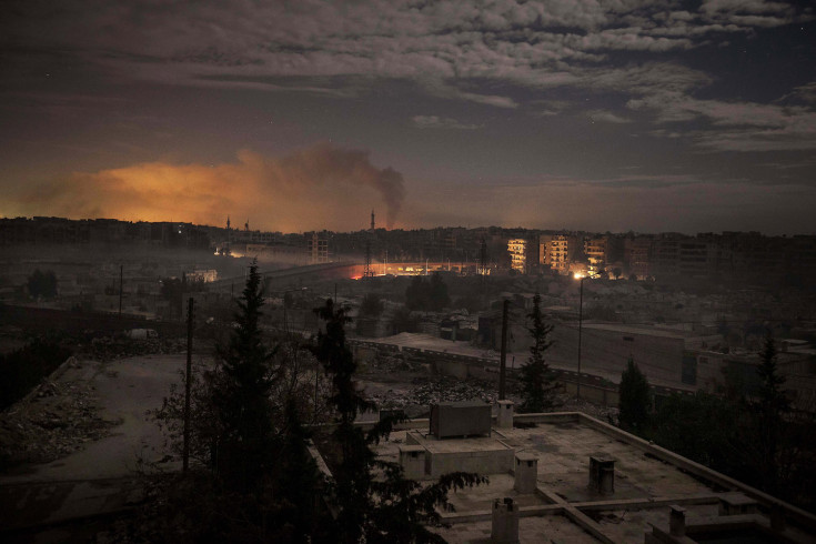
Spring is a season of festivals: Chinese New Year, Carnival, Mardi Gras, and many, many more around the globe.  A recent example is the Holi festival, which you can see in slide shows here and here.  Such celebrations are photographic attractors, and for obvious reasons: brightly colored costumes, outlandish floats, dazzling light shows, and other displays of over-the-top theatricality in ordinary settings provide ritualized departure from winter’s humdrum routines, as well as plenty of eye candy.

Holi festival backstage

And once in a while, a moment of profound visual art.  This stunning photo is a powerful example of how the camera can do more than capture the color and excitement of another culture.

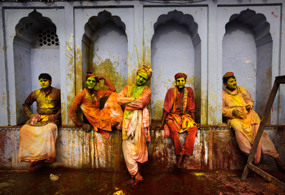
Holi is a festival of color: individuals festoon themselves with paints while great crowds of people are drenched in colored powders of every hue.  Colored water bombs explode, people sing, dance, and surge through the streets, and not a few may be imbibing intoxicants along the way.  There also are vernacular theatricals replaying mythic stories, which is why, in the photo here, “Indian villagers from Nandgaon wait for the arrival of villagers from Barsana to play Lathmar Holi at the Nandagram temple famous for Lord Krishna and his brother Balram, in Nandgaon, India.”

Despite its aesthetic fidelity to the festival, this photo is quite unconventional.  Many festival images feature thick washes of color, the energy and excitement of people in motion, and displays of massed exhilaration.  By contrast, here we see the riot of color framed and subdued by the blue grey building, static poses instead of movement, individuals instead of a crowd, and attitudes ranging from bored to indifferent.  And instead of being in the middle of the action, they and we are waiting for something to happen.  And while that isn’t happening, we can sense that what is yet to come already is on its way being over: the red/orange/yellow/green stains look more messy than festive, and it is easy to imagine how the clothes will be washed, the walls washed down, and the bodies scrubbed to return everyone and everything to the ordinary time and business as usual the extends beyond the ritual celebration.

So the photographer isn’t showing us the festival that we would expect to see–an expectation determined by ideological habits that locate culture in the premodern present of a developing world known for being more colorful than productive.  (See Reading National Geographic for a thoughtful account of how these habits are formed.)  And when you think of it, the virtual experience that is being communicated by the typical photographs is a bit of a sham.  Instead of all the noise and sounds and physical sensations of being pulled along by a crowd, intoxicated with sensual overload, freely yelling and laughing gleefully, we get—an image.  Mute, and also lacking taste, smell, sound, or touch, two-dimensional, static . . . there isn’t much to get excited about.  Of all the media that one might use to capture the experience of being caught up in a moment of collective delirium, photography probably is the worst choice you could make.

And that should tell us something.  Several things, in fact.  One is that the photographs that we do have must be working not merely in respect to the event being recorded, and not merely to reproduce that event, but rather in respect to a larger economy of images, one where they provide visions, or reminders, of social relations that are needed to fill out a larger conception of the world as picture.  Another is that the visual encounter, and the virtual festival, might be doing more than we realize, for example, by stimulating imaginative reconstructions of events as if we were experiencing them through our full sensorium.  (This is in part a psychological question, which I’ll leave to the scientists, but it also could be an interpretive claim.)  A third point is that a specific image may seem more profound to some viewers (me, for example) as it comes to approximate the conventions of the Western fine art pictorial tradition.  Most important, however, photography’s limitations when it comes to festivals could also provide a way of thinking about the role of ritual in human affairs.

And so we get back to the photograph above.  It gives us a more institutional sense of theatricality, and with that, a basis for serious reflection on the relationship between drama and life.  The guys in the picture are not merely villagers out of role, but rather acting like experienced troupers long accustomed to waiting backstage.  And they are backstage, which provides a reverse shot on the explicit theatricality of the festival while miming a type of social theory developed by Erving Goffman and others.

And there is more: they are arrayed as if on stage, but in the sense of being posed for a painting.  The four arched spaces could have been taken from a renaissance alterpiece, one now updated to include Hindu saints.  Or they could be statues on a cathedral, giving us apostles, angels, and perhaps a defiant gargoyle on the inner left.  Krisha has no need of a cathedral, of course, but some of his viewers might need a little help in seeing what is right in front of their eyes.

If you go back through the slide shows on Holi and the other festivals, it turns out that there are quite a few backstage shots.  The photographers are doing what they have to do to file the story to compete in a marketplace of attention, but they are doing more than that as well.  Precisely because the photo above is so static and composed, it gives us some insight into the carnival’s celebration of excess, play acting, and role reversals.

Or perhaps more than one insight. On the one hand, human beings are always on stage, always acting, always in character even when no one is supposed to be looking.  And if waiting is part of the frenzy, then likewise the madness that is supposed to be released during the festival is always with us, no matter how mundane ordinary life may seem.  On the other hand and at the same time, we retain an ability to step back, be still, carefully look at one another, and marvel at the strange, beautiful, fallen angels before us, just as they look and marvel at us.  Indeed, all the distractions of color and action might be there in part to avoid seeing how much can be seen in ritual repose.

So look again.  Notice that those in the photograh are not only being looked at, they also are looking: at others outside the frame, inwardly, and at us.  As we study them, they study us, each mirroring the other.

Photograph by Manish Swarup/Associated Press.

 1 Comment

Portraits of that Alien Thing: The Human Being

You may not have noticed, but part of the current renaissance of photojournalism is the continuing development of the slide shows offered by online newspapers and magazines.  Before waxing nostalgic about the glory days of Life and Look, spend some time at the Boston Globe‘s The Big Picture, the Atlantic‘s In Focus, and similar sites.  You will see that the editors are doing more than slapping together the news of the day or putting up human interest eye candy.  I won’t say they are immune to those tendencies, but most of the time they are going one better to help create a richer and more visually literate public culture. And speaking of culture, when Alan Taylor at In Focus put together a set of photos under that label in response to reader requests, he included this portrait of Mitt Romney.  Taylor will have had many requests, but he had a stroke of brilliance in selecting this subject for a show on culture and this photo for what would otherwise be the most conventional of images: the candidate profile.

Taylor reports that he looked for a photo “that let you see him [Romney] as more of a person, less a politician.”  So he was trying to get us to see through the usual framing of the political candidate–you might say, to actually see him as he is, rather than to simply see the stock character in the standard pose.  Although Romney hasn’t stepped out of role–he’s still carefully groomed, tactically controlled, precisely calculative, and even a bit wary–the portrait creates a sense of something like intimacy.  Indeed, he seems exposed rather than scripted, and despite the fact that his shirt, haircut, and tan are thoroughly conventional, he is inescapably a single, specific person.  This is the image of someone who has a history, personality, and mortality all his own.  Being cast into the glare of the public stage clearly frames, envelopes, and may consume him, but he is who he is nonetheless.

But is this culture?  Aren’t we told that culture is art and artists and other things that, whatever else they might be, are more unusual, unconventional, and even otherworldly than a mainstream presidential candidate.  Something like this, for example:

This photo from a Comic Con event (which would draw fantasy, sci-fi, and gaming enthusiasts) would seem to fit the bill for “culture.”  A woman has costumed herself as a character from the “Portal” computer game, and whatever she is, she is not yet another politician.  No wonder that she was the lead image for the slide show: her ghostly hair and skin, space-age clothing, and cyborg eyes create an uncanny effect: she is both human and not human, image and reality, organic material and living artifact.  In other words, the conjunction of 21st century folk art and good photojournalism has given us a different kind of exposure: we can see how the human being could become alien to itself.  That is, we can imagine how human and alien are in fact kin, like image and reality, perhaps.  Nor does this recognition scene have to be set in a fantasy world.  Right here and how you can look at this alien thing and realize that she is human.  And thus that what is human is from another vantage also alien.

Just like the first image.  The best reason they both belong under the “culture” label is that they are the same image.  Each one reveals how human being depends on self-representation that is inherently uncanny, were we but to step back and notice.  So it is that I want to push back a bit against the caption provided at In Focus, for the verbal text puts a familiar face on what otherwise can be a troubling image.  Romney is a real person, of course, so this is not a question about veracity.  But it is reassuring to be told that someone who is spending hundreds of millions of dollars to present his image to hundreds of millions of people is in fact still an individual human being, one of us.  I think that deep artistry of the photography is this: at the same time that it is presenting the individual person, it also is showing us how much we don’t know about Mitt Romney, and how much we rely on a very few stock features to feel comfortable with him, and how much the public’s relationship with him will remain a relationship with a skillfully crafted image.

If you don’t buy it, reverse the order of looking at the images; then look carefully at her to see how she is in fact a specific individual, and then do the same amount of work to see him as an artful composition, as someone acting like a person.  This is not done to claim that Romney or any politician is somehow more phoney and less substantial than the rest of us.  Degrees of performance still exist, but my point is precisely that he and you and I could not do otherwise than to exist as both actor and character, familiar and strange, human and alien.

So it is that he perfectly mirrors her, and she perfectly mirrors you.

Photographs by Gerald Herbert/Associated Press and Leon Neal/AFP-Getty Images.

 0 Comments

Photography and Ruptures in Time

Ezra Pound famously remarked in The Spirit of Romance that “All ages are contemporaneous.”  This was not the temporal equivalent of a flat earth claim, but rather his announcement of what was to become one of the great poetic doctrines of twentieth century modernism.  For most of us, however, the past is past.  Sure, Faulkner knew better, and there are vital cultures of memory, but modernity is about an endlessly expanding future.  Even as that dream has been steadily degraded of late, the incessant demands of ordinary life amidst a continual stream of news, weather, and sports continues to keep most of us living from day to day.  The timeline isn’t quite so narrow as that of an Alzheimer’s patient, but American society might be suffering from a similar loss of temporal bandwith.  Forced to live in a continually collapsing present, personality becomes brittle and fear can contaminate everything.  For that reason, then, there actually may be good reason to see something closer to what Pound had in mind.

A month ago I posted about the peculiar return to medieval clothing and weaponry in security forces.  I suggested that what may seem to be a superficial analogy could be documenting a regressive transformation of political power.  Globalization, excessive capital accumulation, and other structural changes may be leading not to the march of progress, but rather to the breakdown of modernity itself.  The photograph above supports that idea, except that now I’m looking at it while in a different mood.

The medieval horseman rides through the modern street, almost as if he were riding out of and then back into the past.  In the background, the signs of modernity are rather slim–primarily the diction in the graffiti.  The steel fixtures in the foreground provide the more reliable assurance, as they literally frame the horse and rider.  Fire seethes in the left of the frame, but it seems self-contained by the metalwork and lack of other material to burn.  The tableau could be an artist’s construction, perhaps by one who had been reading Pound.  Medieval past and modern present are contemporaneous: uncannily yet easily captured together in the artistic medium.  At the moment the medium is photography, the art that traps any moment–but 1/500 of a second–in an eternal present that can be seen as it was endlessly, anytime, out of time.

Art does mirror life, however.  The horseman really was there, and the photograph can remind us that time need not be linear, that the past need not be past, and that a medieval world may already be present among us.  Modernity may be riven with ruptures where what was thought to be safely superseded continues to lurk, resurface, or reassert its power.  These remnants of the past need not be the absolute opposite of modern time, as with the myth of eternal return, but rather something much more capable of displacing and redirecting the course of history.

But I’m getting grim again.  This post began, if that is the right term, with a commitment to enjoying contemporaneity, or at least appreciating how public arts could be restoring a sense of the past that is uncanny and provocative rather than conventional.  Like this:

The caption placed him at the Gay Pride parade in New Delhi on July 2, 2011.  I think he walked right out of Renaissance Italy.  Again, the slogan in the background reminds us of the present, but otherwise he could have fit right in at Florence.  And they would have understood that mask more than we can imagine.

Any photograph is another reproduction of modernity’s endlessly unfolding present, but this one also offers a glimpse into another time.  Thus, the photograph itself is a tear in the modern fabric of time.  And through that narrow aperture, we can see something eternal.

Photographs by Victor Ruiz Caballero/Reuters and Prakash Singh/AFP-Getty Images.

 1 Comment

Photographing Poverty: Realism or Sentimentality?

Debates about the moral value of photography have to deal with poverty.  One might think that there is little to discuss: poverty can be distressingly visible, and photographs have been a principle means for motivating efforts to help those in need.  From the classic photographs by Jacob Riis and Lewis Hine to those persistent Save the Children ads, images of poverty and particularly of its effects on children have raised awareness, shaped public policy, and opened pocketbooks.  All that remains, one might think, would be to continue to produce compelling images of destitution.

a-child-stands-at-his-hom-haiti1

This photograph from Haiti may not prick one’s conscience, perhaps because we can’t see the child’s face, but it remains a striking image.  It also reflects the other side of the debate about photography’s moral legitimacy.  One argument against the image is that the photographic depiction of poverty is in fact highly sentimentalized: a continuation of the stock attitudes–including charity, but also condescension–of the Victorian era.  In short, the photograph of the poor child is a transposition of the Victorian waif from illustration into photography.   For this and other reasons, photographers such as Gordon Parks and others have been accused, not entirely without cause, of simplifying or otherwise aesthetically framing poverty as an object for concerned contemplation, instead of either exploring the social fabric of the poor community or exposing the causes of its continued oppression.

This photo would seem to fall under that criticism.  The image is too good: on the one hand, a near-perfect outline of the waif and, on the other hand, a composition of elegant design and rich colors that belies the child’s lack of resources.  Indeed, it could be in a Renaissance painting, and both the cropping and the oddity of the one shoe draw one into a close study of the image itself and thus away from critical attention to the social and economic conditions that lie behind it.

The photograph may reflect another criticism as well.  Somewhat paradoxically, photography is faulted (and by the same people) both for not evoking the correct moral response and for wearing out compassion or other charitable or progressive inclinations.  (Save the Children does come to mind.)  That idea could drive photographers to look for new angles on an old subject, and the image above certainly has been cropped in that manner.  Instead of the typical dirty face, we see asymmetrical feet (one shod and one bare); instead of the usual sense of need, there is a strange self-sufficiency in this child’s pose; instead of the same assurance that everyone knows what is needed, wearing one shoe creates a whiff of illegibility.  And so a photo that may be making poverty into art could also be reworking viewing habits to suggest that seeing is not knowing.

The debates about photography are not going to be resolved today.   I don’t think one can or should avoid the work done by public art, which includes channeling sentiments and thus risking sentimentality.   Photojournalism does traffic in stock sentiments, just as intellectuals rely on stock criticisms.  I’ll admit that there are days when I side with Oscar Wilde’s comment that “One must have a heart of stone to read the death of little Nell without laughing.”  But there is still reason to take a good look at the other side of privilege, and to consider how compassion must at some point be a way of seeing.

Photograph by Ramon Espinosa/Associated Press.  (This post is the second this week on channeling 19th century public art; the first is here.  Another relevant post is here.)

 7 Comments

What We See and What We Know

Guest post by Aric Mayer.

Consider for a moment these two mundane photographs taken this morning. In their differences lies a subtle insight into the Western mind.

In the first image, the columns and porch are recorded looking up with the vertical lines receding away from the viewer and converging somewhere in space off the top of your screen. For the second image I have corrected this so the vertical lines are parallel. In both the brick in the foreground creates receding lines that emphasize the horizontal space moving away from the viewer. For the purposes of this post I will skip the technical means by which this is done in camera and instead focus on what this means for how we see.

To understand this better, let us travel back in time to the early fifteenth century when there comes into painting the theory of two point perspective. This opens up the world for realistic depictions of a single point of view. For the first time space is rendered as though it is being seen through a single eye, rather than through the multiple viewpoints of the previous ages. It is architecture that makes this possible, for the theory of two point perspective relies on the understanding that the world, or at least the man made world, is made up of parallel lines that remain equidistant from each other in reality and in perception appear to converge as they recede away in space.

If you spend time with paintings from the Renaissance to Modernity, you will see that the sophistication of the way space is rendered as it moves horizontally away from the viewer grows. But almost universally the vertical axes remain vertical. This corresponds to how we know the world to be. Up is up and down is down. But this is not how we see. If you stand at the base of a tall building and look at its middle, you will not see it as a rectangle, but more as a cone where the top is much smaller than the base. The vertical axes are not
straight up and down. They conform more to the way space is rendered in the first image.

Optically speaking, vertical axes are possible only when our eye is pointed directly at the horizon, thereby creating a balance between earth and sky, with each occupying an equal amount of perception. In this case the viewer is visually located between the two. To experience this personally, stand near the base of a tall building and look through the building towards the horizon. You will perceive with your peripheral vision that the vertical lines of the building above you do not converge but go straight up as we know them to do. The ground will also occupy about the same amount of perception as the building does. Perceiving vertical axes seems to ground us with a sense of balance.

Consider again the above images. The first image seems to dominate the viewer, looming slightly while the second is arranged in the picture frame in balance as we know the building to likely exist. The feeling is subtle but distinct in its difference. As you look at photographs, pay attention to how these axes are recorded. They can be manipulated to create different senses of space and feeling within the image.

 0 Comments

Stopping Time at the Olympic Diving Trials

The Boston Globe now provides an online photography page that features stunning images in full page display. I’ve wanted to call attention to The Big Picture since it was brought to my attention recently, and the images below are a fitting example of the work that can be found there.

Tony Dumais is spinning through the air between the three meter board and the water at the US Olympic diving trials. You’ll see more at the slide show at The Big Picture, but hang with me for just a minute. This is an amazing shot, not least because you are seeing something you would never see were you watching the actual dive. The dive will have been a whirling swoosh of motion that was over in the blink of an eye. Yeats once asked, “O body swayed to music, O brightening glance,/How can we know the dancer from the dance?” Well, this is how: stop time and take a look.

There is much to see in this instant of stopped time. The incredible muscle definition, his concentration, the contortion that exposes the body while bending it to a demanding task, the sheer energies of the torqued body drawn through gravity’s funnel toward the surface below, the taut suspense of whether he will pull everything together in time. And the photograph asserts itself amidst all this, displaying a human body with the exquisite anatomical detail of Renaissance art. The body is displayed as if a specimen, and yet not only that, for it is both commanded and exposed as part of a society’s relentless attempt to optimize human power. The perfect dive, the perfect shot.

All that is evident in this image, and something more.

Again, the definition is incredible. Allison Brennan could have been sculpted out of living flesh. But another facet is revealed here, as this image reminds us that diving is a controlled fall. Allison seems to have it under control, waiting only for gravity to finish the job. For some reason, however, the photo gives me the sense that she could be falling for miles. She seems to be holding her breath, and that may evoke something dream-like, as though she were under water rather than in the air, or in a science fiction film, falling through one dimension after another in some alternate universe. Her body’s sense of suspended animation reinforces the formal dimension of the photograph itself, a suspension of time, and so of space.

Thus the dive unfolds: from concentrating the body while throwing oneself out into the air, to folding into a controlled fall toward the earth, to entering the water:

This is Terry Horner at the moment of completion. Again, a powerfully defined body, the controlled fall, and now the water. The beautiful water, which reminds us that this has been about being in another medium all along. Not just on the ground, where we only breathe the air and drink the water, but in the air, just as he will within the next instant be immersed in the water. Just as these photographs have allowed us to be suspended within another medium, not just looking at things but caught up in vision, seeing what otherwise would be a blur.

Only a very few people will ever dive at this level. Their experience is not ours, nor should we miss it. The last picture provides a caution in that regard. The buff body is so forceful within the frame, and yet it also is headless. I can’t help but admire his build, and yet he appears monstrous. The beautiful water might as well be a trap. The diving competition has brought these athletes to the heights of athletic achievement, and yet there always remains the fall. Much is given, and yet something is always taken. The Olympics, like the dives, isn’t even here yet but soon will be over. The trick is to see, and savor, the brief moment of time.

Photographs by Harry How/Getty Images. Note that The Big Picture at the Boston Globe online should not be confused with the excellent economics blog, The Big Picture.

 2 Comments

A Jewel of a Planet

Many of the intellectual habits of Western culture have been subjected to devastating critique in the last few decades. This period of vital academic work has been much decried by conservative commentators, most of whom neither read nor practiced the tradition in question. There are times, however, when an antique idea may have limited application, not least as a starting point for understanding what an image can teach us. The idea that I have in mind today is that what is beautiful is also good. Those of us who look best on radio know the limitations of this claim, but it might make more sense when applied at a larger scale than individual appearance. Like this:

chandeleur-islands.png

The photograph accompanied a New York Times story on how climate change can cause endangered ecosystems and species to migrate from the nature preserves designed for their protection. So it is that the Chandeleur Islands that you see here might go under water entirely, taking a bird habitat with them. The story spoke of the “preservation predicament,” but environmental advocacy faces a continuing rhetorical predicament as well, which is that it is difficult to provide definitive examples of systemic change. So it is that every cold snap produces sarcastic jokes about global warming, while every heat wave can be discounted as merely a local phenomenon. Nor can this photo do the job: although water is overtaking the land, that’s what you might expect of low-lying barrier strands. And isn’t it more aesthetically interesting because the water is there?

But let’s back up a bit. Forget about documentary evidence. The image is beautiful, and not just typically so. This is not what you expect to see in either landscape photography or at the seaside. Instead of nature’s wonder spreading beyond our limited horizon, here we look down from above. That god’s eye view makes what is in fact a geological landform look like an ornament. I saw not islands so much as a piece of artisan jewelry. Instead of water, recently molten metal; instead of land, delicately wrought ceramic; instead of accident, design.

The point is not that you should see it the same way. But to see the island as a thing of beauty is to grant it special status as a good thing. And it will be a good thing regardless of any calculation of utility, whether by a real estate developer or an environmental protection group. And if it is a good thing because of its beauty, then we should appreciate that this beauty comes from its inherently variable and fragile nature. Neither sea nor land nor sky, the image gives us these things in precarious equilibrium. The message is not that the earth is warming or that change is inevitable anyway, although either conclusion can be drawn. No, the photograph says something more basic: This is a beautiful planet. Admire it. Love it.

Photograph by Robert F. Bukaty/Associated Press. For an earlier post on aesthetic design in nature, see The Photographic Cosmos. The beauty-is-good idea was a stock item in the Renaissance; see, for example, Castiglione’s Book of the Courtier.


 0 Comments