In the late 1940s and throughout the next decade Life magazine would regularly put private individuals and and their nuclear families on display with their accumulated property: consumer goods. One of many visual convention for doing this was to have the family surrounded by their prized possessions, collected en masse and organized in a careful and orderly fashion, a visual metaphor perhaps for their ordered and conformist lives (and much more as well).
I was reminded of this visual trope when I came across a NYT slide show reporting on “The Pink and Blue Project,” a photographic installation by JeongMee Yoon that will soon be on display in Chelsea at Manhattan’s Jenkins Johnson Gallery.
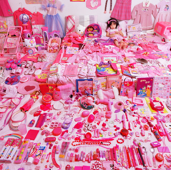
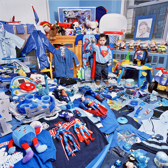
One is struck immediately by the sheer mass of consumer goods accumulated “by” five year old children – consumers in training – but it is the stereotypical and gendered color schemes which appear to convert the images into something bordering on a spectacle. The title for the slide show announces a “Wonderful World of Color” – a phrase that no doubt resonates for those of us old enough to remember watching “Disney’s Wonderful World of Color” on Sunday evenings in the late 1950s and early 1960s – and it would seem to be the coordinated concentration of bright color that animates the author of the accompanying article, Bonnie Yochelson, to note that the project delights “the eye” while “coercing a smile.” Color, it would seem, trumps gender segregation and “compulsive shopping.” And while the smile she remarks upon is “coerced,” it is nevertheless an approving smile.
What Yochelson misses is the way in which the “wonderful world of color” diverts our attention from an even more pronounced (and arguably troubling) element of the spectacle: not simply the sheer mass of similarly colored consumer goods, or even the ways in which color simultaneously marks and masks a narrow and conventional set of gender stereotypes, but the way in which everything within the scene is carefully ordered and organized, literally schematized as if by a structural anthropologist. Like the convention from Life that it seems to mimic, the project thus becomes something of a cipher for the underlying assumptions of bourgeois life, and not least the commitment to a rigid sense of order and regimentation disciplined by cultural demands for the accumulation and conspicuous display of wealth and possession. And in this context it should be noted that one has to look to pick the children out amidst the exhibit of consumer goods, a sure sign that like everything else in the hyper-ordered scene, they too are possessions; and like the glittering commercial trinkets that “coerce” our smile, they are put on public display by and for the benefit of cultural and economic interests that exceed their easy control.
In some ways we have not come far from Life’s America of the 1950s and 60s.
Photo Credit: JeeongMee More
What I find interesting in these pictures is the placement and pose of the subject, the boy, just past center right, standing, dressed as Superman and throwing evil fingers, the girl all the way in back, laying down, hunched, shy, and shrinking into her room.