Guest post by Marita Sturken
Of the many seismic changes signaled by this election, one is surely a change in the aesthetics of American political culture. Not only is Obama telegenic in a way that we have not seen in decades, but the aesthetics of his campaign and of the image economy that emerged around his candidacy signal a new kind of aesthetic, one that is embedded within a contemporary image culture of pastiche, play, and savvy image-making.
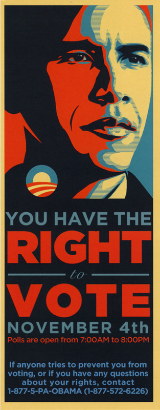
Let’s take, for instance, this flyer, which was handed out by volunteers in Pennsylvania in the last get-out-the-vote push (it was created by the Pennsylvania Democratic Party, not the Obama campaign). The flyer has a very specific informational intent (its reverse side gives information about voter rights and explicitly counters the misinformation campaigns intended to confuse voters), yet it is a strikingly visual document. It is derived from a poster that was made in support of Obama by Shepard Fairey, a street artist who became know for his Andre the Giant graffiti in cities such as New York, who has since made his name through a clothing line and his Obey Giant logo.
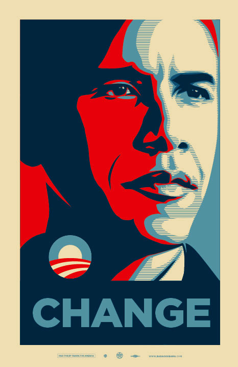
Fairey is emblematic of a new kind of cultural producer, at home with commerce and cultural politics simultaneously. In the new edition of our book Practices of Looking, Lisa Cartwright and I analyze the widely circulated Fairey-Obama posters (one features “Hope” and one “Change”) as both evocative of the historical image of JFK and as deploying the visual style of graphic poster design used by the Bolshevist agitprop artists of the 1920s. The graphic newsprint-like reproduction gives the work a sense of political urgency, playing with the idea of the image (and political figure) with mass appeal. The aesthetics of the image convey the spirit of progress and hope experienced both in the early Soviet context and in the Kennedy era. Contemporary viewers might be expected to read the poster’s graphic style as evoking a very modern kind of hope and optimism recoded within a savvy postmodern culture. The elegance of the poster is worth noting, with its deployment of a blue that is lighter than the stars and stripes blue, and a yellow warm tone—evoking yet not fully using the conventions of the red, white, and blue.
Of course the Obama logo (seen on the flyer) has already received significant attention (it’s been referred to as the “hardest working presidential candidate logo”) with its clever play on the “O” of Obama with the image of a sunrise evoking change, and its color scheme subtly signifying patriotism and the flag. Simple, evocative, smart. It was designed by Sol Sender of Sender LLC in Chicago in collaboration with mo/de, and was used in highly adaptable ways in the campaign. This week’s post-election coverage signals that the “O” will be played with throughout Obama’s tenure in office in headlines, political cartoons, and images (see, for instance, the cover of this week’s New Yorker).
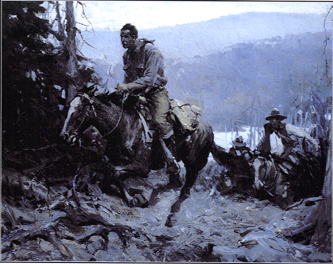
It was amusing to hear that when Bush showed Obama the Oval Office for the first time this week, he took him on his standard tour of the kitschy artifacts in his personal collection on display there (one can see this tour on the White House homepage). Presumably the tour included his painting A Charge to Keep, which depicts a lone cowboy riding his horse up a hill followed by a pack of riders, an image from a pulp cowboy story about a thief fleeing a posse that Bush had mythologized as the lone “determined horseman” who has a “difficult trail.”
One can only imagine the aesthetic disconnect the president-elect might have felt in that moment, and perhaps in quietly “measuring the curtains” he might have considered for a moment what kinds of images he would take with him to the White House.
Sidney Blumenthal has written on Salon.com about the “peculiar aesthetics propagated in the age of George W. Bush” with its “contradictory styles of softening nostalgia and hardening cruelty.” Blumenthal saw the Bush kitsch as a rejection of the Reagan-era kitsch of patriotic sentiment, stating that “under Bush, kitsch has been transformed from sentimentality to sadomasochism.” The kitschy (and brutal) cowboy aesthetic of the Bush Administration has finally run its course, and a new aesthetic, one that rejects kitsch for a nuanced play off the visual codes that evoke America, is emerging in its place.


the best part of “A Charge to Keep” is that it depicts a horse thief fleeing the law!… http://harpers.org/archive/2008/01/hbc-90002237
this is a fascinating, insightful article. Thank you very much.
[…] of or was modeling a sluice of U.S. popular culture circa 1950, but given the ways in which the Bush administration has framed the intervention in Iraq from the very beginning as an extension of our […]
Great article. I admire your work (on Vietnam Vet Memorial etc.) I myself have seen connections between the Fairey poster also to the Che Guevara poster. Also the color coding reminds me of anarchist color coding (black/red) which is here subverted to blue-white-red. I think it works without coding Obama as “left”, it just picks up on the iconicity of these images and the vague hope (Che is revered not only by political progressives). Thanks for the article
Great article. There’s a lot of good info here, though I did want to let you know something – I am running Mac OS X with the circulating beta of Firefox, and the look and feel of your blog is kind of funky for me. I can read the articles, but the navigation doesn’t function so great.