Aug 16, 2013
Jan 20, 2014
Feb 03, 2013
May 15, 2011
Mar 22, 2009
Apr 14, 2008

Showing Coffins, Revealing Isolation

A great deal of heat was generated over the Bush administration policy of censoring photographs of military coffins being returned to the US from Iraq and Afghanistan.  (Actually, the policy had been in effect since the first Bush administration in 1991, but it was renewed by W.  The policy was changed in December 2009.)  The criticisms were justified, of course: democratic governments are supposed to be transparent; wars should not depend on public ignorance of their costs; military sacrifice can not be properly honored if hidden.  On the other side, defenders of the status quo had argued that the images would fuel controversy about the war.

Now that the coffins are back in public view, however, the impact of the photographs seems to be far less than anticipated.  (Some day governments will learn that the best strategy is to hide things in full view.)  In fact, the result has been a big yawn.  That may be why photographers now are doing something far more interesting that playing supporting roles in a conventional standoff.  Instead, we are being shown something else.
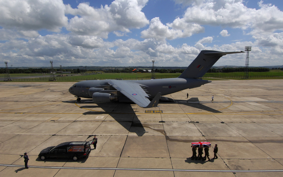
coffin-uk-tarmac

This image from the UK is, not surprisingly, a model of ritual observance.  The coffin of a rifleman killed in Afghanistan is being carried to a hearse during a repatriation ceremony at RAF Lyneham in Wiltshire, England.  The flag-draped coffin forms one point of a triangle completed by the enormous transport plane centered in the vanishing point and the hearse in the left foreground.   (The vectors are marked by the line on the tarmac, the wing/coffin and tail/two figures standing at attention.)  The set also composes a rectangle as the plane appears to be the same length as the distance between hearse and coffin.  The rectangle creates a strong sense of order and stability, while the triangle directs the meaning of the event from the foreground on earth through the plane to the blue sky beyond.

Thus, the photograph completes the work of the ritual practice being depicted.  The viewer is being asked to acknowledge two transitions: the soldier’s remains are being brought from a foreign battleground back to the motherland, while his soul can be imagined as already winging its way from earth to heaven.  Fittingly, the coffin is neither in the plane nor the hearse; the soldier is neither completely within the institution of the state nor transferred to the family.  He is now forever in between and somewhere else.  The institutions remain, here in idealized form: the large, impersonal, powerful plane that is nonetheless beautifully self-contained and standing at ready, dedicated to service of the individual citizen; and the small, familiar vehicle is also beautiful because built to human scale, carefully polished, designed to handle loss, and part of everyone’s fate.

Obviously, that story is too good to be true.  Rituals are not merely fictions, and they don’t contain only good news.  What struck me most about this photo is not the precise positioning of the ritual objects but rather the terrifying isolation being displayed in plain view.  Note how nothing is connected except by the invisible vectors of visual design.  Each element of this social setting stands in complete separation from the others–including the viewer from the scene itself.  In place of any connectivity, we see the open tarmac, flat landscape, and immense sky.  You can imagine heaven, just as you can imagine the nation, but the photograph also suggests the the story of this death is radical isolation.  That soldier is forever separated from those who knew him, and that loss contributes to greater separation among all those within the community.

Nor is this the work of one photographer, or a British rather than American tableau.
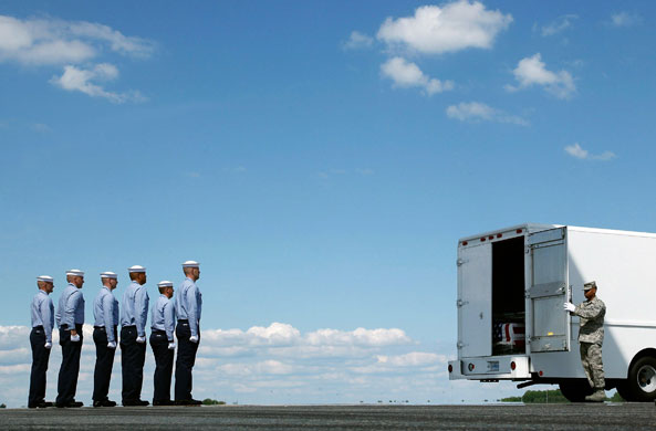
sailors-and-coffin

This photograph is from Delaware, probably at Dover AFB.  A Navy team stands at attention before  a coffin that has arrived from Afghanistan.  Here you see basic elements of the military ritual in the first photograph, albeit in much more humble fashion.  The coffin is partially hidden, the state how is represented by a delivery van, and the sailors’ service uniforms suggest a working class destination.  Most important, however, is that we again see human isolation amidst a vast emptiness.  Here, in fact, that comprehensive absence can’t be contained by ritual forms.  The scene is, sadly, all too revealing.

Perhaps this is the real challenge of showing the coffins.  The basic question is not whether to criticize the war or support the troops, but rather how to cross the distances that already separate everyone in the human community.

Photographs by Adrian Harlen/Reuters and Mark Wilson/Getty Images.
 2 Comments

A Thousand Words: Masters of Photojournalism

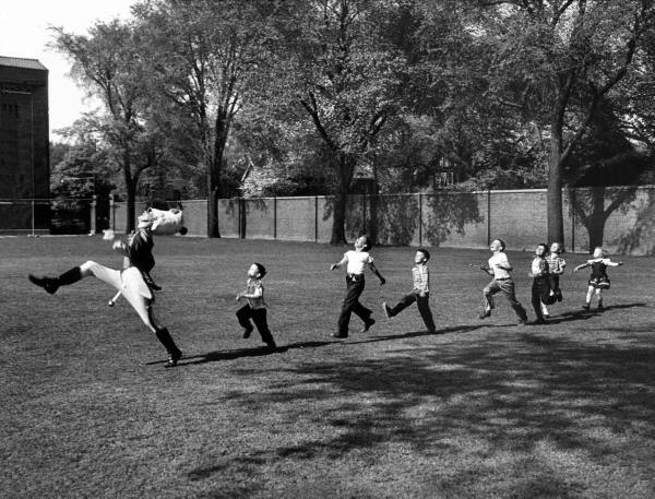
drum-major-eisenstaedt

Monroe Gallery of Photography, 112 Don Gaspar, Sante Fe, NM, is pleased to announce “A Thousand Words: Masters of Photojournalism”, an exhibition of more than 60 great photographs from the field of photojournalism. The exhibition opens with a public reception on July 3 from 5 – 7 pm, and will continue through September 25.  Additional information is available here.

Photograph taken in Ann Arbor, Michigan in October 1950 by Alfred Eisenstaedt/Life.

 0 Comments

Photographing Poverty: Realism or Sentimentality?

Debates about the moral value of photography have to deal with poverty.  One might think that there is little to discuss: poverty can be distressingly visible, and photographs have been a principle means for motivating efforts to help those in need.  From the classic photographs by Jacob Riis and Lewis Hine to those persistent Save the Children ads, images of poverty and particularly of its effects on children have raised awareness, shaped public policy, and opened pocketbooks.  All that remains, one might think, would be to continue to produce compelling images of destitution.

a-child-stands-at-his-hom-haiti1

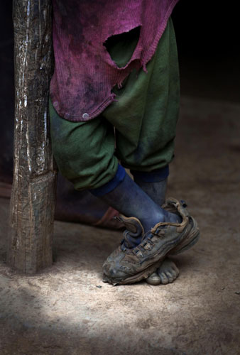
This photograph from Haiti may not prick one’s conscience, perhaps because we can’t see the child’s face, but it remains a striking image.  It also reflects the other side of the debate about photography’s moral legitimacy.  One argument against the image is that the photographic depiction of poverty is in fact highly sentimentalized: a continuation of the stock attitudes–including charity, but also condescension–of the Victorian era.  In short, the photograph of the poor child is a transposition of the Victorian waif from illustration into photography.   For this and other reasons, photographers such as Gordon Parks and others have been accused, not entirely without cause, of simplifying or otherwise aesthetically framing poverty as an object for concerned contemplation, instead of either exploring the social fabric of the poor community or exposing the causes of its continued oppression.

This photo would seem to fall under that criticism.  The image is too good: on the one hand, a near-perfect outline of the waif and, on the other hand, a composition of elegant design and rich colors that belies the child’s lack of resources.  Indeed, it could be in a Renaissance painting, and both the cropping and the oddity of the one shoe draw one into a close study of the image itself and thus away from critical attention to the social and economic conditions that lie behind it.

The photograph may reflect another criticism as well.  Somewhat paradoxically, photography is faulted (and by the same people) both for not evoking the correct moral response and for wearing out compassion or other charitable or progressive inclinations.  (Save the Children does come to mind.)  That idea could drive photographers to look for new angles on an old subject, and the image above certainly has been cropped in that manner.  Instead of the typical dirty face, we see asymmetrical feet (one shod and one bare); instead of the usual sense of need, there is a strange self-sufficiency in this child’s pose; instead of the same assurance that everyone knows what is needed, wearing one shoe creates a whiff of illegibility.  And so a photo that may be making poverty into art could also be reworking viewing habits to suggest that seeing is not knowing.

The debates about photography are not going to be resolved today.   I don’t think one can or should avoid the work done by public art, which includes channeling sentiments and thus risking sentimentality.   Photojournalism does traffic in stock sentiments, just as intellectuals rely on stock criticisms.  I’ll admit that there are days when I side with Oscar Wilde’s comment that “One must have a heart of stone to read the death of little Nell without laughing.”  But there is still reason to take a good look at the other side of privilege, and to consider how compassion must at some point be a way of seeing.

Photograph by Ramon Espinosa/Associated Press.  (This post is the second this week on channeling 19th century public art; the first is here.  Another relevant post is here.)

 7 Comments

19th Century Public Art in 21st Century Photography

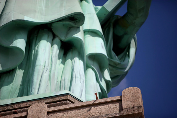
The Statue of Liberty is open for business again for the first time since 9/11.  As a result, New York photographers have had to deal with the task of finding a distinctive angle on one the the most familiar images in public art.  This one shows the lengths we all are expected to go to see the icon anew:

statue-of-liberty-small-hand

A child’s arm points upward while the massive statue looms above.  The photo is not likely to find its way into a photography textbook: we see nothing whole but instead only a truncated pedestal, sectioned statue, and disembodied person.  You have to peer into the image to locate the child’s small arm, which then makes the statue’s bulk all the more overpowering.  Distinguishing features are cut out of the picture while proportion is mangled.  In its place, attention is drawn to the institutional concrete and the heavy metalwork, and to the fragility and impermanence of the child’s limb.

But the photo is not cutting anything down to size.  Instead, it may be depicting a relationship between the national icon and the viewing public.  Note now the child’s arm is reproduced by the arm of the statue.  This is the only correspondence visible between the living person and the icon.  The parallelism is likely to be symbolic: and so, just as the statue is a token of America’s past, so is the child a sign of its future.  As both are aligned, and as the one is there to provide inspiration to the other, the implication is that America’s future will continue to be true to the ideals and aspirations of its past.

At this point, some would quote the text at the monument, say, about “huddled masses yearning to breathe free,” but my point is not to endorse a specific sentiment.  I do want to suggest, however, that the sentimental work of the 19th century public artwork is being continued today in two registers–by the statue itself and by its photographic reproduction.  Neither is innocent of complicated motives, but if you accept (as I do) that democracies depend on sentiments just as they depend on critical reason, then it is interesting to see how public arts continue to evoke such admittedly formulaic emotions.  Sometimes photography simply relays another artwork and much of the time it draws on its own iconography.  The image above does some of each.

An image of obvious fragmentation should also alert the viewer to its own limitations.  This view of the national monument makes it seem even more, well, monumental, while reducing actual citizens to the miniaturized status of a small child who can, of course, do little more than look and point.  The state may loom too large, and the people are now all but invisible individuals and certainly not masses that might be not so much huddled as unionized.  But perhaps that is too much of a stretch.  On the other hand, if we are to follow the lead of the photographers, we should be willing to consider more than one angle on our national icons, and on the state of the union they represent.

Photograph by Nicole Bengiveno/The New York Times.

 1 Comment

Disasters, Spectacles, and Random Acts of Civility

By guest correspondent Nathan Atkinson

When catastrophe strikes we can always count on photographers to offer up images of citizens helping their fellows in times of need.  These images usually focus on the drama of rescue amid dangerous circumstances. Firefighters work to save property and lives, police officers maintain order on behalf of the helpless, and EMTS rush to aid the sick and the injured.  The camera follows dutifully, recording their efforts for a public concerned, curious, or otherwise compelled to look.  What’s a disaster good for if it doesn’t bring out the best in our best?

But what of those smaller, one might even say trivial acts of assistance of the sort depicted in this picture?

dc-subway-helping-hand

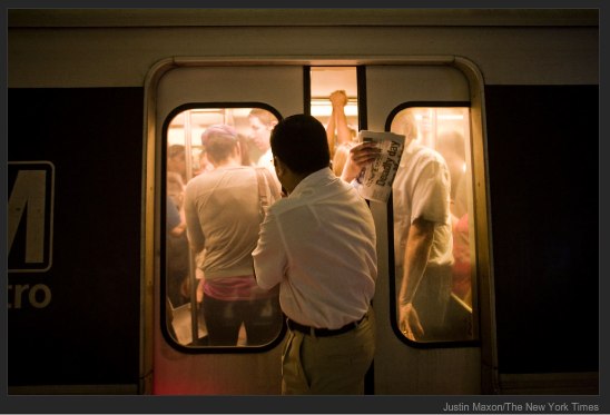
This photo represents the community that emerges from the mundane aftermath of tragedy. An anonymous commuter dealing with the disruption caused by the June 22 Metro accident struggles to board a train.  A rider, already on board, holds the door so that another might enter—a telling courtesy given that our usual stance on public transportation is one of unenlightened self-interest.

In holding the door this woman—the hand looks female though the figure is invisible behind the equally anonymous office-casual male in the foreground—gives up a bit of her comfort for a stranger she recognizes as a resident of a community brought together by the inconveniences that follow inevitably from catastrophe. It translates the bodily pains and horrors we extrapolate from the collision photos into the harmless bisection here.

We feel guilty when angered by the minor inconveniences of catastrophe.  The profound suffering of the catastrophe’s immediate victims makes our frustration with a missed appointment seem the height of selfishness.  The paper held by the same hand holding the door reminds us to feel this guilt, to forfeit self-pity and our personal comfort to make room for empathy.

This picture shows us that these minor inconveniences provide the opportunity to recognize our membership in a public in trivial acts, and in the comings and goings of civic life.  We rarely think of ourselves as part of a community when riding public transit. We react to the limited personal space by retreating into our audio players, cell phones, newspapers, ourselves.

The minor inconvenience to which the door-holder exposes herself echoes the small claim on our time that disaster coverage makes, our compulsion to read the paper—a compulsion the door holder shares. Her discomfort echoes moreover the discomfort we feel when we take the time to look at images of disaster.  This discomfort, in turn, functions as a visceral reminder of our membership in a community. Reading the paper, looking at photos, it’s the least we can do.

Photograph by Justin Maxon/New York Times.  Nathan Atkinson is a Ph.D. candidate in rhetoric at Carnegie Mellon University.  He is currently completing a dissertation on the visual rhetoric of atomic testing at the beginning of the Cold War.  Nate can be contacted at natkisno@andrew.cmu.edu.

 2 Comments

America the Empty

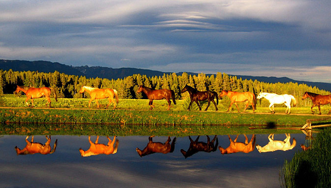
Recently USA Today ran a photo contest to answer the question, “Can a single image capture the essence of America?”  Of the 1,035 entries, this one was judged to be the best:

usa-today-photo-winner

It’s a fine image, and one can easily concur with the judges’ statement that it has “gorgeous color, beautiful light and a killer reflection.  The visual surprise makes the eye move back and forth, and the subject is emblematic of the American West.”

But wait a minute.  There is a difference between the first half of that judgment and the second.  Color, light, and the reflection are one thing, while surprise and emblematic representation are another.  In fact, water reflections are standard stuff in nature photography, so there would be little surprise there (nor would viewers be likely to be confused about which horses are real).  And what about the idea that the landscape is the definitive image of the American West–and therefore of America?  Can you get more conventional than that?

My unease wasn’t helped by the paper’s claim that the contest photos “capture America the beautiful beyond obvious landmarks to its glorious landscape and spacious skies.”  OK, no Statue of Liberty, but the Western landscape is an equally obvious visual figure, and it is clear from the text that our perception is supposed to be shaped by the iconography of “America the Beautiful.”  Sure enough, the second and third place photographs are from Antelope Canyon, Arizona and Arches National Park, Utah: in other words, they are beautiful examples of familiar scenes in the photographic archive of Arizona Highways, National Geographic, and similar house organs of travel photography.

The fourth place photo is of an ocean sunset, and so it goes.  Most tellingly, of the top ten photos, only two–numbers 6 and 10–include people.  In the first of these, we see children practicing with lariats at a “cowboy training camp” representing “family fun vacations in the American West”; in the second, there are tiny figures in the background of a photo of kites at a beach.

Don’t get me wrong–some of the contest entries are fine photographs.  But what about the big question: do they picture America?  If so, we may have a problem, because then America is in some important sense essentially empty.

If you look at the rest of the submissions, it seems evident that America is the West, which is largely void of people.  As Richard Avedon, Michael Shapiro, and others have stated before, this is not an innocent idea.  The photo operates ideologically, whether by hiding the workers, implying that natural resoures are boundless, or reinforcing assumptions about American exceptionalism and providentialism (as if Central Asia didn’t have similar vistas, or lacked God’s grace).

To be fair, however, we also have to note that these photos also are negotiating other problems of political representation: by not featuring people, no one ethnic or social group is given the privilege of being the “face” of America, and showing natural scenes through conventional iconography does supply the typical places and common objects that are necessary for the shared seeing that is a vital element of democratic public culture.

That said, it seems to me that we could do better.  The dedication and skill of the amateur photographers in the contest needs to be augmented by critical discussion of how one might represent “the essence of America.”  One argument is that there is no such thing to represent; another is that no one representation could do so.  On the other side, the US is not simply a neutral aggregation of autonomous individuals having nothing in common, and collective living requires common images and ongoing judgments about what is more or less representative.

And let me say it as clearly as possible: America is not empty.  Nor is the natural order of things walking serenely in single file.  Nor can photographs represent a political community as neatly as still water reflects horses.   Public life needs many images–these and others as well.  America is beautiful, but not because the people are invisible.

Photograph by Joanne Panizzera/USA Today.

 8 Comments

Second Birthday for Nocaptionneeded.com

Today nocaptionneeded.com celebrates its second birthday.

second-birthday-part-deux

There is a lot to be said for the Web, but virtual parties are not likely to be high on the list. Even so, we’re still here and somewhat amazed about that, and still growing and somewhat amazed about that.

As we did last year, this is a time to say “Thanks” and to take stock.  Thanks to all our readers, and not least to those who take the time to comment.  We don’t always like what you say, but you don’t always like what we say, and that’s what we should expect from an honest and engaged discussion.

We also want to pause a moment and take stock.  If you would like to give us any advice, now is a good time to do it.  What works and what could be improved?  What might be added?  Where should we be headed?  Advice might not be heeded, especially given our limited resources, but it always is appreciated.  You can comment below or email us at rhariman@gmail.com and lucaites@indiana.edu.

We’ll be taking two weeks off from posting—first, to lead a week-long seminar at the Rhetoric Society of America’s summer institute for scholars, and then to get of out of Dodge for awhile.  Both should provide additional context for our assessing what we do here, and we’ll continue to read our mail. . . .

See you July 6, as we start another year at NCN.

 6 Comments

When Dissent Lacks Drama, It's Still Dissent

The riveting images and real time coverage of the events in Iran this week are about as good as it gets for those who celebrate public demonstrations on behalf of progressive social and political change.  The power of the people is there to see, as are the democratizing effects of modern media technologies when they are used to organize and amplify what is happening on the street.  The interlocking institutions of authority and corruption begin to look like the walls of Jericho, cracking as they are about to come tumbling down.

May it be so, but let’s not forget that the media also features one story at a time.  There always are other protests, other causes, other appeals to the international community that are, have been, or will be overlooked.  Equally important, perhaps, is the recognition that most protests are frail things that seem pathetic at the time and inconsequential thereafter.  Most important, we should celebrate the fact that people protest anyway.

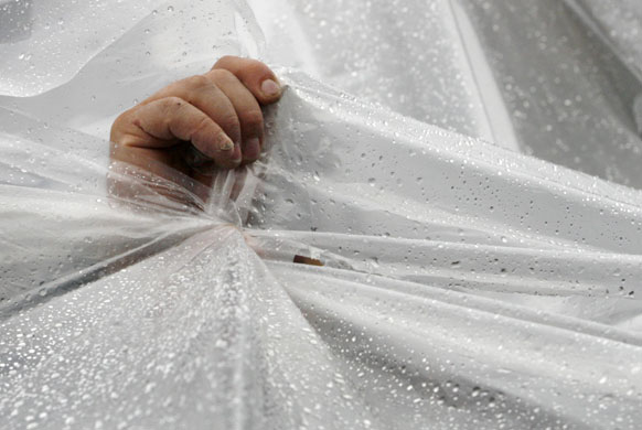
When it rains, for example.

hand-in-rain-dissent

This photograph from a demonstration in Tbilisi, Georgia captures so much of the dismal side of dissent.  A single hand strives to hold plastic sheeting together to keep out the rain that is ruining the demonstration.  It’s hard to make your case in the public square when you can’t be seen and no one is going to be there anyway.  The hand is all that remains of the citizen, who is reduced to a small act of self-preservation.  So much for the will of the people.  The sheer vulnerability of the protester is emphasized further by the white sheet, which could as well be a burial shroud.  And yet he lives, and waits for another chance to stand for his cause.

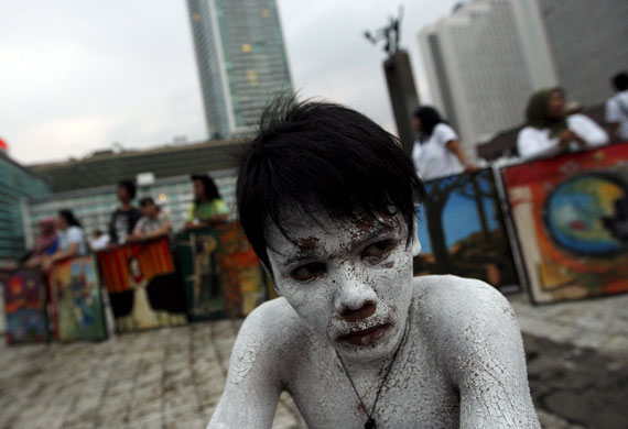
As does this demonstrator in Jakarta.

whitened-dissenter

This might be titled the activist’s very bad day.  He has gone to considerable trouble to make a statement–body paint, a performance that will have been scripted and rehearsed, all to be presented before an audience who probably couldn’t care less.  Yet he, too, is a study in fatality: white as a corpse, looking as if beaten, nakedly vulnerable, and alone but for his fatigue and discouragement while the public looks elsewhere.  It was Earth Day in Indonesia, which has a terrible environmental record including 70% deforestation and some of Asia’s worst air pollution.  Let’s hope that next year things go better.

Heroism can’t be the staple of democratic dissent.  I won’t for a minute belittle those who are standing up to brutality today, but let’s not forget the many others who have been keeping up the struggle in other settings.  They, too, keep the spirit of democracy alive, and they do it by withstanding humiliation and failure.  Heroism is a rare and beautiful thing, but for those bad days, a different kind of courage may be required.

Photographs by Shakh Aivazov/AP and Mast Irham/EPA.

 1 Comment

Showing Political Action: Images in the Iranian Protests

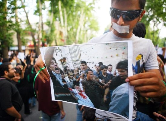
Commentators on photography frequently claim that the image is a counterfeit of reality. Beware the image, we’re told, as it is not the real thing.  But it you look at what people do with images, you can see far more than people being mislead.  What I find particularly notable is how ordinary people are enlisting images as foot soldiers in public demonstrations.  Instead of displacing reality, images are being used to increase the scale and impact of democratic advocacy.

You could see it as Chinese parents held photographs of children killed when their schools collapsed during an earthquake, and you can see it now as Iranians protest their government’s attempt to fix the presidential election.

protest-photo-in-protest

Here a protester is not only marching in the street but displaying a photo of another protester who was shot by a government thug in an earlier demonstration.  For an example using an earlier photo of state violence, look at the bottom of this post, and see others in photograph 9 at The Big Picture. That’s only part of the repertoire, however.

photograph-mask-iran

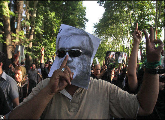
I doubt anyone thinks this guy actually is Mir Moussavi, so the protectors of reality can stand down for a moment.  He is doing something much more significant than imitation, anyway: by making the photograph a mask for this political theater, he puts the political leader’s face on the body politic that is the multitude of people in the street.  The leader, who actually is living on the edge of house arrest, is given the force of the people, whose identification with his cause and their right to a fair election is given specific statement.

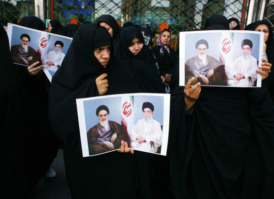
There may be more going on as well.  This carnivalesque mashup may also be a response to the State’s attempt to mobilize the same means of persuasion on behalf of their theocratic regime, as they do here:

photo-in-protest-pro-gov-iran

These women are holding photos in a demonstration on behalf of Mahmoud Ahmadinejad.  The stock portrait of Leaders with the Flag and corresponding production values are in sharp contrast to the dynamic documentary witness in the first image above.  If you want to communicate Order and Stability instead of change, however, this state-sponsored image will do.

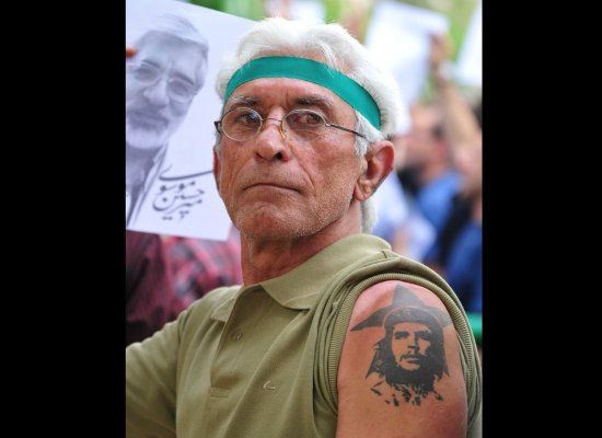
It’s tempting to leave it at that: a contest between competing images that reflects the two sides of the polarized confrontation in the street.  The  disenfranchised people, their candidate, and a dynamic visual culture on one side, and traditionalist social orders, clerical leaders, and propaganda on the other.  But I want to tip the scales further on behalf of democratic public art, which, after all, should be too brash and ungainly to be easily categorized.  For that and other reasons as well, you really ought to get a look at this:

che-tatto-iran

The photographs are from the slide show at the Huffington Post.  Photographs 1-3 are Getty images; I don’t have an ID on 4.

 7 Comments

Twittering Past the Bloodbath

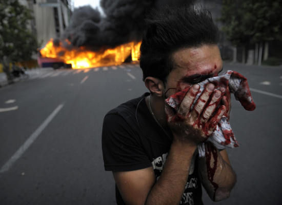
The new media have been giddy with their up-to-the-minute coverage of the events in Iran this weekend.  Direct comparison, compliments of Twitter, with CNN’s poor showing made the contrast all too obvious: The new media reports coming out of Tehran were equivalent to CNN coverage of the 1991 bombing of Baghdad.  Better yet, the “revolution” unfolding today had erupted because Mousavi supporters had been able to text around state censorship of major media networks.  Add to this the early photographs of hip, attractive students showing V signs and you might think that the whole thing was one big Obama rally.  Except for this:

injured-iranian

This guy got nailed. Broken nose, for sure, and maybe some teeth.  His protest is over for the day.  You can see how the injury has refocused his attention down to a single zone of pain and perception, the single preoccupation of holding his body together, the single act of getting himself to a safe place.  The cloth that he is using to staunch the blood does additional work for us, as it can imply that he might want to weep, not for himself but for his cause, or that he might want to hide his face in shame, not from the blood but from the larger stain created by his government as it makes a sham of a democratic election.

But this is not the time for symbolism.  As the government and its vigilantes are becoming increasingly violent, images (and videos) like this probably will become more prominent in the next day or two.  With that, viewers are going to have to adjust the frame that was created by the initial news coverage online.  Don’t get me wrong: I’ve been devouring reports by bloggers, Twitter feeds, and Facebook pages, all via various online aggregators.  Even if some may be caught up a bit too much in promoting their own role in making history, the new media definitely are a part of the story.  But the heart of the matter is that people have been putting their bodies on the line.

And let’s not forget that history still is being made the old fashioned way–by brutally beating people.  Note this report on anti-Mousavi thugs from Samson Desta, a reporter for CNN (!), as printed at the Huffington Post: “They were plain clothes, carrying baseball bats. They were carrying metal pipes, and they were just beating up anyone that was that was in that area. Today, I went to a second protest…probably the most violent that I’ve seen, that we have seen.  . . . No uniforms but they had weapons such as metal pipes, and they were actually just driving around, intimidating people, beating up people, anyone that was in the street, anyone that was in the road, anyone that dared to chant “Mousavi, Mousavi,” they were beating them senseless.”

Baseball bats, metal pipes, and blood.  All we see here is the blood, which is but a trace of the violence.  But it is a vital sign.  Let’s not support the protesters because they are young and beautiful and connected; they should be supported because they are willing to risk all that for democracy.

Photograph from Getty Images/Huffington Post.  Currently 41 photos of the demonstrations and reprisals are available at The Big Picture.  Unfortunately, the point I’m trying to make here is vividly evident in the arc from the first image to #41.  The list also includes another photograph (#16) of the man shown above.  NCN readers may remember other posts on showing blood, including this one.

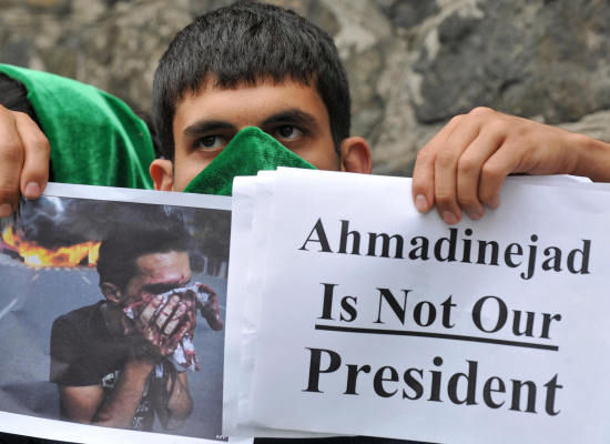
UPDATE:

bloodied-iranian-photo-poster

 5 Comments