Apr 13, 2012
Apr 24, 2020
Sep 19, 2007
Jul 25, 2010
Apr 29, 2008
Jul 10, 2011

The Sight of Blood

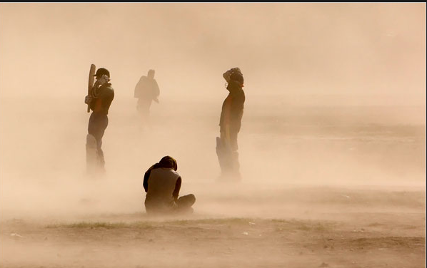
Some get light-headed at the sight of blood, others get nauseous, kids are amazed, nurses get used to it. Most of the time, we don’t see it. Despite the gallons of fake blood spilled in the movies, the sight of the real thing continues to be a shock. That will be one reason you don’t see it often in a family newspaper. The daily slide shows have more leeway, however. That’s where I found this image:

bloody-monk.png

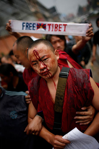
The caption stated that a number of people had been injured when a rally in Katmandu was broken up by police wielding tear gas and batons. (Why do they call them police?) Now this photo isn’t grotesque. Indeed, it’s not too far aesthetically from the more familiar tourism photos of Buddhist monks in colorful robes, or from other images that have been in the news lately from the many carnivals and similar rites of spring that are going on around the globe. And one could suggest that it’s somewhat staged: he could be propped up for the camera, and the red, white, and blue sign in English certainly is directed at the Western media. Besides, blood flows freely above the lip line; he could just be nicked as if by shaving, right?

Wrong. He’s been clubbed, and he’s being held up because he might collapse. He is not colorful. He is bearing witness to violence. If they will club him in the public square, you can imagine what can happen behind closed doors. But we don’t go there, and that is why it is important to see the blood. Stunned into silence, his body now speaks for him.

If we were to measure speech, perhaps it could be done in blood. How much has to be spilled to secure the right to speak freely? How much has to be said to stop the flow of blood in police states and failed states and war zones and ghettos around the globe? How often will we turn away rather than look, nauseous, at the blood streaming from the victims of beatings and bombings and drive-by shootings? When will we face this:

baghdad-clinic-blood.png

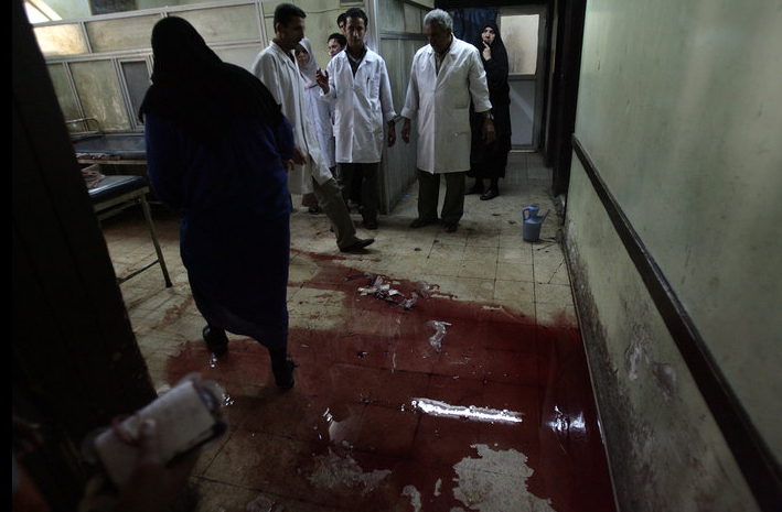
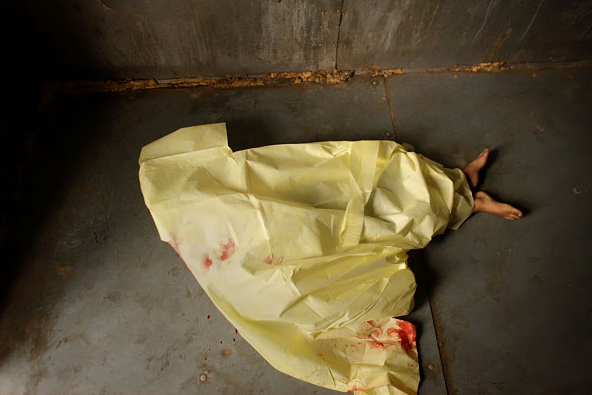
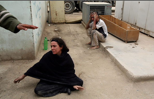
Sadr City, Baghdad, a local clinic after a firefight between US troops and militiamen. It makes me sick.

Photographs by Brian Sokol/New York Times and Ahmed Al-Rubaye/AFP-Getty Images.

 1 Comment

Looking at the Pope, Seeing Humanity

With the Pope’s visit to the US this week, some Protestants will be sorely tempted to fall into the sin of pride. Protestants like me, for example, when I look at photographs such as this one:

pope-benedict.png

Just what American needs, a medieval monarch. Just what Christ had in mind: opulent robes, gold trim, courtiers, pageantry, all on behalf of hierarchy.

But that’s too easy. Irony and two bucks will get you a seat at the coffee shop, but it’s no more righteous than sitting in a pew. Rather than rehash differences, the more interesting question is, what might a non-Catholic learn from the Pope’s visit? While looking through the photo essays on his pending arrival, there seemed to be little there that I hadn’t seen before and that wasn’t playing out a familiar script in the courtly style. But then I saw this image:

pope-benedict-mortality.png

The ornate robes and crown are gone, leaving the human person who temporarily inhabits the institutional role. The off-write robe or shawl could be a rough covering against the cold, or a shroud. The bare head, thin, white hair, and almost fearful expression suggest vulnerability, yet his eyes are resolutely open to what awaits him. He is illuminated from above, but the light bathing him seems not to confer a blessing but to call him toward the next realm. The shadows along his face and body cue the sense of pending mortality that suffuses the picture.

The first photograph allows ironic contrast between the majestically robed pope and the body of Christ on his scepter. No irony is intended, of course, but instead the suggestion of a common immortality: Christ in heaven and the universal church. In the second photograph, I see only one body: the mortal body, seen to be aging where not covered with common cloth signifying the grave. The scepter has changed as well: in place of the tortured Jesus, only a small cross. Most tellingly, in the center of the metallic halo, one sees a translucent circle. Note also how the light illuminates both the pope’s head and the center of the sceptered ornament. One can see a human being and the mechanism of the church. One can imagine that he will at the last see an aperture to heaven, or only emptiness, diffusion, nothingness.

There need be nothing parochial about that choice. Instead of the Grand Inquisitor, this pope, for one moment, bears witness to the human condition.

And there is more. My response to the second image did not occur by accident. The robe is called a humeral veil–from the Latin humus, or soil–and was once a burial shroud and then a baptismal vestment, thus signifying death and rebirth. Likewise, the scepter is called a Monstrance–from monstro, to show–and is used to display the consecrated sacrament (the body of Christ) to the congregation. Thus, although one need not follow the path all the way through death to eternal life, the liturgical ritual clearly had marked out a path. What it cannot do is mandate a single valid interpretation of what is shown: if one sees faith and the promise of salvation, another can see empty ritual and collective delusion. Regardless of what I believe, I see a signifying animal that persistently, perhaps even nobly confronts the void with its need to communicate and ability to imagine a better world.

Photographs by Darlo Pignatelli/Reuters; Pier Paolo Cito/Associated Press. Thanks to the Rev. Dr. Robert Clarke for technical support on church liturgy.

 4 Comments

Conference Call: A Return to the Senses


CALL FOR PAPERS:

A Return to the Senses: Political Theory and the Sensorium

– A Theory & Event Conference –
May 7 – 9, 2009

The resurgence of scholarly research on the nexus between politics and aesthetics has brought to the fore rich and diverse investigations on the role of the senses in political life. Whether engaging the theories of perception that configure our understandings of justice, or forms of aesthetic experience in an ethics of appearance, or the role of affect and the passions in human motivation, the concerns that motivate these and other cognate inquiries stem from an important fact of pluralist democratic societies: namely, that individuals or groups in pluralist democracies attend to one another at the level of appearances. In this respect, how we imagine the configuration, disposition, character and function of the senses when engaging political events is of critical importance for political theory.

In collaboration with the political and cultural theory journal Theory & Event, an international conference will be held at Trent University in Peterborough (Canada) on May 7 – 9, 2009. Multidisciplinary in scope and ambition, this conference seeks proposals from scholars whose research interests pursue the diverse cultural sites of political theory’s sensorium. Such sites might include television, cinema, new media, food, music, and dance; practices of visibility, iteration, aurality, flavor; contemporary and historical treatments of perception and taste, time and movement – from a multitude of political, historical and theoretical perspectives.

The submission deadline for proposals is October 1, 2008. Please submit abstracts of 300-400 words (Ph.D. candidates should indicate their expected date of completion) to the following email address: sensorium2009@gmail.com. Notifications of acceptance will be sent out in January, 2009.
Conference Organizer:
Davide Panagia
Canada Research Chair in Cultural Studies
Traill College, Trent University
Conference Coordinator:
Adrienne Richards
The Center for the Study of Theory, Culture, and Politics
Trent University

Sponsored by the Canada Research Chair in Cultural Studies and The Centre for the Study of Theory, Culture, and Politics at Trent University.

 *********************************

UPDATE: We are at a conference at the University of Rochester on Visual Communication this weekend. Last night we had dinner with Michael Shaw of the BAG and Cara Finnegan, University of Illinois, where we prepared a “collective” post on a photograph from yesterday’s NYT. You can see the post titled “Serpentine Days” here.

 0 Comments

The Global Neighbor: Behind a Glass Darkly

Photographers occasionally shoot images of people reflected in windows, framed by windows, or looking through windows. Such images can be visually distinctive while also prompting more reflexive viewing: one sees both the image and some aspect of seeing. The two images below are examples of this visual thinking, while also reflecting other conventions that mediate global communication.

afghan-window-veil.png

This photograph shows an Afghan schoolgirl. The good news is that she is in school–not a given in Afghanistan. The bad news is that the photographer has put her under the veil. The window screen stands in for the chadiri she is likely to wear as a woman, while the rip in the screen might be a trace of orientalist fantasy, one shaded further by the stain on her hand. The implication is that, despite being in school, she still needs to be liberated. She would welcome that, it seems, as she is looking not through the screen but through the tear. That gash in the screen could stand for poverty or accident, but it makes the screen appear the more inevitable. Although a close-up shot of a vibrant young girl, she remains on the other side of a barrier. That barrier dulls perception in both directions. She seems a lost soul, ghost-like, someone who can see and be seen but not someone we can touch or help, as she really is from another world.

There are others in that world.

china-window.png

This is actually only a temporary confinement, as they are passengers in a Chinese train delayed by heavy snow. But that news is the least of it. Surely this is a vision of the human condition of separation, of the transparent barrier that stands between any human being and another. One grips the rail and looks to the side, warily; he has learned to expect the worst. The younger man still can admit to his yearning to connect. He looks at us, reaches out and puts his hand to the glass, as if we might place ours against his, as if we could touch and not feel only the cold glass.

Each photo tells us that it is not enough to see; we also need to connect. The Biblical allusion in the title of this post is to the beautiful poem in 1 Corinthians 13. Now we see in a “glass” (in the oft-quoted King James translation, referring to a mirror) darkly, but when united with God we shall see face to face. This vision of heaven doubles as a vision of how humanity might live with itself. Indeed, it might be that one step to achieving heaven on earth is to see one another as if face to face. To do that, we have to not settle for merely being able to see through barriers that still dull empathy and divide one from another.

Photographs by Rafig Maqbool and Vincent Yu for the Associated Press.

 0 Comments

A Sparrow Falls in Sadr City

This one is heartbreaking.

iraqi-dead-boy.png

I can’t help but think of a small bird lying in the dirt. Small yet once throbbing with life and song, now lifeless, soon to disappear entirely. Perhaps it’s the bright yellow–so unusual for a shroud yet somehow appropriate for a child–or the shape of a broken wing with the telltale blood, or the feet sticking out birdlike from beneath the body. Such a small, innocent thing. Do not speak here of the grandeur of war, or of forging character and testing national resolve.

There is a companion photograph, this one of the boy’s parents grieving outside the morgue.

iraqi-parents.png

In the first photo, the body is both there but not there. Here the body is not there but there–signified by the open coffin that will be used to put him away forever. Even the parents are both there and not there: physically present, but hopelessly distracted, lost in their grief, separate from each other, from anyone else, from themselves. The mother could be a wounded bird, flopping awkwardly in the dirt, not yet killed but crippled by the blow.

In the first photo, the bare feet evoke the vulnerability of a small animal but also are the one sure mark of a human body. Likewise, the hand extending into the second picture may be the one sign of human compassion in the scene. I don’t know, but it seems as if someone is cautioning the photographer to not get too close or otherwise intrude on the grieving parents. That small gesture holds out the promise that others could recognize their pain and respect their need to mourn. Thus the hand cues response to the photograph as a whole, suggesting that others might care for those being harmed by the war. The question remains whether that is a plausible hope or an empty gesture.

Photographs by Michale Kamber and Joao Silva for the New York Times.

 2 Comments

Sport on Planet Arrakis

One of the basic ideas of this blog is that photographs can depict more than what was happening in front of the lens. This added value can include highlighting larger patterns and processes and also providing imaginative projections of current tendencies. This is what some artists try to do by writing, and science fiction is particularly keen on exploring possible technological and political consequences of present tendencies. This comparison came to mind when I saw this photograph from Afghanistan.

sandcricket.png


The caption confirms that these are cricket players in a sandstorm. It also adds that they are on a “playground,”but something seems lost in translation. The scene looks more like something out of Dune (the book, not the movie). Recreation on the desert planet Arrakis may not be a lot of fun, but we can marvel at how humans can adapt to anything. At the same time, the imperial influence seems to be alien and superficial rather than any genuine improvement of the place. The storm and much more may pass, but there is something poignant about this image of human beings defined by arbitrary rules and shared isolation on their desert planet.

With this photo sitting on my desktop, I wasn’t entirely surprised when a second appeared a few days later.

morrocorace.png


You are looking at the competitors begin the 150-mile Sand Marathon in Morroco. The race includes a full marathon, and a 50-mile day, and others as well across varying terrain. The race has to be run while carrying all their equipment on their backs and getting only 9 liters of water a day. Again, the old fort, the desert, and the peculiar, imported form of ritual play by hardy adapters could be from Dune. Where one would think survival would be enough, more is achieved, but always by staying close to the severe limits of nature.

My comparison may be fanciful, but I can’t help but think that these photos are displayed for reasons that go beyond being visually distinctive or documenting unusual forms of recreation. They might also be images of a possible future. That would be a future not on some distant planet, but on this one, should it become ruined by some combination of unrestrained emissions, deforestation, warfare, and other forms of ecological destruction.

Photographs by Ahmed Masood/Reuters; Pierre Verdy/AFP-Getty Images.

 0 Comments

Photographer's Showcase: The Ways of Paint

This week our showcase takes us outside the ambit of photojournalism. David Sutton is a professional photographer who creates remarkable portraits of people and their animals. His distinctive black and white images have appeared in numerous media outlets and brought him the unique honor of being named the best pet photographer in America by the magazine Forbes FYI. You can see some of David’s portraiture at his studio website. Today’s showcase provides a glimpse of some of David’s other work and of how he sees the world in color. The five photographs below are from a series entitled The Ways of Paint. David remarks that he is intrigued by how “paint reveals processes.” And so it does, while also becoming richly evocative.

eggshellearth.jpg

sut-2.png

sut-3.png

sut-4.png

sut-5.png


 0 Comments

Lying to Tell the Truth about Hillary Clinton

The story of Hillary Clinton’s compulsive lying about being under sniper fire during a trip to Bosnia is already slipping away, so much so that she now is referring to is as a minor mistake. Well, I guess we should forgive and forget, right? (Wrong.) Before that happens, however, let’s take one last look at Hillary dodging bullets as she sprints across the tarmac:

clintonbosniajpg.jpg

As one astute reader put it at another blog, it depends on what your definition of “sniper fire” is.

Cynics will be gloating over this egregious example of how “all politicians lie.” That sloppy thinking only helps cynics and liars. Not everyone is in Hillary’s league, and she, not her opponent, has asked that people judge her on her judgment and experience. Note that character is not on that list, and the lie about her reception upon landing in Tuzla reflects both bad judgment and a misuse of experience. But, truth be told, her claim may have been not so much a lie in her own sense of things as a fiction–something not true that is told to convey a truth. OK, the snipers weren’t there, and she had to know it since she brought her daughter along, but you’ve just got to know that she is soooo ready to be a “war-time president.”

I don’t think earnest yearning excuses much, but if we grant Hillary any slack, she had better be ready to concede that visual commentary might tell the story slant to get a better sense of the truth. Like this:

iwo-cartoon-hillary.jpg

Editorial cartoonists love to use the Iwo Jima icon. This one may seem a tad unfair because of how the icon is gendered, but, again, it’s Hillary who has said she’s the only one who ought to answer the mythical National Security Phone. What is more telling is that she is facing the viewer. In contrast to the anonymity of the soldiers laboring together selflessly on behalf of the nation, she is jumping in unbidden to serve personal ambition. Of course, she wasn’t claiming to be a soldier, and there are no bullets in the iconic photograph of the flag-raising, but the cartoonist has revealed more than one problem with Clinton’s lie.

Hillary got caught telling a whopper; perhaps she ought to be given a dose of her own medicine. Some people wish it could be her Dukakis moment–that is, the equivalent of the 1988 Democratic candidate’s mistaken photo-op, when a shot of him riding in a tank became a defining moment of the campaign and one reason you don’t hear references to “President Dukakis.” That episode may be why you can see this image online today:

hillary-tank.jpg


Really, really unfair. I’m just broken up about it.

Photograph by the Associated Press. Cartoon by Joe Heller/Green Bay Press-Gazette (March 31, 2008). Photoshopped image by registered@aol.com. For scholarly discussion and examples of the use of the Iwo Jima template in editorial cartooning, see Janis L. Edwards and Carol K. Winkler, “Representative Form and the Visual Ideograph: The Iwo Jima Image in Editorial Cartoons,” Quarterly Journal of Speech 83 (1997(: 269-89, and Hariman and Lucaites, No Caption Needed, at pp. 121-124 (on Iwo Jima) and elsewhere.

 3 Comments

Iconic Images, Lego Art, and the Limits of Imitation

One of the characteristics of iconic images is that they are reproduced across a wide range of media, genres, settings, and topics. Actually, that is true of media more generally–think of how songs, jokes, quotations, recipes, fashions, and many other other things circulate widely–but it usually is not so intentional or distinctive as when it is done with widely recognized and influential images. Iconic photographs have been reproduced as drawings, paintings, sculpture, murals, graffiti, embroidery, beadwork, silkscreens, figurines, stamps, plates, coins, tattoos–you name it. Oh, yes, and Lego art:

lego-kiss.jpg

This is one of a set of nine that are posted at a Flickr page. The set contains reconstructions of three canonical photographs by Henri Cartier-Bresson, the Charles Ebbets’ shot of iron workers sitting on a beam hanging in empty space, Robert Capa’s photo of a soldier being shot in the Spanish civil war, the Times Square kiss, two from the Vietnam war, and the lone protester standing before a tank in Tiananmen Square.

The question is whether there is anything to be learned from the Legos. One wouldn’t expect much beyond what we already know: with a few key features in place, we can recognize the iconic image in any medium, and people can be clever when they have time on their hands. The odd imitation is basically a joke, and we marvel–briefly–that someone could get so much out of Legos or ice cream (it’s been done: the flag-raising at Iwo Jima) or whatever else is getting the iconic upgrade.

I wonder, however, if there isn’t more to the Lego art. Let’s take two examples–briefly. First, the Times Square kiss:

kiss.png

The Lego version captures both the strongest positive feature of the photo as well as one cause for criticism. The positive feature is the good vibe that so many people get from seeing a young couple passionately “kissing the war goodbye” on V-J Day. You get that feeling in the Lego work from the smile on the sailor’s face. In the photograph from Times Square, there is much more: youth casting off of wartime restrictions, Eros and regeneration triumphing over war and death, private and public life beautifully harmonized; what’s not to like? Well, there is one thing for some, and that’s how the woman may be a less that willing participant. He didn’t ask first, and so one form of domination could be giving way to another form of domination. And sure enough, the Lego art gets that as well: look at how awkwardly she is bent back, and how she is not returning his advance.

I could stop there, but let’s do one more:

lego-shot.jpg

This is a reprise of the Eddie Adams photograph from the 1968 Tet offensive in during the Vietnam War.

eddie-adams-icon.png

Adams believed that the officer was justified in executing the bound prisoner of war, and perhaps a case can be made. But the photo records more than a single incident, and it fit too well with many other acts that were both criminal and marked by the official indifference that is displayed here. So, much to Adams dismay, the photograph became memorialized as a statement against the war.

And something like that ambiguity is evident in the Lego art. The smiles of the two figures, and particularly the one being shot, are just not right. They’re wrong because not in the photograph, and because not fitting with the scene, and because not appropriate for cuing our reaction to a killing. As with the iconic photograph, what seems to be a simple image is in fact one that churns complicated responses, in part because it isn’t right with itself.

There are limits to imitation. Not everything can be said in any medium, and some media can’t say much at all, but there still can be more there than we might think. Next up, iconic images in cornfield mazes. Really, they’re out there.

Photographs by Alfred Eisenstaedt/Getty Images; Eddie Adams/Associated Press.

 7 Comments

Radiant Agriculture

Every spring and fall the photographic record in the US includes a few stock images of agriculture. Spring images include tractors turning the earth and kids holding newborn lambs; typical autumn fare includes combines moving across the Great Plains and pumpkins waiting to be carved. Modern agribusiness and a mythic county life each get their due. For the most part, however, we don’t see where our food comes from. The near-complete separation of the production and consumption of food is more than a distribution of labor–it is one of the things that makes us feel modern. Not surprisingly, it also ensure that “food” becomes very elastic, so much so that the local supermarket can have over 100,000 different products for sale.

The absence of images about food production is part of this willful dislocation of eating from growing, killing, and preparing food. It also isn’t a big loss much of the time. Who wants to watch wheat grow? Even so, once in a while an image comes along that can stop me in my tracks. Like this one:

yunan.png

The photo is of a rice field in Yunnan province in Southern China. It’s displayed both as a photo of the day at National Geographic online and at the Yunnan entry at Wikipedia. I think it belongs in the tradition of Chinese fine art. Indeed, if it seems familiar that probably is because it evokes earlier art works. Those paintings also may have captured terraced fields on landforms that seem so dynamic that they might be clouds. They, too, will have showed a place as if it were both uniquely particular and some fantastic otherworld. They also have mastered the exquisite tension between energy and order that makes the scene appear at once airily ephemeral and so beautiful that it could be eternal. The photograph stands alone, however, because of how it captures the light. The bright-hued light doesn’t so much shine on the landscape as radiate from within it.

The photo’s sense of aesthetic harmony amidst powerful natural energies might carry over, through the caption, to the idea that this also is an image of the good life: carefully manicured fields hug the wild mountain, and one can imagine that farmers are serenely engaged in sustainable agriculture as they have been for millennia except when drunk on sunshine. In fact, Yunnan has been a poor province that only now is producing enough rice to feed itself thanks to the addition of high-tech seeds and other modern practices. And so we get to the next photo:

nd-horizon.JPG

This image from North Dakota seems almost funereal. The land is cold and empty, the sun is setting, and all that remains are a line of metal railroad cars that are evenly spaced as if sprockets in some cosmic abandoned factory. This is mechanized commodity crop production, and it’s hard to imagine anyone wanting to be in the picture. The image accompanied a report on North Dakota’s population decline; the story was entitled Not Far from Forsaken.

That’s not the whole story, however. This barren winter desert is an unbelievably productive source of food that is shipped all over the world. So let’s look at the photo again, for it, too, suggests the promise that was so vivid in the first image. As Kathleen Norris learned, Dakota also is a place of heavenly energy. Look at the sun in this photo as something radiating constantly through the land, through the networks of exchange that define every meal we eat, and, most important, through the wheat that lies in the rail cars waiting to be converted into food and all we can do when we don’t want for food.

Photographs by Eugene Richards/New York Times; Jialiang Gao.

 4 Comments