Sep 15, 2007
May 25, 2009
Sep 15, 2007
Apr 18, 2010
Oct 26, 2007
Mar 29, 2013

Dancing with Wolves at Camp David

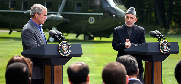
Yesterday’s papers reported on the talks between Bush and Afghanistan President Hamid Karzai, which were concluding with the requisite photo-ops. These diplomatic events are artfully choreographed dances: the American president has to suggest that the two countries are equal partners rather than an imperial state and its client regime; the visiting pol has to suggest some degree of independence for the folks back home while otherwise blessing the dependent relationship. Thus, Bush could say that Karzai “knows best about what’s taking place in his country, and of course, I’m willing to listen.” That’s our Bush, not only The Decider but also one heck of a listener. And Karzai (on CNN) had referred to Iran as a “helper” while not making a fuss about his country’s lack of sovereignty, say, in deciding whether US troops are allowed within its borders. The New York Times coverage included a front page above-the-fold shot of the two striding along as if equals hitting their stride together, and then this photo with a story that made it sound like they were having a thoughtful debate.

07prexy600.jpg

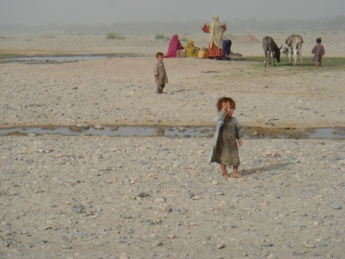
Two things strike me right away. One is Karzai’s gesture, which neatly reflects his ambivalent stance politically. Holding his hands in that manner can provide sophisticated inflection of a point in deliberative discussion, and it can also can be a sign of obeisance or supplication. The second thing I can’t help but notice is the grass–how green and lush it is. Everyone there is taking it for granted, but it’s so rich–and so far away from Afghanistan:

afghanistan-senlis-council.JPG

Photographs by Doug Mills/The New York Times, and the Senlis Council/Global Policy Forum


Digg!

 0 Comments

Arms and the Man

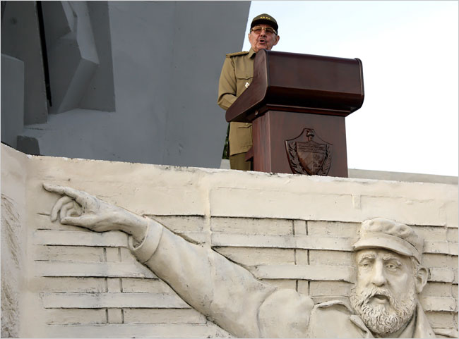
Recently I suggested that photojournalism includes an iconography of body parts that are used to communicate emotions, attitudes, relationships, and the other elements of political experience. Coverage of the celebration of the 54th anniversary of the Cuban revolution is a case in point, and also a brief lesson in the politics of photo selection. Let’s start with this photograph of Raul Castro speaking at the ceremony:

raul-no-hand-01.jpg

Raul is not exactly shown to advantage here. By contrast with the concrete bas relief of Fidel in front of the podium, he is a diminutive figure set into the background of the scene. Fidel is cut to heroic dimension, bold, direct, and resolute. Raul is like a Lil’ Bush, outmatched even by the lecturn blocking him off from Fidel, the audience in Camaguey, and the viewer. Most important, Fidel is pointing in a classic elocutionary pose as the leader pointing the way into the future. Although looking along the same line of sight, Raul’s arm is stuck next to his side as if he were a stiff, bureaucratic functionary. The implication is clear: Raoul is not the bold, active leader of a revolution. And since that leader is already set in stone while no longer on the political stage, he’s no longer a factor either. Whatever the past glories of the Cuban revolution, it seems apparent that the future will be dull, inert, doomed to decline.

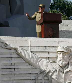
But that’s not the only photo available. Some papers showed this one:

raul-hand.jpg

Here Raul still has to follow behind Fidel, but now the comparison is altered on both sides. Fidel now is not just pointing but doing so to give elocutionary inflection to his speech before a bank of microphones. Raul also is speaking before a row of mikes and he is pointing; instead of a lifeless speech shown up by an image of bold action, we have two speakers making an emphatic point in much the same way. Perhaps its much the same point; in any case, the photo becomes a story of continuity. Raul may be no Fidel, but he obviously knows the role and is playing it with gusto while leading the state in the same direction.

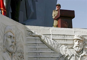
And, fittingly for Cuba, between decline and progress there also is a third alternative.

raul-hand-che.jpg

Now we have a more complicated scenario. Both Castros are set back while Che enters the tableau. This ghost of the revolution is set at an oblique angle to both Fidel and Raul. He also is set in a shadow that neatly follows the line of Fidel’s arm. That arm is no longer the dominant signal but rather the transition between past and present. This image has more ambivalent implications. The left-right-up succession goes from dead to nearly dead to living but perhaps geriatric leader. That would suggest decline. But there also is a deeper continuity from martyred idealist to bold founder to ordinary official. Raul may be less than his older brother, but he is grounded in their achievements and remains heir to the spirit of the revolution.

Three photographs, three stories. Regardless of what the photographer is thinking when the picture is taken, by the time the photo is published, photojournalism is an art not only of description but also of prediction and political judgment.

Photographs by Associated Press.


Digg!

 3 Comments

Giving Elocution a Hand

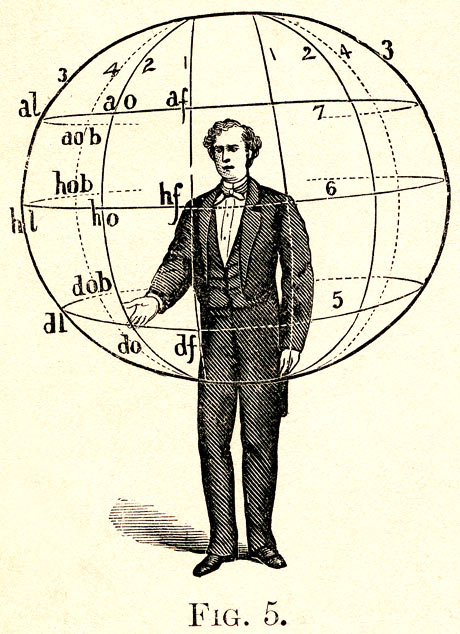
A long century ago some of the self-help gurus of the day were teachers of elocution, the art of gestural inflection in public speaking. Today it is easy to ridicule their elaborate systems for training speakers to communicate emotions through minutely choreographed patterns of hand movements. Note, for example, this diagram from Albert Bacon’s Manual of Gesture:

bacon-genture-diagram.jpg

Bacon’s system would describe the gesture in this pose as “right hand supine descending oblique.” It is one of 88 basic gestures, each of which had a preparation, execution, and return, and all of which could be used in combination with a large number of foot positions and facial expressions, and with varying degrees of energy, and sometimes including additional gestures of the hands such as a clenched fist. The thousands of possible combinations were supposed to communicate many different emotions or attitudes; the book helpfully includes a list of common sentiments and their accompanying gestures (e.g., “Abandonment, utter”: both hands descending lateral). Foucault would have been beside himself.

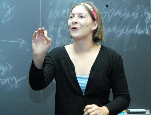
So, who would do that today? Well, nobody and everybody. Whether schooled or not, we talk with our hands. And some are even schooled, though not at an institution you’d care to attend. Here, for example, is a snapshot of a competitor for the Boylston Prize for Elocution at Harvard:

harvard-elocution.jpg

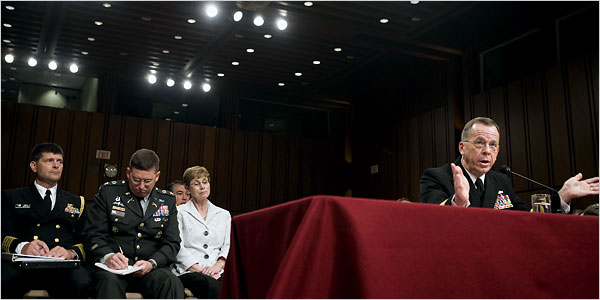
There even are elocutionary moments outside the ivory tower, but, again, not in reputable settings:

01military-600.jpg

John and I have started to collect images of hands being used for communicative effect, and there are a lot of them. More to the point, we believe that, although elocution is rightly no longer an important part of public speech, the elocutionary function of using gestures to communicate has been transferred from one public art to another, that is, from oratory to photojournalism. There are several dimensions to gestural photography, including recording elocutionary acts such as the images above, to relaying stock gestures characterizing the political class, to creating its own iconography of photographically dismembered hands and feet. We’ll be showing examples of each of these variations in later posts. Criticisms and other suggestions are welcome. We always can use a helping hand.

Photographs by Jose L.A. Camacho for the Harvard Crimson, August 9, 2004, and Brendan Smialowski for The New York Times, August 1, 2007.


Digg!

 1 Comment

Back Lot Iwo Jima

Yesterday’s New York Times reports that “Iwo Jima Sculpture, Model for Marine War Memorial, Is Losing Its Home on Floating Museum.” The story is about a statue created as one of the models for the Marine Memorial at Arlington Cemetery. Since 1995 it has been part of the Sea, Air, and Space Museum on the aircraft carrier Intrepid. Museum officials have decided that the statue has no place in a renovation now underway. Other items have been shipped out to other museums, but there are no takers for the statue.

Is the Iwo Jima icon being consigned to the back lot of US public culture, or, worse, the scrap heap of history? Could happen, of course. Photographic icons are not immortal and many have strong generational resonance. Ken Burns has remarked that his forthcoming documentary on The War reflects his sense of urgency about recording soon-to-be-lost oral testimony. Perhaps he also sensed that his primary audience was slipping away as well.

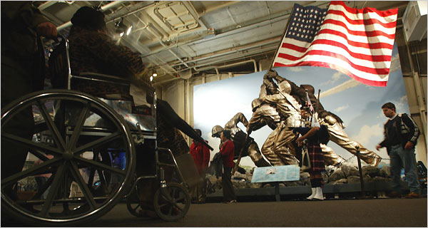
The photo accompanying the story reflects some of these tensions.

iwojima600.jpg

The flagraising dominates the middle of the frame but also is set back as if receding into blue (heavenly) sky beyond and then into the vanishing point of the picture. The lighting, faux bronze hues of the men, and bright flag give the sculpture a heroic cast, but it also looks colorized in comparison with the rest of the picture and, more important, with the iconic photograph that was the inspiration for the statue. The effect seems contrived, as if to evoke reverence that already has faded, or to appeal to a younger audience that already has too many flashier distractions.

This sense of futility is reflected in the other figures in the picture. On the far right, we see a young man; if he isn’t old enough to be drafted, he soon will be. He is the natural successor to those memorialized by the statue, whose civic republican aesthetic carries with it the anxiety that the sacrifices of one generation will be squandered by those who follow. This is the visitor who should be gazing reverently up at the model of civic virtue. Instead, he isn’t looking at the statue, and he seems to be either fixated on the kilted bagpiper in front of him or hurrying by as if intent on getting to something more pressing such as the cafeteria. The piper, who is hard to pick out of the background figures, seems to be another contrivance, and his Scottish costume suggests that the whole tableau is one of pastiche. Other figures continuing leftward around the statue also are looking away. The only person looking at the flag raising is the woman in the wheelchair that dominates the left foreground. Indeed, she is the counterpoint to the statue: both sit in metal, and her umbrella points directly to the base of the flagpole. Thus, the one connection being made in the picture is between able-bodied men in the past and a disabled woman in the present. This does not bode well for the statue.

The full implication might be that times have changed and different people are dealing with different issues. We need national solidarity and heroic effort not on the battlefield but in health care reform. We need museums, too, of course, and we may still have good use of the Iwo Jima icon. What we don’t need, however, is to keep one of several poorly crafted statues in the public eye. Today, as in 1944, the public art that counts is photojournalism.


Photograph by Librado Romero/The New York Times.


Digg!

 0 Comments

Is There an Icon for Everything?

It may have started with this:

180px-smileysvg.png

Search for “icon” on LexisNexis and you can quickly overload the browser with thousands of citations. And no wonder, the word appears continually these days in every section of the newspaper. Yesterday the Chicago Tribune reported, “At Hall of Fame, Day Dedicated to Two Icons, Not Controversy.” Who were the two titans of the game? Iron man Cal Ripken was one; the other was Tony Gwynn. A fine player, I’m sure, but not exactly a household name. He is, however, probably in the same league as Tom Snyder, who today was labeled a “late-night talk show icon.” A search reveals the same for a clerk in Cambridge, a banker in Arkansas, and just about everything in Australia. Not to mention tomato soup in the U.S. . . . Should we be surprised that there now also are “supericons” (Kate Moss, by one account)?

One might wonder why. My Northwestern colleagues Pablo Bockowski and James Webster have each done research that suggests one answer to the proliferation of “icon.” Very briefly, the combination of new media and intense competition for consumer attention can produce homogenized content. YouTube is an obvious example: of all those video clips seen by millions of viewers, one result is that a very few get tremendous circulation–dare we say they become iconic?–while most fade unseen in the desert air. As all media become focused on relaying what is currently popular to get their share of consumer attention, this phenomenon becomes the standard of significance while “repurposing” pops up as a new (and ugly) verb.

Here’s where “icon” comes into the picture. The homogenization thesis is a corrective to the fragmentation thesis, which says that incredible proliferation in media technologies and producers creates ever more finely segmented and isolated audiences. Thus, fragmentation and homogenization are countervailing forces that can produce mixed outcomes. We might speculate that the homogenization that can happen across producers and audiences can also happen within any topical category, audience, or sub-culture: amidst the information explosion within that “locality,” some few individuals will get a disproportionate amount of attention and thus seem to be representative of the category. Given these market forces, being notable and being well-known will seem to be much the same, so much so that one word might suffice for both. And so it is that anyone trying to claim that anything is worth our attention might say that it is iconic.

Thus, the same word can mark two related though quite different qualities. “Icon” can refer to anything that is recognized widely, such as the smiley face, or to any representative of a particular sub-culture, such as Tony Gwynn.

Have a nice day.


Digg!

 1 Comment

Paper Call: Video Game Reader

Joystick Soldiers: The military/war video game reader

Edited by Nina B. Huntemann and Matthew Thomas Payne

The editors seek essays on military/war-themed video games which explore the multifaceted cultural, social, and economic linkages between video games and the military. The collection will feature scholarly work from a diversity of theoretical and methodological perspectives, including: close textual readings of military-themed video games; critical histories of game production processes and marketing practices; and reception studies of video war gamers, fandom, and politically resistant game interventions. As there is no other collection of its kind, Joystick Soldiers will make a significant contribution to the breadth of work shaping the burgeoning field of game studies, complementing analyses concerning the Military-Entertainment Complex, and offering diverse insights on how modern warfare has been represented and remediated in contemporary video games. The editors invite junior as well as established scholars to submit, and welcome cross-disciplinary work from sociology, cultural studies, anthropology, history, military studies, psychology, economics, media studies, visual communication, graphic arts and game design, education, and so forth.

We are looking for submissions that address a wide range of topics from diverse methodological approaches, including but not limited to:

–Use of games for training, recruitment, propaganda (serious games)
–Video games and military ideology (or Military-Entertainment Complex)
–Representing / playing soldiers, terrorists, & civilians
–Global reception of America’s Army and other “pro-US” war games
–Production of war video games
–War video games across genres (e.g., FPS, RTS, RPG)
–Playing war video games of past & near-future conflicts
–War game mods and other user-generated content
–Machinima as social commentary on war (e.g., Red vs. Blue)
–Games and resistance (non-combat games, in-game protests, diplomacy as alternative to force)
–Game for peace
–Networked war games in different spaces (LAN parties, on-line, mobile).
–War games and post-traumatic stress disorder (PTSD)

We are interested in defining “military/war” video games widely, but not so widely as to be useless for critical analysis. The following is a partial list of war video games we hope to include, but submissions for scholarly work about other games are welcome, for example games based on past wars (Battlefield 1942; Call of Duty, etc) and non-US based games.

–Marine Doom
–Counter-Strike & its mods
–America’s Army & America’s Army: Rise of a Soldier
–Battlefield 2: Modern Combat
–Close Combat: First to Fight
–Conflict: Desert Storm II – Back to Baghdad
–FA-18 Operation Desert Storm
–Freedom Fighters
–Full Spectrum Warrior & Full Spectrum Warrior: Ten Hammers
–Kuma War
–Ghost Recon 3: Advanced Warfighter
–Operation Flashpoint: Resistance
–Rainbow Six 3: Raven Shield
–Sniper Elite
–SOCOM
–Under Siege, Under Ash, and Special Force

Please submit a 500 word abstract and short bio (100 words max) by September 17, 2007 in Rich Text Format (RTF) to Nina Huntemann and Matthew Payne at joysticksoldiers@gmail.com. We expect final papers will not exceed 5000-7000 words and will be due December 10, 2007. Feel free to repost this CFP on relevant lists. Please contact us if you have questions about potential essays or the book project in general.

 1 Comment
Lil' Bush at Street Level

John has written about Lil’ Bush, referring to how the president is being photographed to emphasize a diminished stature; whether the reduction in size reflects his slide in the polls, a corresponding loss of political effectiveness, or continued moral decline may be in the eye of the beholder. John and I have each written on photographs that feature hands or feet while cutting faces or the rest of the body out of the picture. And last week I wrote about a striking illustration by Barry Blitt for the Sunday New York Times. Given these interests, imagine my reaction when I saw Blitt’s illustration in this Sunday’s Times:

29opart-1650.jpg

There he is, a real little Bush, surrounded by the many different shoes one can see in any New York City street scene. The illustration is a stand-alone piece, moreover, as it has only a very general relationship with the Frank Rich essay for which it is a visual caption. Rich presumes Bush’s loss of credibility and focuses on the administration’s strange PR strategy of hiding behind General David Petraeus. None of this is marked in the drawing.

So what is going on? Certainly the drawing does a fine job of cutting the president down to size. (To really get the point, look at the silhouette.) The contrast with the many feet brings in more as well: Bush and the other figures represent two versions of the body politic. Bush provides the standard image of the elected official speaking to the public. In that model, the official stands in for the office that represents the body of the people. He is a single person and they are a single, unified collectivity, as if a single audience within earshot of the speaker. Obviously, Lil’ Bush isn’t up to that job. And perhaps he shouldn’t want it anyway. Instead of the president’s stock gestures (note the prominent hands), canned speech, and failed policies, we see a variety of anonymous people representing different lifestyles, going about their business briskly in different directions, without getting in each other’s way. This is a different idea of the people–a plurality that need not be One, pluribus without the unum–because they already are members (note the pun) of a liberal, pluralistic civil society.

But liberal visions need not be innocent of violence. I think the image also evokes the fantasy that one of those busy feet on the crowded street might just step on Lil’ Bush and squash him flat. You can’t blame people for thinking–or drawing–that way, but this is one example of how even the reality-based community, feet solidly on the ground, needs to be reminded that there are no simple solutions.

llustration by Barry Blitt for the New York Times, The Week in Review, July 29, 2007.

 0 Comments

Pre-conference Paper Call: Democratic Aesthetics

National Communication Association Pre-conference Seminar

Democratic aesthetics: actual, radical, global.

Wednesday, November 14th 2007, Chicago Hilton, Conference Room 4K

(Participants in the seminar must be registered for the NCA Annual Convention.)

Seminar leaders: Jon Simons and Michael Kaplan, Indiana University, Bloomington.

Issues to be Explored: The purpose of the seminar is to focus on those senses of aesthetics that pertain to the sensory communication of social meanings through the production/dissemination and consumption/interpretation of cultural symbols. In these senses, democratic aesthetics can consist of, among others:
a) particular genres of art forms that embody specific democratic values (such as portraits of ordinary people and individualism, or Brechtian, didactic, realist theater);
b) democratic styles of political performance (such as political actors presenting themselves according to the modes of popular culture, such as politicians as celebrities, or theatrical or “spectacular” activism);
c) the democratization of aesthetics, recognizing aesthetic activity in everyday life (as in Paul Willis’ “grounded aesthetics” or Pierre Bourdieu’s “popular aesthetics”);
d) the constitution of democratic publics as communities of aesthetic judgment (e.g. drawing from Kant’s and Arendt’s notions of sensus communis).

The seminar will analyze general processes and particular examples of democratic aesthetics, while also assessing them in terms of conceptual and normative distinctions of democracy. In particular, the seminar will address the question of whether democratic aesthetics is irrevocably associated with commodified and mass mediated capitalist culture, and hence as symptomatic of attenuated forms of actually existing liberal or market democracy (as in critiques by Terry Eagleton and David Harvey), or whether (and under what circumstances) democratic aesthetics can motivate more radical, emancipatory versions of democracy. The distinctions between actual, critical and radical notions of democracy is also crucial to addressing a key motivating question for the seminar, namely, whether under current conditions in which the Western militarized export of democracy cannot be considered an unqualified “good,” democratic aesthetics offer less hostile ways of practicing democracy in an international and transnational environment.

Seminar structure: The all-day seminar will be structured by three position papers, written by previously selected presenters and circulated to seminar participants in advance, each of which will address a different aspects of “democratic aesthetics” as outlined above. The discussion around each position paper, following a 15 minute overview by the presenter, will be led by a named facilitator, who will structure the discussion on the basis of responses written by seminar participants 2 weeks in advance of the seminar. The seminar will close with a discussion about directions, themes and case studies for future research on the topic.

Requirements: Those interested in participating are initially asked to submit a one-page (250-300 word) statement of interest in the seminar topic, including research already undertaken in the area. These statements of interest should be e-mailed to the seminar leaders: simonsj@indiana.edu and mikaplan@indiana.edu, by Wednesday 1st August 2007. Notification of successful submissions will be given by 21st August.

Seminar participants will be sent the three position papers by Wednesday, 3rd October and are asked to read all three papers and to write a 500-750 word response to the paper in which they are most interested by Wednesday 31st October. Responses should be e-mailed to the seminar leaders: simonsj@indiana.edu and mikaplan@indiana.edu, the paper writer and the facilitator for that paper (details will be provided).

 0 Comments

Visual Memory and 9/11: It's deja vu all over again

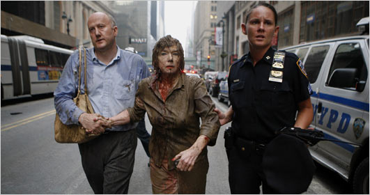
A recent story in the New York Times following an accidental explosion in New York City began with this photo:

ny-blast-victim.jpg

and these words: “It has instantly become the iconic image of Wednesday evening’s steam pipe explosion.”

Well, I’m confident this photo will not become an iconic image. And not for want of trying: the Times chronicles its immediate distribution, provides a long interview with the guy on the left, then a later interview with the woman in the center, as well as other links, including one that includes wry commentary on the promotion of the image. Like most of those images that are promoted as icons, however, this one will soon sink out of sight.

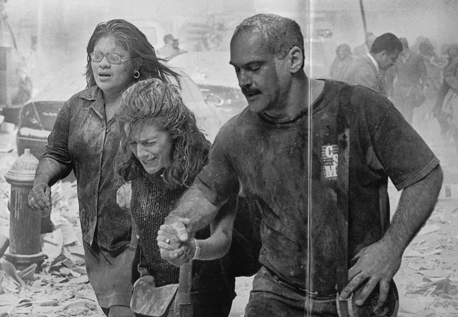
What interests me is why the reporter could think this rather banal image is so significant. Steam pipe explosions are not good candidates for historical significance. The photo could be of an auto accident, and the facial expressions do not suggest alarm, so why is this street scene thought to be iconic instead of business as usual for NYPD? One reason is the preoccupation with icons that is current today. (I know, I know, but as was said in the comic strip Zits recently, “nobody every died of irony.” I’ll post on the contemporary desire for icons another time.) I believe the answer is that the photograph resonates powerfully with a number of the images that were prominent during the coverage of 911. These all included women covered in dust or blood and often being helped as they walked, staggered, or were carried while emerging from the scene of the catastrophe. For example:

911-woman-low.jpg


Thus, the reporter saw through the current photograph back into the many more distressing images of a far greater event. She was seeing not only with her eyes but also with her memory, which carried the powerful emotions associated with the many earlier images. Though not likely to be an icon, you might say it’s deja vu all over again.

First photo: Brendan McDermid/Reuters. Second photo: Lyle Owerko–Gamma. The crease is due to my inexpert scan from Time, September 11, 2001.

 2 Comments

Visual Memory and the Fall of Iraq

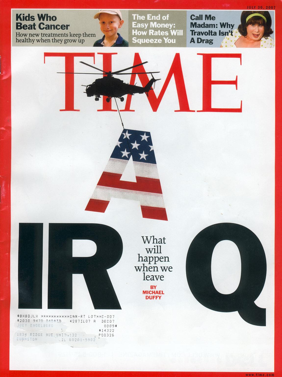
The cover of the current issue of Time provides a fine example of two features of the visual public sphere: allusions between images in different media, and the role of visual memory in shaping historical analogies. Here’s the cover:

time-iraq-2.jpg

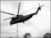
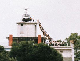
This is a remarkable piece of graphic design. The most important feature, I believe, is the helicopter, which is a direct allusion to the fall of Saigon. That event is fused in collective memory with photographs of helicopters–they are omnipresent in the images and the discourse about the last hours of the evacuation. For example, Time‘s silhoutte is a reprise of this image:

saigonfall2.jpg


There are few examples of this or similar images in the Google image archive, however, which is dominated by this photograph:

vietnamescape.jpg

The photo was taken by Hubert Van Es; you can read his report on the shot here. There also were images of of the choppers being pushed off the decks of one or more aircraft carriers, but those are less available today. Helicopters became the visual marker of the fall, and any one image probably channels the others. I suspect that there are fewer still shots of the airborne machines online because those images were more likely to be on video. The one I used was taken from a BBC puff piece on Peter Arnett; the photo is captioned “Fall of Saigon, but Arnett stays.”

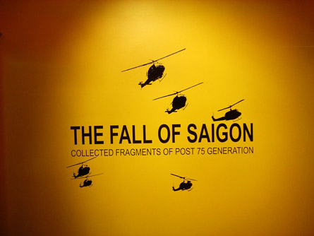
These photographic and video images shape collective memory in part because they have been relayed in the intervening years by graphic designers. So, for example:

title_thmb.jpg

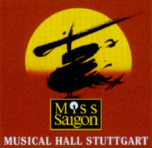
and, probably the most widely circulated design, which could rely on the literal image to support a formal allusion:

miss-saigon2.jpg

Thus, the Time designer could count on the historical analogy because the visual design had become so thoroughly disseminated.

And the analogy has specific implications that are evident from other elements of the cover. For example, look at the text that is where the A had been in “IRAQ”: “What will happen when we leave.” It is not a question.

Time photo-illustration by Arthur Hochstein, July 30, 2007.

Update: To see how the Bush administration tries to counter the analogy, look at the July 26 post at BAGnewsNotes, which compares the Time cover with the latest photo op.

 5 Comments