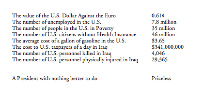
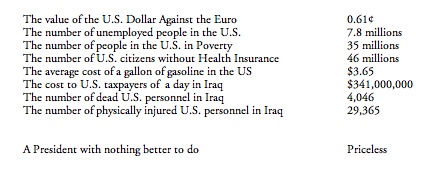
As of today 4082 U.S. citizens have died since the beginning of the invasion of Iraq in March 2003 … and counting …

85,047 Iraqis have died …

Photo Credits: John Moore/Getty Images; Moises Saman/NYT

Photo Credit: John Lucaites
Our primary goal with this blog is to talk about the ways in which photojournalism contributes to a vital democratic public culture. Much of the time that means we are focusing on what purport to be more or less serious matters. But as John Stewart and Stephen Colbert often remind us, democracy needs irony, parody, and pure silliness as much as it needs serious contemplation. For our part, we will dedicate our Sunday posts to putting some of that silliness on display in what we call “sight gags,” democracy’s nod to the carnivalesque. Sometimes we will post pictures we’ve taken, or that have been contributed by others, or that we just happen to stumble across as we navigate our very visual public culture. And we won’t just be limited to photography, as a robust democratic visual culture consists of much more. We typically will not comment beyond offering an identifying label, leaving the images to “speak” for themselves as much as possible. Of course we invite you to comment … and to send us images that you think capture the carnival of contemporary democratic public culture.
Last week we missed the passing of artist Robert Raushenberg (1925-2008), who maintained that he worked “in the gap between life and art.” Characterized as a “neo-dadaist” his work challenged the difference between traditional art objects and the objects of the everyday world (including everything from the “junk” one might find on the streets to snapshot photographs), creating what became known as “combines” and “assemblages.” By some accounts he sought to make “sense out of senselessness.”
Often controversial, he was also a prolific artist and his work occasionally graced the cover of Time magazine. He will be missed.

Note: For a commentary on the conflicted reception of Raushenberg’s work see James Johnson’s post at (Notes on) Politics, Theory, and Photography.

I learned to read at the age of five because of the tireless efforts of my grandmother who would spend hours teaching me how to sound out words and then sentences after working a full shift on a factory assembly line. There wasn’t much money to buy books and so all that we read came from the public library. Each Saturday we would get five new books. And the books that I loved the most were a series of tales about a mischievous monkey by the name of Curious George who had been “rescued” from his native Africa and taken to live in a big city by “The Man in the Yellow Hat.” I would check the same ones out over and again, never tiring of reading about George’s adventures. I was reminded of all this recently when I encountered the image above and the recent controversy it sparked in Marietta, Georgia.
By now you probably know the issue. Bar owner and ultra-conservative Mike Norman was selling the t-shirt displayed in the above photograph. When challenged that the image was offensive to African-Americans he recoiled, claiming that he was “no racist” and that he had simply “seen” a resemblance between Senator Obama and the monkey while watching a cartoon movie. In his words, “Look at him … the hairline, the ears, he looks just like Curious George.” According to Norman, the comparison to a monkey was simply coincidental. Watching Norman on CNN I initially considered the possibility that he was simply an uneducated redneck who really didn’t know how truly offensive and racist the image was. That assumption was quickly proven false when it became clear that Norman was a notorious local provocateur (one sign outside of his bar announces, “I wish Hillary had married O.J.; another reads “INS agents eat free”) and he later acknowledged that he understood the connection between the image and racist stereotypes of the Jim Crow South, averring, “this is 2008 … not 1941 in Alabama, so get over it.” But the question for me was whether someone could identify with the image of Curious George and not know that it was a racist image. Was my grandmother a racist because she had allowed me to develop a close attachment to Curious George in the 1950s? Was I?
The answer to these questions, I fear, is yes. Or at least a qualified “yes” with the acknowledgement that racism comes in many shades and that some are much easier to see (or to veil) than others. As an example that seems less obvious to the sight, consider columnist Kathleen Parker’s recent endorsement of those who “would be more comfortable with ‘someone who is a full-blooded American as president’.” Her argument is that politics is now driven by a “patriot divide” animated not by race or gender but by “blood equity, heritage, and hard-won American values.” And lest there be any confusion as to the target of her argument, she notes “Hillary has figured it out. And the truth is, Clinton’s own DNA is cobbled with many of the same values that rural and small-town Americans cling to. She understands viscerally what Obama has to study.”
It is hard to know where to begin here. But surely it is difficult to imagine an appeal to “blood equity” that isn’t fundamentally racist at its core. And that one candidate can know America’s underlying core values “viscerally” while the other can only “study” it would seem to make the point. Or maybe, like Mike Norman’s claim that his comparison of Obama to a “cute” monkey was only coincidental, so too, perhaps Parker’s contrast is simply a matter of happenstance. But I think not. Norman, after all, is a caricature of himself, a local character that we might find in an episode of The Dukes of Hazard seeking out his fifteen minutes of fame; Kathleen Parker is a syndicated columnist whose reasoned missives are featured nationally as part of the Washington Post’s writer’s group. Norman, it would seem, is really just trying to make a buck by selling parodic t-shirts and beer to his local constituency, and so perhaps he has an excuse (i.e., racism sells, or as he puts it, “it’s my marketing tool”), but what is Parker’s excuse? I’m really curious to know.
Photo Credit: Thinh D. Nguyen/AP
Photojournalism about natural disasters has always served a political purpose, which is why authoritarian governments censor it as much as anything else. US coverage of foreign disasters has at least two themes: first, demonstrating our magnanimity and the wealth; second, suggesting that authoritarian governments are incapable of helping their own people. Frankly, I’ve always liked the second half of this story: it’s good to be reminded that democracy, though not perfect, still works better than non-democratic regimes. Apologists for dictatorship rely on the conventional wisdom that dictators are more efficient than democracies. That overlaps with other hierarchies as well and so it seems natural to think that you can make the trains run on time by keeping decisions in the executive suite.
So it is that I don’t mind seeing Myanmar exposed for what it is, a brutal, incompetent regime whose only priority is holding on to power. When coupled with the many reports of that government’s control–and theft-of international relief, photographs such as this one speak volumes:

The government is not in sight, and people seem to be making do with whatever they were able to scrounge or share. The New York Times caption included the report that “Nearly one week after a devastating cyclone, supplies into the country were still being delayed and aid experts were being turned back as they arrived at the airport.” Look again at the one pan of food, then at the children waiting to be fed, and do the math. There is not going to be enough to go around.
Because of my commitment to democracy, I don’t mind this political message being added to the reportage. For that very reason, however, coverage of the earthquake in China should be seen as a genuine challenge to American complacency. Despite staggering levels of destruction and enormous difficulties due to terrain, weather, the remoteness of the region, and wreaked infrastructure, the response of the Chinese governments at all levels has been superb. From local first responders to mobilization of medical personnel on a large scale to sending in 100,000 troops, the scale, coordination, and competence has been obvious. In addition, you might also note the high levels of modernization and affluence. The heavy equipment, medical supplies, temporary shelters, equipment, clothing, and more are first rate.
There are dozens of photographs supporting this story, including this one:

Civilians are being helped around a mechanical hoe that is being used to clear a mountain road. That late model Volvo probably wasn’t airlifted in. As the refugees are helped out, fully laden and unarmed troops march in to the disaster area. People seem to know what they are doing.
Initial coverage in the US included criticism of Chinese restrictions on media coverage. When those restrictions were quickly ignored by the Chinese themselves and then lifted by the government, the criticism ended for the simple reason that there was nothing left to fault.
And so we get to Katrina. Although the response to that disaster may have been better than that of the despot in Myanmar, it nonetheless was terrible. Nor could the US claim that it was in a remote region or that vital infrastructure had been destroyed–Interstate highways went right to the door and the port remained open. So let’s take a moment to recall how things looked on the fourth day after the flood:

And the food? Peanut butter sandwiches:

And the troops?

None of this is the full story. There were differences that have not been mentioned. Visual evidence, like any evidence, should treated with some skepticism. But, still. US or China: which scene looks more like a third world society–and a third world government?
Photographs by Chumsak Kanoknan/Getty Images; Du Bin/New York Times; Eric Gay/Associated Press; James Nielson/AFP-Getty Images; Eric Gay/Associated Press.
One of the important characteristics of photography is that it is used across public and private life. Most people have not printed a newspaper or erected a statue, but everyone has taken snapshots. Photography is a democratic art, and so we are exposed to a wide range of images that in turn offer many different moods. Likewise, there always is an audience for those images that stand out from the rest because they are so evocative. This blog devotes a lot of space to those images that are patently newsworthy and so caught up in complex structures of meaning and power. Some images, however, ought to be seen as poems–indeed, as small poems that capture a specific experience, emotion, or moment of reflection.
The visual poem can stand for everything from state power to personal serenity. There are always court poets and the course of empire has its bards–think of Kipling. The image below is as good as anything intoned at a public ceremony.

This photograph of a space shuttle launch is a visual gem–and also, of course, laughable in its fully realized phallic symbolism. But those who groove on shuttle launches will love it. This is the dream of technocratic power: sheer technological ascendancy, harnessing nature to overcome gravity on the way to a glorious apotheosis with the heavens. And safely, even serenely so. Set at a distance across the calm, glassy water, any sense of risk or cost is muted. The poem takes one outside of any context of debate, providing instead a fantasy of divinely ordained connection with great but not dangerous power.
My placing the image in the context of poetry is odd, as most of the images that one could include are from the opposite end of the spectrum between public institutions and private pleasures. These include the endless supply of nature photos; look, for example at the many fine images by amateur photographers in The Daily Dozen at the National Geographic website or at similar digital archives provided by online news services. Some appear as well in the daily slide shows, and these images clearly are offered as moments of respite from the insistent clanging of the news. Images like this one:

This photo of incense smoke could be of a diaphanous fabric, the body it covers, the desert at night, sound waves, the music of the spheres. . . . Note also that it shares key elements of design with the one before it: smoke, light, and darkness combine to shape a dynamic form both composed and possibly eternal. Here, however, one joins that deep beauty by letting the image sink into the soul rather than watching in awe from a distance.
There are many poems, and many moods. Let me show you two more that editors thought we might want to see this spring.

This image is literally reflective. Like the others, it suggests an essential harmony between nature and culture. Now, however, the objects are neither grand nor miniature but rather set to human scale. The boats’ colors, like the boats, are neatly demarcated in the water, suggesting social harmony as well. And they are both worn and colorful. Worn by good use but still distinctive, suggesting that although sharing a common mortality we can enjoy our individuality. Or, on reflection, we can do so if we don’t move too fast or demand too much.
One should not let a moral ruin a good poem, so I’ll finish with one more image:
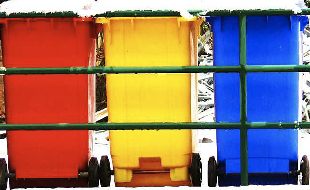
Like the one before it, we see three colors and an unspoken coordination of nature and culture. Bright, plastic trash cans stand like crocuses in the late spring snow. Again, the coordination of the differently colored canisters suggests three households getting along easily. And just as the boats were in the common space of a harbor, here the ritual form of garbage collection has the public world as background for enjoying a moment of private delight. So perhaps there is a moral after all. This photograph is an image of hope and good cheer as it can be achieved in daily life. Empire will not go away, but spring will come.
Photographs by David Bortnick/NASA; Anna Arca/Guardian Unlimited; Rob Garbett/Guardian Unlimited; Leander Starr Jameson/Guardian Unlimited.
The tradition of transporting the Olympic torch from Mt. Olympia to the Olympic Stadium via relay was inaugurated at the Eleventh Modern Olympiad, more commonly known as the 1936 Berlin Olympics, and under the watchful eyes of Adolf Hitler and the German Third Reich. Needless to say, there was no question that the spectacle, captured by Leni Riefenstahl in her documentary Olympia, served an explicit political purpose; and equally certain, there were no dissenters present at the event (or at least visible to the cameras that captured the occasion for posterity). Any discussion of the recent protests for human rights surrounding the relay of the torch to Beijing for the Twenty-ninth Modern Olympiad needs to begin by remembering the origins of the tradition.
China’s record of human rights violations have been featured in western photojournalistic venues recently, oscillating between images of the often brutal oppression of Tibetans and images of protesters around the world urging a boycott of the Beijing Olympics. And, of course, photographs of protesters challenging the Olympic relay have been especially prominent. The photograph below, however, is somewhat unique amongst such images and in its own way it is a provocative allegory for the problem that China and the International Olympic Committee face.
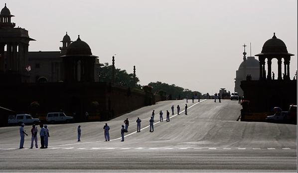
What we are looking at is the route that the Olympic torch was to take in New Delhi along Prakash Vir Shastri Avenue, the major boulevard that runs throughout most of the city and eventually passes Rashtrapati Bhavan, the palace and official residence of the President of India, seen here in the upper right hand corner of the photograph. Shot from on high and at a distance, the image situates the viewer as a spectator looking down upon the scene, but apparently not part of it. The wide angle underscores the fact that we are in a public space as it captures a major intersection in the road; the sharp contrast of shadow and light draws our attention away from the buildings on either side of the avenue to the width of the boulevard and the vectors that divide and guide the street traffic. According to the caption that accompanied the picture in the NYT, the people standing in the street are “officials wait[ing] for the torch … along a boulevard purged of spectators.”
The Olympic relay is designed as a spectacle, its ostensible purpose being to generate visible and worldwide enthusiasm for the pageantry and athletic events soon to follow. But, of course, a spectacle needs spectators, and here, the caption tells us, they have been “purged.” The choice of words is ominous, as is a midday image of a major boulevard in a major city absent any sign of its people. India is a democratic republic with a constitution that guarantees its citizens a wide range of civil rights, including freedom of speech and expression and the freedom of peaceful assembly. The dissent that is the product of such rights is essential to a vital democratic polity, but here apparently, the simple fear of anti-Chinese protests was enough to keep the public—supporters and dissenters alike— far enough away from the event so as to avoid “marr[ing] its appearance.” The irony is that in the process the Olympic relay in New Delhi was made into something of a caricature of itself. Designed to silence those who would urge a boycott on the Olympics, the photograph shows us what the effect of such a boycott might actually be: a spectacle without spectators.
From a slightly different vantage point, however, the photograph reinvests the viewer with a certain moral force, for while the framing distances us from the scene, it also nevertheless positions us as witnesses to a “purging.” And in this context it calls to mind the iconic photograph of the lone individual standing down a row of tanks in Tiananmen Square, shot on a similar public thoroughfare and from a comparable vantage. The difference, of course, is that the earlier photograph featured the liberal individual by his heroic presence, and here we are confronted with a democratic people by their forced and pronounced absence. What we need to remember is that in the end a functioning liberal-democracy requires both in some measure of equipoise and that we can never—not ever—let the fear of dissent compromise our commitment to either lest we destroy what we intended to save in the first place.
Photo Credit: Vijay Mathurs/Reuteurs
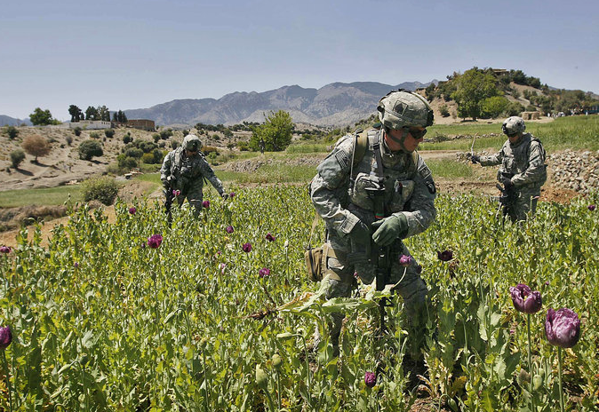
At first glance it might look like these troops are in the poppy fields of Colombia or possibly Mexico, “fighting” the so-called “war on drugs.” After all, the U.S. government has dedicated five billion dollars to Plan Colombia since 2000 and more recently another 1.4 billion dollars to the Meridia Project, all with the goal of defeating the illicit traffic in opium and heroin. And according to the DEA it has been effective, forcing a 44% increase in the street price of a gram of cocaine, as well as a 15% reduction in its purity. Indeed, it almost seems like it is worth the effort … almost, but not quite, since there doesn’t seem to be much evidence of a reduction in demand, which means the drug dealers are just getting richer. But in any case, I digress, for the photograph is not of a battle field in the war on drugs, but actually a battle field in the war on terror!
The picture is a taken of a poppy field in the Khost Province where the U.S. military—now 32,000 strong in Afghanistan vs. 160,000 strong in Iraq—has effected a “basic strategy shift” in its war on terror. No, those troops aren’t looking for Osama bin Laden (remember him? the one apparently responsible for 9/11, the one President Bush said was our “number one priority, we will not rest until we find him”) hiding among the plants. Rather, they are “destroy[ing] opium poppies while on patrol.”
There might actually be some sense to focusing on the drug trade in Afghanistan given the evidence that there is a connection between the illicit traffic in opium and various insurgent groups, including both the Taliban and Al Qaeda. But, of course, the approach is all wrong. For one thing, the U.S. government has dedicated the majority of its resources to eradication, interdiction, and the prosecution of high-level drug traffickers, strategies which, as we’ve seen in virtually every instance that it has been employed, only makes the drug more valuable. And for another thing, it is stretching an already thin military cohort even thinner as, in the picture above, its efforts are being devoted to an odd form of “search and destroy” fixated on poppies and not the real enemy.
But there is a bigger point to be made. As I thought we learned in Vietnam, winning a war such as this requires capturing the “hearts and minds” of local populations, and here those populations—altogether absent from the photograph as if to mark their irrelevance to the basic “shift in strategy”—are the peasant farmers who subsist on their illicit poppy crops. When our policy is to target poor farmers through strategies of eradication and interdiction we not only alienate those who should (or at least could) be our allies in the war on terror, but we push them closer to the enemy with its grassroot ties and increase the likelihood of civil unrest if not actually civil war. And what is sad is that there are more effective approaches, such as those used to undermine the international drug traffic coming out of India and Turkey, including licensing farmers to produce crops to be used for legal pain medications and/or buying crops from the farmers and then destroying them.
But apparently John Walters, America’s drug czar, and the Department of State will hear none of it. After all, this is a war on terror. Either you are with us or you are against us. Why use the carrot when you can use a stick—even if it doesn’t work!
Photo Credit: Rafiq Maqbool/AP
With the Pope’s visit to the US this week, some Protestants will be sorely tempted to fall into the sin of pride. Protestants like me, for example, when I look at photographs such as this one:

Just what American needs, a medieval monarch. Just what Christ had in mind: opulent robes, gold trim, courtiers, pageantry, all on behalf of hierarchy.
But that’s too easy. Irony and two bucks will get you a seat at the coffee shop, but it’s no more righteous than sitting in a pew. Rather than rehash differences, the more interesting question is, what might a non-Catholic learn from the Pope’s visit? While looking through the photo essays on his pending arrival, there seemed to be little there that I hadn’t seen before and that wasn’t playing out a familiar script in the courtly style. But then I saw this image:
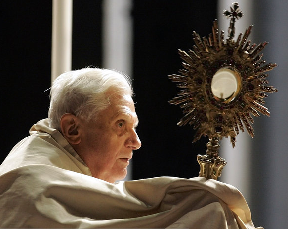
The ornate robes and crown are gone, leaving the human person who temporarily inhabits the institutional role. The off-write robe or shawl could be a rough covering against the cold, or a shroud. The bare head, thin, white hair, and almost fearful expression suggest vulnerability, yet his eyes are resolutely open to what awaits him. He is illuminated from above, but the light bathing him seems not to confer a blessing but to call him toward the next realm. The shadows along his face and body cue the sense of pending mortality that suffuses the picture.
The first photograph allows ironic contrast between the majestically robed pope and the body of Christ on his scepter. No irony is intended, of course, but instead the suggestion of a common immortality: Christ in heaven and the universal church. In the second photograph, I see only one body: the mortal body, seen to be aging where not covered with common cloth signifying the grave. The scepter has changed as well: in place of the tortured Jesus, only a small cross. Most tellingly, in the center of the metallic halo, one sees a translucent circle. Note also how the light illuminates both the pope’s head and the center of the sceptered ornament. One can see a human being and the mechanism of the church. One can imagine that he will at the last see an aperture to heaven, or only emptiness, diffusion, nothingness.
There need be nothing parochial about that choice. Instead of the Grand Inquisitor, this pope, for one moment, bears witness to the human condition.
And there is more. My response to the second image did not occur by accident. The robe is called a humeral veil–from the Latin humus, or soil–and was once a burial shroud and then a baptismal vestment, thus signifying death and rebirth. Likewise, the scepter is called a Monstrance–from monstro, to show–and is used to display the consecrated sacrament (the body of Christ) to the congregation. Thus, although one need not follow the path all the way through death to eternal life, the liturgical ritual clearly had marked out a path. What it cannot do is mandate a single valid interpretation of what is shown: if one sees faith and the promise of salvation, another can see empty ritual and collective delusion. Regardless of what I believe, I see a signifying animal that persistently, perhaps even nobly confronts the void with its need to communicate and ability to imagine a better world.
Photographs by Darlo Pignatelli/Reuters; Pier Paolo Cito/Associated Press. Thanks to the Rev. Dr. Robert Clarke for technical support on church liturgy.
