Sep 19, 2010
Jul 11, 2007
Jul 25, 2014
Dec 01, 2008
Jan 13, 2010
Jul 25, 2011

Sight Gag: Irony or Synchrony?

ironysynchrony.png

Photo Credit: Damon Winter/New York Times, On the Trail, January 19, 2008

Our primary goal with this blog is to talk about the ways in which photojournalism contributes to a vital democratic public culture. Much of the time that means we are focusing on what purport to be more or less serious matters. But as John Stewart and Stephen Colbert often remind us, democracy needs irony, parody, and pure silliness as much as it needs serious contemplation. For our part, we will dedicate our Sunday posts to putting such momens on display in what we call “sight gags,” democracy’s nod to the ironic and/or the carnivalesque. Sometimes we will post pictures we’ve taken, or that have been contributed by others, or that we just happen to stumble across as we navigate our very visual public culture. Sometimes the images will be pure silliness, but sometimes they will point to ironies, poignant and otherwise. And we won’t just be limited to photography, as a robust democratic visual culture consists of much more. We typically will not comment beyond offering an identifying label, leaving the images to “speak” for themselves as much as possible. Of course we invite you to comment … and to send us images that you think capture the carnival of contemporary democratic public culture.

 1 Comment

Photographer's Showcase: Campaign 2008 – On The Road

Today we are introducing a new feature that we call the “Photographer’s Showcase.” From time to time we will post the work of photographers whom we believe exemplify or extend photojournalism as it is an important public art. We will feature their work without commentary, although we do of course encourage you, our readers, to comment and link on behalf of our common interests.

There are many fine photographers and the authors of this blog know only a very few of them. We spend our days in the university, not the newsroom, and have little opportunity to meet with working photographers, attend exhibitions, or otherwise make connections that could lead to work being posted here. If you know of photographers whose work should be featured, please contact us. Self-nominations are welcome, as photographers today have enough problems without having to be modest as well.

We inaugurate the Photographer’s Showcase with the work of Patrick Andrade. Patrick is a freelance photographer affiliated with the Atlas Press. His work has appeared in the NYT, Newsweek, and Paris Match as well as many other places. He is currently following the campaign for the presidency. The work posted here is a series of black and white photographs that feature the people of Campaign 2008 – On The Road. Click on the photograph below to see the full slide show.

andradenhpeople08.png


 3 Comments

Kissing War and Tasting Victory

Alfred Eisenstaedt’s “Times Square Kiss” is among the most famous photographs ever taken.With the exception of Joe Rosenthal’s “Raising Old Glory on Mt. Suribachi,” it is possibly the most reproduced, imitated, and performed photograph of any in the pantheon of U.S. photojournalism or documentary photography. It is, as Time/Life might say, the center piece in the American family photo album, a representation, as one caption of the image has it, of “The Way We Were.” It should come as no surprise then, when critics draw upon it to call attention to the hypocrisies and tragic ironies of U.S. policies and cultural practices. The most recent case in point is this digital illustration by Koren Shadmi that appears in “Artists Against War,” a collaboration between The Nation and The Society of Illustrators to showcase the work of 60 prominent graphic artists whose work “challenges the self-destructive ignorance, indifference, incompetence and corruption that is the result of the U.S. Middle East foreign policy.”

shadmi-kiss.jpg

The illustration is easily recognizable as an imitation of Eisenstaedt famous photograph, but of course the differences are both pronounced and resonant. The original is a bright and fairly high contrast image produced in the grey scales of black and white film and according to the strict conventions of realist photography; there are shadows, but they are barely recognizable, and in general the visual tableau invokes the symbolic brightness of a new day, just as the occasion of V-J Day invited the promise of the return to a golden past. Following the visual conventions of the graphic novel, the illustration above is drawn in muted tones and tinctures, only slightly more colorful than the black and white photograph. The kissers here are cast at the edge of a dark shadow (emanating from the space of the viewer, and pointing, no doubt, to the future), the background of the drawing enveloped in either billowing smoke or black clouds, and in any case the overarching tonality of the image is dark and ominous rather than bright and joyful, menacing rather than hopeful.

It is the thorough absence of joy and hope that determines the affect of the illustrated kiss. The photograph represents a joyful moment, its kiss a passionate and public performance of the release of nearly four years of repressed desires. Thanatos gives way to eros, marked not only by the kiss itself, with the promise of greater release yet to come, but by the way in which civilian spectators witness the event with approving smiles. This is the world we want to live in, and there is a sense in which the bodies of the kissers channel the emotional energy—the hopes and desires—of the people that surround them as the vectors of the image vaguely recall the “V” for victory, men on his side, women on hers.

By contrast, the illustrated kiss is neither joyful nor passionate, but rather decidedly foreboding. The awkward and somewhat restrained left hand of the sailor in the photograph now holds a gun poised for use (although the enemy remains unseen and thus anonymous), while his right hand is covered in red blood that blemishes the purity of the nurse’s white uniform and forces us to acknowledge that eros and thanatos are inextricably entwined. The kiss is made to seem all the more impersonal—if not also somewhat transgressive—by the fact that the kisser is wearing night goggles as well as a wide array of weapons and military accoutrements. And note too that the pair are no longer surrounded by ordinary citizens—an indulgent and approving public—but by an anonymous and armed military force. It is not clear that the surrounding soldiers even notice the kissers, and even if they do, they certainly offer no signs of approval. Overshadowed by the events of war, both the presence and voice of the public has been erased—a telling cipher, perhaps, for our current political condition. If victory has been achieved here, it clearly seems to be short lived.

The Eisenstaedt photograph is often captioned as a “return to normalcy,” and on one popular poster for sale, it is titled “Kissing the War Goodbye.” From this perspective the normal world is a rejection of the dark and dreary culture of war, and with it the eternal return to a bright and joyful place where the sexual obsessions of private life can operate in tandem with the decorum necessary to the discipline of public life without the hint of tension or irony. By contrast, Shadmi’s illustration is titled “Tasting Victory,” and thus frames the image as the embrace of war, rather than its rejection. From this perspective, the normal world seems to be a culture where one eroticizes the taste of military success and in which wars are cultivated and eventually normalized in a never ending cycle of violence.

It is easy, of course, to prefer one image over the other at any given moment in history, entranced either by the romance of the photograph or the critical skepticism of the illustration. But what we need to acknowledge is the fundamental sense in which the two images are inextricably connected. Treated apart from one another, each underwrites a more or less simplistic political fantasy of civic life that invariably falls short of the complex social and political needs of the late modern world; treated together the two renditions remind us that each representation is a limited construction of the world and that a healthy polity needs both romance and skepticism—and more—in order to enable and sustain a robust public culture.

Illustration Credit: Koren Shadmi

Digg!

 5 Comments

Seeing Through Shadows

Every so often there will be a soft news photo that features the optical effect of a double image. It might involve a mirror or TV monitor or a photograph, among other options. Shadows are another variant of optical replication, as in this photo from the Australian Open:

tennis-shadow.png

Maria Sharapova is hitting a forehand. It’s not a good photo of her. At the least, most photo editors would have no interest in a long view that has her looking awkward and disconnected from her own shot much less the flow of the game. (Unless, perhaps, she was blundering to a loss, but she won the match handily.) One thinks of antique images from the 1920s, when the game had style but none of the extreme athleticism that we now take for granted.

But it’s not a picture about her, directly. The interest is created entirely by the shadow. The optical doubling of Sharapova lies along the two primary axes of the composition: she defines the vertical plane, while her shadow lies along the horizontal. Sharapova is the familiar presence visually, but the shadow is reinforced by the horizontal white line crossing the field of blue along the top of the photograph. The ball lies like a point in a graph, the intersection of X and Y coordinates. Thus, the figural composition acquires a hue of abstraction. This is not a photograph of a person, but of something else.

What else? The shadow knows. We can look there for the form of a thing and so for what we might miss when distracted by all the details of ordinary perception oriented toward social interaction. Were we looking only at Sharapova swinging her racket, we should see an individual tennis player, someone with a specific face, look, game. When we look at the shadow, however, the distortion created by the angle of the light and twist of her body brings something more elemental to the surface of the court. There we see a body transformed by the act of hitting the ball. The shadow outline of her legs is much like her legs, but as she torques through the shot her torso appears to be compressed into one continuous limb that grows out of her pelvis and arcs into forearm, hand, and racket. Her head has disappeared into upper body which has morphed to maximize the force traveling into the prosthetic extension of the hand. What started out human ends up a hitting machine.

Thus, the optical double reveals a more abstract dimension of the act of hitting a tennis ball, and of the game of tennis as it is played on the world stage. Tennis is promoted by featuring individual players as if they were fashion models or rock stars. To get there, however, the players need a lot more than flair. They can only succeed by subjecting themselves to grueling training that makes them extremely efficient competitors, and little else.

Shadows can reveal the other self. Like the portrait of Dorian Gray, the double might reveal one’s sins, but that might be more melodramatic than is needed much of the time. A shadow also could lend itself to recollection or prophecy or other opportunities for reflection. I’ll close with another image, one also taken because of the shadow in the frame.

soldier-shadow-thin.png

This image of an American soldier in Iraq is a study in opposites. The soldier, who should be the focal subject, is partially outside the frame and has his back to us. His shadow, which should be merely an afterimage, is in the right center of the picture and facing forward. Indeed, the shadow figure seems almost exposed, turned toward us in a way that makes him seem vulnerable, open to injury as the stalwart soldier shielded by his backpack is not. That vulnerability is accentuated by the distortion, which makes him appear slouched, even sunken-chested. And this shadow is not hard dark but rather a soft, yellowish color like the wall behind it. This double is wraith-like, a ghostly presence with streamers and gun drooping down like Marley’s chains, though ethereal. And also, like the photograph above, somehow less than human: in this case, arachnoid–like a spider or scorpion lying in wait in the sun.

Somewhere between Sad Sack and the war dead while looking like a primitive predator, this shadow could be the image of the elemental soldier. That is, the soldier seen without the martial virtues evident in the actual figure on the left. The soldier who, for all his terrible power, will not project power for long, whose presence will evaporate in time even if he is not killed first. The soldier who will have to be replaced by another much like him.

Photographs by Ezra Shaw/Getty Images (1/14/08) and Alexander Nemenov/AFP (9/29/07).


Digg!

 5 Comments

The Political Season

Robert and I have not written very much about the current political season. Part of the reason is that our good friend over at the BAGnewsNotes, Michael Shaw, has been tireless in covering the campaign and we encourage our readers to check in there. But there is another reason as well, for while there was a time when the political campaign for president truly constituted a quadrennial season, something that political junkies like ourselves would look forward to, the current campaign seems to have transcended any sense of being seasonal; indeed, it has become altogether ordinary and everyday –- if not downright monotonous. I find myself checking in on the various candidates and their doings as a matter of mindless habit, much like the way I check in on the baseball box scores in mid-June (or the way in which some friends of mine watch the afternoon soap operas). And if I miss them for a day or two, or even a week, I can usually be confident that little of real or longstanding consequence will have changed.

The length and mundanity of the campaign seems to have taken its toll on photojournalists as well. If I see one more picture of the various candidates shaking hands with citizens, or speaking from the stump in a town square or in a quaint little café, or against flag draped backgrounds, or surrounded by spouses or celebrities with cheesy smiles … I think I might die from excessive exposure to visual cliché.* I realize that this seems like it is all that there is to capture visually in these contexts, that photojournalists are working on deadlines and the tried and true genres and conventions are easy to supply, and further that it is the media’s job to “report” what is actually happening (even if that turns out to be … well, nothing), but all of that may well be part of the problem. The campaigns have become so quotidian that it seems like there is nothing “new,” nothing really to see. Of course, one of the things that Robert and I have been suggesting all along is that it is precisely at such moments that we need to look all the more closely.

Consider this photograph from this week’s Sunday NYT:

campaign-1.png

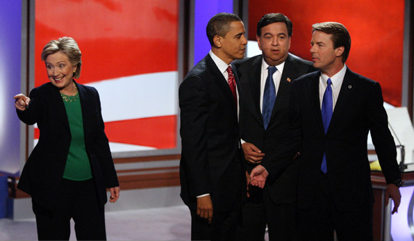
At first blush, it could be a photograph of a singing group, say, Hillary and the Three Pips (sorry, I couldn’t resist). But in fact it anchors a story about how Senators Obama and Edwards joined forces to “go after” Senator Clinton in a televised debate in Manchester, NH. The attack turned out to be pretty mild stuff, with Obama and Edwards accusing Senator Clinton of being an advocate of the status quo after she had suggested that Obama had unfairly characterized Edwards’s positions on several issues. And one can only imagine what Governor Richardson (the third “Pip”) might have been thinking when he noted that he had been in “hostage negotiations” that were “more civil.” In any case, apart from the separation of Clinton and the three men, it seems to be a rather generic and ordinary campaign picture. In fact, we have seen it before. Look at this photograph that Robert posted on in August:

labor-meeting-gestures.jpg

The first thing to notice, of course, is how little has really changed. The staging and background are effectively identical to one another, with each enveloping the candidates in a red, white, and blue color scheme. Clinton is clearly separated from her three rivals in each image, and more, she stands in almost the exact same spot and strikes the exact same pose, presumably making contact with someone in the audience. She may even be wearing the same suit. The male actors have changed, but more in name than anything else as they all represent the Democratic party and the Washington establishment.

But of course the differences are pronounced. In August the separation of the four people seemed to be a function of random movement, and the sense in which Senator Clinton was disconnected from her rivals was minimal at most. In the more recent picture the separation seems forced, or rather calculated – the relationship between Clinton and the others is one of disconnection and not just separation. Note in this regard that while Clinton still looks out to the audience, seeking (or at least seeking to appear) to make contact with one or another of the spectators, the other three are talking to one another, a closed group seemingly oblivious to the fact that they are on stage or in front of an audience, while nevertheless appearing to conspire about what to do with this woman. One can almost hear them figuring out who will play what roll in the drama that is about to unfold (or if this is an after moment, assessing what actually took place). While in the earlier image Clinton seems to be channeling the energy of the audience, in the later image she seems “defiant,” rather as the title of the article suggests, standing strong and independent in opposition to the men bonding together to attack her.

And so, perhaps the photojournalist here has captured not just another in the continuing and everyday moments of the campaign, but what the editors have recognized as an image that goes beyond what words can say easily or prove (or what it might be injudicious for a journalist to report), i.e., a male conspiracy against the candidacy of the New York senator. The story does not seem to have achieved very much traction, however, and one has to wonder why.

One reason might be that the whole issue of opposition between the candidates seems so much like political melodrama put on simply to accommodate the daily news cycle. So, for example, take note of this photograph that also appeared in the NYT on Sunday.

campaign-2.png

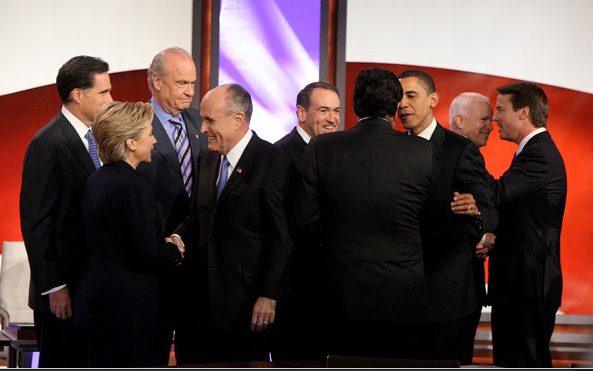
Here we have something close to the full slate of candidates for president kibitzing with one another in between the Democrat and Republican debates. No less staged than other pictures from the event – a picture of the performance of civility really – nevertheless it makes one wonder how the participants could be engaged in the incivility of hostage-like negotiations at one moment, and hand shaking and back slapping at another. Sure, Hillary is separated from the three Pips here, but it is hard to imagine that she has any more regard for those with whom she is socializing. The point, of course, is not to make light of public displays of civility, but to wonder what to make of them when they lack narrative fidelity with the stories being reported or seem to be altogether feigned, merely staged for the camera.

Then again, maybe it’s just another day in the never ending political season …

*UPDATE: Since writing this post I came across Alan Chin’s black and white photographs of the New Hampshire campaign. His work stands out as a stark exception to many of the claims made here. I will try to post on it in the near future, but in the meantime check it out at BAGnewsNotes.

Photo Credits: Doug Mills/NYT, Peter Wynn Thompson/NYT

Digg!

 3 Comments

Paradigmatic Violence in Pakistan

I’ve posted before about the heroism of the Pakistani middle class as they confront terror to create a modern, liberal-democratic civil society. That post featured an image of waiting and the prospect that things could get worse. They did get worse:

paki-man-on-street.png

This photograph is centered on a man wounded in the fatal attack on Benazir Bhutto in Rawalpindi, Pakistan. It shows much more than that, however. I see the pathos of civil society in an era of violence, a scene that can be understood as both a series of small choices and the brutal logic of historical fatality.

The photo features the man in the middle of the frame, and he is a peculiar figure: at once a picture of bourgeois composure and someone blasted into stunned incongruity. His pants have been shredded by the blast of the suicide bomber, yet his suit is still buttoned and his tie knotted neatly. One sleeve is disheveled but only to reveal a crisp shirt with white French cuffs. He checks his head for damage yet his hair is still parted. Those around him have been leveled by shrapnel, but he is sitting upright with his legs crossed at the ankles; he could just as well be sitting in a barber’s chair.

The emotional appeal of the image may derive from this tension between the raw violence of the scene and the habitual routines of ordinary life. This tension might be concentrated in the contrast between his orderly demeanor and exposed flesh. He acts as if the only problem is whether his hair is mussed, while we see that his pants have been flayed by violence. Much is revealed: he is not just a “suit,” and a “stable” society is not one where anyone can be torn apart by others who are no respecter of persons. More to the point, his habits of dress, posture, gesture, and thought are both touching and out of place in a world blown apart. They are so far from the harsh realities of civil war, so foreign to the production of violence. His habits are nothing more or less than than consolidated choices that both assume and reproduce a decent civil society. They are isolated by the destruction around him, and the implication is that they may be useless.

Although his suit didn’t protect him, he is alive. And that sets up the second emotional vector in the image. As the street spreads out behind him, we see the carnage wrought by the bomb. You might not want to look too closely. Those lying behind him are dead, and the further into the background, the more broken the bodies. Again, the scene is marked by little signs of normalcy gone awry: strips of paper, items of clothing, it could be the aftermath of a tornado except that it doesn’t stop there. The sitting man, the prone body, the crumpled bodies, the body parts present a declension of violence: to wound, to kill, to kill and mutilate, to dismember, to blow to bits. Thus, the distance from the man in the foreground to whose scattered on the ground behind him can double as a series of steps as a society devolves into anarchy. Those who are committed to civic order are threatened, then attacked, then killed as everything associated with them also is shredded and scattered. Small choices and everyday habits that are the fabric of peace cannot withstand the weapons of those committed to destruction.

John and I have posted periodically about the normalization of violence, but that rarely occurs in the immediate presence of actual destruction. This photograph documents that violence itself is about anything but the taken for granted routines of ordinary life. We now seem to be in a season of violence–Iraq, Pakistan, Kenya, and others are suffering the destruction of social order. It seems that the process is irreversible: once the detonator is set off, waves of destruction spread ever outward. But look at the photograph one last time. There are others in the picture. In the rear, another of the wounded also has risen to a sitting position. On the side, there are onlookers. These figures suggest that fatality has limits. The swath of destruction went only so far this time, each time. Those watching still have choices to make. Who to side with. How to help. With what weapons.

Photograph by John Moore/Getty Images.

Digg!

 0 Comments

The Aesthetics of Freedom

Back in September I commented on the allegorical design of the new U.S. passports and focused attention in particular on the opening page, a cornucopia of signs and references to American hegemony. The visual tableau there begins with an image of Baltimore Harbor being “bombarded.” Subtly but noticeably blended into the background so as to encompass both the inside cover and the first page is the American flag. The “alien” force then was the British Army, but the reference to more recent alien bombardments and expressions of the indestructibility of the American banner are hardly veiled. I promised to continue to examine the visual design of the passport and was reminded of this while traveling recently in the U.K.

The last two pages of the new U.S. passport offer an interesting allegorical complement to the opening two pages, and complete a framework for engaging the intervening twenty-seven pages of image and text that activate a history of the American sublime rooted in the nation’s divinely ordained, adventuresome and inventional spirit.

back-cover.jpg

Reading from left-to-right and from top-to-bottom, we first encounter an inscription from Ellison S. Onizuka, “Every generation has the obligation to free men’s minds for a look at new worlds … to look out from a higher plateau than the last generation.” This is quickly followed by a notice, centered and in bold face–and at least twice as large as anything else on the page–indicating that “This document contains sensitive electronics.” The remainder of the page contains addresses “for information” on importation restrictions, customs and border protection, agriculture, U.S. taxes, and social security. All of this information is obscured, more or less like the legalese we ignore and yet are required to sign-off on when we install new software on our computers. Instead, our attention is directed to the connection between “new worlds,” “higher plateau[s],” and “sensitive electronics.” This connection is animated by the photographic illustration that occupies the right hand page and to which our attention is drawn by the formal articulation of the bold faced font of the notice, the reddish hue cast by the sun on the left hand page, and the dark sky of outer space. Here we encounter the earth, centered in the image and, on close inspection, featuring the North and South American land masses. In the foreground is what appears to be the moon. Situated above the two and in-between them, as if the tip of an triangle connecting all three objects, is a satellite. At the bottom of the page is a bar code that corresponds to the passport number.

There is much to comment on here, but what I want to focus on is how the inside back cover is something of a formal “mirror” of the inside front cover, albeit with a difference that coaches the viewer to treat the ideological implications of American exceptionalism as the result of a natural, technological determinism.

The passport begins with a painting and ends with a photograph, the two genres of visual representation framing the historical shift from early to later modernity. The implications of that shift are formalized by the contrast between the quill-and-ink script that sits atop the painting on the inside cover and the computer generated bar code indicating the passport holder’s identification number that rides across the bottom of the photograph on the inside back cover. The shift from “then” to “now”–from painting to photograph, from quill-and-ink to computer generated bar code–is thus marked as a sign of technological progress. Each operates within its own aesthetic register, but the almost perfect symmetry–from left to right, from top to bottom – encourages the viewer to acknowledge a transcendent beauty predicated on the concept of “orderliness.” Notice, for example, how the quill-and-ink script is perfectly measured (at least for its antique medium), and thus anticipates the even more perfectly measured, technologically enabled bar coding on the back page. The shift from “then” to “now” is thus coded aesthetically as a sign of ordered, technological progress.

This aesthetic coding underwrites a politics concerning the relationship between American-style democracy and technology. The key marker here is the reference to “sensitive electronics.” The specific referent is the “electronic chip” embedded in the passport and designed to record the movement of citizens (and others) across borders, but its visual juxtaposition with the satellite looming over the galaxy implies something more. One might expect that technological progress would enable greater latitudes of individual freedom, as is the promise of the “land of the free and the home of the brave,” but here it offers not freedom of movement but panoptic oversight. Such control might be necessary in a world fraught with danger, but the point to notice here is how it is aesthetically domesticated and naturalized.

This post has gone on too long already, but two points are worth noting in this last regard. The first has to do with the way in which the passport is color coded from start to finish. As I indicated above, the inside front cover is encompassed by a washed out American flag that serves as the background to the painting and text, and it bleeds across the margins of the page on the right side, inviting us to turn the page. The color scheme carries its way throughout the passport to the back cover, where we see a tree looming over a land mass in the distance. It doesn’t take too much of a stretch to see that the color coding here might be analogous to the flag unfurled. The tree leans like a flag pole, the leaves recall the dark shield of starts, the red and white hues of the setting sun reminiscent of the alternating stripes. And so the banner originally sewn by a woman is here replicated by nature’s pallet, an almost perfect representation of America’s manifest destiny. But note too that the very last page is severe and abrupt in its difference. Virtually all color is lost as the world is now rendered in black and white; virtually, that is, but not entirely, for on close inspection we can see that the colors of nature/the flag bleed here too, though the threat that they will be washed away remains stark and foreboding. And so, of course, the need to mobilize technology, whatever risks it might invoke to freedom and liberty, seem warranted in the name of security.

But there is more, for we have yet to comment on the somewhat odd quotation from Ellison S. Onizuka that leads off the left hand page. The quotation is odd, less for what is said than for who is doing the talking. Few readers will easily identify Ellison Onizuka, nor could I until I researched it (even though I have previously written extensively about the key event for which Onizuka is known!). Ellison Onizuka was a mission specialist on NASA flight STS 5-L. You know it as the “Challenger” spacecraft. He died along with six other astronauts on January 28, 1986 when, in the famous words of President Reagan, the crew “slipped the surly bonds of earth” to “touch the face of God.” Onizuka’s words, locating the “obligation” of “free men” to “look out from a higher plateau” is thus not just an analogy for the spirit of progress—and the calculated risk that it always entails and yet we work so hard to repress—but operates in an anagogical regiser that puts man (and by implication the technologically advanced American, with his “sensitive electronics”) in proximity to the face of God. In this context the starkness of the black and white world on the facing page takes on an even more sinister, Manichean resonance.

Surely the dangers that the world poses have to be more complicated than this, and yet, here, it seems so natural … almost as if it is destined.

Welcome to 2008.

Digg!

 4 Comments

Diane Arbus: Humanity without Humanism

Yesterday the news in the art world included a New York Times story on “A Big Gift for the Met: The Arbus Archives.” The paper reproduced two of her photographs, the deeply affective “Russian Midget Friends in a Living Room on 100th Street, N.Y.C.,” and the more often reproduced “Woman with a Veil on Fifth Avenue, N.Y.C.” (The later is doubly jarring today, when “veil” is taken to refer to something quite different than an affluent white woman on Fifth Avenue.)

If you follow a link provided by the Times, you can see several photos that were revealed at a major retrospective of a few years ago. They are pure Arbus, and all the more stunning for that. This is art, and I won’t presume to add to what has been said to celebrate her achievement. It is enough to look:

arbus-young-man.jpg

He is no freak and the more exposed for that. Although composed for and confidently presenting himself to the camera, we see a profound vulnerability. Dressed for going out in public or to the office, he seems almost naked. Covered, even layered, he seems thin, at best a thinking reed. And can anything that gentle not be mowed down? It seems that the wind could cut through him like a bullet, and won’t the many snubs, rejections, and disappointments to come do the same?

That may be too morbid, however, an homage more to the Arbus aura than to the art itself. Perhaps he already is well armored. Look at the formal perfection that she captures: the arced lines of his eyelids are paralleled by his eyebrows and the brim, band, and top of his hat. The long oval of the face is mirrored by the ears, their protuberance now an aesthetic virtue. Likewise, the arcs of the lower lids, lower lip, and chin are mirrored by the V-lines of the collar, coat, and his arms. Eyes, mouth, hands; ears, lapels, hands–the incredible candor and goodness in his direct gaze at the camera is buttressed by these symmetries of composure. What should be a confrontational stance is instead a moment of pure openness. He, not just the photograph, is a work of art.

Except for the cigarette. That’s the punctum for me. The term was coined by Roland Barthes to describe the part of an image that punctuates or punctures interpretation to create a more intense or troubling emotional effect. The cigarette puts this young man back into time. He is living in a particular time and place and social world, and time is passing as surely as that cigarette is going up in smoke. Thus, the photograph brings him, and us, back to all the desires and vicissitudes and erosion of real life. He doesn’t have it all together; he’s imitating a movie star. He isn’t composed and armored and capable; he’s playing a part for which he is ill cast and cheaply costumed. He’s not open to a life of possibility; he’s already caught in an epidemic. The wind won’t blow through him, but he could end up thinner yet as cancer wastes him to the end. He’s really one of us.

Young Man in a Trench Coat, N.Y.C., 1971, by Diane Arbus/The New York Times, “Unveiled (September 14, 2003),” and Diane Arbus: Revelations.


Digg!

 0 Comments

Santa Claus, Child Abuser

This blog keeps to the straight and narrow much of the time, by which I mean we cover photojournalism with the occasional art photo or advertisement thrown in. We don’t range across Flickr, YouTube, MySpace, and the rest of the digital spectrum, much less put up snapshots from our own social networks. But one of the characteristics of media (and not just in the digital age) is that they all flow into one another. So it is that the Chicago Tribune website is inviting people to send in their snapshots of kids who are scared of Santa. And people do:

scared-of-santa-1.jpg

Cute, huh? Actually, I don’t think so. This photo probably is a good example of how one’s emotional response to images depends on context. The parents can chuckle because they know that this behavior was momentary and aberrant—the kid was fine in a minute and had lots of fun with the Santa myth otherwise.

It’s also a good example of why there should be some distinction between private and public media. Snapshots do many things, and photojournalism does many things, and they often can overlap and at times each do the work of the other. But you don’t have to look at many snaps to be relieved that they are not in the paper every day.

What interests me about these Santa images is that something does happen when they are collected for public viewing. Not one or two, but over a hundred and counting. Images like this:

scared-of-santa-2b.png


And this:

scared-santa-3.jpg

And that’s more than enough, isn’t it?

The question arises, what does the series of images show that might be overlooked in any one? The answer is, the social form–that is, the custom, and who it serves, and what it costs. The visit to Santa is revealed to be something done not so much for the kids as for the adults. Frankly, the kids would never miss it, don’t need it, and in some cases would be better off without it. And isn’t this a lesson in the tyranny of social forms? A very, very minor example, of course, but an example nonetheless of how people can be pushed into fixed scenarios before they are ready for what social goods might be conferred there. You might say that the visit to Santa is the first step toward middle school.

Digg!

 14 Comments