Feb 01, 2009
Nov 05, 2007
Sep 27, 2013
Feb 17, 2013
Oct 15, 2014
Jan 24, 2014

The State of the State of Nature

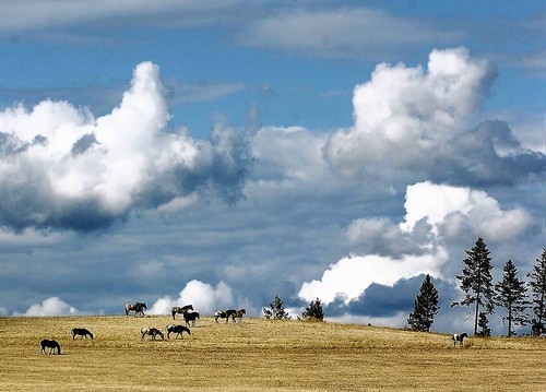
From the redwood forest to the gulf stream waters and from sea to shining sea, images of natural splendor have loomed large in American national identity. The appear everywhere from car ads to movie vistas to those framed Ansel Adams’ photographs that you see in doctors’ offices. Images of the national landscape also appear periodically as photographs in the daily paper. This one caught my eye yesterday while clicking through the photos of the week at the Chicago Tribune:

idaho-landscape.jpg

Why did I stop and look? Because it is beautiful. The strong blues and turbulent contrasts of the sky flow smoothly over the golden field of grass. The herd of horses moves nonchalantly across the field despite the powerful forces gathering above them. Like the trees on the right, together yet each standing independently, they need not fear an afternoon storm. The photograph was taken “near Troy, Idaho”; that “near” is a linguistic marker of the Western sense of open space. The scene is a reminder of the sublime promise of the American West, where all can live both free and in harmony with nature.

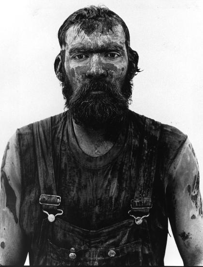
That’s the promise. Other photographs document the underside of the dream. Richard Avedon created a brilliant series of images to challenge the myth of the empty landscape. His images of miners, migrant workers, and others provide stunning evidence that the West is also a place where people live lives of hard labor. These images reveal domination, exploitation, and the wastage of human life on behalf of the production of wealth, but they also reveal something not found in the natural landscape: dignity.

avedon_100604_big.jpg

This is a picture of Red Owens, an oil field worker. This, too, is the American West. Free but not free, close to nature but used up by the physical work of extracting natural resources from the earth.

The first picture appeared during a week when the papers were reporting deaths from a mining accident in Utah, and a swath of destruction unleashed by thunderstorms across the Midwest. The mountains bring more than scenic views, and nature is no respecter of persons, or cities, or nations. We cannot serenely move across the landscape to better pastures.

The task of rebuilding community has to include far more than a change in perspective. In fact, I think we need both photos. And they can do more than provide sunny distraction or a grim reminder. It’s a stretch, but the first photo brought to mind a phrase from Winston Churchill’s “finest hour” speech: “If we can stand up to him (Hitler), all Europe may be free and the life of the world may move forward into broad, sunlit uplands.” If a photograph of beautiful uplands can be an image of freedom, then perhaps we are more likely to aspire to that. Likewise, the second photo can evoke the remainder of Churchill’s statement: “But if we fail, then the whole world, including the United States, including all that we have known and cared for, will sink into the abyss of a new dark age made more sinister, and perhaps more protracted, by the lights of perverted science.” We need not bash science, but the truth is that the control of nature, like nature itself, can be used for good or ill. A free people cannot live in a state of nature, but freedom may depend on how they understand their relationship to nature and to each other.

Photographs by Steve Hanks, Lewiston Tribune, August 22, 2007, and Richard Avedon, 1980/1985. See In the American West.

Winston Churchill, “Their Finest Hour,” speech to the House of Commons, June 18, 1940.

Thanks to Michael J. Shapiro for bringing the Avedon photographs to my attention in his fine essay, “The Political Rhetoric of Photography,” chapter four of The Politics of Representation.
Digg!

 4 Comments

Sight Gag: The Limits of Empire

empirea-reduced.jpg

Our primary goal with this blog is to talk about the ways in which photojournalism contributes to a vital democratic public culture. Much of the time that means we are focusing on what purport to be more or less serious matters. But as John Stewart and Stephen Colbert often remind us, democracy needs irony, parody, and pure silliness as much as it needs serious contemplation. For our part, we will dedicate our Sunday posts to putting some of that silliness on display in what we call “sight gags,” democracy’s nod to the carnivalesque. Sometimes we will post pictures we’ve taken, or that have been contributed by others, or that we just happen to stumble across as we navigate our very visual public culture. And we won’t just be limited to photography, as a robust democratic visual culture consists of much more. We typically will not comment beyond offering an identifying label, leaving the images to “speak” for themselves as much as possible. Of course we invite you to comment … and to send us images that you think capture the carnival of contemporary democratic public culture.

Photo Credit: John Lucaites


Digg!

 4 Comments

Who is that Man in the Picture?

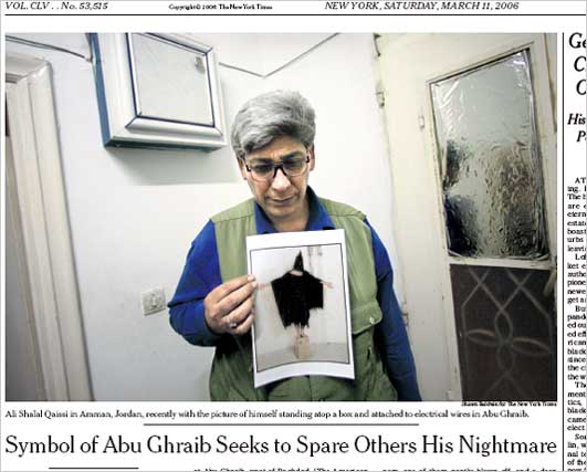
Last week I commented on the latest effort to discover the “true” identity of the kissers in the famous “Times Square Kiss” photograph. Reporting on such efforts is a fairly common narrative that follows along with the circulation of many iconic photographs. After all, most such photographs rely upon a certain degree of anonymity and when we encounter the anonymous our curiosity is piqued. Who is the migrant mother? Or that young girl at Kent State? Or the man standing in front of the tank in Tiananmen Square? And so on. Earlier this week Erroll Morris, an important documentary film maker, reprised the question raised last year (3/11/2006) in the NYT concerning the alleged identity of the man known as”Gilligan” in the iconic Abu Ghraib torture photograph:

15qaissi533.jpg

Morris argues that the controversy demonstrates “how we make false inferences from pictures.” We think that he gets it wrong, or perhaps more to the point, he asks the wrong question and thus diverts attention from the very important range of ways in which photojournalism contributes to a vital and robust democratic public culture. Robert posted our response as a comment at the Times. We’ve reposted that comment below, but we also encourage our readers to attend to the continuing and very spirited and engaged debate on this topic at the NYT.

Posted at the New York Times, August 16, 2007:

Errol Morris’s essay is one example of his claim that “We do not form our beliefs on the basis of what we see; rather, what we see is determined by our beliefs.” His critique of the Abu Ghraib story depends on several axioms of Susan Sontag’s critique of photography. Unfortunately, each one of them is at best half true.

1. Photographs corrupt moral response by substituting the image of the victim for reality: “The no longer anonymous Hooded Man became a national news story – not because he was a victim of torture and abuse at Abu Ghraib but because he was in a famous photograph.”

2. Photographs corrupt our knowledge of reality: “Namely, the central role that photography itself played in the mistaken identification, and the way that photography lends itself to those errors and may even engender them. . . . photographs attract false beliefs – as fly-paper attracts flies.”

The basic problem with both of these ideas is that the critic is attributing to photography what is true of all representation, verbal as well as visual. Think about it: can you depend any more on written accounts of reality? If so, I have a bridge to sell. You don’t have to spend more than ten minutes in a court of law to see that writing is highly suspect. Newspaper reportage is partial at best while details often are mistaken; government reports have an additional set of problems, scholarship is subject to paradigmatic restrictions, and so forth and so on. The most false, dangerous, immoral, and harmful publication in the world is not a photograph, but a book: The Protocols of the Elders of Zion.

And for all that, writing, like photography, is a remarkable tool for learning about, knowing, and navigating through the world. If left only to what we see directly, we would know and care about very few people (and no more accurately, by the way: eyewitness testimony is notoriously bad evidence). That we care about victims because we see images of them—or read about them, say, by reading the Diary of Anne Frank—demonstrates that we can expand our capacity to care through our use of the public media. Nor are we trapped in our representations. In fact, belief and experience work both ways: prior belief shapes perception, yet human beings, like other animals, continually adjust their conception of the world based on what they observe.

That said, I’ve gotta like the attention Morris pays to iconic images such as the photo from Abu Ghraib. (Full disclosure: I’m co-author with John Lucaites of No Caption Needed: Iconic Photographs, Public Culture, and Liberal Democracy, and John and I maintain the blog No Caption Needed.) The debate about identifying the specific individual in the Abu Ghraib icon is one measure of the photo’s status: similar efforts are made with every iconic photo. At least two issues need to be noted here: one is that, although indifference to the specific individual in the photo could be a moral mistake, the moral testimony of the photograph requires only that someone is there, not any one person. Morris makes the right distinction but gets things backwards when he claims, “Now we are talking about reality – not about photographs.” No, we are talking about photographs, specifically, about a photograph’s documentation of torture. As with other iconic photographs, the image’s moral power depends on the anonymity of those in the picture. We empathize because the person could be anyone, not because it is this or that individual. The photograph of the napalmed girl running down the road in Vietnam was moving not because it was a picture of Kim Phuc, but because it was a picture of a girl much like children you have known.

This is why I can’t get excited about the stories of who was in the photographs from Iwo Jima, Vietnam, Kent State, or Abu Ghraib. These narratives usually serve to domesticate the image, to transform its powerful call for public action into a feel-good story about private life. Barthes said the photograph could be mad or tame. Locating the individual in the iconic image, however accurately, only tames the photograph and perhaps the public as well.

Photo credit: Shawn Baldwin/New York Times


Digg!

 0 Comments

The Photographic Renaissance

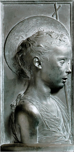
Not long ago it was easy to think of photojournalism as a dying art. Its successful remediation on the web now suggests a very different if less predetermined story. In fact, you could argue that we are experiencing something like a renaissance of the art. One sign would be that we are surrounded by many dazzling images that we take for granted. Another comparison would be that photojournalism today at times achieves the powerful aesthetic and ethical values of Renaissance humanism. This may seem a stretch, but I’ve seen two images this week that stopped me in my tracks, and for the same reason. The first is a profile relief by the Florentine sculptor Desidero da Settignano, who is the subject of a retrospective at the National Gallery of Art.

19355243jpg.jpg

Ostensibly a “Young St. John the Baptist,” the figure is a stunning depiction of a young boy as if in the flesh, and of the grace and wonder and vulnerability of childhood, and of human being in all its individuality and curiousity.

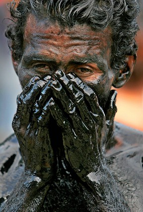
The work obviously required incredible artistic skill. We could hardly expect to see anything like it from a camera, where it seems all you have to do is push a button to make an image. For all that, I think the following image is equally accomplished:

31784129.jpg

The caption reported that this was a ritual immersion in recycled oil during the celebrations in Managua, Nicaragua for its patron saint, St. Dominic of Guzman. As before, a religious scene is the pretext for isolation of the individual person. We see in his face, eyes, brow, hands not idiosyncrasy but rather a profound depiction of individual experience captured within visible form. I have seen many Renaissance sculptures that are nearly identical in features and effect. The oil gives the image the feel of sculpted stone or metal, and it seems that the man’s human distinctiveness is emerging out of the block of inert material. I could look at it, and learn from it, for hours.

The first image is considered priceless. The second was stuck among many others in a big slide show of “photos of the week.”

Photograph of “The Young St. John the Baptist” by Desiderio from the Museo Nazionale del Bargello, Polo Museale Fiorentino, Florence. Photograph of Nicaraguan man by Esteban Felix/Associated Press.


Digg!

 0 Comments

Double Duty During the Dog Days

John and I have been posting six days a week since we started at the end of June, and we hope to continue to maintain a pace of 5-6 posts per week. It is August, however, and traffic is slow everywhere–on the street, on the Internet, around the office, you name it. So today I’m just directing those who might be interested to our posts this past week at BAGnewsNotes: yesterday, the 11th, on “The Fighting Romneys,” and August 6 on the photographs accompanying Michael Ignatieff’s mea culpa in last week’s New York Times Magazine.

In the latter posting we caught some heat for being too easy on Ignatieff, which we were. For the record, I’ll reprint my own mea culpa from the comments thread at the BAG:

In the last week, Ignatieff has been beaten with a stick all over the blogosphere. He deserved every bit of it. The essay is as self-serving as they come. So why did John and I say it was “thoughtful”? Three reasons: 1. We wanted to get past most of it to focus on the photos and how they illustrated his bad advice about being emotionally muted. Obviously, that didn’t happen, and for reasons–i.e., emotions–we have to respect. 2. If you read the essay as having nothing to do about Iraq but rather as an essay on the mentality best suited for politics, it’s pretty good of kind. John and I have an interest in that literature on prudence, so it was easy for us to bracket his motives. Too easy, it seems; we got suckered on that one. 3. We haven’t been interested in talking about any of the many mea culpas now being written becasue they all have been pathetic, don’t show real remorse, etc. Because so many of us were right about the war from the beginning, why listen to the other side’s still bizarrely convoluted acounts of the world? The lesson I’ve learned this week at the BAG and elsewhere is that people like Ignatieff do need to be thumped when they don’t come clean. The record does need to be set straight, and not being honest and not recognizing good judgment still are major causes of this war. And that’s why it remains important to think about what we see and how we feel. One problem with the reaction against Ignatieff–Katha Pollitt’s otherwise fine essay at The Nation is a good example–is that we only end up going from worse back to bad. We shouldn’t have a foreign policy conducted by overzealous ideologues, sure, but do we really want a foreign policy conducted by “realists” who also have a bad track record? If we reject Rumsfeld only to resurrect Kissinger, we haven’t learned a damn thing.

 0 Comments

Dancing with Wolves at Camp David

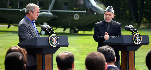
Yesterday’s papers reported on the talks between Bush and Afghanistan President Hamid Karzai, which were concluding with the requisite photo-ops. These diplomatic events are artfully choreographed dances: the American president has to suggest that the two countries are equal partners rather than an imperial state and its client regime; the visiting pol has to suggest some degree of independence for the folks back home while otherwise blessing the dependent relationship. Thus, Bush could say that Karzai “knows best about what’s taking place in his country, and of course, I’m willing to listen.” That’s our Bush, not only The Decider but also one heck of a listener. And Karzai (on CNN) had referred to Iran as a “helper” while not making a fuss about his country’s lack of sovereignty, say, in deciding whether US troops are allowed within its borders. The New York Times coverage included a front page above-the-fold shot of the two striding along as if equals hitting their stride together, and then this photo with a story that made it sound like they were having a thoughtful debate.

07prexy600.jpg

Two things strike me right away. One is Karzai’s gesture, which neatly reflects his ambivalent stance politically. Holding his hands in that manner can provide sophisticated inflection of a point in deliberative discussion, and it can also can be a sign of obeisance or supplication. The second thing I can’t help but notice is the grass–how green and lush it is. Everyone there is taking it for granted, but it’s so rich–and so far away from Afghanistan:

afghanistan-senlis-council.JPG

Photographs by Doug Mills/The New York Times, and the Senlis Council/Global Policy Forum


Digg!

 0 Comments

Is There an Icon for Everything?

It may have started with this:

180px-smileysvg.png

Search for “icon” on LexisNexis and you can quickly overload the browser with thousands of citations. And no wonder, the word appears continually these days in every section of the newspaper. Yesterday the Chicago Tribune reported, “At Hall of Fame, Day Dedicated to Two Icons, Not Controversy.” Who were the two titans of the game? Iron man Cal Ripken was one; the other was Tony Gwynn. A fine player, I’m sure, but not exactly a household name. He is, however, probably in the same league as Tom Snyder, who today was labeled a “late-night talk show icon.” A search reveals the same for a clerk in Cambridge, a banker in Arkansas, and just about everything in Australia. Not to mention tomato soup in the U.S. . . . Should we be surprised that there now also are “supericons” (Kate Moss, by one account)?

One might wonder why. My Northwestern colleagues Pablo Bockowski and James Webster have each done research that suggests one answer to the proliferation of “icon.” Very briefly, the combination of new media and intense competition for consumer attention can produce homogenized content. YouTube is an obvious example: of all those video clips seen by millions of viewers, one result is that a very few get tremendous circulation–dare we say they become iconic?–while most fade unseen in the desert air. As all media become focused on relaying what is currently popular to get their share of consumer attention, this phenomenon becomes the standard of significance while “repurposing” pops up as a new (and ugly) verb.

Here’s where “icon” comes into the picture. The homogenization thesis is a corrective to the fragmentation thesis, which says that incredible proliferation in media technologies and producers creates ever more finely segmented and isolated audiences. Thus, fragmentation and homogenization are countervailing forces that can produce mixed outcomes. We might speculate that the homogenization that can happen across producers and audiences can also happen within any topical category, audience, or sub-culture: amidst the information explosion within that “locality,” some few individuals will get a disproportionate amount of attention and thus seem to be representative of the category. Given these market forces, being notable and being well-known will seem to be much the same, so much so that one word might suffice for both. And so it is that anyone trying to claim that anything is worth our attention might say that it is iconic.

Thus, the same word can mark two related though quite different qualities. “Icon” can refer to anything that is recognized widely, such as the smiley face, or to any representative of a particular sub-culture, such as Tony Gwynn.

Have a nice day.


Digg!

 1 Comment

.. and Before the Caption Comes the Picture

take-no-picture.png

Robert and I have spent much of the past ten years trying to figure out what makes a photograph “iconic.” We have some pretty good ideas about what leads to photographic iconicity, but all but one are arguable: Unseen photographs never become iconic. And the condition of see-ability, of course, is that the photograph actually has to be taken. And now the truly great city of New York, in all of its infinite wisdom, wants to regulate the taking of photographs, requiring permits and $1 million dollars in liability insurance from anyone who “wants to use a camera in a public place for more than 30 minutes” or from “a group of five or more people who plan to use a tripod in a public location for more than 10 minutes, including the time it takes to set up the equipment.”

The NYT reports that the policy is not “intended to apply to tourists or amateur filmmakers or photographers” who, the rules emphasize, are “rarely” effected by the proposed regulations. We are quite sure that this is of very little comfort to citizens who might actually want to picture the world around them. The permits are “free” (though liability insurance, one might imagine, is a different matter), and the proposed rules include all sorts of exceptions (designed, no doubt, to navigate and manage First Amendment concerns), but Kafka taught us about the bureaucratic style and we all know about the slippery slope of regulation.  And the question has to be, exactly what interests are being served by such regulations?

The advocacy group Picture New York has an on-line petition and is planning other protest activities, as in the picture above of photographers with faux-cameras. Thanks to Ted Striphas for calling my attention to this issue.

Photo Credits: Gabriele Stabile/New York Times

 0 Comments

Sex and the Civitas

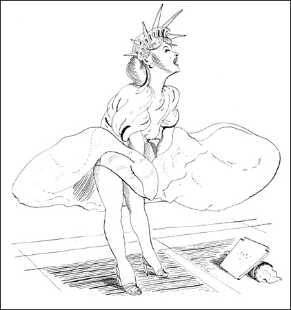
Although photography has almost completely displaced illustration as the visual art of print journalism, some newspapers still use drawings regularly. The New York Times is particularly inventive in that regard (as well as with graphic art, but that’s another topic). The Sunday Times featured a terrific drawing that dominated the space above the fold for Frank Rich’s weekly essay on political culture.

marilyn-liberty-blitt450.jpg

Rich was remarking on “the G.O.P.’s overdue summer of love,” whereby the Party was caught between the David Vitter prostitution scandal and having a twice-divorced adulterer as the front runner for the presidential nomination. Gloating aside, Rich’s main point is that the electorate may be moving beyond Family Values prudery. The illustrator got that idea big time. The drawing fuses two iconic images: Marilyn Monroe’s publicity shot for The Seven Year Itch, and the Statue of Liberty. If the image seems incongruous or naughty, that shouldn’t be surprising. Whether you see Lady Liberty enjoying the not rush of air up her thighs, or Marilyn donning a the civic crown as part of her erotic playfulness, these are not attitudes that are likely to be taught to home schoolers. (Pedantic aside: “prurient,” meaning lascivious or lustful, is derived from the Latin word for itch.) That transgressiveness is reinforced by the formal hybridity of the image: the icons in question began as photograph and a statue (neither of which is an illustration); they became icons of celebrity culture and civic culture; they reflect 19th century civic republican art and 20th century image making.

The drawing may be go farther than Rich would like. He is suggesting that the electorate is coming to its senses, not in the sense of having its own summer of love, but rather in becoming prudent rather than moralistic about the relationship between private life and public policy. The drawing, however, suggests that when the private passions and civic ideals go public together, the result is much more a matter of desire than restraint. Or perhaps I’m being moralistic. In any case, this is a great example of how illustrators still can play an provocative role in the visual public sphere.

Illustration by Barry Blitt for the New York Times, The Week in Review, July 22, 2007. (NB: Blitt already has a place in the history of iconic images, as he created the New Yorker cover that depicted two male sailors kissing in the manner of the iconic photograph of a sailor and a nurse clenched in Times Square on VJ Day. You can see the cover here (scroll down). If you have a copy of No Caption Needed, it’s on page 79.)

 0 Comments

The War of the Roses

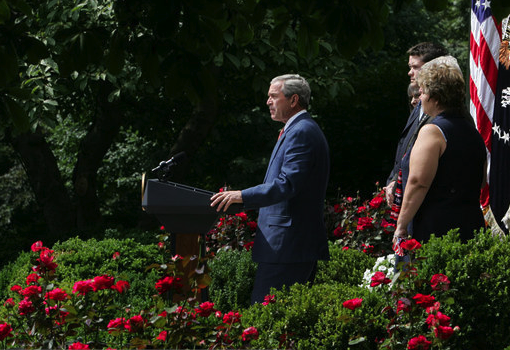
Several days ago I commented on the common and ordinary conventions of photographic representation that tend to guide and discipline photojournalistic decorum in representing the President of the United States. As I noted there, the conventions typically employed reinforce our perception of the president’s power and presence as commander-in-chief. But I also noted how the conventions can be managed in ways that call attention to their artifice, thus undermining the window-on-the world sensibility that they generally promote. And sometimes, I suggested, they can be actively exploited so as to produce effects that are wholly contrary to our ordinary expectations. In recent times such conventions have operated in something of a tension between efforts to minimize and maximize representations of President Bush’s stature. Two photographs of President Bush speaking in the Rose Garden on July 20th make the point—and more—exceedingly well.The first photograph was used to lead an AP wire report with the headline, “Bush Criticizes Democrats on Iraq”:

AP.Rose Garden

The AP, of course, is required to be “fair and balanced” in its reporting of any event, and no less so a media event planned by the White House. But this photograph tells a somewhat different story than the headline. First, it is important to note that in its published version the photograph is smaller by at least half than the version I’ve reprinted above, and this is not inconsequential to the interpretation it invites from its viewers. Shot from a low angle, as per the convention for emphasizing the power of the president, it is also shot from the side and at long distance. Indeed, the president is miniscule, once again dwarfed by the scene in which he is performing his office. Indeed, he is so small in relationship to his surroundings that it is hard to know exactly what he is doing—one has to strain to recognize that he is standing at a podium. He is backed up by an entourage, but they are almost entirely obscured by the roses, which clearly dominate the scene. And note too how the use of the roses to frame the action situates the viewer – presumably the American people: It is as if those who are viewing this scene are interlopers, voyeurs jealously sneaking a peek at a party to which they have not been invited. And the color seems off too, slightly washed out in a way that suggests that the roses have begun to pass their prime; the visual effect carries over to the president’s jacket, making it seem more like a drab and faded grey, than blue, his shirt and tie barely visible. It is hardly the image that an embattled president seeking public support for a contentious policy would want to portray.

One might expect to find a very different photograph of the event at the White House website and so they might be surprised to find this image which, at first glance, seems to be akin to the one used by the AP:

White House Rose Garden

The differences between the two photographs are subtle but invite very different affective responses. Note first, that at the White House website the image is slightly larger than the one reproduced here. In this image the president is shot in middle-distance, and as such his body stands in comfortable proportion to the scene in which he acts. He dominates the frame and appears to be in full command of the event unfolding: Standing at a podium, speaking to an unseen audience, he is the master of his house/garden. His entourage of supporters are visible and prominent, albeit subordinate; dutifully at attention and attending to his words, they reinforce the sense that he is in control. Equally prominent is the U.S. flag, somewhat obscured in the AP photograph. But most important are the roses, which now function as a natural and pleasant setting rather than as subterfuge or camouflage. They neither obscure the viewer’s line of sight nor hide the viewer’s presence from detection. While still to the side, the viewer is now a legitimate part of the scene. The colors are rich, saturated, alive, the roses in full bloom, the suit a bright and pleasing blue, his white shirt and red tie clearly connecting him to the flag that sits behind him.

Much more could be said about these photographs, but the point to underscore here is that each displays a very different social order: One a dim and dying world animated by secrecy and political jealousies; the other a bright and vibrant world, alive to the future and animated by the presumption of political openness and equanimity. The impulse here, no doubt, is to ask: Which, if either, is the real world? Or is it a third version that one finds at the NYT and that seems to sit somewhere between the two? But such questions are dangerously myopic, if for no other reason than the assumption that one photograph is fundamentally more real than the other. Every photograph is a construction, a tool for making (and unmaking) the world that draws upon complex mediating technologies, recognizable conventions of representation and cultural practice, and the inventional skills of photographers and editors. The better questions to ask are how do visual technologies enable the imagination and production of alternate worlds? What do such images reveal—both about the worlds they portray and about us? And what do they (necessarily) hide or obscure? And, perhaps most important, what are the implications of such constructions for the world (or worlds) in which we want to live?Photo Credits: Gerald Herbert/AP Photo, Joyce N. Boghosian/White House Photo

 3 Comments