Apr 21, 2008
Dec 08, 2008
Jul 15, 2009
Oct 02, 2011
Feb 24, 2014
Nov 06, 2009

War and Representation: Showing the Limits of Comprehension

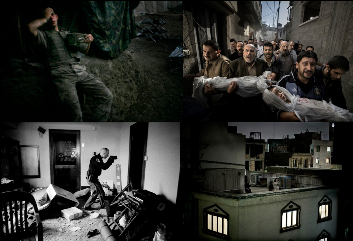
There’s been a lot of talk lately, including a post at this blog, about accuracy in photojournalism: How much can a photograph be adjusted artistically and still be considered true?  How much detail should the captions provide, and in respect to what questions or values?  Despite strong and often heated disagreements, most commentators across the spectrum seem to assume that the reportage could be thoroughly accurate, specific, relevant, and otherwise up to the task of giving the public what they need to form sound judgments about current events.

Let me now suggest that sometimes we are better off without that assumption.  More to the point, one of the jobs that photojournalism also has is to remind the public how much eludes understanding.  Thus, some of the photos (and their captions) are good journalism because of how they show us the limits of what can be seen.

SYRIA-CONFLICT

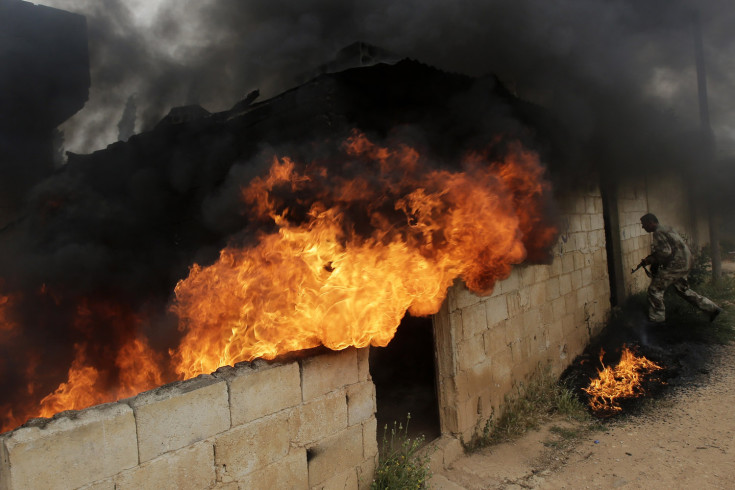
The caption at Time said, “May 13, 2013. Syrian army soldiers take control of the village of Western Dumayna, some seven kilometers north of the rebel-held city of Qusayr.”  The “seven kilometers” suggests that we are being given a precise description of what is happening, even though you can’t see any of that fact in the photograph.  Many viewers might feel adequately anchored at that point and so look a moment longer and then move on.  But wait a minute: is this an image of “control”?

Horrific flames and dark, thick smoke billow from the other side of the wall.  The open doorway reveals only blackness, as if a void lies within.  A swatch of fire has dropped on the outside of the wall, near which a lone soldier is about to enter through another doorway into the interior.  The soldier is controlled, disciplined, brave, and probably used to working amid the roiling destructiveness of battle, but he also is a marginal figure in the composition and appears almost furtive as he enters what is effectively the back stage of this set.  Set in diminutive contrast to the powerful flames, he can’t be the locus of control.  Likewise, additional reportage (the full caption not included at Time) tells us that a Syrian advance had gained a strategic advantage and cut supply lines in Qusayr, but that larger sense of command and control also is not evident here.  In fact, this image seems to be very much a picture of something closer to chaos.

And that may be the point.  I’d say this photograph shows just how “control” is an abstraction that is imposed on the material destructiveness of war.  Being abstract doesn’t mean it isn’t real, but it does mean that it depends on a certain distance from the flames.  Likewise, describing the battle in terms of control is of course very much to the point of the fighting, but it also encourages denial of just how terrible life can become on the other side of that wall.

Seen in this light, the wall now assumes a double meaning.  It is still a structure about seven kilometers north of Qusayr, but it also can be a symbol of how the truth of the matter on the ground might lie forever behind a barrier.  Walls stop vision, and here it seems that the action that really counts lies on the other side of that thick, stony, silent wall.  This is not just a blockage, however, but a reminder of how vision and with that understanding is always partially blocked.  This wall now speaks eloquently of the limits of our understanding: we no more understand the battle than we did when we were told that it was about “control,” but now we have a visual emblem of that limit on our comprehension.

In marking how war can exceed representation, the image also can say something about this war.  Readers of a certain age will recall the infamous statement that “we had to destroy the village in order to save it.”  One can’t help but wonder if the same holds for Syria, which is being laid waste.  If we can’t see a reason for the destructiveness, it could be because one no longer is there.  As Suzy Linfield has said, violence today too often becomes untethered from any ideological rationale and political administration.  The result is not something that later can be honored as justified sacrifice for the nation or the cause, but only awful cycles of violence that burn through civilians like firewood.

Thus, by recognizing how this war exceeds our understanding, we also can consider how that is not merely a failure of perception.  War itself may lie hidden behind that wall.  Raging destructiveness without purpose or limit, fueled by ignorance and protected by abstraction, it can lure anyone to cross that threshold, only to devour them in the darkness.

That compact with oblivion is all the more reason to supply as many photographs and words as one can to show what must be shown.  But it is equally important to remember that none of us can fully know the truth, and how war can count on that.  That is no reason for despair, however.  Even when at the limits of comprehension, the ideal of peace is always on the horizon, waiting for those who will start walking in that direction.

Photograph by Joseph Eid/AFP-Getty Images.

 2 Comments

Reflections on a Scene (or Two)

Screen shot 2013-05-19 at 8.49.44 PM

We don’t write about sports very much here at NCN and today will be no different.  After all, what is there to say here.  The photograph pictures the Miami Heat’s  four time MVP LeBron James about to take the Chicago Bulls’ Jimmy Butler to the basket.  The only suspense is whether it will be a three point play or not.  No, what makes this photograph notable has almost nothing to do with the actual action taking place and everything to do with the way in which the camera has captured two scenes at once—one on top, the “real” scene, and the other, on the bottom, a reflection from the highly polished floor.

Of course, one might argue that this is only one scene, the inverted image on the bottom a natural extension of the top image.  And that would be true also.  The question, really, is how one wants to “read” the image.  We typically think of a mirror reflection as an inverted but otherwise identical (re)presentation of the original.  It is one of the reasons we are so often challenged to “look at ourselves” in a mirror, so as to see what is “really” there, or at least what others purport to see  But here, while the original and the reflection bear enough points of similarity that one might identify them as the same scene, they are not identical.

The top image is sharp and clear, consonant with the photojournalists avowed dedication to the realist aesthetic that purports a sort of mechanical objectivity—everything to scale, the light natural, the natural plane of the image represented as if one were actually there witnessing it. The bottom image has more of the quality of an impressionist painting, the appearance of thin brush strokes that call attention to texture, especially as it relates to human movement; emphasis on the quality of light as it effects the scene; and finally notice of the unnatural angle that resituates the viewer, underscoring the sense in which what we are looking at is clearly a representation that needs to be decoded and not the thing itself.

The effects of the image and its reflection are different as well.  Note, for example, how the realist image locates the contest between James and Butler in a multiplicity of scenes that first calls attention to the game itself as we see the coach calling out orders and other players positioning themselves to respond to the central action, and then calls attention to the immediate crowd watching the event.  The focus is clearly on the two principles, but they are part of a larger event.  By contrast, the impressionist image focuses our attention almost entirely on the central actors, giving them an almost epic significance, everything else cast with a spectral patina that suggests that they are both there and not there (perhaps like the external viewer of the image).

Whether you see one scene or two either (both) is (are) shot with the same camera, with the same aperture, from the same vantage point, and at the same moment in time. And yet what we see are two potentially and palpably different (albeit related) events, each calling attention to the otherwise taken for granted conventions that underscore both what is present and what is absent in the other and thus animating the possibilities of meaning.  What makes the photograph particularly interesting then is how it schools the viewer concerning the everyday necessity of visual literacy, always “reading” an image, not just glancing at it, seeing it for what it always is: an artistic construction.

Photo Credit:  Mike Ehrmann/Getty Images

 1 Comment

Sight Gag: Economic Games (In “the Good ‘ole Days”)

Modern-Monopoly-Game

Photo Credit: Anonymous

Sight Gag is our weekly nod to the ironic, satiric, parodic, and carnivalesque performances that are an important part of a vibrant democratic public culture.  These “gags” may not always be funny or represent a familiar point of view, but they attempt to cut through the lies, hypocrisy, shamelessness, stupidity, complacency, and other vices of democratic life.  Of course, we invite you to comment … and to send us images that you think might deserve a laugh or at least a wry and rueful look by those who are thinking about the character of public life today.


 0 Comments

The Rhetoric of Prize-Winning Photographs

Guest Correspondent: Jens Kjeldsen

Is it a fake? Is it photoshopped? Is it real? Paul Hansen’s winner of the 2012 World Press Photo competition is just the latest example of more than 100 years of continuous discussions about the manipulation of photographs.

Netherlands World Press Photo Contest

However, instead of asking only if prize winning images are manipulated (and of course in some way they all are), we should also ask why are they changed to become the way they are?  Or, to put it differently: what kinds of photographs win awards?

When we look closer at the changing styles of the winning photographs since the beginning of the World Press Photo competition in 1955, we see that Hansen’s picture is part of a cinematic form of expression that has emerged in the last 6-7 years.

The image portrays family members from Gaza carrying the bodies of a two small children to their burial after being killed in an Israeli air strike. It is no coincidence that it has been called a movie poster. However, the photo is more like a still; a story frozen in time, but condensed with motion and movement, inviting us into a narrative of what has happened before, and what might happen next.

This new trend is different from other dominant styles among the WPP winners. Some of the winning pictures hold what we can call news moments (similar to Henri Cartier Bresson’s decisive moments). Most of the news moments are from the 1960s. A prime example is Eddie Adams’ 1968 picture of the execution of a suspected Viet Cong member, showing the exact moment of the bullet’s penetration of the brain. The impact of the picture lies primarily in capturing a certain news event in a fraction a second.

The closer we get to this century, the fewer pictures we see of such news moments.

Instead we see more feature-like photographs capturing – not a moment, but a general situation or condition. Take this winner from 2004 portraying a woman mourning a relative after the Asian tsunami of December 2003.

Image 2, WPP 2004, A. Datta

The photo is constructed around a juxtaposition between the dead body, represented by only an arm in the left of the frame, and the bereaved, represented by a woman lying face down on the sand in the right part of the frame.

This kind of explicitly artistic visual rhetoric prevailed from 2000-2004. The 2001 winner portrays how the body of a one-year-old boy who died of dehydration is being prepared for burial at Jalozai refugee camp in Pakistan.

Image 3, WPP 2001, E. Refner

It is a very rare example of a picture being taken in a full bird’s eye perspective, directly from above.

The picture is dominated by the white color of the draping sheets, covering the body of the little boy, so we only see the left side of his face. He seems at peace, and the picture exudes calmness, giving it an almost ethereal dimension. Combined with the angle of the arms draping the sheets, the picture is more an aesthetic moment than it is a news moment.

Hansen’s picture is neither a news moment nor an aesthetic moment – not to say, of course, that it does not have style. All images do. Instead the aesthetic tendency exhibited in this picture is a more of a kind of movie realism, a sort of photographic cinema verité. We see a similar tendency in the winners from 2007, 2008, and 2009.

Image 4_Winners of WPP 2007, 2008, 2009, 2012

The 2007-winner shows a US soldier sinking onto an embankment in a bunker in Afghanistan. The 2008 winner depicts a policeman entering a home in Cleveland, USA, in order to check whether the owners have vacated the premises. In 2009 we see women shouting their dissent from a Tehran rooftop following Iran’s disputed presidential election.

These images are not colorful, there are no close ups, no clear, simple or stylized compositions, and no conspicuous juxtapositions or an obvious use of some part to represent a whole. They give the impression of the fictional realism we sometimes encounter at the cinema.

While the beginning of the decade presented photographs that have their main rhetorical appeal in their compositional and aesthetic organization, these photographs appeal more through story-making.

The first kind invites the viewer inside the frame, encouraging exploration of the elements in the visual moment, captivating us through visual design. The second kind invites the viewer outside the frame, encouraging participation in the construction of a narrative, engaging us in speculations of what has happened and what will happen.

This kind of neo-realistic press photography seems to be more open to interpretation than the more obvious symbolic photos.

The strange thing, though, is that the more the pictures draw us into a story of mostly our own creation, they seem to draw us away from the events they are depicting. They are all fabulous images, but even when provided with the backstories I remain a spectator immersed in the story, in awe of the artwork, waiting for the movie to premiere.


World Press Photo award-winning photographs by Paul Hansen, Arko Datta, Erik Refner, and (clockwise from the upper left) Tim Hetherington, Paul Hansen, Pietro Masturzo, and Anthony Suau.

Jens Kjeldsen is professor of rhetoric and visual communication at the Department of Information Science and Media Studies, University of Bergen (Norway), and Professor of rhetoric at Södertörn University (Stockholm, Sweden). He currently is visiting Fulbright professor at the Department of Communication Studies, Northwestern University.

 8 Comments

When Words are Photoshopped

Yet another prize winning photographer has been accused of visual deception.  Subsequently, Paul Hansen’s World Press Photo of the Year passed the forensic review that was set up hurriedly–by WPP–to address the scandal, but it has become clear that the image was substantially “improved” in post-production.  All commercial photos are enhanced, and few news photos have ever appeared without some artistic manipulation, so there is at the least a sliding scale involved.  At some point, however, art becomes deceit, and with that the integrity of the press as an institution is at risk.  Thus, the press needs its own watchdog, and from the beginning of photojournalism there have been those who were happy to question whether the images in the news were telling the truth.

I’m fine with that, but what I don’t get is why captioning so often gets a pass.

Mideast Israel Palestinians

This photo was captioned by Time as, “April 30, 2013. Israeli security forces arrest a Palestinian man during clashes with Jewish settlers, left background, near the Jewish settlement of Yitzhar, near Nablus.”  Now, the photographer and magazine were playing by the rules, carefully identifying who, what, when, and where in sufficient detail to place the photo within the event being covered.  We now know that the photo was not taken on April 29th and that it was near Yitzhar (the Jewish settlement) near Nablus (the Palestinian city) and not near some other settlement or city.  Given either forensic or historical questions, those could be crucial details.

Those are not the only questions that apply, however.  There also are political and moral questions, for example.  In respect to those questions, a very significant detail has not been identified.  Look closely: the man is double over in pain while trying to get something out of his eyes.  He is a large, well-muscled man yet unable to resist the two soldiers grabbing him, so the pain must be debilitating.  Now look closer still: the two soldiers are trying to spray something into his face. The one is spraying–you can see that he is holding and firing a spray canister, and that the foam or mist is coming out as white blur.  The other soldier is trying to hold and turn the man so that the first can hit him directly in the face.  Hit him squarely in the eyes, that is, and perhaps for the second time.

The caption did not say, “April 30, 2013. Israeli security forces try to force a second dose of pepper spray into the eyes of a Palestinian man during clashes with Jewish settlers.”  That probably would be the more specific, more accurate description of what is being shown.  It also would shift the sense of political blame: instead of a man being “arrested,” as if a criminal, we have Israeli soldiers siding with the settlers who rioted following a stabbing.  (The stabbing of a settler was of course criminal and should lead to an arrest, but ask yourself how rioting following a crime would be treated in your town.)   Instead of settlers violating the rule of law, here the Palestinian is the sole law breaker.  Instead of soldiers attacked a wounded man to deliver a second dose of punishment, we have merely an arrest.  Of course, I’ve had to make some suppositions here and may be mistaken, but keep in mind that this is a result of the caption not supplying key information.

The saving grace of photographs is that they can show what is happening contrary to the interpretation that is applied to them.  Even so, as many commentators have pointed out, captioning can significantly influence what is seen, what is remembered, and how it is used.  The caption tells you both what to see and what to ignore in the photograph.

Nairobi beating

Most of us would see a vicious beating.  The London Telegraph apparently wasn’t so sure, as it captioned the photo this way: “At least five people were killed when police fired on about 100 Muslim youths in the Kenyan capital who were protesting against the arrest of a radical Jamaican-born Muslim cleric whose teachings influenced one of the 2005 London bombers.”

Well. I guess we are to think that they guy on the ground is one of the lucky ones–after all, he’s still alive, isn’t he?  (Barely, I would guess.)  And if he is getting a good beating, perhaps we are to think that it might be deserved: after all, he is associated with one of the London bombers.  The paper is showing the violence, of course, but it also is coaching the viewer in how to look past it, minimize it, pretend that even though nasty things happen on behalf of homeland security one really doesn’t have to say that they happen.

So it turns out that there really are two sets of rules: the rules that guide reporting what is supposed to be said, and the rules that ensure that some things are not said.  That second list probably is longer than we would like to think (speaking of learned denial).  To give one indication, in my own not-scientific survey of documentary images, it seems to me that police brutality often is not mentioned.  To the credit of the news organizations, it is shown, but it it not mentioned.  That strategy probably is safer for the news organizations–they are less likely to be accused of being “political,” or of having their photographers beaten.  But the omission is not just a prudent division of labor: it schools the public in seeing and not saying.  In short, it encourages the worst form of bystander behavior.

Words were being manipulated long before photography existed. They still are being manipulated with all the power and subtlety that we expect of Photoshop.  When attached to a photograph, they can seem all the more innocent, as if providing nothing more than background information that can be checked instantly for its accuracy.  Except that those words often are not innocent, and they are persuading us to not see, not check, and not ask.

Photographs by Nasser Ishtayeh/Associated Press and by Thomas Mukoya/Reuters.  To read a better caption of the second photo, go here.

Cross-posted at BagNewsNotes and PetaPixel.

 5 Comments

About to Die (But not in the USA)

Falling Man.2013-05-12 at 9.18.41 PM

The man we see here is in the clutches of death. Still alive, but only for a few seconds before his body meets with the pavement five floors below, his death is imminent and all but certain.  As Barbie Zelizer points out, such “about to die” images sanitize the visual representation of death, emphasizing the contingency of the moment while nevertheless gesturing to the only logical conclusion.  Such images not only neutralize the emotional affect and spectacle of a broken and mutilated body, but they serve as well to draw the viewer into the scene, inviting contemplation of the subjunctive moment and to consider the possibilities inherent in the image (if not in history itself).  Photographs of death have a finality to them that the visual trope of an “about to die” photograph challenges.  And because the still image stops the action for all time it leaves open—for all time—the tentative possibility of alternate outcomes.

The photograph above is of a man who has “fallen” from a burning building in Lahore, Pakistan.  Or at least that is how the caption for the image typically reads.  It is more likely that he jumped to his death—as did at least four others—to avoid the immolation that killed at least seventeen people.  But whether he jumped or fell, it is clearly an “about to die” image.  It was reproduced in many of the “pictures of the day/week” slideshows that are now featured at most journalistic websites.  What drew my attention to it, however, had less to do with the simple fact of its quality of an “about to die” image and more with how it reprises similar images of people plunging to their deaths from Manhattan’s Twin Towers on 9/11.

There is no official count of how many people jumped from the towering infernos on that fateful day, but the lower end estimations put the number at nearly 200.  Many of the jumpers were captured by videographers and a number of still photographs appeared in newspapers, though almost never on the front page.  More importantly, these photographs disappeared from public view almost as quickly as they had originally appeared, virtually erased from the public record through at least the tenth anniversary of the event itself.  One can now access some of these photographs by searching on the internet, but the larger question has to be why it was deemed inappropriate to broadcast and publish such images then, and yet now it seems acceptable to document the tragic fire in Lahore with virtually identical images and, indeed, to feature the photograph in institutionally sanctioned journalistic websites?

One answer to this question is the assumption that foreign lives count for less than American lives; it is hard to abide such cynicism, but events in recent years make it an answer that we should not discount altogether.  Nevertheless, I think there is something more going on here than an hyperbolic and over-extended American exceptionalism.  One of the features of the “about to die” photograph is that it activates an audience engagement with the image that bridges the distance between here and there, implicating the viewer in the scene being depicted by requiring them to complete the event frozen in time, both cognitively and affectively.  This can produce an especially powerful identification when the actors portrayed are strangers, distant others, as we would imagine most Pakistani citizens to be for most American viewers.  When the actors are easily identified with—by type if not as particular individuals—the problem is reversed, as there is an emotional need to provide some measure of distance.  In the immediacy and aftermath of 9/11 the problem of distance from those who died in  the terrorist attack had to be managed differently as the photographs operated in an interpretive register that distinguished social identity (which arguably needed to be pushed to the background so as to mute social pain) from political identity (which needed to be placed in the foreground to animate the anger needed to spur collective action).

The point is a simple one, but worth emphasizing:  as with linguistic conventions, so with the conventions of visual representation, literacy dictates attention to context at multiple levels: historical, social, cultural, political, and so on.  And perhaps most important in recent times, international and global.  And more, it is in learning how to interpret and engage with such images that we begin to get a sense for what it means to see and be seen as citizens in all of these different registers.

Photo Credit:  Damir Sagolj/Reuters

 0 Comments

Sight Gag: Lest We Forget

Bush-Library-Fountain

Credit: Nick Anderson

Sight Gag is our weekly nod to the ironic, satiric, parodic, and carnivalesque performances that are an important part of a vibrant democratic public culture.  These “gags” may not always be funny or represent a familiar point of view, but they attempt to cut through the lies, hypocrisy, shamelessness, stupidity, complacency, and other vices of democratic life.  Of course, we invite you to comment … and to send us images that you think might deserve a laugh or at least a wry and rueful look by those who are thinking about the character of public life today.

 0 Comments

Invisible Modernism and the Texture of Ordinary Life

Images like this one used to be depictions of the impersonality, alienation, and anomie of modern life.

modernist building Chicago

Perhaps the retro chic and post-feminist nostalgia of Mad Men has changed the way we think about mid-century modernism, but the show is more likely to be a symptom than a cause.  For whatever reason, these completely uniform, featureless, rectilinear, steel and glass cages no longer have to carry the symbolic baggage of an earlier era’s popular sociology.  The Organization Man, The Man in the Grey Flannel Suit, The Lonely Crowd, Death of a Salesman, and other titles of sixty years ago documented the anxiety and desperation that hung like second hand smoke throughout the new society of imposing office towers and distant suburbs.

Individuals still have their preferences, of course, but modernism is now a period style rather than a dynastic order.  The technologies, architectural designs, and engineering have become ubiquitous and are used to support a wide range of artistic and political initiatives, while also no longer being directly coupled to either capitalist hegemony or authoritarian regimes.  (Le Corbusier once said the choice was between “Architecture or Revolution,” and, not to be outdone, the Soviet Union and China converted their revolutions into disastrous schemes for centralized, state-controlled modernization.) The modernism that was the leading edge of 20th century development has been relegated to the background in the 21st.

office carpet Japan

Just like the carpet at the office, you might say.  And with that demotion in status, it may be time to take another look.  Ironically, modernism’s abhorrence of decoration proved to be no safeguard against other kinds of excess, including hubris.  But cut back to scale, the functional simplicity, elegant abstraction, geometric patterning, subtle textures, and other characteristic features of modern design still are capable of evoking a sense of beauty and even of serenity.  Take away the imperial power, crushing hierarchies, and totalizing extension into all aspects of the lifeworld, and you are left with a sculpted space and muted tones that could nurture both comfort and creativity.

As with the two images above, modernism always was about radical manipulations of scale.  The same aesthetic could be found in a gleaming skyscraper and the chairs or staplers inside the building.  Usually it was about scaling up, however.  The sequence of images here provides a scaling down, much like the change in status that they represent.  One thing I like about the second picture is that the aesthetic is taken down yet another notch by the slight fraying of the wall covering along plastic baseboard.  Look closer still and you can see the line separating two swatches of carpet on the left.  Whether the original piecework or evidence of deterioration over time, these details give us a modern environment that isn’t so far removed from the human condition after all.

This corner, like the building above, will have become almost invisible.  Nothing distinctive to be seen either on the skyline or down the hall. They haven’t just faded into the background, they now are the background for another era still struggling to define itself–in fact, still struggling to even begin to become something other than another repetition of a culture hanging on past its time.  Perhaps one small way out of that dilemma is to see all of modernism as a useful backdrop to a future yet to be designed.  And when caught in one of those moments when the mind seems stuck, perhaps we might look a little closer at the surface of those things now taken for granted.  Things that, once the old urban angst no longer applies, we can see both for what they are and for how they might suggest better things yet to come.

Photographs by Michael Wolf, The Transparent City, and Lars Tunbjork/Agence VU, Office.  Both images are part of the slide show “A Major Case of ‘the Mondays’: Photographs of Office Life,” curated by Myles Little, Time Lightbox.

Cross-posted at BagNewsNotes.

 2 Comments

What Does Injustice Look Like?

Birmingham_campaign_dogs

This past week marked the 50th anniversary of the Children’s Crusade in Birmingham, Alabama.  By many accounts it was the tipping point in generating national public support for the civil rights movement, and much of that effect is often attributed to the national news reports that showed Birmingham police officers using attack dogs and fire hoses on nonviolent protestors. Chief among the most famous of those images is Bill Hudson’s photograph of high school student Bill Gadsden being attacked by a police dog.  It appeared the next day, May 4th, above the fold in the New York Times and has been reprinted perhaps more than any other image affiliated with the civil rights movement.  The photograph was memorialized in a statue in Birmingham’s Kelly Ingram Park in 1993, fixing the meaning of the civil rights movement as a response to repressive state action.

There is much that could be said about this photograph, but perhaps most important is the way in which it puts the relationship between dominance and acquiescence on public display. Prior to the Boycott in Birmingham one could find photographs that visualized the ways in which white citizens sought to enforce the codes of social and racial hierarchy through verbal and physical intimidation, the most prominent example being the photograph of Hazel Barnes “barking” at Elizabeth Eckrich in the streets of Little Rock.  But typically such images located the agency of such control in the hands of civil society, i.e., ordinary citizens.  Here the agents of action are duly authorized police officers armed with guns and in control of highly trained attack dogs.  And of course that marks a huge difference.  Indeed, it should be of little surprise to anyone that the scene above, cast in the full light of day and executed by officers of the state, was characterized as a “legal lynching.”

To see the image through the haze of memory and framed by the contemporary consensus that state sponsored racial segregation was a profound injustice destined to be eliminated by a truly egalitarian society is in some ways to dull the effective, functional power of the image at its point of production and dissemination–however powerful it remains today.  But imagine seeing the photograph in 1963 and in the context of reports made by the Commissioner of Public Safety, Eugene “Bull” O’Connor, that the protestors were a serious threat to public security.

The young man in the photograph does not appear to be a threat to anybody.  Note in particular his somewhat passive stance.  Despite being viciously attacked by a police dog his right hand rests at his side, while his left hand is on the police officers arm in a manner that seems either to be steadying himself or pushing the police officer away.  We might imagine a much more defensive or even aggressive stance in response to such an attack, but here we have an almost textbook example of nonviolent resistance.

The lack of threat is manifest in other features of the image.  Notice, in particular the countenance of the two police officers.   One seems to be pulling the youth into the dog’s maw, not so much trying to subdue him as to hold him still while the dog attacks.  The other police officer, with a handgun prominently displayed in its holster, heels his dog while he observes the scene before him.  One might imagine that if the black youth were truly a threat, so much so as to warrant the use of a dog to attack him, that the second police officer would be more directly and actively engaged.  Surely he would have his dog assisting in subduing the suspect, or that he would have pulled his gun.  But nothing of the like happens.  And the reason is manifest, for the action in the center of the screen is not about public safety.  Rather it is a public spectacle put on display for the enjoyment of the second police officer (and who he represents) and for the intimidation of the black citizens in the background.

When Martin Luther King, Jr. was challenged by reticent and fearful black religious leaders in Birmingham with the question, why are you here, he responded, “I am in Birmingham because injustice is here.”  Injustice can be a difficult concept to put into words, but once made palpably visible it is difficult to ignore. Sometimes we have to look closely to see it for what it is, sometimes it is there simply waiting to be seen.

Photo Credit:  Bill Hudson/AP

 4 Comments