Oct 12, 2008
Mar 31, 2010
Aug 29, 2010
Feb 24, 2010
Oct 22, 2010
Apr 23, 2010

.. and Before the Caption Comes the Picture

take-no-picture.png

Robert and I have spent much of the past ten years trying to figure out what makes a photograph “iconic.” We have some pretty good ideas about what leads to photographic iconicity, but all but one are arguable: Unseen photographs never become iconic. And the condition of see-ability, of course, is that the photograph actually has to be taken. And now the truly great city of New York, in all of its infinite wisdom, wants to regulate the taking of photographs, requiring permits and $1 million dollars in liability insurance from anyone who “wants to use a camera in a public place for more than 30 minutes” or from “a group of five or more people who plan to use a tripod in a public location for more than 10 minutes, including the time it takes to set up the equipment.”

The NYT reports that the policy is not “intended to apply to tourists or amateur filmmakers or photographers” who, the rules emphasize, are “rarely” effected by the proposed regulations. We are quite sure that this is of very little comfort to citizens who might actually want to picture the world around them. The permits are “free” (though liability insurance, one might imagine, is a different matter), and the proposed rules include all sorts of exceptions (designed, no doubt, to navigate and manage First Amendment concerns), but Kafka taught us about the bureaucratic style and we all know about the slippery slope of regulation.  And the question has to be, exactly what interests are being served by such regulations?

The advocacy group Picture New York has an on-line petition and is planning other protest activities, as in the picture above of photographers with faux-cameras. Thanks to Ted Striphas for calling my attention to this issue.

Photo Credits: Gabriele Stabile/New York Times

 0 Comments

Mourning in America

Memorializinig Iraq

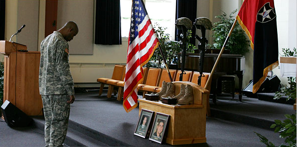
As of this posting there have been 3,013 U.S. military casualties in Iraq since the beginning of Operation Iraqi Freedom. That is three thousand and thirteen indistinguishable, flag-draped coffins. Three thousand and thirteen individual bodies. And the question is, how should we honor and mourn their sacrifice, as individuals or as faceless members of a collectivity? The issue came to a head at Fort Lewis, Washington this past week, where the base commander considered doing away with the practice of individual services for each death in lieu of a collective monthly memorial. The rationale was logistical, if not a little bit ironic: there are just too many deaths coming out of the war to honor and remember each individual. The protest from soldier’s families and veterans was palpable and pronounced. The policy was subsequently revised to hold weekly memorials, a compromise which surely satisfies no one.

The photograph above was featured with the original New York Times story – although it was subordinated after a few hours and replaced on the mast with a picture of an honor guard performing a rifle salute – and then repeated the next day in a story reporting the compromise. And as poignant as it is, it nonetheless underscores a very real problem: this is not WWII, where an entire generation sacrificed and fought and died, and thus could be memorialized in the collective – “the greatest generation.” Nor is it Vietnam, where those who fought and died became the scapegoats for the nation’s sins and could only be memorialized after great public controversy, and at that by splitting the difference between the collective and individual trauma of the war in a monument that honored both at once, with names inscribed in black granite. Rather, it is a war being fought in the shadow of our dueling memories of WWII and Vietnam, by men and women who are individuals first and soldiers second (and only incidentally so). We have yet to come to terms with this difference, or the symbolic register in which it is being experienced and enacted, and yet, as this image hints, it is a difference that will no doubt animate a unique mode of memorium, one that in the end, perhaps, will need to put the individual face in front of the flag.

Photo Credits: Kevin P. Casey/New York Times


 2 Comments

Visual Memory and 9/11: It's deja vu all over again

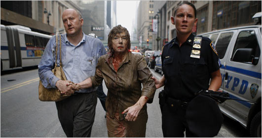
A recent story in the New York Times following an accidental explosion in New York City began with this photo:

ny-blast-victim.jpg

and these words: “It has instantly become the iconic image of Wednesday evening’s steam pipe explosion.”

Well, I’m confident this photo will not become an iconic image. And not for want of trying: the Times chronicles its immediate distribution, provides a long interview with the guy on the left, then a later interview with the woman in the center, as well as other links, including one that includes wry commentary on the promotion of the image. Like most of those images that are promoted as icons, however, this one will soon sink out of sight.

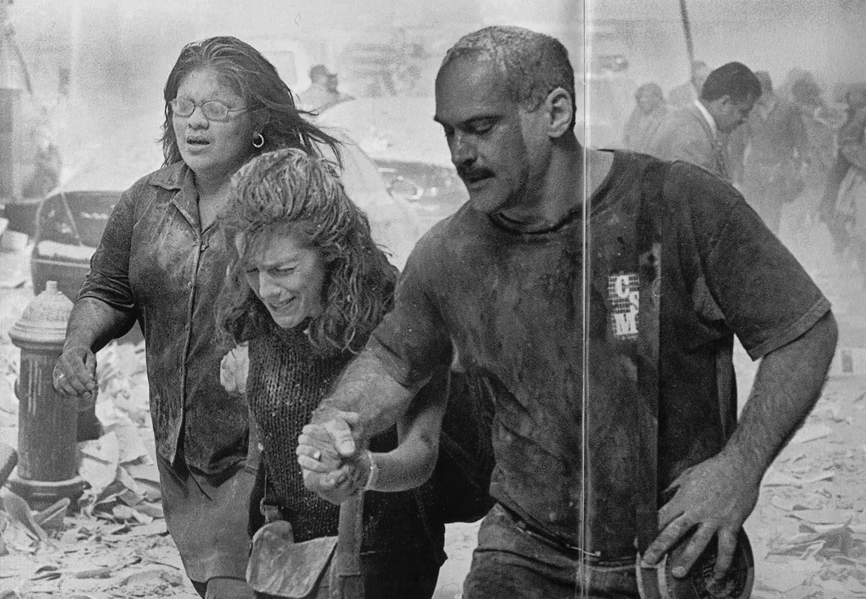
What interests me is why the reporter could think this rather banal image is so significant. Steam pipe explosions are not good candidates for historical significance. The photo could be of an auto accident, and the facial expressions do not suggest alarm, so why is this street scene thought to be iconic instead of business as usual for NYPD? One reason is the preoccupation with icons that is current today. (I know, I know, but as was said in the comic strip Zits recently, “nobody every died of irony.” I’ll post on the contemporary desire for icons another time.) I believe the answer is that the photograph resonates powerfully with a number of the images that were prominent during the coverage of 911. These all included women covered in dust or blood and often being helped as they walked, staggered, or were carried while emerging from the scene of the catastrophe. For example:

911-woman-low.jpg


Thus, the reporter saw through the current photograph back into the many more distressing images of a far greater event. She was seeing not only with her eyes but also with her memory, which carried the powerful emotions associated with the many earlier images. Though not likely to be an icon, you might say it’s deja vu all over again.

First photo: Brendan McDermid/Reuters. Second photo: Lyle Owerko–Gamma. The crease is due to my inexpert scan from Time, September 11, 2001.

 2 Comments

Visual Memory and the Fall of Iraq

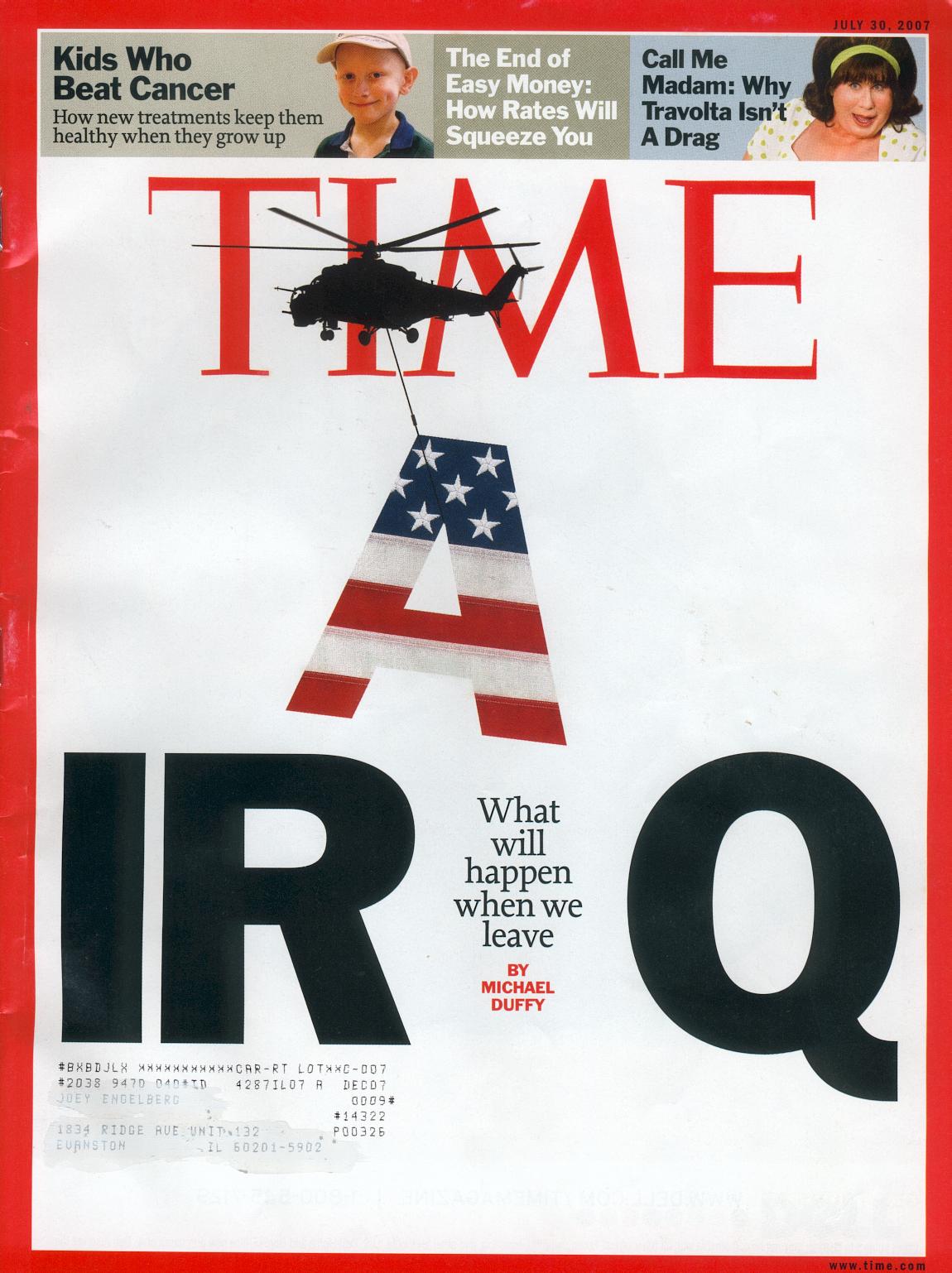
The cover of the current issue of Time provides a fine example of two features of the visual public sphere: allusions between images in different media, and the role of visual memory in shaping historical analogies. Here’s the cover:

time-iraq-2.jpg

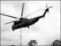
This is a remarkable piece of graphic design. The most important feature, I believe, is the helicopter, which is a direct allusion to the fall of Saigon. That event is fused in collective memory with photographs of helicopters–they are omnipresent in the images and the discourse about the last hours of the evacuation. For example, Time‘s silhoutte is a reprise of this image:

saigonfall2.jpg


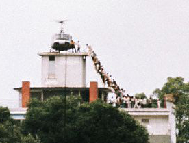
There are few examples of this or similar images in the Google image archive, however, which is dominated by this photograph:

vietnamescape.jpg

The photo was taken by Hubert Van Es; you can read his report on the shot here. There also were images of of the choppers being pushed off the decks of one or more aircraft carriers, but those are less available today. Helicopters became the visual marker of the fall, and any one image probably channels the others. I suspect that there are fewer still shots of the airborne machines online because those images were more likely to be on video. The one I used was taken from a BBC puff piece on Peter Arnett; the photo is captioned “Fall of Saigon, but Arnett stays.”

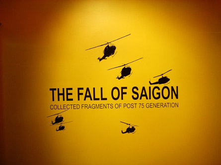
These photographic and video images shape collective memory in part because they have been relayed in the intervening years by graphic designers. So, for example:

title_thmb.jpg

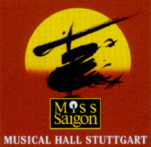
and, probably the most widely circulated design, which could rely on the literal image to support a formal allusion:

miss-saigon2.jpg

Thus, the Time designer could count on the historical analogy because the visual design had become so thoroughly disseminated.

And the analogy has specific implications that are evident from other elements of the cover. For example, look at the text that is where the A had been in “IRAQ”: “What will happen when we leave.” It is not a question.

Time photo-illustration by Arthur Hochstein, July 30, 2007.

Update: To see how the Bush administration tries to counter the analogy, look at the July 26 post at BAGnewsNotes, which compares the Time cover with the latest photo op.

 5 Comments

Sex and the Civitas

Although photography has almost completely displaced illustration as the visual art of print journalism, some newspapers still use drawings regularly. The New York Times is particularly inventive in that regard (as well as with graphic art, but that’s another topic). The Sunday Times featured a terrific drawing that dominated the space above the fold for Frank Rich’s weekly essay on political culture.

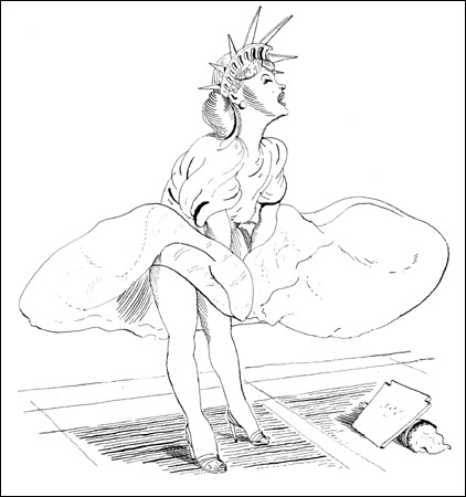
marilyn-liberty-blitt450.jpg

Rich was remarking on “the G.O.P.’s overdue summer of love,” whereby the Party was caught between the David Vitter prostitution scandal and having a twice-divorced adulterer as the front runner for the presidential nomination. Gloating aside, Rich’s main point is that the electorate may be moving beyond Family Values prudery. The illustrator got that idea big time. The drawing fuses two iconic images: Marilyn Monroe’s publicity shot for The Seven Year Itch, and the Statue of Liberty. If the image seems incongruous or naughty, that shouldn’t be surprising. Whether you see Lady Liberty enjoying the not rush of air up her thighs, or Marilyn donning a the civic crown as part of her erotic playfulness, these are not attitudes that are likely to be taught to home schoolers. (Pedantic aside: “prurient,” meaning lascivious or lustful, is derived from the Latin word for itch.) That transgressiveness is reinforced by the formal hybridity of the image: the icons in question began as photograph and a statue (neither of which is an illustration); they became icons of celebrity culture and civic culture; they reflect 19th century civic republican art and 20th century image making.

The drawing may be go farther than Rich would like. He is suggesting that the electorate is coming to its senses, not in the sense of having its own summer of love, but rather in becoming prudent rather than moralistic about the relationship between private life and public policy. The drawing, however, suggests that when the private passions and civic ideals go public together, the result is much more a matter of desire than restraint. Or perhaps I’m being moralistic. In any case, this is a great example of how illustrators still can play an provocative role in the visual public sphere.

Illustration by Barry Blitt for the New York Times, The Week in Review, July 22, 2007. (NB: Blitt already has a place in the history of iconic images, as he created the New Yorker cover that depicted two male sailors kissing in the manner of the iconic photograph of a sailor and a nurse clenched in Times Square on VJ Day. You can see the cover here (scroll down). If you have a copy of No Caption Needed, it’s on page 79.)

 0 Comments

Conference Paper Call: Photographic Proofs

CALL FOR PAPERS
Photographic Proofs
Yale University, New Haven, CT
Friday-Saturday, April 4-5, 2008

“A photograph passes for incontrovertible proof that a given thing
happened. The picture may distort; but there is always a presumption
that something exists, or did exist, which is like what’s in the
picture.” – Susan Sontag

“But the proof of the pictures was in the reading. The photographs had
to have their status as truth produced and institutionally sanctioned.”
– John Tagg

The Yale University Photographic Memory Workshop, in conjunction with
the Beinecke Rare Book and Manuscript Library at Yale, invites
submissions for a graduate student conference entitled “Photographic
Proofs.” The theme of this conference should be interpreted
broadly. Papers could be theoretical, historical, or critical
explorations based upon one photograph or a collection of photographs.
They might interrogate the theme of photographic proofs from one of
many different angles, including documentary, artistic, commercial, and
vernacular photography. Selected sets of photographs may relate to
war, science, medicine, race, class, law, business, reform, the natural
and built environment, frontiers, performance, gender, sexuality, or
family, among other subjects.

In order to engender an inter-disciplinary community and to further
challenge and develop the vocabulary that surrounds photographic
criticism, we encourage submissions from graduate students at all
stages of their studies, working in any discipline. The Beinecke
Library will add to this discussion by hosting a workshop for
conference participants highlighting the library’s extensive
photographic holdings.

We are pleased to announce that Professor John Tagg will deliver the
opening keynote address. John Tagg is Professor of Art History and
Comparative Literature at Binghamton University. His books, which
often focus on the relationship between photography and power, include
The Burden of Representation: Essays on Photographies and Histories,
Grounds of Dispute: Art History, Cultural Politics and the Discursive
Field
, and the forthcoming The Disciplinary Frame: Photographic
Regimens and the Capture of Meaning
.

In an effort to foster a geographically diverse community of graduate
student presenters, we are pleased to be able to cover travel and
accommodation expenses for students whose papers are selected.

Email CVs and abstracts to photographic.proofs@yale.edu by Monday,
October 15. Abstracts should be under 300 words. Final papers should
not exceed 20 minutes in length. We will notify selected speakers by
December 15.

Co-organizers: Alice Moore and Francesca Ammon, graduate students in
American Studies. Please address any questions to
photographic.proofs@yale.edu.

 0 Comments

The War of the Roses

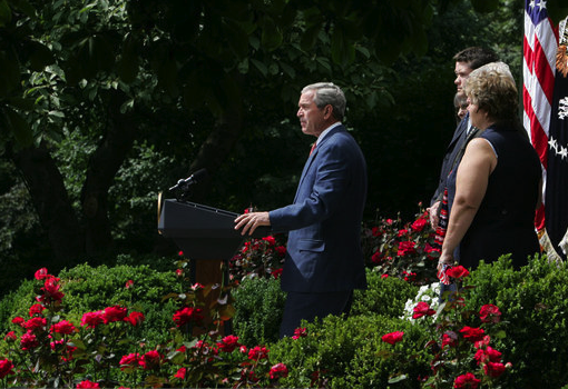
Several days ago I commented on the common and ordinary conventions of photographic representation that tend to guide and discipline photojournalistic decorum in representing the President of the United States. As I noted there, the conventions typically employed reinforce our perception of the president’s power and presence as commander-in-chief. But I also noted how the conventions can be managed in ways that call attention to their artifice, thus undermining the window-on-the world sensibility that they generally promote. And sometimes, I suggested, they can be actively exploited so as to produce effects that are wholly contrary to our ordinary expectations. In recent times such conventions have operated in something of a tension between efforts to minimize and maximize representations of President Bush’s stature. Two photographs of President Bush speaking in the Rose Garden on July 20th make the point—and more—exceedingly well.The first photograph was used to lead an AP wire report with the headline, “Bush Criticizes Democrats on Iraq”:

AP.Rose Garden

The AP, of course, is required to be “fair and balanced” in its reporting of any event, and no less so a media event planned by the White House. But this photograph tells a somewhat different story than the headline. First, it is important to note that in its published version the photograph is smaller by at least half than the version I’ve reprinted above, and this is not inconsequential to the interpretation it invites from its viewers. Shot from a low angle, as per the convention for emphasizing the power of the president, it is also shot from the side and at long distance. Indeed, the president is miniscule, once again dwarfed by the scene in which he is performing his office. Indeed, he is so small in relationship to his surroundings that it is hard to know exactly what he is doing—one has to strain to recognize that he is standing at a podium. He is backed up by an entourage, but they are almost entirely obscured by the roses, which clearly dominate the scene. And note too how the use of the roses to frame the action situates the viewer – presumably the American people: It is as if those who are viewing this scene are interlopers, voyeurs jealously sneaking a peek at a party to which they have not been invited. And the color seems off too, slightly washed out in a way that suggests that the roses have begun to pass their prime; the visual effect carries over to the president’s jacket, making it seem more like a drab and faded grey, than blue, his shirt and tie barely visible. It is hardly the image that an embattled president seeking public support for a contentious policy would want to portray.

One might expect to find a very different photograph of the event at the White House website and so they might be surprised to find this image which, at first glance, seems to be akin to the one used by the AP:

White House Rose Garden

The differences between the two photographs are subtle but invite very different affective responses. Note first, that at the White House website the image is slightly larger than the one reproduced here. In this image the president is shot in middle-distance, and as such his body stands in comfortable proportion to the scene in which he acts. He dominates the frame and appears to be in full command of the event unfolding: Standing at a podium, speaking to an unseen audience, he is the master of his house/garden. His entourage of supporters are visible and prominent, albeit subordinate; dutifully at attention and attending to his words, they reinforce the sense that he is in control. Equally prominent is the U.S. flag, somewhat obscured in the AP photograph. But most important are the roses, which now function as a natural and pleasant setting rather than as subterfuge or camouflage. They neither obscure the viewer’s line of sight nor hide the viewer’s presence from detection. While still to the side, the viewer is now a legitimate part of the scene. The colors are rich, saturated, alive, the roses in full bloom, the suit a bright and pleasing blue, his white shirt and red tie clearly connecting him to the flag that sits behind him.

Much more could be said about these photographs, but the point to underscore here is that each displays a very different social order: One a dim and dying world animated by secrecy and political jealousies; the other a bright and vibrant world, alive to the future and animated by the presumption of political openness and equanimity. The impulse here, no doubt, is to ask: Which, if either, is the real world? Or is it a third version that one finds at the NYT and that seems to sit somewhere between the two? But such questions are dangerously myopic, if for no other reason than the assumption that one photograph is fundamentally more real than the other. Every photograph is a construction, a tool for making (and unmaking) the world that draws upon complex mediating technologies, recognizable conventions of representation and cultural practice, and the inventional skills of photographers and editors. The better questions to ask are how do visual technologies enable the imagination and production of alternate worlds? What do such images reveal—both about the worlds they portray and about us? And what do they (necessarily) hide or obscure? And, perhaps most important, what are the implications of such constructions for the world (or worlds) in which we want to live?Photo Credits: Gerald Herbert/AP Photo, Joyce N. Boghosian/White House Photo

 3 Comments

Flag of Shame

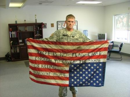
A reader has suggested that we post about the image below, which is labeled “truthflag” and has provoked a heated argument this week at Flickr.

truth-flag.jpg

The Flickr page reports that the photo has been viewed 164,050 times since it was posted on August 7 2006. There is one comment listed from 11 months ago, and 170 more in the last two days. Why the debate has flared now, I don’t know, but I’ll take it as a good sign. The debate turns on a basic question: is this a courageous act of democratic dissent regarding a shameful war, or is the dissent and desecration of the flag a shameful act of cowardice? I think the image is eloquent. Why? Obviously, the uniform speaks volumes. I think it also matters that the flag does not look new; this is not a case of running out to buy a flag for a publicity stunt. Likewise, the words themselves had to written laboriously, and the man’s serious expression communicates an equivalent resolution. This is a considered act by someone who is aware of what it might cost. The setting reinforces this effect: again, this is not a publicity stunt or a big demonstration, but rather someone in his own locale, perhaps a Guard office (you can see the water cooler and sports trophies in the background). His public act is grounded in his private life, and he is willing to take responsibility for his actions. And the message is all about responsibility, deeply so. The desecration of the flag and its soiled look suggest the shame he feels–shame is often experienced as a literal stain. The writing on the flag also overcomes two barriers to public speech: the flag no longer has the fixed meaning of “pure” patriotism, love it or leave it, that is used so often to squelch democratic dissent; and words that would be ignored otherwise acquire rhetorical force. I am reminded of a special news report following Texas v. Johnson, the Supreme Court case that now protects flag burning. Johnson was asked why, instead of burning the flag, he hadn’t simply spoken up to voice his dissent in the legitimate medium of public speech. He replied, “Who would have listened to me?”

Update: I had wondered why debate about this image had flared up. My colleague Eszter Hargittai wondered as well, but she knew how to do something about it. The answer is that it got “dugg”:
http://digg.com/political_opinion/Pic_There_Is_No_Flag_Large_Enough_To_Cover_The_Shame

Those who like to mine comments will find 700+ at the digg page.

 6 Comments

Conference Paper Call: Visual Values

Of Aesthetics and Ethics:
A Conference on Visual Values

January 10-12, 2008

University of South Florida, St. Petersburg

Registration: FREE

CALL FOR PAPERS AND PRESENTATIONS

Deadline: November 1, 2007

Confirmed Professional Presenters Include:

Jay Maisel: Keynote Speaker and New York City Freelance Photographer
John Filo: CBS, Pulitzer Prize Winner for the Kent State Photograph
John Harte: Photographer, Bakersfield Sun
Janet Kestin: Chief Creative Officer, Ogilvy & Mather, Toronto
Creator, Dove Anti-Stereotype Advertising Campaign

This conference examines ethical questions regarding the expression of values in visual media presentations. Text and visual submissions are solicited that address topics including, but not limited to: stereotypes, manipulation, privacy, violence, journalistic stage management, infographics, graphic design, fair use, and persuasive visuals.

This is a juried competition. The top faculty submission will be published in the Visual Communication Quarterly. Award will also be given to the best student submission.

Submit One Identified and One Anonymous Version of your Work To:

Deni Elliott, Dept. of Journalism and Media Studies, USFSP,
140 7th Avenue S, FCT 204, St. Petersburg, FL 33701 or Elliott@stpt.usf.edu.

Jurors and Organizers:

Deni Elliott: Poynter-Jamison Chair in Media Ethics and Press Policy, USFSP
Paul Martin Lester: Editor, Visual Communication Quarterly and Professor, California State University, Fullerton
Paul Wang: Assistant Professor of Visual Communication, Department of Journalism
and Media Studies, USFSP

 0 Comments

The Western Burqa

This is the third post in what is becoming a series on how the burqa challenges the visual norms that define public spaces in the West. (Previous posts are here and here.) Today’s image is a small work of public art that I’ve held on to for several years:

burkah-head.jpg

You are looking at Rosemarie Skaine, author of The Women of Afghanistan Under the Taliban. Or are you? She is under the veil, while you are shown her hands holding a laptop whose screen reproduces a digital image of her face. She is both there and not there, and so the photograph creates an eerie strangeness. (Georg Simmel observed that the stranger “is near and far at the same time.”)

Or the tableau can be understood to include two women, one imprisoned under the veil by premodern authority and the other enjoying full personhood due to Western scientific achievement. It also implies a narrative of progress: women who are completely effaced by traditional customs such as the burqa can be liberated by Western technology to achieve self-realization. In any case, the tableau is striking precisely because it intensifies, almost to the breaking point, two assumptions defining the visual public sphere of modern liberal societies: liberty involves the ability not to hide but rather to be seen, and the face is the essential medium of individuality.

Although Skaine’s entire body is in the room, it is the digital image of her face that is the sole marker of her identity. That face, however, is an image; unlike the women behind the mask, it cannot see, and it can be reproduced indefinitely or eliminated by touching a key. The irony is that Western woman’s face lives in the modern technology but acquires a greater vulnerability for that fact. So there are two women there after all: one is premodern, devoid of personality, and looming large, monstrous, like an image of death itself. The other is modern, the epitome of individual personality, but also disembodied and mechanized. Perhaps both are under the veil. If we can assume that continued global modernization will liberate women now in burqas, the fate of women in the West nonetheless becomes less clear. One hopes for a third alternative, which is one indication that the artist has done her job.

There is a lot more that could be said about his tableau, and there are other images that I’d like to put alongside it. But that will have to wait for another day. The photo was taken (posed) for a story in an Iowa newspaper promoting the book’s pending release in 2002. Photo by Harry Baumert for the Des Moines Register, October 14, 2001, E-1.

 1 Comment