Readers who are interested in our occasional observations about images of boots and hands might check out John’s post today at BAGnewsNotes on a photograph of President Bush with the troops. Boots and hands are proving to be remarkably rich tropes for visual argument, and for exposing the character of those being photographed.
Lil' Bush
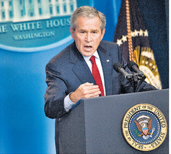
The President of the United States is the most powerful person in the world. Or at least so we are told. And photographic representations of him typically reinforce the point, commonly filling the frame with his visage, often shot from a low angle to accent his omnipresence, frequently surrounding him with an entourage in courtly fashion, locating him in the midst of cheering crowds, and so on. The conventions here are so familiar that we normally don’t even notice them until they are ignored or otherwise distorted and exploited. Consider this image that appeared in the NYT on July 16th, 2007:
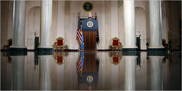
The president is speaking from the Cross Hall. Built as part of the original White House plan in the 19th century, it connects the State Dining Room and the East Room. The floors, walls, and pillars are made of marble. It is often used for receiving foreign dignitaries, and it displays all of the grandiloquence we would expect as the location for putting the most powerful head of state in the world on display in all of his magnificence. And all of the accoutrements of the presidency are here as well, including the U.S. flag and the presidential seal displayed twice. Clearly, the stage is set for majesty.
And yet, the force of the image is anything but majestic. Ironically, what is most striking about the photograph is the president himself, who is barely noticeable, a tiny head protruding from the podium, fully and completely dwarfed by his surroundings. Shot from below, as per convention, it is from such a long distance and at such a wide angle that it makes him seem out of place and altogether inconsequential. Cast in a diminutive register, he seems more akin to Comedy Central’s “Lil’ Bush” than to the portraits of past presidents that grace the walls surrounding him. Indeed, the angle is so low and so wide that it not only miniaturizes the president, but it calls attention to how truly alone he is, with no visual evidence of an entourage or a viewing audience—let alone an adoring American people—to be seen. The president’s reflection on the floor in front of him suggests that perhaps he is only speaking to himself. And indeed, it would not be a stretch to see this photograph as a visual metaphor for a presidency that has become increasingly insular and isolated, performing only for its own pleasure: a Court without courtiers. Contrast this image with the photograph of the same speech at the White House website and the capacity of the camera (or perhaps, more properly, the photographer) to manage the conventions of visual representation to maximize or minimize presence and power is palpable.
Photo Credit: Doug Mills/The New York Times
![]()
Should Pelosi Be Watching Her Back?
One of our readers asked for a post on this picture, which accompanied a Washington Post report on the presentation of the Congressional Gold Medal to Norman Borlaug. I’m tempted to say it needs no caption.
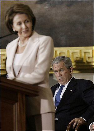
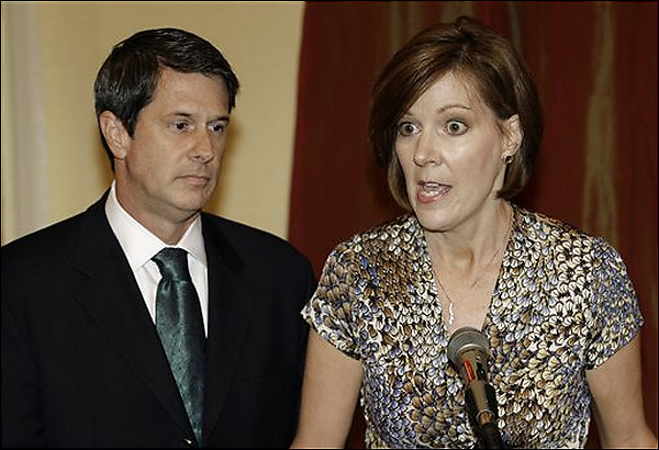
The paper said this: President Bush, right, listens as House Speaker Nancy Pelosi of Calif., left, speaks in the Capitol Rotunda on Capitol Hill in Washington, Tuesday, July 17, 2007, during a ceremony for Congressional Gold Medal recipient Norman Borlaug. (AP Photo/Pablo Martinez Monsivais)
If this were a scene from a TV drama, we would know exactly what was up. And, of course, it is a scene from a TV drama. It also could be an object lesson in civility: despite the intensity of this antagonism, the guy will not actually put a knife in her back. I don’t think that is why the Post used the photo, however. What is particularly interesting is that there is no relationship whatsoever between the content of the picture and the story. The paper is taking the opportunity to do two things at once: report on the ceremony and also on the backstage antagonisms that make Washington what it is. Or are there three things: is this a photo of the real Bush? The photo clearly is all about him: Pelosi is blurred while the camera has zeroed in on him with the intensity of his reaction mirrored by the sharp precision of that part of the photo. It certainly shows us a different Bush from either the empty suit or the Casual Friday executive that we usually see.
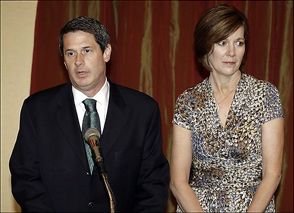
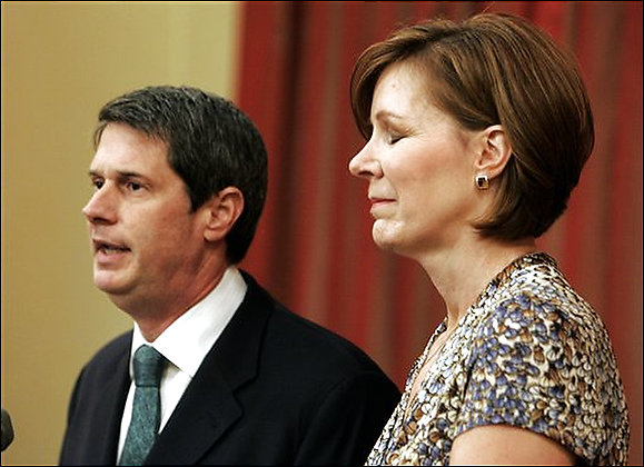
Three Faces of the Political Wife
The revelation that another Family Values legislator has been a serial adulterer is sure to bring out the best in all of us: gleeful smugness about the hypocrisy of the Right and hypocritical replies that the media are trafficking in human pain. Well, the media are trafficking in human pain, but whose? Not Senator David Vitter’s (R-La.) pain–or, if they are, he had it coming. But what about his wife? Well, she may have asked for public humiliation as well, given past comments reported at Wikipedia, but as a politician’s spouse she is easily set up, then and now. My question is, what are the images of the Senator and his wife showing us about her role as a political wife? I saw three images in succession: one in the NYT, another in the Chicago Tribune, and the first AP image that surfaced with a Google search. Together they neatly set out three distinct roles:
First, the one we know so well, the cipher:
(AP Photo/Alex Brandon)
Loyal, but not happy about it, but trying not to show it, and succeeding well enough but also indicating inadvertently that there really is a person in there, someone who can be bored (much of the time) or even hurt (although that is under wraps today). Diana had made this role into an art form.
Then, the 90’s figure, the victim:
(AP Photo/Bill Haber)
This image from the Trib shows the pain, the humiliation, the terrible cost she has had to pay for signing on with this guy. This is the image I first saw, and it had me feeling for her.
But then I read the Times story, which reported that both the Senator and Wendy lashed out at the media. And sure enough, there’s another photo that fits with that attitude:
(AP Photo/Alex Brandon)
So we have a third role, the ally. And my sympathy went south.
A spouse can be all three at once, of course, but the different images lead us down different paths, emotionally and politically.
Update: For another posting on the first image, go to David Vitter trots out wife to cover for him at Pandagon; on the second image, go to The Pained Political Wife at Cheat-Seeking Missiles.
Animated Music Video Photo Cartooning
Nick Anderson, editorial cartoonist at the Houston Chronicle, has created a remarkable example of next generation political cartooning. The cartoon, entitled Feel Good, Inc. combines animated figures for Bush, Rove, and Cheney, who rap and sing in front of a dense montage of news photographs and the occasional smiley button. The animation is deft and the songs are clever, but it’s the photos that provide the critical edge and disturbing emotional tone, while the pop culture icon of the smiley button really drives the point home: These people are playing with our lives and don’t give a damn about the harm they cause. Comments at the paper’s online site, Chron.com, are here.
Paper Call: Visual Communication
Announcing the 4th biennial
William A. Kern Communications Conference
Call for Papers
Visual Communication: Rhetorics and Technology
April 10-13, 2008
Rochester Institute of Technology
Strathallan Hotel, Rochester New York
Call for Papers: The first Kern conference on Visual Communication took place in 2001 and provided a wide-ranging forum for scholars and practitioners to share their work. Since then, the interdisciplinary study of visual communication has continued to grow, sparking a variety of projects, books, journals, studies, and methodological approaches to research and critical studies. The fourth and final Kern Communication conference on visual communication continues the conversation with a renewed commitment to interdisciplinary interests and scholarship. Visual Communication: Rhetorics and Technology (2008) focuses on the study of visuality as communication with a special interest on the interconnections between visual rhetoric and visual media technologies.
We invite individual papers, panels and presentations that address this theme in the widest ways we can imagine. How does scholarship in visual communication interact with traditional approaches to the processes of human communication, inclusive of rhetoric and communication media technology? How do individual cases of visual communication, visual rhetoric, visual documentation and creative innovation enlarge our understanding of human communication? How does the history and practice of visuality inform our teaching of communication, media and rhetoric? What is the state of the field? Where are our individual research projects taking us? Individual papers, presentations, experimental “work in progress,” panel proposals and workshop proposals are welcome.
Send complete papers or 500 word abstracts via email as a Word document attachment to Diane S. Hope, [dshgpt@rit.edu], or by paper mail to Diane S. Hope; 92 Lomb Memorial Drive, RIT, Rochester, Institute of Technology, Rochester NY, 14623, by December 1, 2007.
Please check the website: www.rit.edu/kern <http://www.rit.edu/kern> for updates, details and registration information.
Diane S. Hope (dshgpt@rit.edu)
William A. Kern Professor in Communications
Rochester Institute of Technology
Rochester, NY 14623
585-475-6053
What Does Peace Look Like?
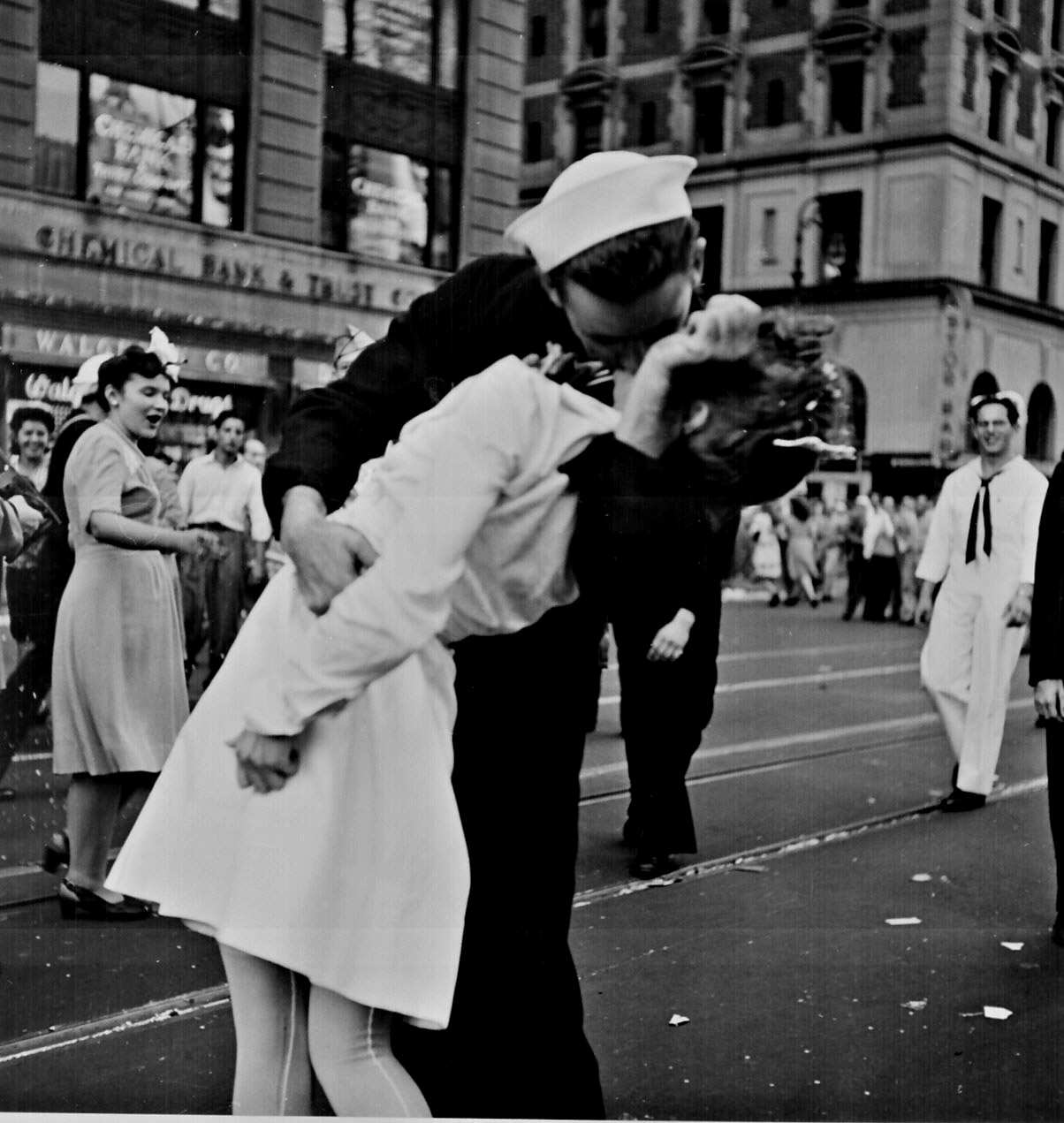
(“New York City celebrating the surrender of Japan. They threw anything and kissed anybody in Times Square.” Lt. Victor Jorgensen, August 14, 1945. National Archives, 80-G-377094.)
War continues to be a major topic of photojournalism and will be one of the topics of continuing interest on this blog, at least until the arrival of perpetual peace. While there are a number of fine studies of war imagery, I happened to ask myself today whether there are, or can be, photographs of peace. Obviously, art history archives are full of images–say, of the lion lying down with the lamb–that signify peace figuratively. Although photographs can acquire figurative and even allegorical meaning, I think that the realism, fragmentation, and other elements of the medium make it more difficult to represent peace. War is force, action, violence, destruction, pain–all things that can be communicated photographically. Peace involves the absence of war and the freedom to experience and enjoy other things, which then become the object of visual interest. If you define peace as necessarily involving sustainability and therefore justice, the problem gets even more complicated.
If you go to the Pictures of World War II at the National Archives Web site, you’ll see that one of the categories is “Victory and Peace.” There are ten photographs available there, and were a space alien to access them, it would have a hard time figuring out what either “victory” or “peace” mean. But those of us on Earth don’t do much better, do we?
This representational problem might be why the Times Square Kiss is an iconic photograph. (The public domain version is shown above.) John and I have much to say about it in No Caption Needed, although it now occurs to me that more could be added about how the image mediates the idea of peace. What I find more interesting, however, is another photo from the same collection, one that you probably haven’t seen before:
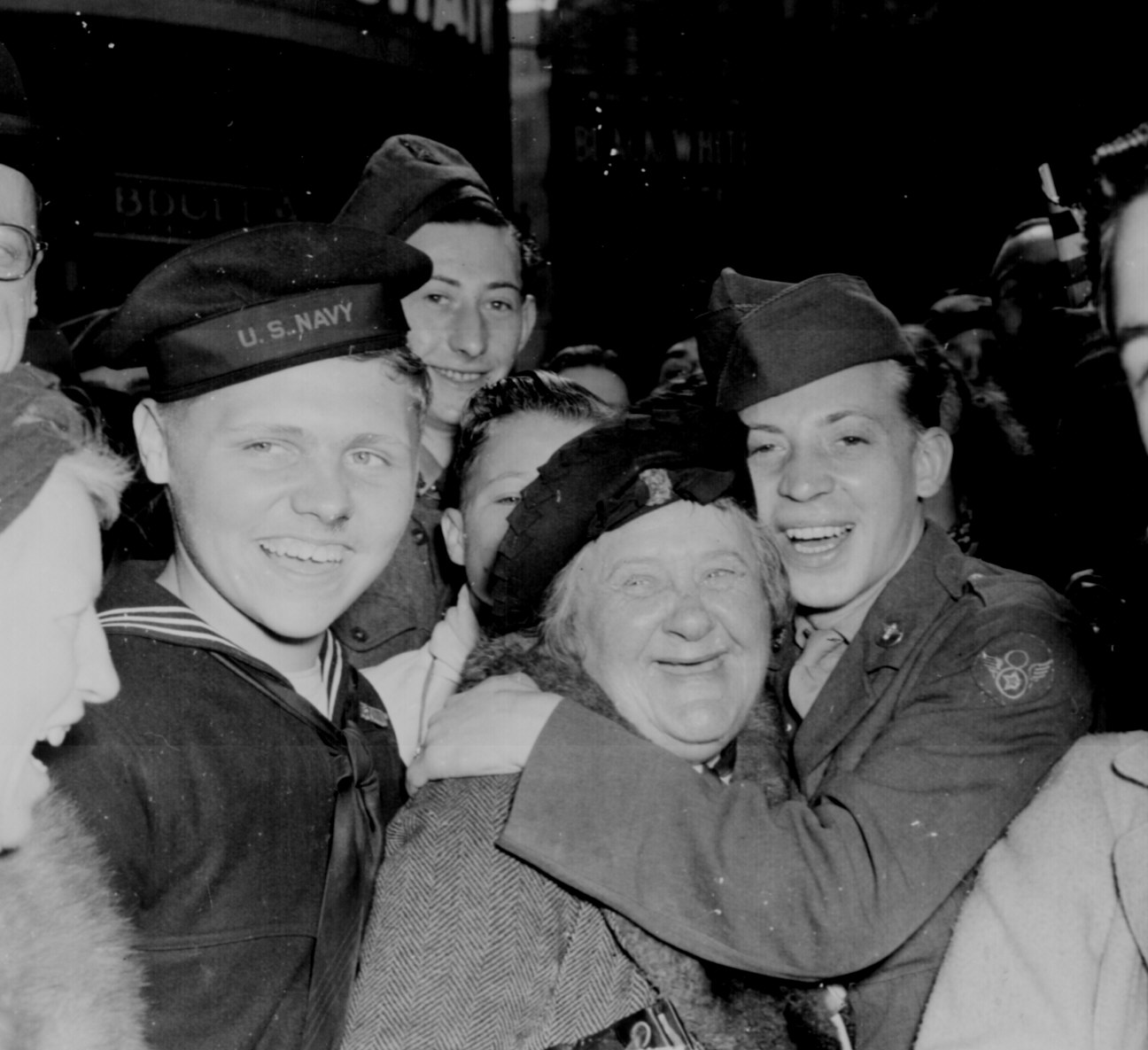
“Jubilant American soldier hugs motherly English woman and victory smiles light the faces of happy service men and civilians at Piccadilly Circus, London, celebrating Germany’s unconditional surrender.” Pfc. Melvin Weiss, England, May 7, 1945. National Archives, 111-SC-205398.
I find this to be a poignant image, particularly when compared with the Kiss. (Let’s leave the jokes about American and English eroticism aside for the moment.) Each photo is of a victory celebration in the public square of a great city, with spectators smiling at the camera to cue viewer participation in the scene. But instead of two sexually hot adults clenched in a powerful kiss, in this image we see mom getting a hug from one of the kids. And that’s the point that tears at me: they really are kids. I’m reminded of (and paraphrasing from distant memory) a scene at the beginning of Kurt Vonnegut’s Slaughterhouse Five: angry about the self-satisfied reminiscing by the narrator and his war buddy, the narrator’s wife spits out that they were just kids, children, when they were sent to fight and die. That’s what this photograph reveals so clearly (no caption needed). And so this really is a war photo after all.
Smile!
Awhile ago I posted an image that suggested how the burqa is not only strange but also distinctively disturbing when encountered in Western public spaces. The idea was that it challenges liberal norms of public transparency; understanding also is complicated by the way it can twist liberal ideas about personal autonomy and gender equality (there are feminist arguments for going under the veil). If these tensions are in play, then we also can expect to see attempts to mange them, say, through images created for comic effect. I think this is such an image:
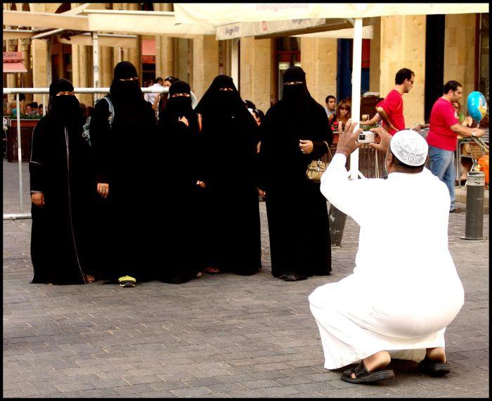
I doubt much needs to be said. At first glance, it just doesn’t make sense or will seem silly to many outside the Islamic world. Why would the women want a picture when they are hidden from view? How can anyone who looks at it know who is there? Isn’t taking a photograph of individuals who can’t be seen self-defeating? Well, yes and no. Yes for some, but obviously not for those in the picture. They know who they are. And there are subtle inversions created just through the act of having the picture taken: The man taking the picture is squatting–and the rear view is not entirely flattering–while they stand. He is in the position of serving them, while they enjoy the privilege of enhanced visibility. He can be forgotten while they will be remembered.
If, that is, they asked for the picture. If this is his idea, all bets are off. Which is another reason I find such images so interesting, as they call into question many of the assumptions we bring to bear in our ordinary viewing. Were the women not veiled (as a women in the background is not), we could safely assume we know the story, particularly as we would be cued by any facial expressions. Of course, our assumptions would still be just that, but the odds would be pretty good. Here we quickly realize how much we depend on such assumptions and how they are culturally parochial.
Note also how the image may naturalize the burqa. The comic effect (which comes, I think from both the basic contradiction and the man’s pose) moderates the threat that visible invisibility can create in a public space. And after all, their invisibility is being undercut by the act of having the picture taken. Most important, the veiled women are being placed within a very familiar visual practice: snapshot photography, and there the habit of having our pictures taken (often by strangers, no less) while vacationing with family or friends. If the burqa can be incorporated into this common habit (so to speak), it can’t be too bad. And just as snapshots taken in public spaces suture private and public life, so does this photograph integrate liberal and non-liberal conceptions of public visibility.
"The Emperor's Clothes …"
There is no king in the United States, or at least so we are taught in our high school civics classes (or at least we were taught that back “in the day” when we actually taught civics in high school). Nevertheless, there has always been something of a courtly attitude towards the presidency, a certain reverence to how we represent the commander-in-chief in the public culture, especially during times of war – or at least in the official public culture, satire and parody notwithstanding. And part of this courtly attitude is something of an unstated agreement between the media and the American people that we will make believe that representations of the president are “real” in a more or less direct, window-on-the-world sort of way. We all know that the White House press corps has its own version of the paparazzi that follow the president around, and that many if not most of the images we see of him are a part of photo opportunities that belie a certain unstated complicity between the administration and the media, but we have come to accept that as part of doing business. After all, the press corps need the pictures to drive their visual medium, the White House needs to have itself shown doing the business of government, and the American people crave the sight of those in power. And so we all try to ignore the staged, theatrical, performed quality of events with a wink and a nod.
Today’s New York Times seems to manage the constraints of this unstated agreement in a somewhat complex and interesting way. The front page headline reads, “A Firm Bush Tells Congress Not to Dictate War’s Policy” and the photograph that is featured on the front page seems to make the point:
Strong, decisivie, resolute, the imprimatur of the White House behind him, the presidential seal in front, he is the very picture of a commander-in-chief. And it is not at all unlike a very similar photograph that graces the corresponding story on the White House website for July 13th, reporting the same speech:
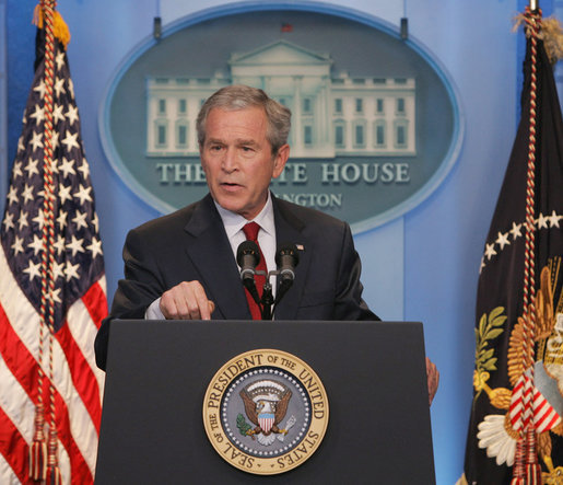
The media and White House are thus in perfect synchrony.
But when we turn to the on-line version of the NYT story we get a different “picture” of the event:
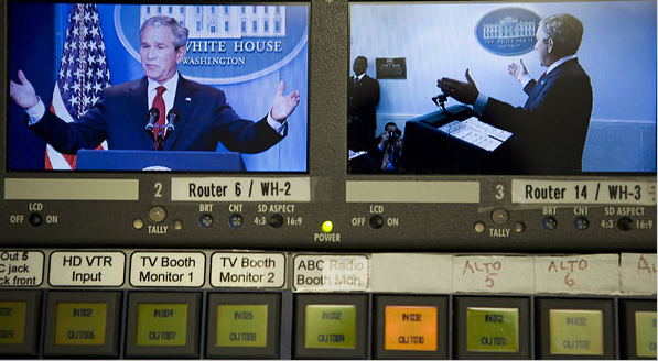
The headline, which appears directly above the photograph, is the same as in the paper version: “A Firm Bush Tells Congress …” But here the caption beneath the photo seems incongrous with the headline, almost a visual non sequitur: “Images of President Bush were fed through an audio-visual console for editing during his White House news conference Thursday on changes in Iraq.”
A couple of things seem notable here. First, there is NO mention of the photograph or what it might illustrate in the story by Sheryl Gay Stolberg and Jeff Zeleny. Hence, it seems added on, a gratuity serving no real or direct information value. But at the same time, of course, it calls direct attention to the mediated quality of the image and to the performative nature of the event. This is not the “real” president we are seeing (as if we ever “really” do see him in some unmediated, unedited, fashion), but a version that is processed through a complex technology of almost total control. And last, it is left somewhat ambiguous as to who owns the console and who will do the editing, but there is at least the hint that it is the White House and not the networks who are in control. And in any case, this clearly does not look like the picture of a “A Firm Bush” telling anybody anything, but rather someone telling the tale of how “the big got away.”
And so we have here an image that suggests not only that the original picture is something of a “fib” – because that’s what fish stories are about, not out and out lies, but self-aggrandizing exaggerations – but that it is also completely and totally manufactured, a performance calculated as to its effect and controlled by someone standing behind the curtain. And, of course, the photograph on the NYT website stands in stark contrast to the image of the regally clothed, firm, and resolute president we see on the front page of the paper version and at the White House website. By casting it all as a fib the NYT does not go completely out of bounds in attacking the president, and so it stays more or less true to the spirit of the unstated agreement to honor some sort of decorum. After all, the president is not a king, but the “first among equals,” and we all do tell fibs. And yet, at the same time, it seems pretty clear that someone is shouting at us that “the Emperor is naked”!
Photo Credits: Brendan Smialowski/New York Times, Chris Greenburg, White House
Is Katrina a Holocaust?
The front page of today’s New York Times has this photo dominating the space above the fold:
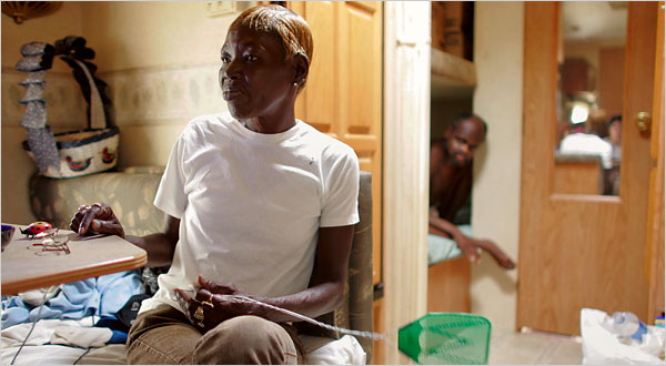
The caption reads: Gwendolyn Marie Allen lives in a Renaissance Village, a FEMA trailer near Baton Rouge, where she cares for with her son and her brother, right.
The story below the photo is titled “Road to New Life after Katrina Is Closed to Many.”
This photo may seem somewhat indeterminate and also innocuous. Gwendolyn’s facial expression suggests that she is dissatisfied, but you have to peer into the image to see that. Otherwise, she seems poised and capable, flyswatter in hand; or at least so in respect to the scene behind her, which is blurred. The trailer also looks like it’s in good shape. What’s the problem?
I’m guessing that if this photo has any moral force, it comes from an allusion to a Holocaust image. Look at the brother in the background, and look at this image:
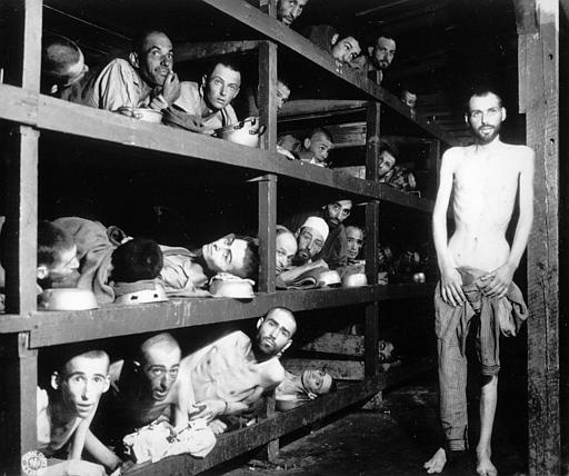
The template has been reversed on the horizontal axis, but again we see one more capable figure (the one able or willing to stand) and others staring out from the sleeping racks of the concentration camp. The allusion works in the other direction, of course: we are disposed to see the brother in today’s photo as if he were stacked along with others (perhaps Gwendolyn’s son, who is not seen) in one of the camps. Thus, the Times photo has smuggled in the Holocaust analogy for the Katrina disaster.
There has been been heated debate about whether that analogy should ever be made, much less in respect to Katrina, and in this case I’m on the side of those who would say the comparison has gone too far. To support that point, let me note how the Times image has a different caption at the online paper: Gwendolyn Marie Allen lives in a FEMA trailer near Baton Rouge with her son, who has schizophrenia, and her severely retarded brother, right.
The additional information should increase our sympathy for Gwendolyn, but now her brother’s confinement can have very different implications than those of inhumane enclosure, government wastage of human lives, and other elements of the Holocaust analogy.
![]()
Update: BAGnewsNotes posted on the same photo, same day, each of us not knowing of the other post. There’s a thread running there as well.