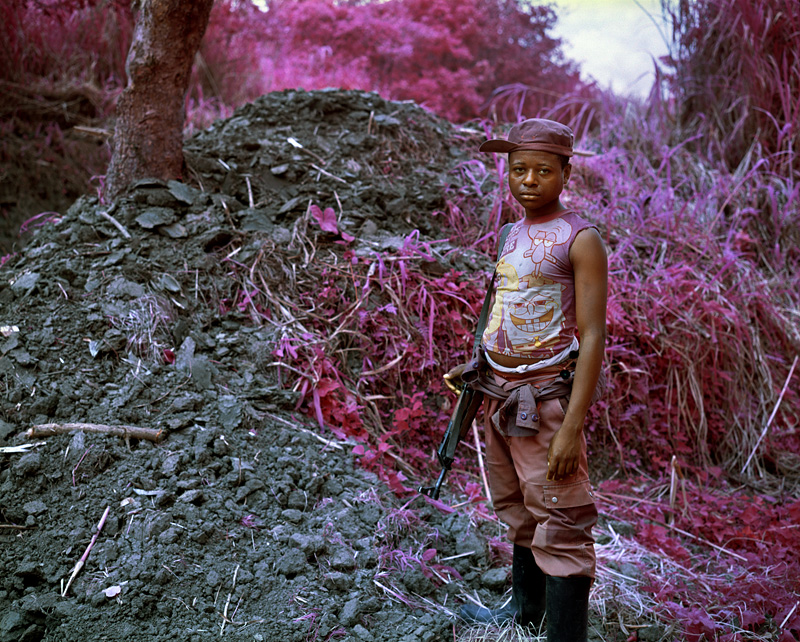
Photographs of child combatants in Africa, Asia, and the Middle East have become so common as to be almost a convention of war photography, and as such it is all too easy to see past them with little more than a tired nod of recognition (if even that). Richard Mosse’s Infra project, which focuses on nomadic rebels in the jungles of the Congo, challenges such nonchalance by disrupting our normal patterns of looking.
Mosse achieves this effect by using Aerochrome, a now discontinued infrared film that was originally produced by Kodak in 1942. Aerochrome is a false-color reversal film designed, according to Kodak, “for various aerial photographic applications, such as vegetation and forestry surveys … monitoring where infrared discriminations may yield practical results.” More to the point, it was intended for military purposes and in particular camouflage detection as it rendered the reflections of infrared and green typical of healthy foliage in strong red tones, making it stand out against the façade of dead and dying leaves—often seen in diluted magenta tones—used to conceal the enemy. In short, its purpose was to make the invisible visible.
The camera is generally understood to be an objective technology, recording only what is presented before its lens. But of course that doesn’t mean that it always shows all that there is to see, even within its limited focus. Infrared, for example, is invisible to the human eye and, indeed, it is also invisible to the camera unless it is filtered by an appropriate medium like infrared film. When such film is used, however, the ordinarily invisible becomes visible, and as the photograph above indicates, it does so in pronounced ways that force us to look again at what we are seeing—to acknowledge what our normal capacity for seeing fails to recognize. In this case, the shift from “real” colors to infrared casts the scene as surreal and thus encourages us to reconsider what it is that we are looking at. Notice here how the muted, purple tint of the boy’s hat and pants blend with both his brown skin and with the magenta foliage in the background. The Sponge Bob t-shirt, which otherwise might have been the primary focus of our attention, now fades slightly from view as the jarring relationship between the boy and the environment is enhanced. And as he becomes more closely identified with the “natural” palette of the apparently borderline healthy foliage, the stresses and strains of the war on him become more pronounced as well. Note too how the infrared reflections contrast with and underscore the black metal of his weapon, an object which now stands out as visually discordant and warrants more attention.
Mosse characterizes his photographs as something of a return to a pre-realist romanticism, but inasmuch as he relies on the mechanical technology of the camera to record everything that it can see, he is actually remaining consistent to a fault with the photojournalist’s commitment to an objective, realist aesthetic. At the same time, however, by pushing the camera to to the full extent of its objective and realist capabilities he highlights simultaneously the technological limitations and the artistry of every photograph. And more, he reminds us that while war’s true colors are not always easily visible to the naked eye that fact does not render them insignificant or inconsequential; and more, it does not absolve us of the responsibility to see what might otherwise appear to be invisible.
Photo Credit: Richard Mosse (North Kivu, Eastern Congo, 2011)

Discussion