May 04, 2014
Feb 11, 2008
Feb 17, 2010
Apr 29, 2011
Aug 02, 2013
Nov 13, 2013

If Can't See Guilt, Can We See Character?

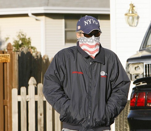
Discussion of a recent post raised an important question about visual thinking. In commenting on a murder suspect’s strategic manipulation of press coverage, I concluded that he still looked guilty.

Of course, I wouldn’t convict on that, and an astute reader noted that “the appearance of ‘innocence’ can only be another act,” and so it seems that there is no point whatsoever to looking for either guilt or innocence in how a person appears in public. And that’s before considering the role of racial, ethnic, and other forms of social bias in perception.

The focus of the earlier post was on the use of appearances rather than their accuracy. But what about their accuracy? I think most people would agree that you shouldn’t judge guilt or innocence on the basis of how a person looks. When that happens–and it does happen–the results include both false convictions and a free pass for con artists. But if that is true, why do we think we can see character?

And we do think we can see character. Scientists report that infants already are paying close attention to facial cues. People are constantly and often accurately discerning that others are in this or that mood. As we get to know people, we sometimes can read much deeper elements of personality on the basis of a glance. Photographs are used the same way, not least to communicate emotions. John and I have been reading social experience, attitudes, and ideas off of photographs for five months now and we rarely are called on this point. As long as the photographs are dealing with known individuals such as Bush, representative figures such as the latest casualty in Iraq, stock social types such as students, or common experiences such as shopping, there is little to be worried about. Whether right or wrong about the individual in the frame, the image provides a basis for conversation about those things that define collective life. And the court of public opinion is not a court of law.

All of this is a long introduction to another photograph:

musharraf.png

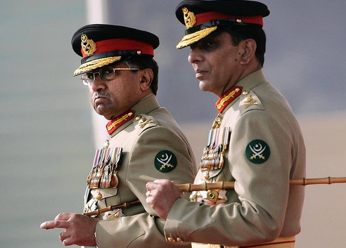
You are looking at Pakistan’s President General Pervez Musharraf reviewing an honor guard with his hand-picked successor, Gen. Ashfaq Kayani. There was this little problem of being a “President General”; fortunately, that term still embarrasses Musharraf’s patron, the US. So Musharraf has turned over direct control of the military, the better to maintain US support for his dictatorship. The transition involved a series of rituals, including a tearful speech. The tears may have been heartfelt; again, that is not the important question.

I’ll cut to the chase: I think we can see character here, and these guys are thugs. If that is too harsh, how about “hardened autocrats.” Of course, they will look otherwise in family photos, just as they will have behaved otherwise when playing with their kids. They may not be thugs all the time: just when in power or maneuvering to stay in power. So what? Any dictator can have a good side. The question is what side will be in charge when power is at stake. I think we can see the answer in this photograph. Musharraf may be a dedicated warrior against Islamic fanaticism, but he is no more a democrat than is Gen. Kayani.

And now for the quiz. What do you see in this photo: the appearance of innocence, or the character of an autocrat?

mush-on-stewart.jpg

Perhaps the question should be, if we can see character, why can’t we see guilt? One answer is that guilt is an assessment of past conduct involving a violation of a law, and these things are not to be seen in the present. There also is the complication of distinguishing between legal and psychological guilt, not least because some people need not hide guilt because they don’t feel it, while others can feel guilty for crimes they never committed. But perhaps there is another answer: the guilt is there to be seen, were we but able to see it. I would never convict on such evidence, but I can’t help but think that there is more to be seen than we realize, and that seeing it might get us closer to justice.

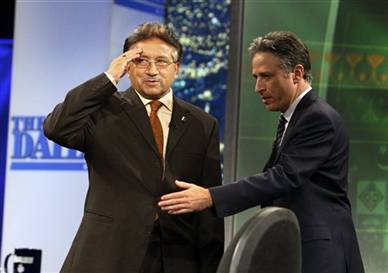
Photographs by Anjum Naveed/Associated Press; Digg screen grab of the You Tube video of Musharaff’s interview on The Daily Show with Jon Stewart.


Digg!

 2 Comments

Dueling Cameras in the Peterson Case

The wife of a police sergeant disappears, and stays disappeared. Turns out that she is–or was–his fourth wife, and the third wife had expired in suspicious circumstances, and the cop may have been using police department computers to get information on his (fourth) wife’s friends, and the story gets curiouser and before you know it, he resigns from the force while becoming both a police suspect and the hot story in the Chicago media.

And they say the suburbs are dull.

Even if this guy beats the rap, it’s clear there is much not to like, but that’s his business. My interest in how he has provided a lesson about the visual public sphere. Peterson clearly has adapted quickly and dramatically to the media mob camped outside his house. Here’s where he started:

dad-american-burqa.jpg

The caption read: “Bolingbrook Police Sgt. Drew Peterson — whose wife, Stacy, has been missing since Sunday — steps outside his home for a few seconds as police investigators search his home Thursday. Asked about whether he was nervous, Peterson told the Tribune, ‘Why should I be nervous? I did nothing wrong.'”

Now it can get chilly in Chicago in November, but you don’t have to cover your face. I thought of doing a separate post on this photo and calling it “American Burqa.” By bundling up against the media gaze, Peterson is challenging our norms of public visibility. Some of us resist the demand to be seen, as when we wear sun glasses inside or ball caps pulled low, but that is always within the range of legitimate withdrawal into a zone of privacy. As Peterson shows, all you have to do is cover the face itself and your display of autonomy is no longer acceptable. No wonder the guy looks guilty as hell. The picture says, “withholding information, hiding something, and a law onto himself.”

It is easy to conclude that this strategy of hiding in the light is not so smart. But don’t conclude that Peterson is not cagey. The jacket and jeans combo, NYPD ball cap, and flag bandanna scream “selected for symbolic value.” He may not be nervous, but he is trying to put some visual spin on a bad situation.

Turns out that he’s also coachable. I’m speculating here, but I’ll bet he got a lawyer and some help on the presentation of self in public. Because this is what we saw more recently:

peterson-cameras.jpg

Whoa! Is that the suspect or his lawyer? Comfortably striding along in middle class attire, he turns his video camera on the press. Instead of denying the norm of public visibility, he ramps it up, creating a hypervisual scene of cameras recording cameras recording cameras. Instead of passively hiding in full view of an unseen camera, he aggressively records the press, thereby bringing them into the picture. Instead of looking isolated and guilty, he declares that he has nothing to hide while the press is unfairly ganging up on him.

He’s catching on, isn’t he? This is what conservative politicians and media flacks have been doing for years: shifting the focus from their actions to the media coverage, which then is denounced as excessive and unfair. You can’t paint Peterson completely with that brush, however, as his brash act has another, more distinguished lineage. This includes Garry Winogrand, a photographer who focused his camera on the technologies of media coverage (see his 1977 book, Public Relations), and, behind him, Walter Benjamin’s argument that photographic artifice depends on hiding the equipment. By exposing the cameras trained on him, Peterson has not only adopted a sophisticated strategy for deflecting the gaze, but also activated a more reflexive awareness of the role of photojournalism in shaping the story.

Even so, I think he still looks guilty as hell. It’s probably the smile. . . .

Chicago Tribune photographs by Antonio Perez (November 1, 2007) and Terrence Antonio James (November28, 2007). Thanks to Elisabeth Ross for reminding me of Winogrand’s work, which was included in her presentation on “Private Eyes and Public Lives” at the recent Northwestern University conference on Visual Democracy.


Digg!

 6 Comments

Mug Shots, Portraiture, and the Verdict of History

You might as well know that recently it’s been getting harder by the day to post at this blog. As far as I can tell, the press is rolling over to accommodate the neocon line that the surge has worked. According to that argument, any bad news now demonstrates that the liberal media refuse to change their script. Since violence is down, there must be a turn for the better, and so the president was right, and the press had better put up or shut up. Perhaps it’s a coincidence, but now we are getting little beyond but photo-op images of officials at press conferences, leaders walking together, soccer games in Iraq, and the like. And this is before we get to the soft news fare for the holidays. . . .That’s why it is heartening to see this image from the Art & Design section:

runsfeld-mug-shot.jpg

This is one of a series of prints by Nora Ligorano and Marshall Reese entitled “Line Up.” Each diptych presents a Bush administration official as if being booked for lying about Iraq; you can hear the vocal recording of the lie while you look at the print. They are on display as part of an exhibition of contemporary prints at the New York Public Library. According the the New York Times, “Line Up” has “prompted protests from some library patrons, attracted coverage by The Daily News, Fox News and USA Today, and has stirred the blogosphere.” It’s not often and probably a bad sign that the action is on the third floor of a library, but I’ll take it.

Of course, the Times doesn’t say that Bush administration lied, only that one can hear each “statement of questionable veracity.” And maybe it really doesn’t matter: the disaster is so comprehensive, the carnage so devastating, the loss of American lives and wealth ($3.5 trillion, according to the latest estimate) so permanent, it’s not worth arguing over this or that fragment of administrative speech. Better perhaps to look at the artwork and see what it has to tell us.

The joke comes from putting a high official in a mug shot. The humor actually runs rather deep: it can suggest that the offense could go beyond false statements; or that these officials are no better the the leader they deposed, Saddam Hussein, who also suffered the indignity of a mug shot; or that in a better world the Arlington police would arrest war criminals the same way they arrest common criminals.

But I think the joke is only the vehicle for a more interesting point, which is made by the fact that the photographs are of portrait quality. Sans the ID sign, the work could double as a heavily framed painting to be hung on the walls of the halls of power. When framed that way it becomes a character study. Forget the lie, but look at the habitual squint of a calculating man, and the assertive posture of a verbal warrior. The man on the left readily adopts a defensive position as he assesses, tests, counters, and feints while planning his rhetorical offensive. The man on the right is on the assault, a model of both composure and intensity as he rains words down relentlessly on those before him. Think of how easily these same portraits–these same characteristics–could be celebrated had the disaster been anything less than one of historical proportions.

Just as the neocon pundits are cowing the press, they will try to do the same with the history of the war. Willful blindness will become decisiveness, rigidity will be the courage of one’s convictions, immorality will be accepting the burden of leadership. (To understand the cause and consequences of this attitude, see Thucydides’ History 3.82-84.) They will spin the pictures the same way they spin the words. But thanks to two printmakers and the New York Public Library, it now will be a bit easier to see what was wrong.

Photograph by Jim Kempner/Fine Art.

Update: Michael Shaw of BAGnewsNotes posted today on another work from the “Line Up” series, one featuring a somewhat clownish Cheney. I couldn’t quite put my finger on what was odd about that piece, but Michael nails it.

To buy postcards of some of the images, go here. From the ad at Pure Products USA, it seems evident that Michael and I each saw one of the two faces of the exhibit. It involves parodic portraiture, and some images (e.g., of Cheney) emphasize the parody and others (e.g., Rumsfeld) the portrait. You can see the very powerful video installation here. A t-shirt is available here.

Digg!

 3 Comments

City Sights and Civil Society

This photograph took up almost a full half-page above the fold for a recent report in the Weekend Arts section of the New York Times:

nyc-street.png

The caption says, “The New Museum of Contemporary Art Onlookers inspect the lobby and the facade of this seven-story structure on the Lower East Side, which opens tomorrow.”

And so they do. But why are we being shown the onlookers and not the building that they find so interesting? The photograph itself would not seem to be the reason as it is hardly a study in dramatic intensity. The viewer’s gaze is directed every which way, whether cued by the many different sight lines of the onlookers or by the way the view expands unevenly but consistently outward across the rear of the frame. The division of the horizontal axis by the posts into uneven thirds further breaks up the scene. The image becomes a triptych, but one that doesn’t tell a story and has only accidental coherence.

It is a remarkable picture, nonetheless, one that could hang on the wall of the museum. The photographer has captured what usually is only a blur in the background of our consciousness but now can be seen in pristine clarity. And what is seen? Society. Modern, urban, liberal-democratic society. Not all of it, of course: what we see is young, hip, affluent, cultured. But that’s easy to see. The street scene is defined not by those attributes so much as by habits of civic interaction that are much more broadly distributed in the developed world today. Look, for example, at the spacings between the individuals and the several groupings of people. The proxemic ratios there will be maintained whenever possible in public in the US.

Let me focus today on how this photograph exposes one dimension of the complex social experience on display. I’ve written before about how public life depends on visual norms, habits, and practices, and how critical theory can misrecognize these forms as long as it depends on assumptions that visual media are largely instruments of power by which elites create spectacles to manipulate the masses. By contrast, one can point out that even social critique calls for “transparency,” a visual metaphor that if nothing else assumes that someone is looking; more important, social phenomena are constantly changing, and social theory needs to do the same if it is to account for public culture as that is something different from manufactured consent. Today’s photograph provides one example of what one might look for if taking seriously the idea that modern civil society requires or at least makes use of forms of seeing.

Let’s simply catalog the many ways the sight is marked in this photograph. The caption features an art museum–an institution devoted solely to public viewing of visual artworks. The people in the photograph are identified as “onlookers”–defined by the act of looking. They may also be citizens, or New Yorkers, or connoisseurs of the arts, but all that is folded into “onlookers.” And looking on is a specific type of seeing: one is not within the scene being observed, not part of the action, but rather seeing “from the sidewalk” as it were. They are spectators, but not degraded by that. In fact, they are “inspecting” the building; although not inspectors, they are engaged in an inherently visual act that includes an assessment, in this case, an aesthetic judgment. That is what the architect assumes, and so we are seeing the other side of architecture: not the building, but the culture within which it makes more or less sense. The building will be judged according to how well it meets the visual challenge carried by the story caption, “New Look for the New Museum.”

And those are merely the captions. In the image itself we see people defined by looking, which clearly goes in many different directions probably reflecting different points of view. Even the dog is looking. More specific looking also is evident, from someone pointing to direct others’ view, to the woman pointing her camera, to the couple in the background who have to watch for traffic. The city is a place to look, from streets to signage to buildings. It also is a place to look at people: those in the picture are posed by the still image as if for inspection. The red coat in the right middle fixes that element of the scene, which is carried across the image by the common fashion of blue jeans, casual coats, shoes, headgear, bags, and postures. Like the woman in red, albeit to varying degrees, everyone has agreed to not only see but be seen. No burqas here.

This shared visual experience is given a reflective touch by the large windows (a transparent barrier) and the reflections off the polished floor. We see, but always through things (even the air can distort) or off of things (such a this web page). One reason people go to art museums is to become more intelligent about how they use their eyes, and the photograph is doing some of this work for those, like the onlookers in the photo, not yet inside.

The final touch is provided by the sign in the center rear of the composition: “City Sights NY.” This cheap sign for what I assume is a low-grade tourist operation is perfect here. On the one hand, it is the art museum’s opposite: a commercial, artistically worthless painting for pre-packaged “sight-seeing” for bumpkins. No wonder it is getting exactly zero attention from both those interested in the museum. On the other hand, it is just the other side of the same street: the city is a place for seeing, and people go there for that reason. The vulgar, vernacular signage tells us why the museum is there, for both are all about “City Sights NY.” And that is a story about not only New York but also anywhere people are to mingle together in modern civil society.

To see what I mean, just look at the picture.

Photograph by Suzanne DeChilo/New York Times.

Digg!

 6 Comments

Public Health and the Cancer Ward

She doesn’t really have cancer. Nor does she die. The emphysema patient in this photograph is now walking without oxygen, enjoying her renewed appetite, and “‘very, very happy.” Thus, the title of this post, like the photograph itself, tells a lie.

or-patient.png

Or does it? Let’s first identify what’s misleading about the photograph. We see an OR/intensive care patient looking as if she has been left to die. Head and hand reveal her pale skin that is otherwise shrouded in layers of white, as if already prepared for burial or fading into some gauzy realm of the spirit. The turn of the head and lifeless droop of the hand suggest that she has no energy left. All but one of the staff in the room has turned their backs to her, and he is intently focused on something else. It’s as if she isn’t there or is already inanimate. Hooked to machines at each end of her body, their currents seem to flow through her uninterrupted on to the monitor hanging overhead that shows only a test pattern. The metal table could be used in a morgue. She is placed in the vanishing point of the picture.

Louis P. Masur deftly summarized a standard criticism of photography in a recent review: “‘The devious lie of a snapshot’ is a marvelous phrase. It is not the photographer who is devious, but the snapshot itself, which isolates and freezes action, disconnecting it from context and sequence.” (Masur is quoting photographer Thomas Hoepker.) This cautionary note would seem to apply directly to the photograph above: what looks like a death scene is in fact a woman beginning her recovery from disease to life.

I think there is more to be said, however. The image accompanies two stories, one about an operation used to treat emphysema sufferers by removing sections of their damaged lungs, and another, much longer front page story about how a past smoking boom among woman is now a major killer. As deaths from chronic obstructive pulmonary disease are rising like smoke in an updraft, and medical costs scaling upward along with them, considerable attention is being focused on the various techniques being mobilized to manage the disease. One strong theme of the story is that we must avoid blaming the victims. OK, but why was nothing said about blaming the tobacco companies, who are not mentioned in the article? We are to not blame individual patients, but we also are supposed to focus entirely on individuals. The disease is an “epidemic” but apparently not a public health problem having a common cause.

So there is something right about the photograph, in that it reproduces the newspaper’s framework for the story, which in turn is not merely a compositional strategy but one that reflects key features of how American health care is organized. When disease appears, the medical patient is the center of our attention, and she will live or die according to how well the society mobilizes high-tech, capital-intensive medical treatments for each individual.

The photograph can lie, but it also reveals.  This photo depicts three forms of inattention built in to our health care system: First, the photo depicts how medical staffers in the room are completely indifferent to her because she already has received their expert care; they know that there is little to worry about as they debrief, clean up, and make the transition to the next case. Second, because they are on the job, we don’t have to pay attention unless we’re likely to end up on the OR table. Epidemic? Not to worry. Third, by focusing on the effects and not the causes of the epidemic, the image models an artificial blindness regarding the causes of a serious public health problem: we are to not see the tobacco companies that work relentlessly to addict people to their carcinogenic drug.

I think the truth of the photo goes beyond its inadvertent performance of a form of blindness. Some of the bad news is seeping out of the frame. Look again at the scene, particularly at the swirl of wires and the rat’s nest of electronic gear. We are looking at a real place of work, but also a society that is held together by a snarl of gerry-rigged connections always on the verge of being jostled, bumped, or broken. It works because there is a lot of expensive equipment combined with serious, no-frills professionalism, but it also is a messy assemblage without any means for doing anything other than responding to disasters seemly not of its own making.

The room is functional but closed off from thinking about public health. The work done there is miraculous but very costly. The operations interrupt suffering but do nothing to prevent it. When her care is structured by the American health care system, the patient is in good hands, but she may be in a cancer ward after all. The question is not whether there is hope for her, but whether there is hope that the system can be changed. In the photograph, the patient is completely without the ability to do anything, and so is the public audience. She will live, but we may be dying.

Photograph by Damon Winter/New York Times. Masur’s review: “How the Truth Gets Framed by the Camera,” Chronicle of Higher Education, November 23, 2007, B6-B8. (Full disclosure: No Caption Needed is discussed elsewhere in the review.)


Digg!

 2 Comments

War, Terror, and a Chain of Photos

Recently the Chicago Tribune ran a special report on one of the lesser known consequences of war: an increase in mental illness among civilians. The story is set in Somalia and includes a slide show of scenes from the only mental health clinic in Mogadishu. Some of the patients will be dangerous to themselves or others, and so the problem arises of how to restrain them. In the West, this is done with drugs, locked wards, and other disciplinary technologies. In Somalia, the means are simple, though effective:

boy-chained-to-tree.png

This young man is chained to a tree. Viewers in the US shouldn’t get too judgmental, as here he could be “free” but homeless, sleeping in the ground, and less likely to be fed regularly. Better resources are needed in Somalia and in the US. My question is, what can photojournalists do to motivate public action on behalf of the mentally ill wherever they are? The press can be damned either way: one always will be faulted if not documenting a social problem, while visual documentation is subject to charges of creating an atrocity aesthetic and compassion fatigue. How, then, should we assess this image?

We can begin by asking how it seems unique, and then how it might nonetheless iterate prior images and assumptions. The photograph is distinctive because of how it places the young man prostrate, legs splayed and body core exposed, and because the girl huddled behind him suggests an unending series of damaged souls, and because the viewer towers above the scene. Indeed, the angle joins the viewer with the trunk of the tree: strong but immobile, anchoring a system of benign restraint but not responsible for the fetters. This is not a position of action.

One reason the photo above caught my eye is that I’d seen it before.

jolie-with-title.jpg

This is the signature shot from the March 19, 2007 edition of Newsweek. (The image was brought to my attention last spring by Beth Iams, who wrote a fine paper on the magazine’s photo essay for my graduate seminar on visual rhetoric.) The story, “Star Power,” chronicled Angelina Jolie’s attempt to focus attention on the suffering in Darfur. Jolie states that “‘If I can draw you in because I am familiar, that’s great because I know that at the end you’re not looking at me, you’re looking at them.'”

Of course, the image is all about Angelina, and there are very few correspondences with the first photograph. I think the few that are there are important, however. The boy is restrained for the same reason in each, and perhaps the tether is becoming a visual convention. (There are other examples of this tether and other forms of shackling by the two photographers.) If so, we might consider how it not only depicts limited means but also implies more fundamental deficiencies. As long as the tether remains identified exclusively with mental illness, poverty, and Africa, it ties understanding to a host of assumptions about premodern medicine and social organization. Never mind that the restraints shown above are age-appropriate and keep the patient within the daily round of community life. Such considerations fall outside the modern disciplinary matrix.

Thee might be a second set of implications. We see not only restraint but also a black body, male, barelegged, tethered to a pole. I can’t help but wonder whether these images allude to lynching photos: whether hanging barelegged from a tree, as in the famous photograph from Marion, Indiana, or chained to one in order to be blow-torched, as in Without Sanctuary. Whatever the source, the association is horrific, and completely mistaken. It could be there, however, in the hope that the public would be motivated to act if they intuitively sensed that they were witnessing a similar descent into brutality.

If there is a chain of visual allusions binding African victims of war to American victims of terror, it surely is unconscious. One should ask whether it might also be influential, and to what end. Are the photos merely imitative of those before them, or are they artistic attempts to mark yet another breakdown in humane social order? Are we becoming complicit in normalizing violence, or is some potential for public action being suggested? Are they hypocritical reconstructions of a tragedy on familiar terms, which certainly is part of the Angelina Jolie story, or do they reflect some peculiar progress regarding public understanding of the suffering of others?

You tell me.

Photographs by Kuni Takahashi/Chicago Tribune and Per-Anders Pettersson/Getty Images. Newsweek gave a documentary tone to the second image by reproducing it in black and white; you can see it in color here. Note also the recently published Beautiful Suffering: Photography and the Traffic in Pain. Thanks again to Beth Iams, who can be contacted at elizabethiams@yahoo.com.


Digg!

 3 Comments

Ship Sinks, Fools Saved, For Now

On an admittedly slow news weekend, there was something about this photograph that tugged at me.

sinking-ship.png

The picture was front page above fold for a story entitled “An Icy Rescue As Seas Claim A Cruise Ship.” An iceberg punched a hole below the waterline, those aboard spent a few hours in lifeboats before being rescued, and the ship eventually went to the bottom of the Antarctic Ocean.

The story is sappy from start to finish. The Explorer was “fondly known in the maritime world as ‘the little red ship,'” as in The Little Engine that Could, perhaps. It closes with a staffer playing the role of the Old Salt who says, “‘She doesn’t want to give up, I can tell you. I still believe that perhaps it is not the last time that we see her.'” Well, maybe someone will try to salvage a 40-year-old single-hulled craft at the bottom of the world, but don’t bet on it.

If you don’t like the yarn, you won’t like the facts. Although named Explorer, the ship is a cruise ship, carrying “modern adventure travelers” for $7,000-$16,000 a pop. To put it bluntly, those on the ship don’t explore anything. Instead, they go on a set route to have preprogrammed experiences. No wonder they were in such “good spirits”after the rescue: the disaster was a genuine novelty, and one that proved to be just as safe as the trip to Shackleton’s grave. I have no doubt that the episode will be good for business.

Given the reasons to be cynical about this soft news story, why does the image take me down a different path? Perhaps because it looks like one of the toy boats powered by baking soda that I played with in the tub long ago. Or it could be the color: lying on its side on the cold ice flow, it resembles an animal bleeding to death in some lonely winter field. Or the name might matter after all: not just this explorer, but exploration is over, and the challenge now is not discovering some new region but rather living amidst natural scarcity. The ship is disappearing, and so are the ice flows around it. Although they are far more important, no one in the story romanticizes their loss.

Let me add something more to the allegory. Roland Barthes once remarked somewhere that the attraction of a cruise ship, which everyone knows is an antique technology, was that it created the sense of living in an autarky, that is, a self-contained, self-sufficient place. That sense of being a world onto itself is an illusion, of course, one similar to the notion that “modern adventure travelers” are exploring the unknown.

Both myths die hard. If the photo is poignant, it may be because we can imagine not just a ship but a civilization going under. That is, if modern civilization is to avoid disaster, it needs more than a double hull or other technological backups. Instead, we have to give up the idea that we are a law onto ourselves, that we can provide adequately and sustain indefinitely without regard to the natural limits and complex dynamics of the rest of the planet.

Photograph from Fuerza Aerea de Chile [Chilean Air Force] via European Presssphoto Agency.


Digg!

 4 Comments

Symposium: Changing Faces of Journalism

The Changing Faces of Journalism: Tradition, Tabloidization, Technology, and Truthiness

11/30/2007 The All-day Symposium

Location: Annenberg School for Communication

3620 Walnut Street, Philadelphia, PA 19104 215.898.7041

From 8:30 am To 6:30 pm

The Scholars Program in Culture and Communication and the Graduate Working Group in Journalism Studies present this all-day symposium at the Annenberg School for Communication.

Speakers include Elizabeth Bird, University of South Florida and a Visiting Scholar, Annenberg School for Communication; Pablo Boczkowski, Northwestern University; Peter Dahlgren, Lund University, Sweden, and a Visiting Scholar, Annenberg School for Communication; Mark Deuze, Indiana University; James Ettema, Northwestern University; Herberg Gans, Columbia University; Jeffrey Jones, Old Dominion University; Carolyn Kitch, Temple University; Julianne Newton, University of Oregon; Carlin Romano, Critic, Philadelphia Inquirer, and Chronicle of Higher Education, Lecturer, Annenberg School for Communication; Michael Schudson, University of California, San Diego, and Columbia University; Barbie Zelizer, Raymond Williams Professor of Communication, and Director, Scholars Program, Annenberg School for Communication.

For more information and to register for this free event, go to http://www.asc.upenn.edu/changingfaces.

 2 Comments

Public Art and the Pain of Others

Since my post about Making Nice on a Day of Shame, Michael Mukasey has been confirmed as attorney general. More to the point, yet another attorney general has been confirmed to oversee rather than stop the American institutionalization of torture. Meanwhile, the news has moved on to more important things like the run up to the Macy’s Thanksgiving Day parade. Along the way, you may have missed the few stories that appeared about an art exhibit that opened recently at the American University Museum in Washington, DC. The exhibition provides the first complete show of Fernando Botero’s 79 painting and drawings of the torture of Iraqis by American soldiers and private contractors at Abu Ghraib prison. Botero’s work draws on the massy bodies of pre-Columbian art, usually regarding cheery subjects. As Arthur Danto at The Nation remarked on the horrors of Abu Ghraib, “if any artist was to re-enact this theater of cruelty, Botero did not seem cut out for the job.” Others in the know will have shared that thought, until they saw what Botero has done through paintings such as this:

botero-abu-g-1.jpg

Botero has avoided reproducing those images that have circulated so widely: the cowled, cruciform victim hooked up to wires, or Lynndie England holding a leash or pointing her cocked hands. Instead, he has taken pains to depict scenes that were captured by print journalism. In fact, a Google search will turn up photographs of many of the abuses marked in his exhibition, but that is beside the point. If nothing else, Botero’s paintings provide another attempt to provoke renewed public revulsion, reflection, and debate. There certainly is need for that as the initial photographs are becoming either icons or curiosities. His images also place the scandal into the archive of Western painting while drawing on that tradition to strengthen protest; so it is that the exhibition is compared to works such as Guernica, among others.

One question is whether painting provides a unique form of documentary witness, one characterized by its superior capacity for moral response. Danto, for example, argues that “Botero’s images, by contrast [to the Abu Ghraib photographs], establish a visceral sense of identification with the victims, whose suffering we are compelled to internalize and make vicariously our own. As Botero once remarked: A painter can do things a photographer can’t do, because a painter can make the invisible visible.’ What is invisible is the felt anguish of humiliation, and of pain. Photographs can only show what is visible; what Susan Sontag memorably called the ‘pain of others’ lies outside their reach. But it can be conveyed in painting, as Botero’s Abu Ghraib series reminds us, for the limits of photography are not the limits of art.”

Although the last clause is certainly true, I find this argument to be bizarre, and not only because it contradicts his claim, earlier in the same article, that “it was hard to imagine that paintings by anyone could convey the horrors of Abu Ghraib as well as–much less better than–the photographs themselves.” Of course, once you invoke Sontag, you had better be prepared to contradict yourself. I’m not questioning Danto’s subjective reactions, of course, but I know that he is wrong about mine. And I have to wonder how anyone could think that people were not feeling the pain of others when they reacted with disgust, shame, and outrage as they saw the photographs. Millions of people have reacted that way, which is precisely why the photos made torture a major topic of public debate. One hypothesis is that it may be difficult for those, such as Danto and Sontag, who are steeped in the pictorial traditions of the fine arts to identify with or respond emotionally to photographs. Fortunately, that is not true for the rest of us.

I won’t go on, for surely there is something obscene about turning the depiction of evil into an intramural debate about aesthetics. Whatever the art, there is need to confront the horrors–and the indifference–of our time. Botero has done that, and his artistic medium and style are important forms of witness. He asks, “Is this what 400 years of modern Euro-American civilization has come to? Is the indigenous body still being tortured?”

Look again at the painting. Keep it in mind when administration officials and neocon pundits obfuscate about torture, or when the leading Republican candidates and various editorial cartoonists joke about torture. This holiday weekend let’s not only give thanks for the good life with friends and family, but also renew our resolve to stop state terrorism.

You can see more of the images from the exhibition here and here.


Digg!

 5 Comments

An Icon Goes Global with a Bang

Eddie Adams’ photo of General Nguyen Nguc Loan executing a bound Vietcong prisoner of war remains one of the searing indictments of the criminal conduct of that war.

eddie-adams-icon.png

Adams went to his grave insisting that the photograph was being misused because the execution was a justifiable act in the context of the battle for Saigon. That may be so, but the literal dimension of the image has from the beginning been irrelevant to its distribution, interpretation, and acclaim. The photograph’s rhetorical power comes from its symbolic and ethical implications in respect to the justification of the war itself. Whatever else was happening on the street that day, this image provides stunning illustration that the war was spiraling far out of control–militarily, politically, and morally.

If this interpretation of the photograph is valid, it nonetheless remains one of many. As John and I elaborate in No Caption Needed, iconic images are important not only because of the role the images play at the time of their initial distribution, but also subsequently as they become templates for artistic imitation and improvisation across a wide range of media, arts, topics, and standpoints. This image from a recent art fair in New York City is only the latest example:

xiangjing1.jpg

According to the review of the show, you are looking at Xiang Jing’s “Bang!” (2002), a work in painted fiberglass. That this image was selected from the hundreds at the show probably is testament to the continuing power of the iconic image, although we also should recognize the reviewer’s rationale: “Ms. Xiang’s sculpture embodies the mood of the first Asian Contemporary Art Fair . . . Fizzy and entertaining on the surface, it has a disquieting underside.” Likewise, the reviewer remarks that “the playful surface of ‘Bang!’ masks a half-repressed trauma.”

I’m not so sure that anything is being “masked” or “half-repressed.” The language of art criticism, and not least its depth psychology, really doesn’t get this one right. There is no underside to this image: the horror is right there on the fizzy surface.

One might wonder why Adams’ photograph was mentioned at all. Jing’s artwork has reversed virtually everything of note in the original image: the figures are women instead of men, civilians instead of soldiers, wearing stylish contemporary clothes instead of the de facto uniforms of the past, highly expressive instead of stony faced or having a tight grimace, hairless instead of having hair, positioned right to left instead of left to right, backed into a corner instead of an open street, colored statues rather than people in a black and white photograph, and fictional instead of real. The “killer” is even more obviously transformed, as she is using a finger instead of a gun, facing the viewer, looking away from the victim, and smiling. And why is a Chinese artist appropriating American photojournalism about the Vietnam War to depict contemporary young women?

Just as the meaning of the iconic photograph quickly escaped the photographer’s sense of scene, our response to this work of art is not likely to be tied to knowledge of the artist’s intentions. If there is no intended connection between the two images, then the sculpture still is troubling, if somewhat puzzling. If the viewer makes the connection, intended or not, part of the experience of the artwork, then it instantly becomes deeply disturbing. Now the social violence of adolescence acquires the killing power of warfare, while the passage of time suggests that killing is becoming ever more casual, routine, normative, and even enjoyable. And just as the traumatic image from Vietnam lives on it the contemporary artwork, so does a history of war, dislocation, and layered betrayals continue to shape contemporary life, not least in societies experiencing both hidden violence and comprehensive modernization.

Don’t be too quick to guess which nation I might be referring to. On reflection, it can make sense after all to speak of surface and depth. “Bang!” might place the medium of photojournalism under the medium of sculptural art, as with a palimpsest, to suggest that under the fizzy surface of modern consumer culture there still are layers of personal and collective violence.

Finally, a footnote: The title “Bang!” may be a double allusion, including both the Adams photograph and another iconic image from the Vietnam War: the photograph of a naked girl running away from the napalm drop on her village. The name of the village was Trảng Bàng.

Photographs by Eddie Adams/Associated Press; ChinaSquare.

Digg!

 0 Comments