Sep 22, 2008
Sep 28, 2012
Sep 23, 2013
Jan 06, 2014
Feb 27, 2011
Jun 03, 2011

Should Pelosi Be Watching Her Back?

One of our readers asked for a post on this picture, which accompanied a Washington Post report on the presentation of the Congressional Gold Medal to Norman Borlaug. I’m tempted to say it needs no caption.

nancy-and-george.jpg

The paper said this: President Bush, right, listens as House Speaker Nancy Pelosi of Calif., left, speaks in the Capitol Rotunda on Capitol Hill in Washington, Tuesday, July 17, 2007, during a ceremony for Congressional Gold Medal recipient Norman Borlaug. (AP Photo/Pablo Martinez Monsivais)

If this were a scene from a TV drama, we would know exactly what was up. And, of course, it is a scene from a TV drama. It also could be an object lesson in civility: despite the intensity of this antagonism, the guy will not actually put a knife in her back. I don’t think that is why the Post used the photo, however. What is particularly interesting is that there is no relationship whatsoever between the content of the picture and the story. The paper is taking the opportunity to do two things at once: report on the ceremony and also on the backstage antagonisms that make Washington what it is. Or are there three things: is this a photo of the real Bush? The photo clearly is all about him: Pelosi is blurred while the camera has zeroed in on him with the intensity of his reaction mirrored by the sharp precision of that part of the photo. It certainly shows us a different Bush from either the empty suit or the Casual Friday executive that we usually see.

 2 Comments

Three Faces of the Political Wife

The revelation that another Family Values legislator has been a serial adulterer is sure to bring out the best in all of us: gleeful smugness about the hypocrisy of the Right and hypocritical replies that the media are trafficking in human pain. Well, the media are trafficking in human pain, but whose? Not Senator David Vitter’s (R-La.) pain–or, if they are, he had it coming. But what about his wife? Well, she may have asked for public humiliation as well, given past comments reported at Wikipedia, but as a politician’s spouse she is easily set up, then and now. My question is, what are the images of the Senator and his wife showing us about her role as a political wife? I saw three images in succession: one in the NYT, another in the Chicago Tribune, and the first AP image that surfaced with a Google search. Together they neatly set out three distinct roles:

First, the one we know so well, the cipher:

ph2007071601767-1.jpg

(AP Photo/Alex Brandon)

Loyal, but not happy about it, but trying not to show it, and succeeding well enough but also indicating inadvertently that there really is a person in there, someone who can be bored (much of the time) or even hurt (although that is under wraps today). Diana had made this role into an art form.

Then, the 90’s figure, the victim:

ph2007071601365.jpg

(AP Photo/Bill Haber)

This image from the Trib shows the pain, the humiliation, the terrible cost she has had to pay for signing on with this guy. This is the image I first saw, and it had me feeling for her.

But then I read the Times story, which reported that both the Senator and Wendy lashed out at the media. And sure enough, there’s another photo that fits with that attitude:

ph2007071700760.jpg

(AP Photo/Alex Brandon)

So we have a third role, the ally. And my sympathy went south.

A spouse can be all three at once, of course, but the different images lead us down different paths, emotionally and politically.

Update: For another posting on the first image, go to David Vitter trots out wife to cover for him at Pandagon; on the second image, go to The Pained Political Wife at Cheat-Seeking Missiles.

 4 Comments

Animated Music Video Photo Cartooning

Nick Anderson, editorial cartoonist at the Houston Chronicle, has created a remarkable example of next generation political cartooning. The cartoon, entitled Feel Good, Inc. combines animated figures for Bush, Rove, and Cheney, who rap and sing in front of a dense montage of news photographs and the occasional smiley button. The animation is deft and the songs are clever, but it’s the photos that provide the critical edge and disturbing emotional tone, while the pop culture icon of the smiley button really drives the point home: These people are playing with our lives and don’t give a damn about the harm they cause. Comments at the paper’s online site, Chron.com, are here.

 2 Comments

"The Emperor's Clothes …"

There is no king in the United States, or at least so we are taught in our high school civics classes (or at least we were taught that back “in the day” when we actually taught civics in high school). Nevertheless, there has always been something of a courtly attitude towards the presidency, a certain reverence to how we represent the commander-in-chief in the public culture, especially during times of war – or at least in the official public culture, satire and parody notwithstanding. And part of this courtly attitude is something of an unstated agreement between the media and the American people that we will make believe that representations of the president are “real” in a more or less direct, window-on-the-world sort of way. We all know that the White House press corps has its own version of the paparazzi that follow the president around, and that many if not most of the images we see of him are a part of photo opportunities that belie a certain unstated complicity between the administration and the media, but we have come to accept that as part of doing business. After all, the press corps need the pictures to drive their visual medium, the White House needs to have itself shown doing the business of government, and the American people crave the sight of those in power. And so we all try to ignore the staged, theatrical, performed quality of events with a wink and a nod.

Today’s New York Times seems to manage the constraints of this unstated agreement in a somewhat complex and interesting way. The front page headline reads, “A Firm Bush Tells Congress Not to Dictate War’s Policy” and the photograph that is featured on the front page seems to make the point:

Bush Resolute

Strong, decisivie, resolute, the imprimatur of the White House behind him, the presidential seal in front, he is the very picture of a commander-in-chief. And it is not at all unlike a very similar photograph that graces the corresponding story on the White House website for July 13th, reporting the same speech:

White House Bush

The media and White House are thus in perfect synchrony.

But when we turn to the on-line version of the NYT story we get a different “picture” of the event:

NYT Bush 2

The headline, which appears directly above the photograph, is the same as in the paper version: “A Firm Bush Tells Congress …” But here the caption beneath the photo seems incongrous with the headline, almost a visual non sequitur: “Images of President Bush were fed through an audio-visual console for editing during his White House news conference Thursday on changes in Iraq.”

A couple of things seem notable here. First, there is NO mention of the photograph or what it might illustrate in the story by Sheryl Gay Stolberg and Jeff Zeleny. Hence, it seems added on, a gratuity serving no real or direct information value. But at the same time, of course, it calls direct attention to the mediated quality of the image and to the performative nature of the event. This is not the “real” president we are seeing (as if we ever “really” do see him in some unmediated, unedited, fashion), but a version that is processed through a complex technology of almost total control. And last, it is left somewhat ambiguous as to who owns the console and who will do the editing, but there is at least the hint that it is the White House and not the networks who are in control. And in any case, this clearly does not look like the picture of a “A Firm Bush” telling anybody anything, but rather someone telling the tale of how “the big got away.”

And so we have here an image that suggests not only that the original picture is something of a “fib” – because that’s what fish stories are about, not out and out lies, but self-aggrandizing exaggerations – but that it is also completely and totally manufactured, a performance calculated as to its effect and controlled by someone standing behind the curtain. And, of course, the photograph on the NYT website stands in stark contrast to the image of the regally clothed, firm, and resolute president we see on the front page of the paper version and at the White House website. By casting it all as a fib the NYT does not go completely out of bounds in attacking the president, and so it stays more or less true to the spirit of the unstated agreement to honor some sort of decorum. After all, the president is not a king, but the “first among equals,” and we all do tell fibs. And yet, at the same time, it seems pretty clear that someone is shouting at us that “the Emperor is naked”!

Photo Credits: Brendan Smialowski/New York Times, Chris Greenburg, White House

 1 Comment

Is Katrina a Holocaust?

The front page of today’s New York Times has this photo dominating the space above the fold:

12exile-6001.jpg

The caption reads: Gwendolyn Marie Allen lives in a Renaissance Village, a FEMA trailer near Baton Rouge, where she cares for with her son and her brother, right.

The story below the photo is titled “Road to New Life after Katrina Is Closed to Many.”

This photo may seem somewhat indeterminate and also innocuous. Gwendolyn’s facial expression suggests that she is dissatisfied, but you have to peer into the image to see that. Otherwise, she seems poised and capable, flyswatter in hand; or at least so in respect to the scene behind her, which is blurred. The trailer also looks like it’s in good shape. What’s the problem?

I’m guessing that if this photo has any moral force, it comes from an allusion to a Holocaust image. Look at the brother in the background, and look at this image:

holocaust_ccamp.jpg

The template has been reversed on the horizontal axis, but again we see one more capable figure (the one able or willing to stand) and others staring out from the sleeping racks of the concentration camp. The allusion works in the other direction, of course: we are disposed to see the brother in today’s photo as if he were stacked along with others (perhaps Gwendolyn’s son, who is not seen) in one of the camps. Thus, the Times photo has smuggled in the Holocaust analogy for the Katrina disaster.

There has been been heated debate about whether that analogy should ever be made, much less in respect to Katrina, and in this case I’m on the side of those who would say the comparison has gone too far. To support that point, let me note how the Times image has a different caption at the online paper: Gwendolyn Marie Allen lives in a FEMA trailer near Baton Rouge with her son, who has schizophrenia, and her severely retarded brother, right.

The additional information should increase our sympathy for Gwendolyn, but now her brother’s confinement can have very different implications than those of inhumane enclosure, government wastage of human lives, and other elements of the Holocaust analogy.

Digg!

Update: BAGnewsNotes posted on the same photo, same day, each of us not knowing of the other post. There’s a thread running there as well.

 0 Comments

In Search of "the people …"

A few weeks back Hariman made the important point that “shrouds” can work in multiple rhetorical registers, masks that can both restrict and enable agency, sometimes at the same time. The focus there was on how individuals can be literally shrouded. But what about something that can be a little more difficult to put our finger on than a living and breathing, flesh and blood person … something like, say, the “American people”?

Yesterday, President Bush spoke before the Greater Cleveland Partnership, a private sector economic development group. Towards the end of the speech he turned his attention to questions of the war, and on the issue of whether or not to withdraw troops he noted that we should not make any decisions until General Petraeus can give his “assessment of the strategy.” And then this: “That’s what the American people expect. They expect for military people to come back and tell us how the military operations are going.” Now clearly the President is not paying attention to the public opinion polls (unlike so many Senators who supported his policy two months ago and now seem to be jumping ship with thoughts of the next election dancing in their heads), but what about the media? How do they frame the “American people” in all of this?

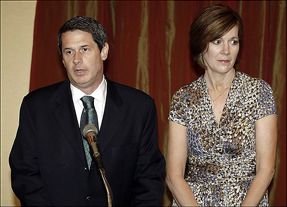
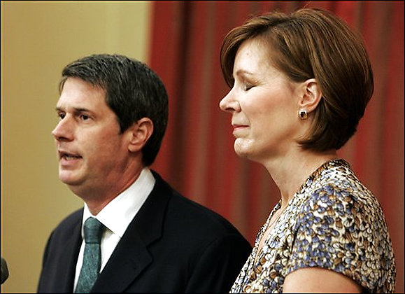
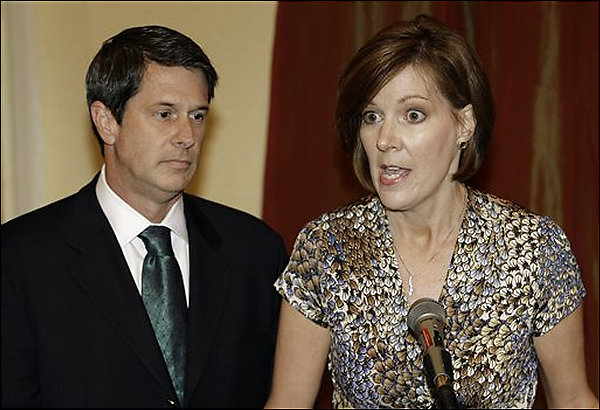
Over at the Bagnews Michael Shaw has made the very important point that many of the representations of the American public from this event seem to mimic Normal Rockwell’s America. And the point is very well taken. BUT, that’s not the only American public being represented, and there might be an important lesson in attending to the array of representations.

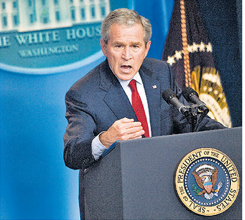
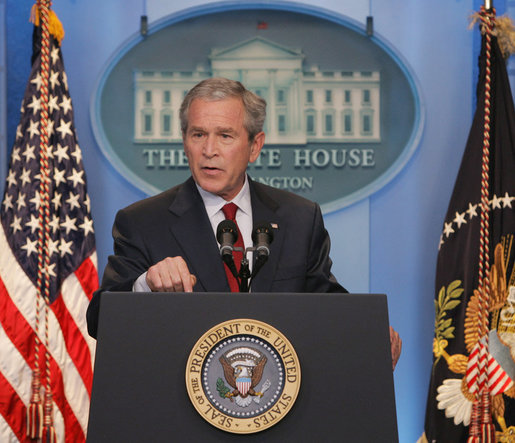
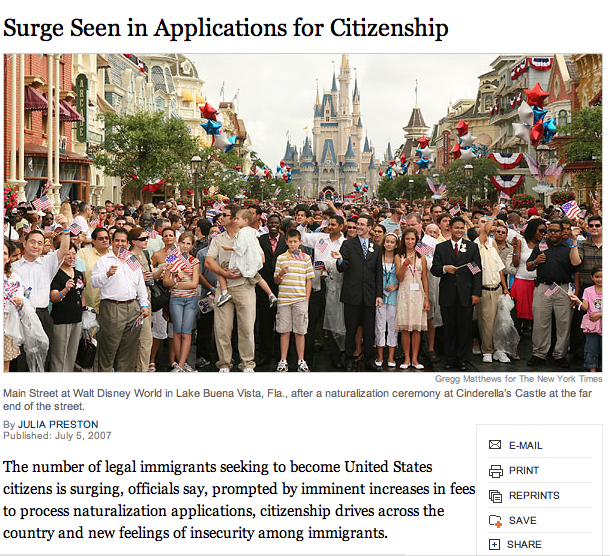
Today’s New York Times story features the following photograph (Jason Reed/Reuters):

NYT Bush Shroud Image

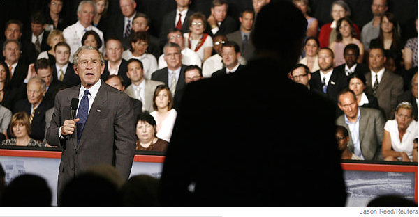
Now this is clearly not a Norman Rockwell rendition. Notice, importantly, that the president is not speaking to the folks behind him, who have the look of a jury. Largely male and dressed in jackets and ties for the most part, this is not an easy cross section of the “American people.” They are attentive, intense, but clearly not admiring anything. Like a good jury, they seem to be weighing the evidence. But whoever they are, what do they see?

First, we should attend to the fact that the president is speaking with a microphone conspicuously displayed? Why a microphone? Modern technology doesn’t require it anymore, but no doubt it is a prop that creates more of a “feel” of interaction between speaker and audience. Fair enough. But here, note too how it hints at the need for something to amplify the president’s voice, almost as if the mere fact that the president speaks it is not quite enough to get the message across. But what dominates the image is not the president nor the jury behind him, but the much larger and somewhat ominous audience members he is addressing — the American people? — prominently shrouded in dark shadows. We can’t see them, although we can see what they see. The shadows, of course, function in multiple registers. Because indistinct they make it easy for anyone to identify with — white/black, rich/poor, republican/democrat — and certainly much more so than most Americans can identify with the business class individuals in the background. But not just that, the shroud also implies a certain danger (think “death” shroud) — it is dark, foreboding, and (visually, at least) dominating. The image could be from an Ingmar Bergman film. Shrouded here, the public being addressed is empowered and, apparently, powerful – or at least potentially and threateningly so.

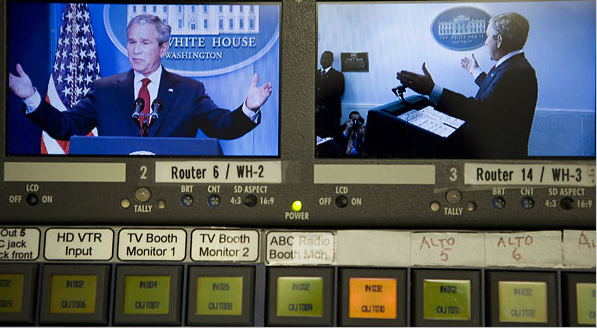
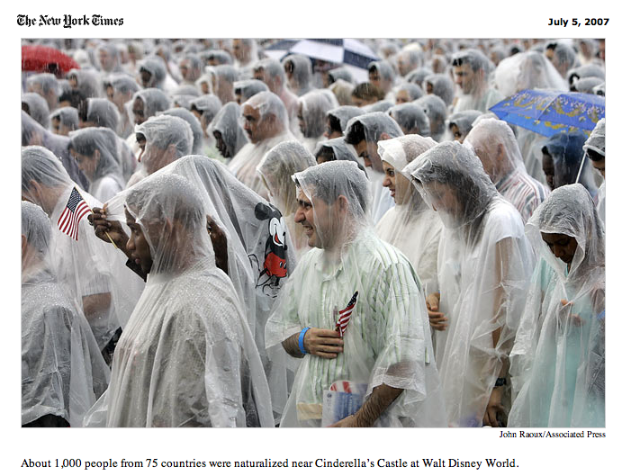
Variations on this photograph have shown up in other places. So, for example, this version from the front page of the Sacremento Bee:

s-bee.png

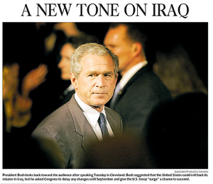
Here, the “jury” has been cropped out. And we see a much more concerned look on the president’s face. The look of concern is reinforced (or framed) by the Secret Service agents prominently displayed behind him. The shrouded public is still there, but now even more ominous. The headline “A New Tone on Iraq” could be referring to the president’s promise to engage in debate over the failures and successes of his Iraq policy, OR it could refer to the changing tone of public attitudes and responses which seem to becoming more and more pronounced with each passing day. But clearly, the public shrouded here is not one to be tarried with, at least not without some attention to the danger lurking in the shadow.

The front page of the Plain Dealer (Lynn Ischay/Plain Dealer) gives us a third option:

picture-1.png

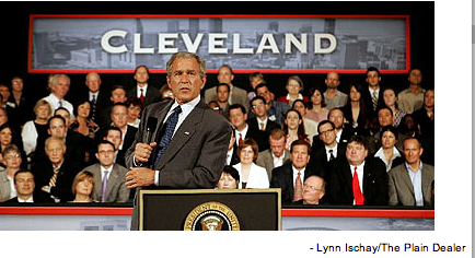
It’s not quite the Norman Rockwell shot seen at The Bag or in other places, but it is close. Unlike the picture at The Bag, however, notice that here the president is not blended in with the people behind him. There is a clear distance. And, perhaps more importantly, in contrast to the pictures at the NYT and the Bee, the public being addressed has been visually removed. Now the public is not so much a concern as a ghostly presence that can only be seen in the eyes of the president (and his promise as to “what the American people expect”) or perhaps what now appear to be the somewhat approving eyes of at least of few of his business class jury.

So, we get multiple possibilities. A public who simply gets spoken into existence by the president, and we can believe him or not, or the one he seems to have to address and be accountable to. And the later public is more or less ominous, skeptical and questioning in the NYT image, and downright dangerous in the Sacremento Bee.

How any of this will effect public behavior and response is unclear. But it surely implicates the ways in which we see and are seen as citizens, as “the American people” … and in some measure more powerfully and subtly so than the simple numbers that show up in public opinion polls. After all, seeing is believing …

 0 Comments

Main Street, USA … or is it the New American Imaginary?

I am unable to identify a single iconic photograph that represents the naturalization process for those immigrating to the United States, but it is of course not uncommon to find pictures of immigrants being sworn in as citizens at places like Ellis Island, Independence Hall, Monticello, and at court houses across the country in cities large, medium, and small.

And it all makes a great deal of sense, for while no single photo of this process of becoming a citizen may be iconic in itself (i.e., in the way, say, in which Lange’s “Migrant Mother” singularly marks the Great Depression or Eisenstadt’s “Times Square Kiss” singularly marks the end of World War II and the so-call “return to normalcy”), each such image nonetheless locates the ceremony in physical places that are in their own rights icons of the American imaginary. The ceremony of becoming a citizen is thus linked in such photographs directly to a foundational part of the nation’s coming to be — whether historically or at the present moment.

The on-line version of the July 5, 2007 New York Times offered a new twist on all of this, as it reported on a recent surge in applications for citizenship, accompanied by a picture of some 1,000 new citizens celebrating their naturalized status on Disneyland’s “Main Street” after having been sworn in beneath Cinderella’s Castle:

Disneyland Citizens

Being sworn in at Independence Hall or Ellis Island or at some other physical place marker of national legitmacy clearly operates in a somewhat romanticized narrative of American citizenship, and so we should be careful about being too critical here. But surely such places are more real, or at least have more of a connection to who and what we are (or want to be) as a people than the pure fantasy of Cinderella’s castle? Or Disney’s version of “Main Street”? Or maybe not.

In any case, the absurdity of the situation must have quickly registered at the Times, because the picture was shortly removed and replaced by a different photograph. The new image, a cropped version of which was actually part of the original on-line story and the full version which was featured above the fold on the front page of the newspaper (see below), shows a close-up of a group of immigrants in the process of being sworn in as citizens:

NYT.Disney 2

What is notable about this newer photograph is not only that the physical place has been visually obscured (even the caption relocates the event, emphasizing that the ceremony took place “near” Cinderella’s Castle, not “at it” as in the original), but nearly all sense of individual difference has been muted or removed, as the new citizens appear more or less “uniform,” wearing identical rain ponchos (the one clear exception, of course, is the poncho bearing an image of Mickey Mouse). And I don’t choose the word “uniform” here randomly, for on the front page of the Times this image is paired with and placed beneath an image (that was also part of the original and now no longer available on-line story) of U.S. Marines being sworn in as citizens … and where else, but in Baghdad!

New York Times, Front Page

It is hard to know what is going on here. I would be inclined to say that the original on-line story was a parody, something like what we might find at The Onion: “Citizenship Available for an ‘E Ticket Ride’ at Disneyland!” But the NYT is, after all, “the paper of record,” and we would not expect to find satire of this sort here. And of course the front page story seems to play it straight, even though the visual identification between Disneyland and Baghdad could be read in a subtle but cynical register. But then why does the original image of Main Street, Disneyland disappear from the on-line version? The American imaginary is always something of a fiction, to be sure, but here it seems to have transformed into pure fantasy. And one, it would seem, we are all too willing to buy! Perhaps that’s the point. Or maybe not.

 0 Comments

American Faces

The June 2007 issue of the Journal of American History includes a series of articles on the use of photographs in collective memory and historical scholarship. The issue, which is entitled American Faces, includes:

“Introduction,” by Donna Drucker and Edward Linenthal (pp. 97–8)

“Worth a Billion Words? Library of Congress Pictures Online,” by Barbara Orbach Natanson (pp. 99–111)

“Religious History and Visual Culture,” by Colleen McDannell (pp. 112–21)

“The Times Square Kiss: Iconic Photography and Civil Renewal in U.S. Public Culture,” by Robert Hariman and John Louis Lucaites (pp. 122–31)

“‘The Day in Its Color’,” by Eric Sandweiss (pp. 132–42)

“Visual Literacy by Michael Lesy,” (pp. 143–53)

“An American Atrocity: The My Lai Massacre Concretized in a Victim’s Face,” by Claude Cookman (pp. 154–62)

“Where Are Our Fathers?” by Ted Englemann (pp. 163–71)

“An Image from Oklahoma City,” by David Allen (pp. 172–78)

“Remembering the Oklahoma City Bombing,” by Anthony Fernandez (pp. 179–82)

“The Public Face of 9/11: Memory and Portraiture in the Landscape,” by Jonathan Hyman (pp. 183–92)

“Image and Artifact: The Photograph as Evidence in the Digital Age,” by Martha A. Sandweiss (pp. 193–202)

Full texts (and images) are available online.

 0 Comments

TaDa!

We’re up and running. To or from what, I’m not so sure, but surely the first post should be to thank those who made this blog possible. My colleague Irv Rein, author of The Elusive Fan, was the first to suggest that an academic book could have a second life on the Web. That suggestion would have remained merely an idea but for Yogi (Bob Yovovich), who was the perfect pest, the burr under the saddle, the guy who wouldn’t take no for an answer. The guy who made it happen was David Huffaker, a grad student in Northwestern’s Media, Technology, and Society program; David is a model of how to be both skilled and good natured. Thanks to all.

 0 Comments