Mar 31, 2010
May 11, 2014
Apr 26, 2013
Feb 04, 2016
Nov 14, 2011
Sep 12, 2012

The Aesthetic Animal

The photograph below doesn’t capture the full effect the image had when smeared across one page and part of another in a print edition of Sunday New York Times Magazine (12/23/07).

lipstick.jpg

I’ll bet you get the idea even without the grainy feel of the overblown printed image. The photograph is by Delphine Kreuter, entitled “Le rouge a levres,” and part of the exhibition “J’embrasse pas” at collection Lambert in Avignon, France. The image was used to decorate a puff piece on the current fashion for red lipstick.

I’ve posted before about how fashion carries the enormous energies released by our being social animals. This image is a show stopper on its own, however. The human face is reduced to flesh and teeth. Those teeth are fashion model perfect but also vulnerable, isolated in the center foreground as if being targeted. The flesh is distended, distorted, manipulated; but for the social context of applying make-up, the angle of the head and its pallor would suggest something closer to a body undergoing surgery or being laid out for an autopsy. It’s easy to think that the hands don’t belong to the face which is being abused somehow, held down, twisted, smeared, exposed, marked.

And marked with red. The Magazine article mentions the usual sexual symbolism, but the image goes beyond that. Like fashion itself, the color exposes what it covers. In this image, we see the thick yet pliable tissues of the mouth, its minute seams and folds, its physical weakness. This mouth is not the typically invisible organ of human communication, but instead an orifice–like the others, a place where the body is folding in on itself but not quite sealed. It does not speak, but rather is a place for decoration, a thing that can bear a sign. The smear of red doesn’t quite cover the form of the lip, and so artistry itself is exposed, and with that the truth that style is imperfect, temporary, and completely artificial.

Artificial, but to die for. The image catches its subject and its audience so powerfully because we also know that what appears to be violent is also voluntary. The person photographed might have been male, but the image captures how women often are subjected to physical distortion and discomfort in the name of fashion. More to the point, fashion and violence spring from a common source.

This tension between the brutal animality underlying social life and its superficial articulation as mere fashion permeates the Magazine’s presentation of the story. It is there in the contrast between the text and image, and between title (“The Human Stain”) and subtitle (“Red lipstick continues to leave its indelible mark”) and within the story itself, which blends fashion twaddle (“red lipstick is having a moment”) with reports of vandalism and of artists who use it as “a tool of symbolic defacement.” One is quoted: “‘Red is primal and violent . . . It’s the universal gash.'”Against such celebrations of violence, the mere fashion statement might be a social achievement.

Digg!

 2 Comments

Sight Gag: The American Way

580_american_way2.jpg

 Credit:  Wrapped-in-the-Flag.com

Our primary goal with this blog is to talk about the ways in which photojournalism contributes to a vital democratic public culture. Much of the time that means we are focusing on what purport to be more or less serious matters. But as John Stewart and Stephen Colbert often remind us, democracy needs irony, parody, and pure silliness as much as it needs serious contemplation. For our part, we will dedicate our Sunday posts to putting some of that silliness on display in what we call “sight gags,” democracy’s nod to the carnivalesque. Sometimes we will post pictures we’ve taken, or that have been contributed by others, or that we just happen to stumble across as we navigate our very visual public culture. And we won’t just be limited to photography, as a robust democratic visual culture consists of much more. We typically will not comment beyond offering an identifying label, leaving the images to “speak” for themselves as much as possible. Of course we invite you to comment … and to send us images that you think capture the carnival of contemporary democratic public culture.

 0 Comments

Paradigmatic Violence in Pakistan

I’ve posted before about the heroism of the Pakistani middle class as they confront terror to create a modern, liberal-democratic civil society. That post featured an image of waiting and the prospect that things could get worse. They did get worse:

paki-man-on-street.png

This photograph is centered on a man wounded in the fatal attack on Benazir Bhutto in Rawalpindi, Pakistan. It shows much more than that, however. I see the pathos of civil society in an era of violence, a scene that can be understood as both a series of small choices and the brutal logic of historical fatality.

The photo features the man in the middle of the frame, and he is a peculiar figure: at once a picture of bourgeois composure and someone blasted into stunned incongruity. His pants have been shredded by the blast of the suicide bomber, yet his suit is still buttoned and his tie knotted neatly. One sleeve is disheveled but only to reveal a crisp shirt with white French cuffs. He checks his head for damage yet his hair is still parted. Those around him have been leveled by shrapnel, but he is sitting upright with his legs crossed at the ankles; he could just as well be sitting in a barber’s chair.

The emotional appeal of the image may derive from this tension between the raw violence of the scene and the habitual routines of ordinary life. This tension might be concentrated in the contrast between his orderly demeanor and exposed flesh. He acts as if the only problem is whether his hair is mussed, while we see that his pants have been flayed by violence. Much is revealed: he is not just a “suit,” and a “stable” society is not one where anyone can be torn apart by others who are no respecter of persons. More to the point, his habits of dress, posture, gesture, and thought are both touching and out of place in a world blown apart. They are so far from the harsh realities of civil war, so foreign to the production of violence. His habits are nothing more or less than than consolidated choices that both assume and reproduce a decent civil society. They are isolated by the destruction around him, and the implication is that they may be useless.

Although his suit didn’t protect him, he is alive. And that sets up the second emotional vector in the image. As the street spreads out behind him, we see the carnage wrought by the bomb. You might not want to look too closely. Those lying behind him are dead, and the further into the background, the more broken the bodies. Again, the scene is marked by little signs of normalcy gone awry: strips of paper, items of clothing, it could be the aftermath of a tornado except that it doesn’t stop there. The sitting man, the prone body, the crumpled bodies, the body parts present a declension of violence: to wound, to kill, to kill and mutilate, to dismember, to blow to bits. Thus, the distance from the man in the foreground to whose scattered on the ground behind him can double as a series of steps as a society devolves into anarchy. Those who are committed to civic order are threatened, then attacked, then killed as everything associated with them also is shredded and scattered. Small choices and everyday habits that are the fabric of peace cannot withstand the weapons of those committed to destruction.

John and I have posted periodically about the normalization of violence, but that rarely occurs in the immediate presence of actual destruction. This photograph documents that violence itself is about anything but the taken for granted routines of ordinary life. We now seem to be in a season of violence–Iraq, Pakistan, Kenya, and others are suffering the destruction of social order. It seems that the process is irreversible: once the detonator is set off, waves of destruction spread ever outward. But look at the photograph one last time. There are others in the picture. In the rear, another of the wounded also has risen to a sitting position. On the side, there are onlookers. These figures suggest that fatality has limits. The swath of destruction went only so far this time, each time. Those watching still have choices to make. Who to side with. How to help. With what weapons.

Photograph by John Moore/Getty Images.

Digg!

 0 Comments

The Aesthetics of Freedom

Back in September I commented on the allegorical design of the new U.S. passports and focused attention in particular on the opening page, a cornucopia of signs and references to American hegemony. The visual tableau there begins with an image of Baltimore Harbor being “bombarded.” Subtly but noticeably blended into the background so as to encompass both the inside cover and the first page is the American flag. The “alien” force then was the British Army, but the reference to more recent alien bombardments and expressions of the indestructibility of the American banner are hardly veiled. I promised to continue to examine the visual design of the passport and was reminded of this while traveling recently in the U.K.

The last two pages of the new U.S. passport offer an interesting allegorical complement to the opening two pages, and complete a framework for engaging the intervening twenty-seven pages of image and text that activate a history of the American sublime rooted in the nation’s divinely ordained, adventuresome and inventional spirit.

back-cover.jpg

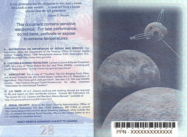
Reading from left-to-right and from top-to-bottom, we first encounter an inscription from Ellison S. Onizuka, “Every generation has the obligation to free men’s minds for a look at new worlds … to look out from a higher plateau than the last generation.” This is quickly followed by a notice, centered and in bold face–and at least twice as large as anything else on the page–indicating that “This document contains sensitive electronics.” The remainder of the page contains addresses “for information” on importation restrictions, customs and border protection, agriculture, U.S. taxes, and social security. All of this information is obscured, more or less like the legalese we ignore and yet are required to sign-off on when we install new software on our computers. Instead, our attention is directed to the connection between “new worlds,” “higher plateau[s],” and “sensitive electronics.” This connection is animated by the photographic illustration that occupies the right hand page and to which our attention is drawn by the formal articulation of the bold faced font of the notice, the reddish hue cast by the sun on the left hand page, and the dark sky of outer space. Here we encounter the earth, centered in the image and, on close inspection, featuring the North and South American land masses. In the foreground is what appears to be the moon. Situated above the two and in-between them, as if the tip of an triangle connecting all three objects, is a satellite. At the bottom of the page is a bar code that corresponds to the passport number.

There is much to comment on here, but what I want to focus on is how the inside back cover is something of a formal “mirror” of the inside front cover, albeit with a difference that coaches the viewer to treat the ideological implications of American exceptionalism as the result of a natural, technological determinism.

The passport begins with a painting and ends with a photograph, the two genres of visual representation framing the historical shift from early to later modernity. The implications of that shift are formalized by the contrast between the quill-and-ink script that sits atop the painting on the inside cover and the computer generated bar code indicating the passport holder’s identification number that rides across the bottom of the photograph on the inside back cover. The shift from “then” to “now”–from painting to photograph, from quill-and-ink to computer generated bar code–is thus marked as a sign of technological progress. Each operates within its own aesthetic register, but the almost perfect symmetry–from left to right, from top to bottom – encourages the viewer to acknowledge a transcendent beauty predicated on the concept of “orderliness.” Notice, for example, how the quill-and-ink script is perfectly measured (at least for its antique medium), and thus anticipates the even more perfectly measured, technologically enabled bar coding on the back page. The shift from “then” to “now” is thus coded aesthetically as a sign of ordered, technological progress.

This aesthetic coding underwrites a politics concerning the relationship between American-style democracy and technology. The key marker here is the reference to “sensitive electronics.” The specific referent is the “electronic chip” embedded in the passport and designed to record the movement of citizens (and others) across borders, but its visual juxtaposition with the satellite looming over the galaxy implies something more. One might expect that technological progress would enable greater latitudes of individual freedom, as is the promise of the “land of the free and the home of the brave,” but here it offers not freedom of movement but panoptic oversight. Such control might be necessary in a world fraught with danger, but the point to notice here is how it is aesthetically domesticated and naturalized.

This post has gone on too long already, but two points are worth noting in this last regard. The first has to do with the way in which the passport is color coded from start to finish. As I indicated above, the inside front cover is encompassed by a washed out American flag that serves as the background to the painting and text, and it bleeds across the margins of the page on the right side, inviting us to turn the page. The color scheme carries its way throughout the passport to the back cover, where we see a tree looming over a land mass in the distance. It doesn’t take too much of a stretch to see that the color coding here might be analogous to the flag unfurled. The tree leans like a flag pole, the leaves recall the dark shield of starts, the red and white hues of the setting sun reminiscent of the alternating stripes. And so the banner originally sewn by a woman is here replicated by nature’s pallet, an almost perfect representation of America’s manifest destiny. But note too that the very last page is severe and abrupt in its difference. Virtually all color is lost as the world is now rendered in black and white; virtually, that is, but not entirely, for on close inspection we can see that the colors of nature/the flag bleed here too, though the threat that they will be washed away remains stark and foreboding. And so, of course, the need to mobilize technology, whatever risks it might invoke to freedom and liberty, seem warranted in the name of security.

But there is more, for we have yet to comment on the somewhat odd quotation from Ellison S. Onizuka that leads off the left hand page. The quotation is odd, less for what is said than for who is doing the talking. Few readers will easily identify Ellison Onizuka, nor could I until I researched it (even though I have previously written extensively about the key event for which Onizuka is known!). Ellison Onizuka was a mission specialist on NASA flight STS 5-L. You know it as the “Challenger” spacecraft. He died along with six other astronauts on January 28, 1986 when, in the famous words of President Reagan, the crew “slipped the surly bonds of earth” to “touch the face of God.” Onizuka’s words, locating the “obligation” of “free men” to “look out from a higher plateau” is thus not just an analogy for the spirit of progress—and the calculated risk that it always entails and yet we work so hard to repress—but operates in an anagogical regiser that puts man (and by implication the technologically advanced American, with his “sensitive electronics”) in proximity to the face of God. In this context the starkness of the black and white world on the facing page takes on an even more sinister, Manichean resonance.

Surely the dangers that the world poses have to be more complicated than this, and yet, here, it seems so natural … almost as if it is destined.

Welcome to 2008.

Digg!

 4 Comments

Sight Gags: Figures of Speech

HAPPY HOLIDAYS FROM No Caption Needed

 With the holidays upon us we have decided to take off the next ten days to rest and be with our families.  We will be back on January 3rd.  We want to invite our readers (or those who just happen to stumble upon us) to browse through the pictures and posts we have put up since we began in June.  We also want to thank all who have visited these pages, and especially those who commented or sent us pictures to post and talk about.   WIth the photo below we offer you “Peace on Earth.”    

peace_2.jpg

Photo Credit: Art Rogers © 2002 Pt. Reyes Light

Our primary goal with this blog is to talk about the ways in which photojournalism contributes to a vital democratic public culture. Much of the time that means we are focusing on what purport to be more or less serious matters. But as John Stewart and Stephen Colbert often remind us, democracy needs irony, parody, and pure silliness as much as it needs serious contemplation. For our part, we will dedicate our Sunday posts to putting some of that silliness on display in what we call “sight gags,” democracy’s nod to the carnivalesque. Sometimes we will post pictures we’ve taken, or that have been contributed by others, or that we just happen to stumble across as we navigate our very visual public culture. And we won’t just be limited to photography, as a robust democratic visual culture consists of much more. We typically will not comment beyond offering an identifying label, leaving the images to “speak” for themselves as much as possible. Of course we invite you to comment … and to send us images that you think capture the carnival of contemporary democratic public culture.


 1 Comment

Conference Call: Society for Photographic Education

Society for Photographic Education
45th National Conference – March 2008

March 13-16, 2008 in Denver, Colorado

Agents of Change: Art and Advocacy

The work of a photographic artist took center stage during the 108th United States Congress. On the agenda was the fate of drilling for oil in Alaska’s Arctic National Wildlife Refuge (ANWR). According to Secretary Gale Norton ANWR was “a flat white nothingness.” In response, Senator Barbara Boxer denounced drilling and held up a book of photographs by Subhanker Banerjee that showed the refuge brimming with life. Congress voted to save ANWR from drilling for two more years.

Lens-based artists have been catalysts for change with imagery that advocates social and environmental awareness. Artists bear witness, interpret, expose and address problems ranging from the Aids epidemic and stereotypes in race and gender to the plight of refugees in war torn countries. In what ways are artists responding to the local and global challenges that are reshaping politics, cultures, economies and the planet? As educators, artists and scholars, what has been the historical impact of our advocacy? What role will we play in shaping the future?

Joann Brennan
Conference Chair

For additional information go to http://www.spenational.org/conference/conf2008/index.html

 2 Comments

Hollywood Censors Torture?

Of course not. Where would the movie industry be without Saw, Hostel, and similar delights? So it might come as a surprise to learn that the Motion Picture Association of America has censored this movie poster:

taxi-poster-larger.jpg

According to Variety, the Association was put off by the hood. We can’t have children seeing a prisoner wearing a hood, can we?One wonders where to begin. Will the MPAA also be firing off a letter to the Bush administration protesting their treatment of prisoners? Since the hood is seen via a photograph of can actual event (and not an illustration or a staged image of a fictional scene), one might ask why the MPAA is prohibiting visual documentary–indeed, depiction of the practice of detention that is the subject of the film. And if children are to be protected from seeing hooded prisoners, does that mean that we should also censor the daily newspapers that have been carrying such photos for the past several years? If so, we also had better protect those tender eyes from this photograph, which received a World Press Photo Award in 2003:

hood-awardee.jpg

There are two sides to the normalization of violence in the US. On the one hand, fictional protrayals of beatings, rape, torture, and murder are standard fare in the culture of popular entertainment (TV, film, video games). The viewing public is constantly rewarded for suspending disbelief and ethical revulsion about the conduct of violence; just play along and you get all the pleasures of the show. On the other hand, actual violence being perpetrated by the government is minimized, sanitized, or outright censored. Let it not be said that the MPAA does anything in half measures.

Second photograph by AP/Jean-Marc Bouju. Thanks to Steve Perry at The Daily Mole for the heads up. Additional links are available at Movie City Indie.

Digg!

 2 Comments

Diane Arbus: Humanity without Humanism

Yesterday the news in the art world included a New York Times story on “A Big Gift for the Met: The Arbus Archives.” The paper reproduced two of her photographs, the deeply affective “Russian Midget Friends in a Living Room on 100th Street, N.Y.C.,” and the more often reproduced “Woman with a Veil on Fifth Avenue, N.Y.C.” (The later is doubly jarring today, when “veil” is taken to refer to something quite different than an affluent white woman on Fifth Avenue.)

If you follow a link provided by the Times, you can see several photos that were revealed at a major retrospective of a few years ago. They are pure Arbus, and all the more stunning for that. This is art, and I won’t presume to add to what has been said to celebrate her achievement. It is enough to look:

arbus-young-man.jpg

He is no freak and the more exposed for that. Although composed for and confidently presenting himself to the camera, we see a profound vulnerability. Dressed for going out in public or to the office, he seems almost naked. Covered, even layered, he seems thin, at best a thinking reed. And can anything that gentle not be mowed down? It seems that the wind could cut through him like a bullet, and won’t the many snubs, rejections, and disappointments to come do the same?

That may be too morbid, however, an homage more to the Arbus aura than to the art itself. Perhaps he already is well armored. Look at the formal perfection that she captures: the arced lines of his eyelids are paralleled by his eyebrows and the brim, band, and top of his hat. The long oval of the face is mirrored by the ears, their protuberance now an aesthetic virtue. Likewise, the arcs of the lower lids, lower lip, and chin are mirrored by the V-lines of the collar, coat, and his arms. Eyes, mouth, hands; ears, lapels, hands–the incredible candor and goodness in his direct gaze at the camera is buttressed by these symmetries of composure. What should be a confrontational stance is instead a moment of pure openness. He, not just the photograph, is a work of art.

Except for the cigarette. That’s the punctum for me. The term was coined by Roland Barthes to describe the part of an image that punctuates or punctures interpretation to create a more intense or troubling emotional effect. The cigarette puts this young man back into time. He is living in a particular time and place and social world, and time is passing as surely as that cigarette is going up in smoke. Thus, the photograph brings him, and us, back to all the desires and vicissitudes and erosion of real life. He doesn’t have it all together; he’s imitating a movie star. He isn’t composed and armored and capable; he’s playing a part for which he is ill cast and cheaply costumed. He’s not open to a life of possibility; he’s already caught in an epidemic. The wind won’t blow through him, but he could end up thinner yet as cancer wastes him to the end. He’s really one of us.

Young Man in a Trench Coat, N.Y.C., 1971, by Diane Arbus/The New York Times, “Unveiled (September 14, 2003),” and Diane Arbus: Revelations.


Digg!

 0 Comments

Santa Claus, Child Abuser

This blog keeps to the straight and narrow much of the time, by which I mean we cover photojournalism with the occasional art photo or advertisement thrown in. We don’t range across Flickr, YouTube, MySpace, and the rest of the digital spectrum, much less put up snapshots from our own social networks. But one of the characteristics of media (and not just in the digital age) is that they all flow into one another. So it is that the Chicago Tribune website is inviting people to send in their snapshots of kids who are scared of Santa. And people do:

scared-of-santa-1.jpg

Cute, huh? Actually, I don’t think so. This photo probably is a good example of how one’s emotional response to images depends on context. The parents can chuckle because they know that this behavior was momentary and aberrant—the kid was fine in a minute and had lots of fun with the Santa myth otherwise.

It’s also a good example of why there should be some distinction between private and public media. Snapshots do many things, and photojournalism does many things, and they often can overlap and at times each do the work of the other. But you don’t have to look at many snaps to be relieved that they are not in the paper every day.

What interests me about these Santa images is that something does happen when they are collected for public viewing. Not one or two, but over a hundred and counting. Images like this:

scared-of-santa-2b.png


And this:

scared-santa-3.jpg

And that’s more than enough, isn’t it?

The question arises, what does the series of images show that might be overlooked in any one? The answer is, the social form–that is, the custom, and who it serves, and what it costs. The visit to Santa is revealed to be something done not so much for the kids as for the adults. Frankly, the kids would never miss it, don’t need it, and in some cases would be better off without it. And isn’t this a lesson in the tyranny of social forms? A very, very minor example, of course, but an example nonetheless of how people can be pushed into fixed scenarios before they are ready for what social goods might be conferred there. You might say that the visit to Santa is the first step toward middle school.

Digg!

 14 Comments

The Presence of the Dead

I guess the war in Iraq turned out OK after all. That’s the conclusion to be drawn from recent newspaper coverage. The photos are devoted to showing Iraqis relaxing in the park or shopping, or US soldiers who don’t seem to do anything except dispense medical care or play with kids. The verbal reports are much the same. Oh, some bad news is there. On Saturday 11 people were killed in several incidents, but you had to read page 21 of the New York Times to know it. While US deaths are at 3893, the tally for November was only about one per day; down from four a day in May and two a day in September, just a trickle really.

So it is that we are on the verge of another betrayal: it is becoming all too easy for the American public to pretend that the war is winding down successfully and that the losses really weren’t so bad. I’d suggest we take another look at the war. This, for example:

iraq-medical-1.png

This is from a story in the December 2006 National Geographic. That magazine is no longer the epitome of middlebrow distraction that it once was. The photographs by James Nachtwey provide wrenching witness to the horrific price paid by so many soldiers who die or are horribly maimed despite the heroic efforts of the medical corps to save them.

This photo of damage done by an IED blast is somehow intensely intimate. Perhaps because the boots look like Converse high tops, or the open wounds on the bare legs, or the fact that he doesn’t look too banged up, almost as if these were legs scraped badly in a game of sandlot baseball. You are instantly brought to care for the wounded boy and to be grateful that he will receive first rate care. He did receive first rate care, and he died anyway.

Just like this guy:

iraq-medical-2.png

I saw this photograph a year ago, and it has been with me ever since.

In his odd, haunting novel about the Vietnam era, A Short Rhetoric for Leaving the Family, Peter Dimock’s narrator sets out to “invent some public speech with which to make the presence of the dead visible: some other history, some practical method by which to be able to speak capably concerning those things which law and custom have assigned to the uses of citizenship” (p. 29). It is the citizen’s duty to keep the dead present in memory, especially when they have died in a mistaken war. To do so requires some ability to resist official discourses and other forms of inattentiveness and amnesia. This can be done with speech and thus with the resources of classical rhetoric featured in the novel. Nachtwey demonstrates how it also can be done with photography.

The Right is crowing that the surge worked, while the Left is resigned to point out that it worked only because force levels were brought closer to what the Pentagon had requested and the Bush administration denied for the previous four years. And what is forgotten in this distorted debate? The simple fact that the surge can never restore what has already been irrevocably, senselessly lost.

There may be no harm in recognizing small victories, but good news should never be used to deny the presence of the dead. It is one thing to take credit where credit is due, and quite another to avoid responsibility for the past. And we do worse yet if we forget about those still to die.

Photographs by James Nachtwey for National Geographic. For the record, this month the total casualty figure for the occupation of Iraq exceeded 25,000 US troops, with an estimated Iraqi death toll at 1, 132, 766.


Digg!

 2 Comments