May 22, 2011
Jul 21, 2013
Mar 26, 2010
Feb 21, 2008
Dec 18, 2009
May 06, 2012

Welcome to Rubble World

One of the important features of public culture today is that globalization has become a social fact. For example, economic historians can document that the world has had a global economy for centuries, but now people know that they live in a global economy, and many people know this, and they know it not only in New York and London but also in Peoria and Bangladesh. At the same time, it would be a mistake to conclude that this shared social knowledge carries with it a common map of the world. To the contrary, another interesting facet of the 21st century is the emergence of multiple geographies. One still acquires a geography of nation states, but amidst that there are diasporic communities, media capitols, free trade zones, black markets, clashing civilizations, greater Kurdistan, the New Caliphate, and perhaps someday the fabled Northwest Passage.

This melange of borders, flows, and visions is not yet a social fact, but it is not merely academic speculation either. One sign that the maps are changing is that the terms First World/Second World/Third World are becoming increasingly outdated, although not because hierarchies are being leveled. Let me suggest that something else is being leveled, and offer one suggestion for a more up to date map. What matters today for a significant number of people is whether you live in Rubble World:

baghdadbombing.jpg

This photograph is from Baghdad. But it also could have been in Beirut, like this one:

beirut-rubble.jpg

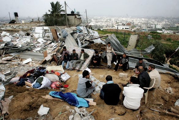
Or, most recently, Gaza:

gaza-rubble.png

These are without a doubt among the leaders in the field, but let’s not forget Grozny and Sarejevo, among others. And then there are the periodic terrorist bombings in Kashmir, New Delhi, Sri Lanki, or wherever, not to mention Ground Zero in New York. Nor should we limit ourselves to the devastation of war, as the combination of poverty and political failure allows quakes, typhoons, and plain old shoddy construction due to corruption to add to the pile. Type “rubble” into Google Image and you can begin your guided tour of Rubble World.

If you take that tour you might notice that many of the images look very similar to the three here. Rubble World doesn’t start from scratch: there has to be something to wreck first. Like war itself, it is parasitic. The curious thing is that it seems as if everything still is pretty much as before–say, as if only the facade of the building has been blown off, or the wallboards and mattresses rearranged. The blast exposes building infrastructure or leaves people gathered together on the ground as if they were in a house, but you might think that everything important remains in place. That is a lie, of course. The buildings have to be condemned, and rebuilding can’t even begin until the all the work and expense of clearing the site has been completed. We are looking at skeletons, not at disruption; not a setback but ruin.

And so we get to the people–those still alive, that is. Rubble World is not uninhabited. As in many of its images, the people here are reduced to being spectators to their own desolation. There are many such scenes, whether of a few people in the urban ravine or of a small gathering of neighbors trying out their new status as squatters on their own property. Each might be a sign of hope. The urban space can be rebuilt only if citizens survey the damage and begin to talk about how to to organize. The local community can only survive if people remain attentive to one another amidst danger. Even so, these people have all been idled. The loss is not limited to an apartment building or a house, but spreads like a blast pattern across the entire economy. Rubble World includes some stories of renewal, but the total losses of productivity, prosperity, and hope itself are staggering. By documenting architectural wreakage, these images reveal how civil society is being laid bare, torn apart, damaged, and dispersed. As that happens, the rubble is sure to spread.

Photographs by Associated Press; Getty Images; Abid Katib/Getty Images.

 3 Comments

Who's Afraid of Pink and Blue?

In the late 1940s and throughout the next decade Life magazine would regularly put private individuals and and their nuclear families on display with their accumulated property: consumer goods. One of many visual convention for doing this was to have the family surrounded by their prized possessions, collected en masse and organized in a careful and orderly fashion, a visual metaphor perhaps for their ordered and conformist lives (and much more as well).

I was reminded of this visual trope when I came across a NYT slide show reporting on “The Pink and Blue Project,” a photographic installation by JeongMee Yoon that will soon be on display in Chelsea at Manhattan’s Jenkins Johnson Gallery.

pink-1.png

blue-1.png

One is struck immediately by the sheer mass of consumer goods accumulated “by” five year old children – consumers in training – but it is the stereotypical and gendered color schemes which appear to convert the images into something bordering on a spectacle. The title for the slide show announces a “Wonderful World of Color” – a phrase that no doubt resonates for those of us old enough to remember watching “Disney’s Wonderful World of Color” on Sunday evenings in the late 1950s and early 1960s – and it would seem to be the coordinated concentration of bright color that animates the author of the accompanying article, Bonnie Yochelson, to note that the project delights “the eye” while “coercing a smile.” Color, it would seem, trumps gender segregation and “compulsive shopping.” And while the smile she remarks upon is “coerced,” it is nevertheless an approving smile.

What Yochelson misses is the way in which the “wonderful world of color” diverts our attention from an even more pronounced (and arguably troubling) element of the spectacle: not simply the sheer mass of similarly colored consumer goods, or even the ways in which color simultaneously marks and masks a narrow and conventional set of gender stereotypes, but the way in which everything within the scene is carefully ordered and organized, literally schematized as if by a structural anthropologist. Like the convention from Life that it seems to mimic, the project thus becomes something of a cipher for the underlying assumptions of bourgeois life, and not least the commitment to a rigid sense of order and regimentation disciplined by cultural demands for the accumulation and conspicuous display of wealth and possession. And in this context it should be noted that one has to look to pick the children out amidst the exhibit of consumer goods, a sure sign that like everything else in the hyper-ordered scene, they too are possessions; and like the glittering commercial trinkets that “coerce” our smile, they are put on public display by and for the benefit of cultural and economic interests that exceed their easy control.

In some ways we have not come far from Life’s America of the 1950s and 60s.

Photo Credit: JeeongMee More

 1 Comment

Miss Landmine Angola 2008

I kid you not.

miss-landmine.png

I’ve devoted a fair amount of time to the intersections of aesthetics and politics, but I was struck dumb by the Miss Landmine project.

Others will react with much more clarity. At the least, the issues regarding gender and commodification are, well, explosive. They even have a T-shirt bearing the logo:

miss_landime_det.jpg

Still a princess, and perhaps Hallmark will want to get into the act. Hell, there already may be sections for Landmine Survivors in the card shops in Angola. Or around Army bases in the US. And who am I to tell them how to get past their trauma?

After reading the manifesto, turning on the theme song (yes, the theme song), and looking at the contestants, I started to get the point. But I’d still be interested in what others think about this weird, Angolan-Norwegian attempt to confront the continuing toll of war in our time.

And if you are interested, voting remains open until April 3.

 6 Comments

Ben Bernanke: Report from the Castle

I doubt that many photography class assignments include problems like this: “Imagine that you are going to photograph the chairman of the Federal Reserve; what angle should you take?” The New York Times had an interesting answer:

bern-framing-feet.png

There are obvious reasons for choosing such an unusual approach to the chairman. Now that photo editors can choose from among 10,000 slides per day, photographers will resort to anything out of the ordinary to catch the editor’s eye. Nor was the the House Financial Services Committee hearing likely to provide much visual interest if left to its own droning routine. But neither of these considerations suggest that the photograph should have been in full color front page above the fold. So what is going on?

I can’t account for the intentions of those involved in production, but I can speculate about how the photograph can influence understanding of the hearing. Two things are notable: how little we see of chairman Ben Bernanke, and what we else see instead. Although just a few feet (so to speak) away from the camera, the chairman appears distant, somehow in his own space that is not directly accessible to us. The dark lines of table edge and pant leg form a V that, when framed by the top of the photograph, form a narrow aperture. It is as if we are looking through a keyhole, which is how K sees the great and mysterious Klamm in Franz Kafka’s The Castle.

Behind Klamm/Bernanke is a bare, blue-white space, as if he is on a promontory and there is no higher authority over him. He must be far from those sitting across from him as well: The caption says that he “signaled his readiness to further reduce interest rates.” We talk, but he signals, for surely his intentions are too great or mysterious to be communicated in full. As he sits alone at the heavy wood table, he is wholly indifferent to those looking up at him. He doesn’t look down on us as if to dominate us, no, that would be too much to hope for, because then we would know, or at least have some assurance, that he was aware of us and might want to, if not actually talk with us, at least contemplate the distance between us. And that distance is very great indeed.

My apologies to Franz Kafka, but the analogy still holds when we turn to the rest of the picture. K yearned for an audience with Klamm but instead had to contend with far less auspicious bureaucrats. Those standing between K and Klamm were of course the surest testament to the power of the one and the hopelessness of the other. And so we see the feet of unnamed minions from the Federal Reserve. These are the men in the gray flannel suits. Uniformity, austerity, discipline, seriousness–bureaucratic character is being performed, and woe to those who would attempt to step over these officials. And how could we, who are literally at the place where one can lick their shoes, how could we do anything but look up and beg, like a dog for a bone? Like a dog.

Photograph by Doug Mills for the New York Times. Shameless plug: If interested a further discussion of the bureaucratic style, readers might want to look at chapter five of my Political Style: The Artistry of Power.

 2 Comments

Sight Gag: Presidential Booty Call

presidential-booty-call.png

Mr. President Goes to Africa

Photo Credit: Charles Ommanney/Getty and Newsweek

Our primary goal with this blog is to talk about the ways in which photojournalism contributes to a vital democratic public culture. Much of the time that means we are focusing on what purport to be more or less serious matters. But as Jon Stewart and Stephen Colbert often remind us, democracy needs irony, parody, and pure silliness as much as it needs serious contemplation. For our part, we will dedicate our Sunday posts to putting such moments on display in what we call “sight gags,” democracy’s nod to the ironic and/or the carnivalesque. Sometimes we will post pictures we’ve taken, or that have been contributed by others, or that we just happen to stumble across as we navigate our very visual public culture. Sometimes the images will be pure silliness, but sometimes they will point to ironies, poignant and otherwise. And we won’t just be limited to photography, as a robust democratic visual culture consists of much more. We typically will not comment beyond offering an identifying label, leaving the images to “speak” for themselves as much as possible. Of course we invite you to comment … and to send us images that you think capture the carnival of contemporary democratic public culture.

 1 Comment

Conference: Modernism and Visual Culture

Modernism and Visual Culture

1st-2nd November 2008
Oxford University, UK

Keynote Speakers
David Trotter (Cambridge University)
Laura Marcus (Edinburgh University)
Maggie Humm (University of East London)

“A writer … has need of a third eye whose function is to help out the other senses when they flag.” (Virginia Woolf, 1925)

In the wake of recent analyses of the landscape of visual cultures at the end of the nineteenth century, new contexts have become available for understanding the emergence and shape of modernism. This conference seeks to unpick our tangled model of the relationships between the established arts in the modernist period and between modernism and popular culture, and to illuminate the types of reactions occasioned in the established arts by the emergence of modern mass media. Papers on any aspect of the relationship between modernist literatures and cultures with visual culture, including cinema and fine art, are welcome.

Possible questions to consider:

Are recent claims for modernism’s affinity with popular culture anything new?

Was Cubism’s debt to chronophotography a model for – or an exception to – modernism’s relationship with photo-chemical reproduction?

Was the ‘modernity’ to which the established arts responded actually the emergence of a rival new cultural landscape comprised of cinema, variety theatre, instantaneous photography, stage illusions, the moving panorama, mass spectator sports, moving-image lantern shows, the illustrated short story and the cartoon strip?

Did literary modernism emerge in emulation of the innovations occurring in modernist painting?

What role did modernism play in altering established theories of visual culture?

Can modernism and late-nineteenth-century popular visual culture be seen as the twin products of a single preceding historical development?

What singular and identifiable properties, if any, did such related forms as cinema, cartoon strips or shadowgrams have in impacting on the existing arts?

Were the different modernisms of the various established arts the product of their varying vantage points on new media forms?

If new visual media generated modernism, did they do so by threatening to become art forms themselves, or by throwing the distinct qualities of the existing arts into relief?

Were modernists already modernists when their work adopted the traits of various new forms of visual culture?

Is realism in cinema equivalent to modernism in the existing arts?

Was the reflexivity learned by the group of polymedia practitioners we call modernists the basis of modernist form in all of the arts?

Speakers are encouraged to use visual material in their presentations. Send 300-word abstracts for 20-minute papers to Andrew Shail (andrew.shail@at-annes.ox.ac.uk), by 1 April 2008. Panel proposals are welcome – please include contact details and affiliations for all speakers.

 3 Comments

Late Modern Pickled Punk

Perhaps the most controversial of carnival exhibits in the late nineteenth- and early twentieth-century was known in the argot of the freak show as “pickled punk,” the preservation and display of fetuses, usually with some pronounced and spectacular deformity. Such displays titillated a curiosity for “knowledge” of the abnormal and bizarre, but like carnival freak shows in general, the practice largely died out in the 1940s with advances in medical knowledge that offered scientific explanations for the freaks, as well as a shift in public attitudes about the propriety of putting such oddities and anomalies on public display. Pickled punk saw a revival in the U.S. in the 1950s and 60s, but was soon outlawed in many states.

I was reminded of the history of the freak show, and of pickled punks in particular, when I saw this photograph, the first image in the recent reprise of a 2005 slide show at the Chicago Tribune :

ctred.png

What you are looking at is the vascular system of a human head that is on display as part of a traveling exhibit at the Museum of Science and Industry titled “Body Worlds.” “Body Worlds” is one of a number of different shows which exhibit human bodies that have been flayed, vivisected and “plastinated.” Plastination is a chemical process that removes waters and fats from a dead body, replacing them with reactive polymers that deny bacteria the nutrition they need to effect decomposition. “Body Worlds” exhibits have been shown throughout the United States and Europe in recent years and with the avowed purpose “to educate the public about the inner workings of the human body and [to] show the effects of poor health, good health and lifestyle choices.”

There is surely need for great scientific literacy in the United States, but one has to wonder if what animates these shows is really an interest in knowledge or a perverse desire to encounter the macabre. I’ve not yet attended one of these shows, but I have talked with several who have and they report that the displays include everything from plastinated body organs (often deformed or diseased) to a wide array of  human bodies performing a full range of activities that include kneeling, smoking a cigarette, dribbling a basketball, shooting an arrow, sitting at a table while playing poker or chess, emulating Rodin’s “The Thinker,” and so on. And with the exception of the “The Smoker,” whose blackened lungs stand as a warning against the use of tobacco, there seems to be very little display or discussion of knowledge about human anatomy that would otherwise be hard to come by, though there is a great deal of attention to the technology of plastination, as well as praise and celebration of its inventor, scientist-artist Gunther von Hagen, who comes across in many ways as a contemporary P.T. Barnum.

Knowledge or entertainment? What’s the big deal? And why shouldn’t the mass dissemination of knowledge be entertaining? It is, of course, hard to know quite where to begin here, but one thing that clearly gets lost in all of this is that we are looking at flayed and vivisected corpses that at one time housed living and breathing human beings, their nameless bodies thoroughly objectified and put on display for our visual consumption. Questions have been raised recently about where the bodies actually come from, but there is another point to be made, for it is hard to imagine how these displays are designed more to prime or sate our thirst for knowledge—or to inure us to the dead or decaying body as part of an avant-garde intervention against bourgeois taboos—than to titillate our desire for macabre spectacle. Indeed, in a slightly different register we might actually call it pornography. How else can we explain the reported “fascination“ with images like that of “The Skin Man“ holding out his own outer shell for our examination (and edification)?

1152653010.jpg

In its own way it would seem to be a late modern form of pickled punk.

Photo Credits: E. Jason Wamsgans/Tribune; Gunther von Hagens/Body World

 10 Comments

Fashion Week and the Drive to Display

February has been the month for Fashion Week in New York, London, Paris, Milan and maybe even Peoria. I don’t get out much, so I have to get by with the slide shows. Where else would I see something like this?

fashion-feather.png

This design is much more refined than most of the dresses, which often seem intended to insult every known aesthetic principle on behalf of sheer indulgence. By contrast, this retro accessory is a model of simplicity, at once elegant and bold. (Not too bad, eh? I also can write restaurant menus and label house paint colors.) And it is retro:

life-hat-1.jpg

Some things never change, however: note how both models are looking in the same direction. In fact, the world of fashion is a continual swirl of variations on a theme. One wonders why. Human invention probably has its limits: if we are ceaselessly inventive, it is largely by variation rather than genuine innovation. And how many ways are there to make an impractical hat? There will be other answers as well. One of them is suggested by this recent photograph from National Geographic:

birds.png

This is an act of competitive display to maintain breeding rights. Here as in many species the males carry the burden of ornamentation, but the results are the same: variation on a theme, often to excess. Nice tail feathers, don’t you think?

What distinguishes the human display is that we imitate other species. In 2008 as in 1942 and long, long before that, we have imitated birds, fur-bearing animals, fish, insects, you name it. Design, in other words, is one way that we are part of nature. The connection may seem tenuous during Fashion Week in February; hothouse fashions certainly seem far removed from the icy winter I see every day. But sometimes it is when it is most extravagant, impractical, and obviously decorative that fashion can suggest a wonderful unity to the world, a panoply of aesthetic forms that have to be both beautiful and functional. So take a look, and enjoy the show:

fashion-hat1.png

Photographs by Nicholas Roberts/Agence France-Presse/Getty Images; Life Magazine; Mauritz Preller/National Geographic.

 2 Comments

Seeing Democracy, Imagining Russia

If you type “democracy” into Google Images you will see one of the more motley and uninspiring slide shows possible. Bad editorial cartoons, messy posters, conventional book covers, not so snappy bumper stickers, a video game, an Internet TV platform, a monument in Bangkok, and my personal favorite: the king of Nepal wearing a floral garland. Most of these are not images from photojournalism. The two iconic images from Tiananmen Square each put in an appearance, along with a few snaps of protesters holding signs, but, again, the record is not distinguished.

This poor showing may be an oddity of the search engine but should not be surprising. Democracy is a set of beliefs, practices, and institutions each of which includes assumptions about the world that are partially metaphysical. I can show you a traffic light, but not “rule of law.” People voting, but not “the will of the people.” A flag, but not “liberty and justice for all.” So it is that we are drawn to documenting political and ethical failures, and to relying on iconic images and other symbols. One can document crime, privilege, and injustice, and a monument or photograph can evoke reaffirmation of our democratic ideals.

These thoughts were brought to mind by an image accompanying a Sunday New York Times story on the erosion of democracy in Russia during the Putin regime. Interestingly, the story was published in Russian on the previous Friday at a Times Russian website, and some of the 3000 comments were translated for a story in the US on Monday. The comments suggest that democratic debate is alive and well in the Russian blogosphere, with the added value of having devotees of authoritarian rule being able to voice their sentiments directly rather than code them as family values. But I digress.

The question I want to raise was provoked by the first photograph in the 13-photo slide show accompanying the article:

novgorad.png

This stunning image is captioned as “Nizhny Novgorod, an industrial center with 1.3 millian residents, was known as Gorky during the Communist era, when it was closed to foreigners and was home to the dissident physicist Andrei D. Sakharov, who was sent into internal exile here. After the Soviet Union’s collapse, it became a hotbed of liberalism. Today, authority flows from the Kremlin to a regional governor appointed by President Vladimir Putin.”

If you read all of that without having your eyes glaze over, you’re ahead of me. I can’t help but note that the 66 words fail to identify the specific place being photographed or the subject of the the large statue in the center of the frame. Likewise, there is no evident reason to believe that what is being shown has anything specific to do with industrialization, Gorky, Communism, or Sakharov. I believe that we are looking at the statue memorializing Valery Chkalov, a Soviet test pilot killed in 1938, but you wouldn’t know it from the Times. In any case, that allusion to Soviet engineering is topped visually on either side by the Orthodox crosses and deer immortalized in ice.

So, what are we being shown with this photograph? One answer is merely aesthetic: it’s a visually striking image, what more do you need to know? I don’t doubt that had something to do with its being selected for the slide show, but it will not account for the full range of effects. We think with images, and this image will make it easier to imagine one Russia rather than another. Apparently, the news is not good. Although technically a color photograph, the scene seems a natural grayscale. The cold, hard, metallic monument sets the tone; its black sheen is the most vital thing in the picture, as if it were a monument to Darth Vadar on the Ice Planet. Inanimate objects surrounded by a vast, empty, public space and a featureless winter sky: Welcome to Nizhny Novgorod.

The “new city” was founded in 1221, and the photograph’s symbolism all but keeps us there. Nature and the church–a bastion of traditional pieties–surround a lifeless monument; Mother Russia envelops a hard core of authoritarian metal. The people are represented by a lone worker and his tools, which appear antiquated. So much for the people’s republic, vanguard of progress, and one has to wonder if a democratic people could fare any better in such a frozen place.

Unlike his counterpart in the US, I haven’t looked into Putin’s soul, but I wouldn’t trust him with the garbage. Even so, those committed to democracy should do more than point to its threats. If democracy is to succeed in Russia, it may need help from citizens elsewhere. (The US did.) We may not be able to see democracy, but it does require imagination. If we have already concluded that Russia is fundamentally cold, harsh, and naturally authoritarian, we do them no favor. Images such as the one above are visually distinctive, but they may be a political mistake.

Photograph by James Hill/New York Times.

 1 Comment

Domesticating Dissent

When I ask my students to make a list of iconic photographs they almost invariably recall the image of the two black athletes at the 1968 Olympics with their hands raised in a “black power” salute.

ap47405iu_black_power_000da.jpg

They rarely know the names of the athletes, nor can they typically recall the particular track event that was being celebrated or who won what medal, but the image itself seems to be seared in their collective consciousness. And why not? Reproductions of the photograph of this moment of political dissent during a time of social and civic turmoil are ubiquitous. Indeed, one can barely read about the 1968 Olympics without the picture showing up, and indeed it has been the subject of several movies including an HBO documentary film titled “Fists of Freedom: The Story of the ’68 Summer Games.” It was prominently displayed in the movie Remember the Titans and it is available for purchase as a mural-sized poster and as a fine art print, as well as stenciled on t-shirts; a rendition of it was cast as a larger than life size statue and is on display at San Jose State University were the two athletes went to school. Both of the men—Tommie Smith and John Carlos—have recently published autobiographies about their experiences featuring their moment on the victory stand.

Given the notoriety of the photograph it is of little surprise that Smith and Carlos have embarked on a year long lecture tour in anticipation of the 40th anniversary of the “black power” salute and the significance of the moment of political dissent that it depicts. What is surprising—if not altogether disappointing—is how the NYT chose to cover the lecture tour as it made its way to the Black National Theater in Harlem last Wednesday. The Times article is titled “Enduring Image Leads to Enduring Dispute” and the story it reports focuses on the petty and personal jealousies that have vexed the lives of Smith and Carlos, once good friends who now “harbor deep-seated and previously unexpressed resentment toward each other.”

As with so many iconic photographs – think of the migrant mother, the flag raising on Iwo Jima, the Times Square Kiss, the Kent State massacre, accidental napalm, and the list goes on – popular interest seems quickly to shift from the key public issues represented and negotiated by such images to the subsequent private lives of the individuals being depicted, i.e., who are they? what became of them? And so on. And in the process, the complexities of significant political events central to the history of liberal-democratic public culture fade deeper and deeper into the background, as a neo-liberal interest in the life of the individual trumps the public interests of a democratic polity. Or at least that is how such images are typically treated by the national media.

This cultural and ideological revisionism is marked by the photograph that accompanies the NYT report on Smith and Carlos:

enduring-image.png

The first thing to note is that the image signifies the tension between “then” and “now” while putting the accent on the present moment. The point is emphasized spatially as the contemporary Carlos (on the left) and Smith (on the right) dominate the image. But note too that the two men are cast in the light and seen in living color, while the past that spawned their relationship is represented by black and white photographs and cast in dark shadows. The author of the article bemoans the “inevitable” moment when “idealism” (then, black and white) gives way to “reality” (now, in color), but the focus in the article on the contemporary travails of these two men (now more private individuals than citizens) seems reinforced by the photograph which treats the past as a antique and fading memory. One might wish for more attention to the idealism of that earlier time, perhaps emphasizing a truly “Olympian” moment when at least some athletes were guided more by issues of social justice—and its attendant risks—than by private self-interest. But I think that there is a different and more important point to be made here, for the photograph above also functions to domesticate the original image of the “black power salute.”

Notice how the contemporary photograph puts the black and white image of King closer to the foreground than the iconic image of Smith and Carlos, even though chronologically the later image is more recent. Our present day remembrances of King thus become the frame through which we are encouraged to view and interpret the original image of the two athletes, and accordingly it is the standard of King’s Christianized, “beloved community” that becomes the marker of idealism against which the current day dispute between Carlos and Smith is to be measured (and found lacking). What this ignores is that the 1968 summer Olympics took place nine months after the publication of the Kerner Commission Report, six months after the assassination of Dr. King, and in the midst of increasing concerns that the then so-called “civil rights movement” had lost its political edge and effectivity. And most of all, what it ignores is that the “black power salute” – a phrase which is never once mentioned in the NYT article – constituted a very different and more threatening political idealism than the one we retrospectively affiliate with King’s “dream.”

In short, what we seem to be witnessing is the domestication of a valued photograph that marks and models an important and radical moment of dissent in the life of the polity. The tragedy here is that the “enduring dispute” announced in the title of the NYT article refers to a normalizing, private quarrel between two individuals, and not the more important tension animating our understanding of the relationship between the “civil rights movement” and the “black power movement.”

Photo Credits: Staff Photo/AP, Gabriele Stabile/NYT

 12 Comments